Shrink to fit content in flexbox, or flex-basis: content workaround?
HtmlCssFlexboxHtml Problem Overview
I have a webapp with which I'm using flexbox for layout.
I'm trying to both fill the screen (it's an app, not a document), and as far as possible to not specify any fixed widths or heights as the content could be all sorts of things (Full fluid layout! The dream!)
So I need fluid height, full width headers and footers, and then a main panel in the middle filling the remaining vertical space, divided into columns, each of which scrolls when too high, and where the width of each non-primary column should shrink to fit its content, and a primary column which uses up the remaining space.
I am so close, but have had to resort to explicitly sizing the non-main columns - I believe that flex-basis: content; is supposed to do this but isn't supported by browsers yet.
Here's a minimal demo showing fixed size columns:
var list = document.querySelector('ul')

for (var i = 0; i < 100; i++) {
  var li = document.createElement('li')
  li.textContent = i
  list.appendChild(li)
}
html,
body {
  height: 100%;
  width: 100%;
  margin: 0;
}
body {
  display: flex;
  flex-direction: column;
}
main {
  display: flex;
  flex-direction: row;
  overflow: hidden;
}
main > section {
  overflow-y: auto;
  flex-basis: 10em;
  /* Would be better if it were fluid width/shrink to fit, unsupported: */
  /* flex-basis: content; */
}
main > section:last-child {
  display: flex;
  flex: auto;
  flex-direction: column;
}
main > section:last-child > textarea {
  flex: auto;
}
<header>
  <h1>Heading</h1>
</header>

<main>
  <section>
    <h1>One</h1>
    <ul>
    </ul>
  </section>

  <section>
    <h1>Two</h1>
  </section>

  <section>
    <header>
      <h1>Three</h1>
    </header>
    <textarea></textarea>
    <footer>
      <p>Footer</p>
    </footer>
  </section>
</main>

<footer>
  <p>Footer</p>
</footer>
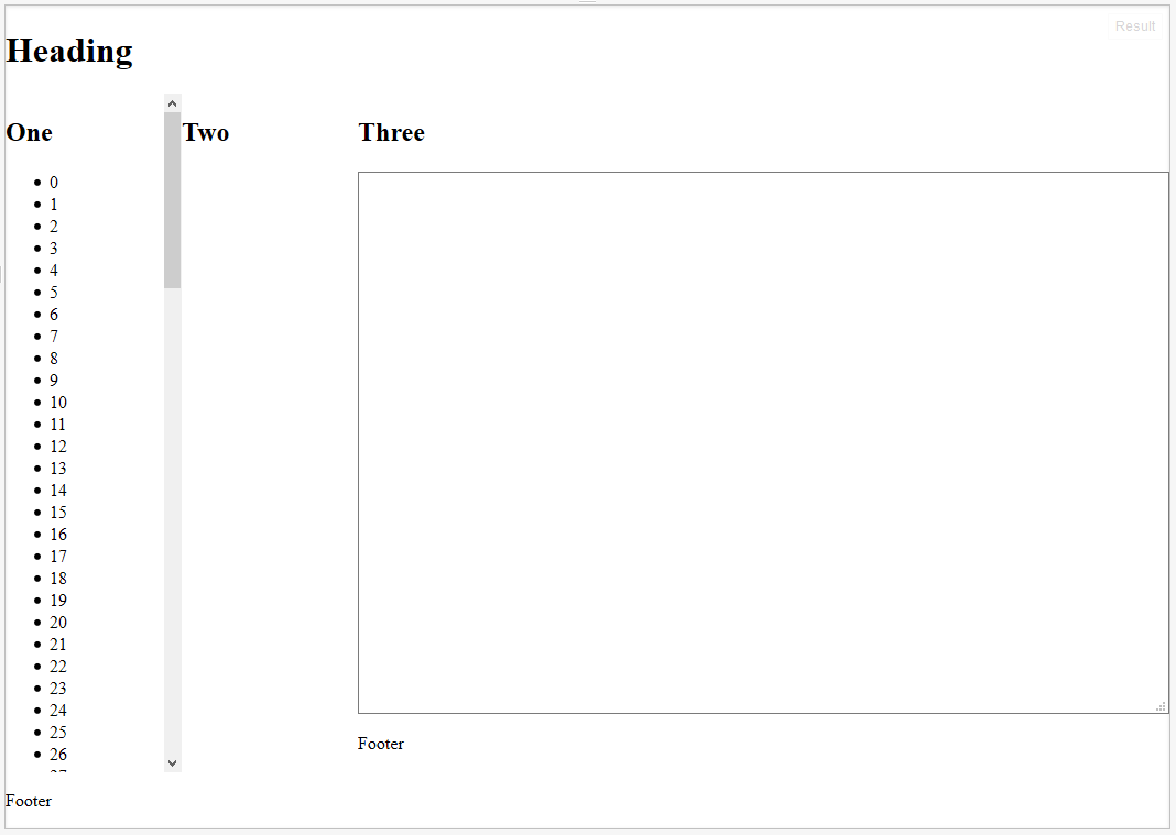
Which looks like this - I want columns One and Two to shrink/grow to fit rather than being fixed:
My question is, is there a CSS-only workaround for flex-basis: content, or an alternative way to realise this goal?
I can possibly live with fixing the column sizes as above, or using javascript, but I HAVE A DREAM DAMN IT.
Html Solutions
Solution 1 - Html
> I want columns One and Two to shrink/grow to fit rather than being > fixed.
Have you tried: flex-basis: auto
or this:
flex: 1 1 auto, which is short for:
flex-grow: 1(grow proportionally)flex-shrink: 1(shrink proportionally)flex-basis: auto(initial size based on content size)
or this:
main > section:first-child {
	flex: 1 1 auto;
	overflow-y: auto;
}

main > section:nth-child(2) {
	flex: 1 1 auto;
	overflow-y: auto;
}

main > section:last-child {
	flex: 20 1 auto;
	display: flex;
	flex-direction: column;
}
Related:
Solution 2 - Html
It turns out that it was shrinking and growing correctly, providing the desired behaviour all along; except that in all current browsers flexbox wasn't accounting for the vertical scrollbar! Which is why the content appears to be getting cut off.
You can see here, which is the original code I was using before I added the fixed widths, that it looks like the column isn't growing to accomodate the text:
http://jsfiddle.net/2w157dyL/1/
However if you make the content in that column wider, you'll see that it always cuts it off by the same amount, which is the width of the scrollbar.
So the fix is very, very simple - add enough right padding to account for the scrollbar:
http://jsfiddle.net/2w157dyL/2/
  main > section {
    overflow-y: auto;
    padding-right: 2em;
  }
It was when I was trying some things suggested by Michael_B (specifically adding a padding buffer) that I discovered this, thanks so much!
Edit: I see that he also posted a fiddle which does the same thing - again, thanks so much for all your help