Set Toggle color in SwiftUI
SwiftToggleSwiftuiSwift Problem Overview
I've implemented a toggle after following Apple's tutorial on user input. Currently, it looks like this:
https://i.stack.imgur.com/jvmsU.png" height="150" />
This is the code that produces this UI:
NavigationView {
    List {
        Toggle(isOn: $showFavoritesOnly) {
            Text("Show Favorites only")
        }
    }
}
Now, I'd like the Toggle's on-color to be blue instead of green.
I tried:
Toggle(isOn: $showFavoritesOnly) {
    Text("Show Favorites only")
}
.accentColor(.blue)
.foregroundColor(.blue)
.background(Color.blue)
None of these worked and I wasn't able to find any other modifiers, such as tintColor.
How do I change the color of a Toggle?
Swift Solutions
Solution 1 - Swift
SwiftUI 3.0
Using tint
A new modifier was introduced that can also change the Toggle color:
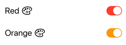
Toggle(isOn: $isToggleOn) {
    Text("Red")
    Image(systemName: "paintpalette")
}
.tint(.red)

Toggle(isOn: $isToggleOn) {
    Text("Orange")
    Image(systemName: "paintpalette")
}
.tint(.orange)
SwiftUI 2.0
Using SwitchToggleStyle
You can now set a tint color for the on position only in SwiftUI 2.0:
Toggle(isOn: $isToggleOn) {
    Text("Red")
    Image(systemName: "paintpalette")
}
.toggleStyle(SwitchToggleStyle(tint: Color.red))

Toggle(isOn: $isToggleOn) {
    Text("Orange")
    Image(systemName: "paintpalette")
}
.toggleStyle(SwitchToggleStyle(tint: Color.orange))
SwiftUI 1.0
Using ToggleStyle
I created a new ToggleStyle to change the three colors of the Toggle (on color, off color, and the thumb).
struct ColoredToggleStyle: ToggleStyle {
    var label = ""
    var onColor = Color(UIColor.green)
    var offColor = Color(UIColor.systemGray5)
    var thumbColor = Color.white

    func makeBody(configuration: Self.Configuration) -> some View {
        HStack {
            Text(label)
            Spacer()
            Button(action: { configuration.isOn.toggle() } )
            {
                RoundedRectangle(cornerRadius: 16, style: .circular)
                    .fill(configuration.isOn ? onColor : offColor)
                    .frame(width: 50, height: 29)
                    .overlay(
                        Circle()
                            .fill(thumbColor)
                            .shadow(radius: 1, x: 0, y: 1)
                            .padding(1.5)
                            .offset(x: configuration.isOn ? 10 : -10))
                    .animation(Animation.easeInOut(duration: 0.1))
            }
        }
        .font(.title)
        .padding(.horizontal)
    }
}
Examples of Use
Toggle("", isOn: $toggleState)
    .toggleStyle(
        ColoredToggleStyle(label: "My Colored Toggle",
                           onColor: .green,
                           offColor: .red,
                           thumbColor: Color(UIColor.systemTeal)))

Toggle("", isOn: $toggleState2)
    .toggleStyle(
        ColoredToggleStyle(label: "My Colored Toggle",
                           onColor: .purple))
From the SwiftUI Book
Solution 2 - Swift
Just use UIAppearance APIs:
UISwitch.appearance().onTintColor = UIColor.blue
It'll of course by default change the appearance of all the instances of UISwitch, as per UIAppearance documentation.
NOTE: Tested as of Xcode 11 beta 5.
Solution 3 - Swift
SwiftUI 2.0 (Post WWDC-2020)
Using the new SwiftUI enhancements you can use the .toggleStyle modifier.
// Switch tinting

Toggle(isOn: $order.notifyWhenReady) {
    Text("Send notification when ready")
}
.toggleStyle(SwitchToggleStyle(tint: .accentColor))
Note this only works for iOS14/iPadOS14/macOS11 and above.
Solution 4 - Swift
You can modify the global onTintColor for all UISwitch objects inside init().
@State var enable_dhcp = true

init()
{
	UISwitch.appearance().onTintColor = .red
}

var body: some View
{
	Toggle("DHCP", isOn: $enable_dhcp)
}

Solution 5 - Swift
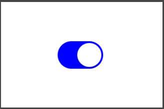
I haven't found a way to directly change a Toggle color yet but an alternative way to have a blue switch or any other custom views, is to create a custom view of your own. To make a custom blue toggle in its simplest form:
struct BlueToggle : UIViewRepresentable {
  func makeUIView(context: Context) -> UISwitch {
    UISwitch()
  }

  func updateUIView(_ uiView: UISwitch, context: Context) {
    uiView.onTintColor = UIColor.blue
  }
}

struct ContentView : View {
    var body: some View {
      BlueToggle()
    }
}
Result:
Solution 6 - Swift
Building off @mohammad-reza-farahani 's solution, here is a fully uncompromising approach to getting the configurability of UISwitch with the implementation protocols if SwiftUI.
First wrap a UISwitch in a UIViewRepresentable and set the colors as you wish:
final class CustomToggleWrapper: UIViewRepresentable {
    var isOn: Binding<Bool>

    init(isOn: Binding<Bool>) {
        self.isOn = isOn
    }

    func makeUIView(context: Context) -> UISwitch {
        UISwitch()
    }

    func updateUIView(_ uiView: UISwitch, context: Context) {
        // On color
        uiView.onTintColor = UIColor.blue
        // Off color
        uiView.tintColor = UIColor.red
        uiView.layer.cornerRadius = uiView.frame.height / 2
        uiView.backgroundColor = UIColor.red
        uiView.isOn = isOn.wrappedValue

        // Update bound boolean
        uiView.addTarget(self, action: #selector(switchIsChanged(_:)), for: .valueChanged)
    }

    @objc
    func switchIsChanged(_ sender: UISwitch) {
        isOn.wrappedValue = sender.isOn
    }
}
Second, create a custom toggle style using the wrapped UISwitch:
struct CustomToggleStyle: ToggleStyle {
    func makeBody(configuration: Self.Configuration) -> some View {
        let toggle = CustomToggleWrapper(isOn: configuration.$isOn)

        return HStack {
            configuration.label
            Spacer()
            toggle
        }
    }
}
Implement a Toggle as you normally would, and apply your CustomToggleStyle:
struct TestView: View {
    @State private var isOn: Bool = true

    var body: some View {
        Toggle(
            isOn: $isOn
        ) {
            Text("Test: \(String(isOn))")
        }.toggleStyle(CustomToggleStyle()).padding()
    }
}
Solution 7 - Swift
Karol Kulesza and George Valkov have provided a very easy to implement solution. I just wanted to add that you can place the code below inside the app delegate's didFinishLaunching method as well.
UISwitch.appearance().onTintColor = .blue
You can also create more specific appearance configurations with
appearance(whenContainedInInstancesOf:)
See https://www.hackingwithswift.com/example-code/uikit/what-is-the-uiappearance-proxy
Solution 8 - Swift
As the original question was just about changing the toggle on colour and not full Toggle visual customisation, I think something like this would do:
import SwiftUI

struct CustomToggle: UIViewRepresentable {
  @Binding var isOn: Bool

  func makeCoordinator() -> CustomToggle.Coordinator {
    Coordinator(isOn: $isOn)
  }

  func makeUIView(context: Context) -> UISwitch {
    let view = UISwitch()
    view.onTintColor = UIColor.red
    view.addTarget(context.coordinator, action: #selector(Coordinator.switchIsChanged(_:)), for: .valueChanged)

    return view
  }

  func updateUIView(_ uiView: UISwitch, context: Context) {
    uiView.isOn = isOn
  }

  class Coordinator: NSObject {
    @Binding private var isOn: Bool

    init(isOn: Binding<Bool>) {
      _isOn = isOn
    }

    @objc func switchIsChanged(_ sender: UISwitch) {
      _isOn.wrappedValue = sender.isOn
    }
  }
}

// MARK: - Previews

struct CustomToggle_Previews: PreviewProvider {
  static var previews: some View {
    ViewWrapper()
  }

  struct ViewWrapper: View {
    @State(initialValue: false) var isOn: Bool

    var body: some View {
      CustomToggle(isOn: $isOn)
        .previewLayout(.fixed(width: 100, height: 100))
    }
  }
}
Solution 9 - Swift
I would change @Mark Moeykens answer a little bit to avoid having the button tap animation. A better solution would be:
@available(iOS 13.0, *)
struct ColoredToggleStyle: ToggleStyle {
    var label = ""
    var onColor = UIColor.proacPrimaryBlue.suColor
    var offColor = UIColor.systemGray5.suColor
    var thumbColor = Color.white

    func makeBody(configuration: Self.Configuration) -> some View {
        HStack {
            Text(label)
            Spacer()
            RoundedRectangle(cornerRadius: 16, style: .circular)
                .fill(configuration.isOn ? onColor : offColor)
                .frame(width: 50, height: 29)
                .overlay(
                    Circle()
                        .fill(thumbColor)
                        .shadow(radius: 1, x: 0, y: 1)
                        .padding(1.5)
                        .offset(x: configuration.isOn ? 10 : -10))
                .animation(Animation.easeInOut(duration: 0.1))
                .onTapGesture {
                    configuration.isOn.toggle()
                }
        }
        .font(.title)
        .padding(.horizontal)
    }
}
Solution 10 - Swift
- The easist way is setting
UISwitch.appearance().onTintColor = UIColor.redbefore using toggle and use SwiftUI Toggle like below.
UISwitch.appearance().onTintColor = UIColor.red
...

let toggle = Toggle(isOn: $vm.dataUsePermission, label: {
    Text(I18N.permit_data_usage)
        .font(SwiftUI.Font.system(size: 16, weight: .regular))
})

if #available(iOS 14.0, *) {
    toggle.toggleStyle(
        SwitchToggleStyle(tint: Color(UIColor.m.blue500))
    )
} else {
    toggle.toggleStyle(SwitchToggleStyle())
}

...
- You can alse use same Toggle interface in SwiftUI but different name, and change tint color.
TintableSwitch(isOn: .constant(true), label: {
    Text("Switch")
})

Toggle(isOn: .constant(true), label: {
    Text("Switch")
})
If only need Toggle without Label, then
TintableUISwitch(isOn: .constant(true))
Use below code.
import SwiftUI

public struct TintableSwitch<Label>: View where Label: View {

    @Binding var isOn: Bool

    var label: Label

    public init(isOn: Binding<Bool>, @ViewBuilder label: () -> Label) {
        self._isOn = isOn
        self.label = label()
    }

    public var body: some View {
        HStack {
            label
            Spacer()
            TintableUISwitch(isOn: $isOn, onTintColor: .red) // 📌 CHANGE HERE
        }
    }
}

public struct TintableUISwitch: UIViewRepresentable {

    @Binding var isOn: Bool
    private var onTintColor: UIColor

    public init(isOn: Binding<Bool>, onTintColor: UIColor = UIColor.m.blue500) {
        self._isOn = isOn
        self.onTintColor = onTintColor
    }

    public func makeUIView(context: Context) -> UISwitch {
        let uiSwitch = UISwitch()
        uiSwitch.addTarget(
            context.coordinator,
            action: #selector(Coordinator.valueChanged(_:)),
            for: .valueChanged
        )
        uiSwitch.onTintColor = onTintColor
        uiSwitch.isOn = isOn
        return uiSwitch
    }

    public func updateUIView(_ uiView: UISwitch, context: Context) {
        uiView.isOn = isOn
    }

    public func makeCoordinator() -> Coordinator {
        Coordinator(self)
    }

    public class Coordinator: NSObject {

        var tintableSwitch: TintableUISwitch

        init(_ tintableSwitch: TintableUISwitch) {
            self.tintableSwitch = tintableSwitch
        }

        @objc
        func valueChanged(_ sender: UISwitch) {
            tintableSwitch.isOn = sender.isOn
        }
    }
}

struct TintableSwitch_Previews: PreviewProvider {
    static var previews: some View {
        VStack {
            TintableSwitch(isOn: .constant(true), label: {
                Text("Switch")
            })

            Toggle(isOn: .constant(true), label: {
                Text("Switch")
            })
        }
    }
}

struct TintableUISwitch_Previews: PreviewProvider {
    static var previews: some View {
        TintableUISwitch(isOn: .constant(true))
    }
}
Solution 11 - Swift
You can change the toggle color in IOS 15.0 using a tint modifier.
Toggle(isOn: $isToggleOn) {
       Text("Toggle")
    }.tint(.red)
and below IOS 15.0, You can use toggleStyle modifier to change the toggle color but it will be depreciated in the future.
 Toggle(isOn: $isToggleOn) {
    Text("Toggle")
 }.toggleStyle(SwitchToggleStyle(tint: .red))
Solution 12 - Swift
This https://stackoverflow.com/a/56480720/5941807 (for now whit Xcode 11 beta 6) is a solution. To switch between to option a fast way is using the boolean instead of if/else:
showFavoritesOnly ? .red : .blue
for foreground:
Toggle(isOn: $showGreeting) {
  Text("Show Favorites only").foregroundColor(showFavoritesOnly ? .blue : .gray)
}
for tint:
uiView.onTintColor = showFavoritesOnly ? UIColor.blue : UIColor.gray
In addition for custom colors: https://stackoverflow.com/a/57744208/5941807