Make a VStack fill the width of the screen in SwiftUI
IosSwiftXcodeSwiftuiIos Problem Overview
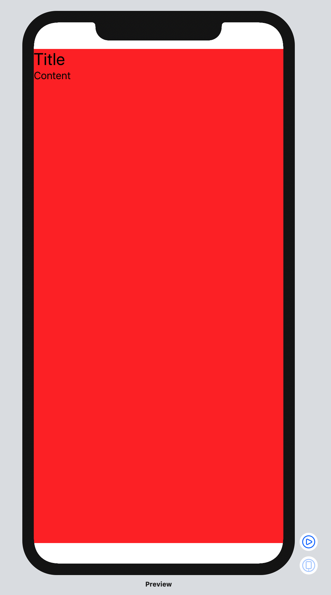
Given this code:
import SwiftUI

struct ContentView: View {
  var body: some View {
    VStack(alignment: .leading) {
      Text("Title")
        .font(.title)

      Text("Content")
        .lineLimit(nil)
        .font(.body)

      Spacer()
    }
    .background(Color.red)
  }
}

#if DEBUG
struct ContentView_Previews : PreviewProvider {
  static var previews: some View {
    ContentView()
  }
}
#endif
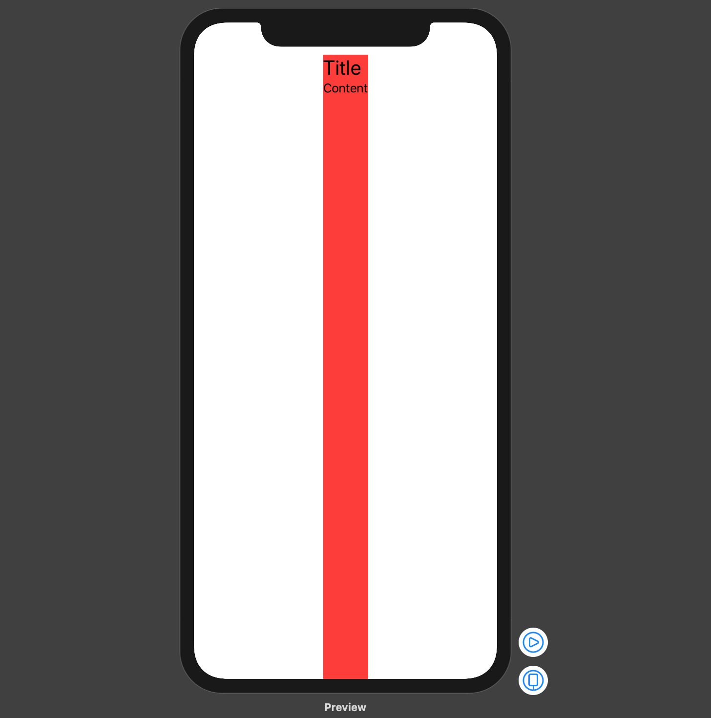
It results in this interface:
How can I make the VStack fill the width of the screen even if the labels/text components don't need the full width?
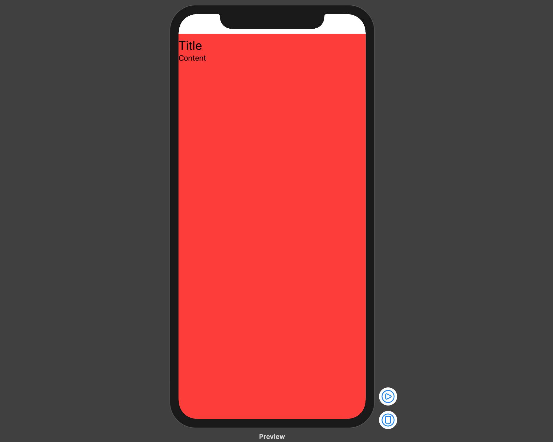
A trick I've found is to insert an empty HStack in the structure like so:
VStack(alignment: .leading) {
  HStack {
    Spacer()
  }
  Text("Title")
    .font(.title)

  Text("Content")
    .lineLimit(nil)
    .font(.body)

  Spacer()
}
Which yields the desired design:
Is there a better way?
Ios Solutions
Solution 1 - Ios
Try using the .frame modifier with the following options:
.frame(
      minWidth: 0,
      maxWidth: .infinity,
      minHeight: 0,
      maxHeight: .infinity,
      alignment: .topLeading
    )
struct ContentView: View {
  var body: some View {
    VStack(alignment: .leading) {
      Text("Hello World")
        .font(.title)
      Text("Another")
        .font(.body)
      Spacer()
    }
    .frame(
      minWidth: 0,
      maxWidth: .infinity,
      minHeight: 0,
      maxHeight: .infinity,
      alignment: .topLeading
    )
    .background(Color.red)
  }
}
This is described as being a flexible frame (see the documentation), which will stretch to fill the whole screen, and when it has extra space it will center its contents inside of it.
Solution 2 - Ios
An alternative stacking arrangement which works and is perhaps a bit more intuitive is the following:
struct ContentView: View {
    var body: some View {
        HStack() {
            VStack(alignment: .leading) {
                Text("Hello World")
                    .font(.title)
                Text("Another")
                    .font(.body)
                Spacer()
            }
            Spacer()
        }.background(Color.red)
    }
}
The content can also easily be re-positioned by removing the Spacer()'s if necessary.
Solution 3 - Ios
With Swift 5.2 and iOS 13.4, according to your needs, you can use one of the following examples to align your VStack with top leading constraints and a full size frame.
Note that the code snippets below all result in the same display, but do not guarantee the effective frame of the VStack nor the number of View elements that might appear while debugging the view hierarchy.
1. Using frame(minWidth:idealWidth:maxWidth:minHeight:idealHeight:maxHeight:alignment:) method
The simplest approach is to set the frame of your VStack with maximum width and height and also pass the required alignment in frame(minWidth:idealWidth:maxWidth:minHeight:idealHeight:maxHeight:alignment:):
struct ContentView: View {

    var body: some View {
        VStack(alignment: .leading) {
            Text("Title")
                .font(.title)
            Text("Content")
                .font(.body)
        }
        .frame(
            maxWidth: .infinity,
            maxHeight: .infinity,
            alignment: .topLeading
        )
        .background(Color.red)
    }

}
2. Using Spacers to force alignment
You can embed your VStack inside a full size HStack and use trailing and bottom Spacers to force your VStack top leading alignment:
struct ContentView: View {

    var body: some View {
        HStack {
            VStack(alignment: .leading) {
                Text("Title")
                    .font(.title)
                Text("Content")
                    .font(.body)

                Spacer() // VStack bottom spacer
            }

            Spacer() // HStack trailing spacer
        }
        .frame(
            maxWidth: .infinity,
            maxHeight: .infinity
        )
        .background(Color.red)
    }

}
3. Using a ZStack and a full size background View
This example shows how to embed your VStack inside a ZStack that has a top leading alignment. Note how the Color view is used to set maximum width and height:
struct ContentView: View {

    var body: some View {
        ZStack(alignment: .topLeading) {
            Color.red
                .frame(maxWidth: .infinity, maxHeight: .infinity)

            VStack(alignment: .leading) {
                Text("Title")
                    .font(.title)
                Text("Content")
                    .font(.body)
            }
        }
    }

}
4. Using GeometryReader
GeometryReader has the following declaration:
>A container view that defines its content as a function of its own size and coordinate space. [...] This view returns a flexible preferred size to its parent layout.
The code snippet below shows how to use GeometryReader to align your VStack with top leading constraints and a full size frame:
struct ContentView : View {

    var body: some View {
        GeometryReader { geometryProxy in
            VStack(alignment: .leading) {
                Text("Title")
                    .font(.title)
                Text("Content")
                    .font(.body)
            }
            .frame(
                width: geometryProxy.size.width,
                height: geometryProxy.size.height,
                alignment: .topLeading
            )
        }
        .background(Color.red)
    }

}
5. Using overlay(_:alignment:) method
If you want to align your VStack with top leading constraints on top of an existing full size View, you can use overlay(_:alignment:) method:
struct ContentView: View {

    var body: some View {
        Color.red
            .frame(
                maxWidth: .infinity,
                maxHeight: .infinity
            )
            .overlay(
                VStack(alignment: .leading) {
                    Text("Title")
                        .font(.title)
                    Text("Content")
                        .font(.body)
                },
                alignment: .topLeading
            )
    }

}
Display:
https://i.stack.imgur.com/qOBQC.png" width="200">
Solution 4 - Ios
There is a better way!
To make the VStack fill the width of it's parent you can use a GeometryReader and set the frame. (.relativeWidth(1.0) should work but apparently doesn't right now)
struct ContentView : View {
    var body: some View {
        GeometryReader { geometry in
            VStack {
                Text("test")
            }
                .frame(width: geometry.size.width,
                       height: nil,
                       alignment: .topLeading)
        }
    }
}
To make the VStack the width of the actual screen you can use UIScreen.main.bounds.width when setting the frame instead of using a GeometryReader, but I imagine you likely wanted the width of the parent view.
Also, this way has the added benefit of not adding spacing in your VStack which might happen (if you have spacing) if you added an HStack with a Spacer() as it's content to the VStack.
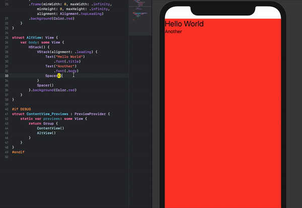
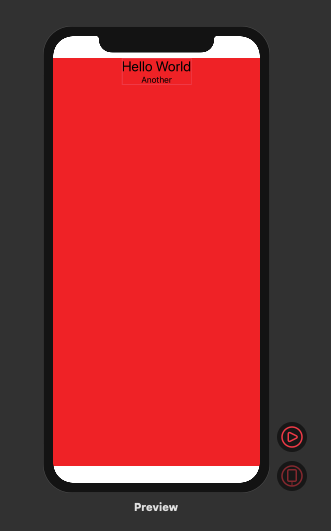
UPDATE - THERE IS NOT A BETTER WAY!
After checking out the accepted answer, I realized that the accepted answer doesn't actually work! It appears to work at first glance, but if you update the VStack to have a green background you'll notice the VStack is still the same width.
struct ContentView : View {
    var body: some View {
        NavigationView {
            VStack(alignment: .leading) {
                Text("Hello World")
                    .font(.title)
                Text("Another")
                    .font(.body)
                Spacer()
                }
                .background(Color.green)
                .frame(minWidth: 0, maxWidth: .infinity, minHeight: 0, maxHeight: .infinity, alignment: .topLeading)
                .background(Color.red)
        }
    }
}
This is because .frame(...) is actually adding another view to the view hierarchy and that view ends up filling the screen. However, the VStack still does not.
This issue also seems to be the same in my answer as well and can be checked using the same approach as above (putting different background colors before and after the .frame(...). The only way that appears to actually widen the VStack is to use spacers:
struct ContentView : View {
    var body: some View {
        VStack(alignment: .leading) {
            HStack{
                Text("Title")
                    .font(.title)
                Spacer()
            }
            Text("Content")
                .lineLimit(nil)
                .font(.body)
            Spacer()
        }
            .background(Color.green)
    }
}
Solution 5 - Ios
The simplest way I manage to solve the issue was is by using a ZStack + .edgesIgnoringSafeArea(.all)
struct TestView : View {

    var body: some View {
        ZStack() {
            Color.yellow.edgesIgnoringSafeArea(.all)
            VStack {
                Text("Hello World")
            }
        }
    }
}
Solution 6 - Ios
use this
.edgesIgnoringSafeArea(.all)
Solution 7 - Ios
A good solution and without "contraptions" is the forgotten ZStack
ZStack(alignment: .top){
    Color.red
    VStack{
        Text("Hello World").font(.title)
        Text("Another").font(.body)
    }
}
Result:
Solution 8 - Ios
You can do it by using GeometryReader
Code:
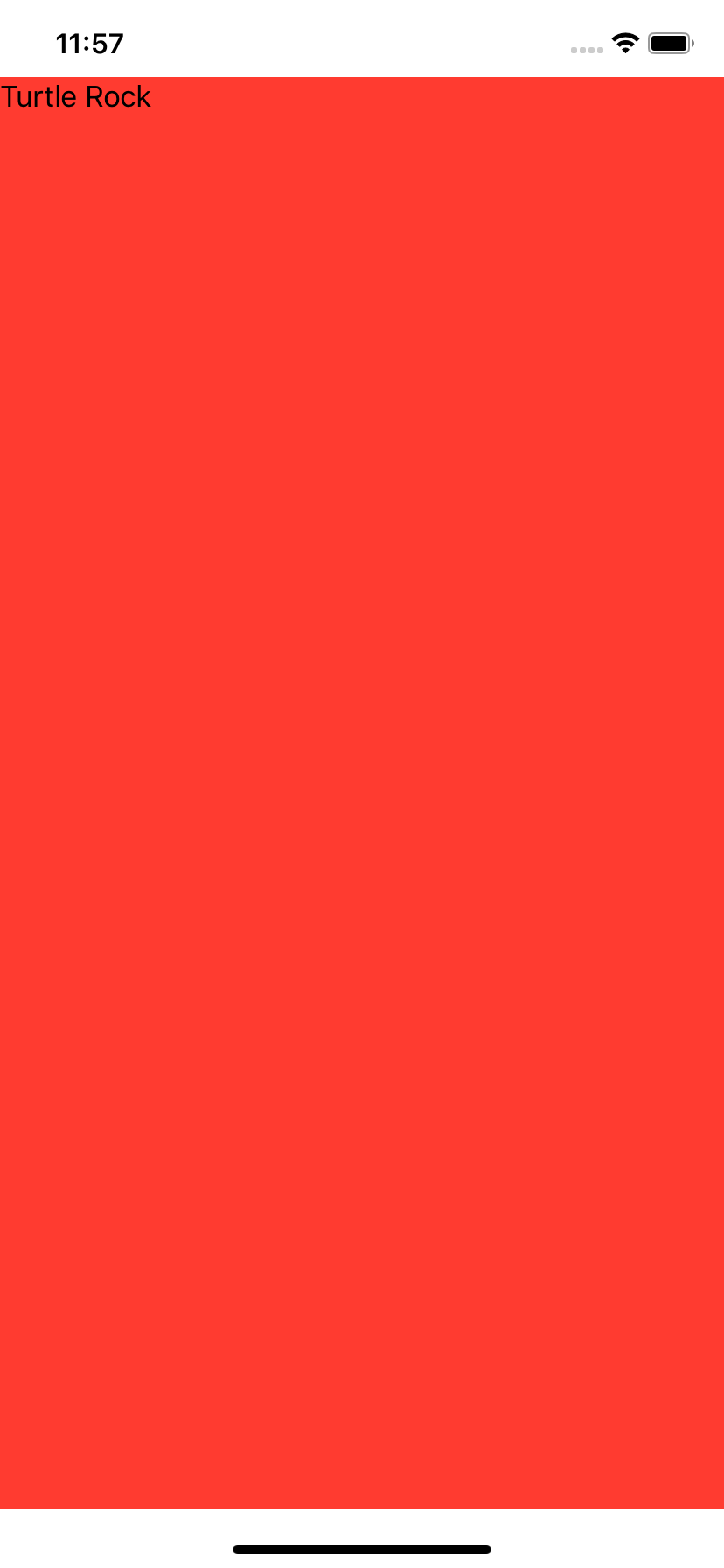
struct ContentView : View {
    var body: some View {
        GeometryReader { geometry in
            VStack {
               Text("Turtle Rock").frame(width: geometry.size.width, height: geometry.size.height, alignment: .topLeading).background(Color.red)
            }
        }
    }
}
Your output like:
Solution 9 - Ios
One more alternative is to place one of the subviews inside of an HStack and place a Spacer() after it:
struct ContentView : View {
    var body: some View {
        VStack(alignment: .leading) {

            HStack {
                Text("Title")
                    .font(.title)
                    .background(Color.yellow)
                Spacer()
            }

            Text("Content")
                .lineLimit(nil)
                .font(.body)
                .background(Color.blue)

            Spacer()
            }

            .background(Color.red)
    }
}
resulting in :
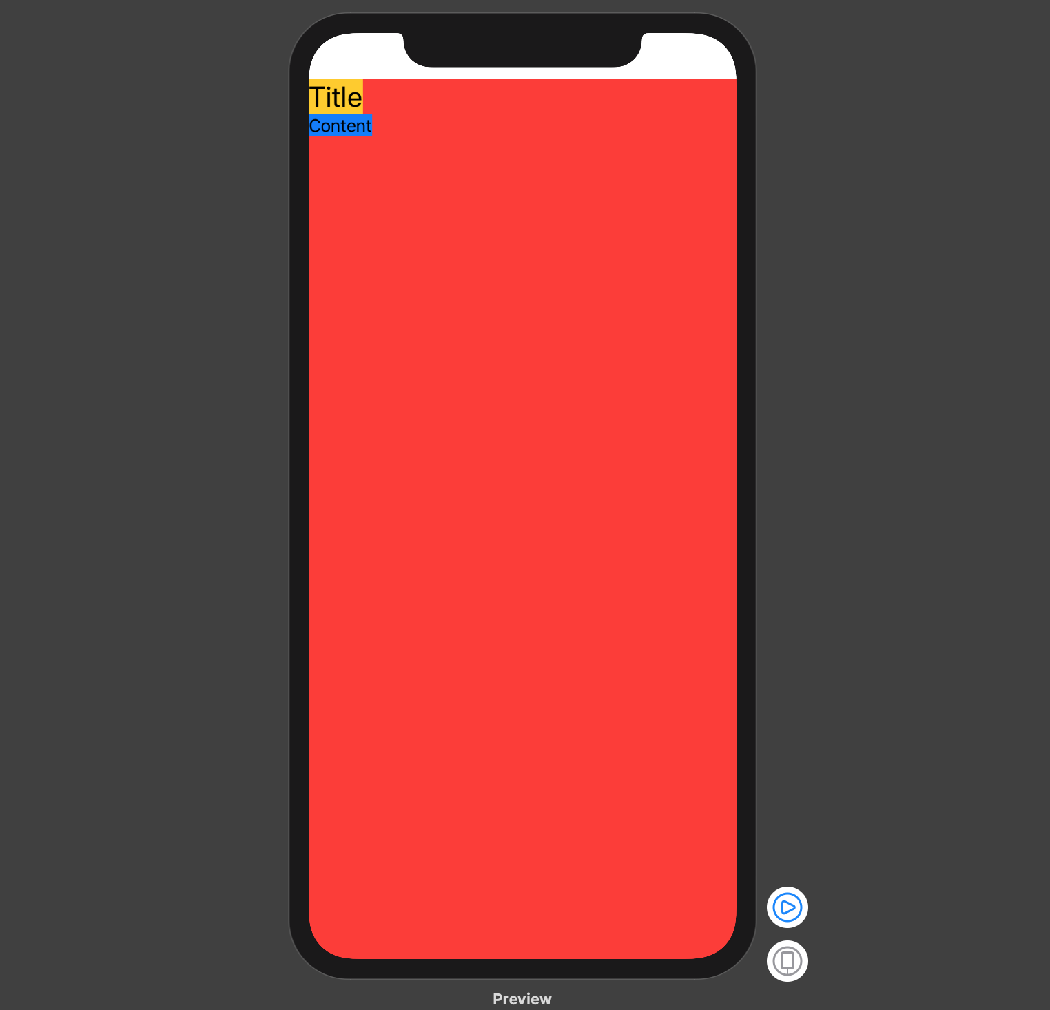
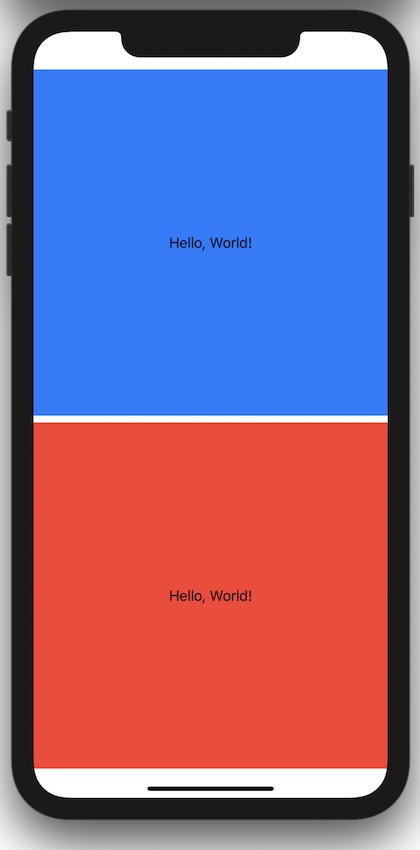
Solution 10 - Ios
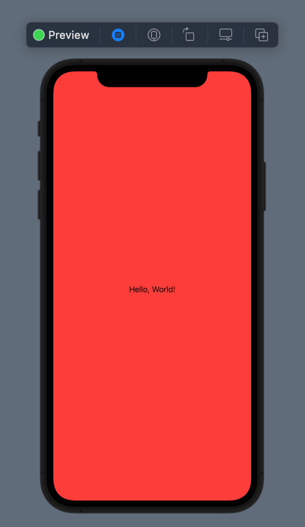
Way Number 1 -> Using MaxWidth & MaxHeight
import SwiftUI

struct SomeView: View {
    var body: some View {
        VStack {
            Text("Hello, World!")
        }
        .frame(maxWidth: .infinity, maxHeight: .infinity)
        .background(.red)
    }
}

struct SomeView_Previews: PreviewProvider {
    static var previews: some View {
        SomeView()
    }
}
Way Number 2 -> Using Main Screen Bounds
import SwiftUI

struct SomeView: View {
    var body: some View {
        VStack {
            Text("Hello, World!")
        }
        .frame(maxWidth: UIScreen.main.bounds.width, maxHeight: UIScreen.main.bounds.height)
        .background(.red)
    }
}

struct SomeView_Previews: PreviewProvider {
    static var previews: some View {
        SomeView()
    }
}
Way Number 3 -> Using Geometry Reader
import SwiftUI

struct SomeView: View {
    var body: some View {
        GeometryReader { geometryReader in
            VStack {
                Text("Hello, World!")
            }
            .frame(maxWidth: geometryReader.size.width, maxHeight: geometryReader.size.height)
            .background(.red)
        }
    }
}

struct SomeView_Previews: PreviewProvider {
    static var previews: some View {
        SomeView()
    }
}
Way Number 4 -> Using Spacers
import SwiftUI

struct SomeView: View {
    var body: some View {
        VStack {
            Text("Hello, World!")
            HStack{
                Spacer()
            }
            Spacer()
        }
        .background(.red)
    }
}

struct SomeView_Previews: PreviewProvider {
    static var previews: some View {
        SomeView()
    }
}
Solution 11 - Ios
This is a useful bit of code:
extension View {
    func expandable () -> some View {
        ZStack {
            Color.clear
            self
        }
    }
}
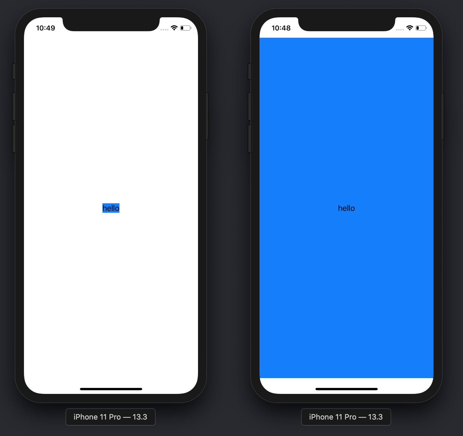
Compare the results with and without the .expandable() modifier:
Text("hello")
    .background(Color.blue)
-
Text("hello")
    .expandable()
    .background(Color.blue)
Solution 12 - Ios
This is what worked for me (ScrollView (optional) so more content can be added if needed, plus centered content):
import SwiftUI

struct SomeView: View {
    var body: some View {
        GeometryReader { geometry in
            ScrollView(Axis.Set.horizontal) {
                HStack(alignment: .center) {
                    ForEach(0..<8) { _ in
                        Text("🥳")
                    }
                }.frame(width: geometry.size.width, height: 50)
            }
        }
    }
}

// MARK: - Preview

#if DEBUG
struct SomeView_Previews: PreviewProvider {
    static var previews: some View {
        SomeView()
    }
}
#endif
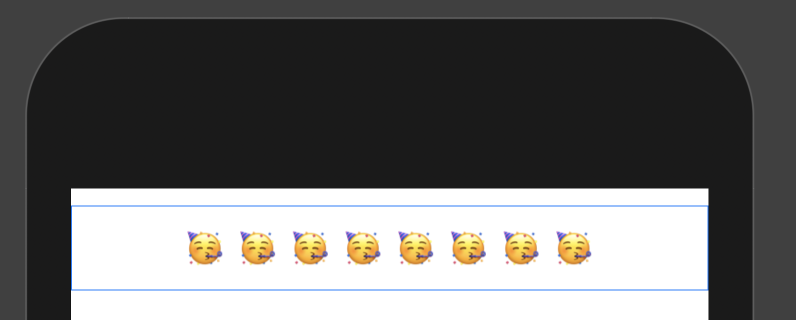
> Result
Solution 13 - Ios
I know this will not work for everyone, but I thought it interesting that just adding a Divider solves for this.
struct DividerTest: View {
var body: some View {
    VStack(alignment: .leading) {
        Text("Foo")
        Text("Bar")
        Divider()
    }.background(Color.red)
  }
}
Solution 14 - Ios
You can use GeometryReader in a handy extension to fill the parent
extension View {
    func fillParent(alignment:Alignment = .center) -> some View {
        return GeometryReader { geometry in
            self
                .frame(width: geometry.size.width,
                       height: geometry.size.height,
                       alignment: alignment)
        }
    }
}
so using the requested example, you get
struct ContentView : View {
    var body: some View {
        VStack(alignment: .leading) {
            Text("Title")
                .font(.title)

            Text("Content")
                .lineLimit(nil)
                .font(.body)
        }
        .fillParent(alignment:.topLeading)
        .background(Color.red)
    }
}
(note the spacer is no longer needed)
Solution 15 - Ios
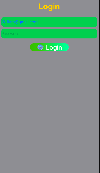
Login Page design using SwiftUI
import SwiftUI

struct ContentView: View {

    @State var email: String = "[email protected]"
    @State var password: String = ""
    @State static var labelTitle: String = ""


    var body: some View {
        VStack(alignment: .center){
            //Label
            Text("Login").font(.largeTitle).foregroundColor(.yellow).bold()
            //TextField
            TextField("Email", text: $email)
                .textContentType(.emailAddress)
                .foregroundColor(.blue)
                .frame(minHeight: 40)
                .background(RoundedRectangle(cornerRadius: 10).foregroundColor(Color.green))

            TextField("Password", text: $password) //Placeholder
                .textContentType(.newPassword)
                .frame(minHeight: 40)
                .foregroundColor(.blue) // Text color
                .background(RoundedRectangle(cornerRadius: 10).foregroundColor(Color.green))

            //Button
            Button(action: {

            }) {
                HStack {
                    Image(uiImage: UIImage(named: "Login")!)
                        .renderingMode(.original)
                        .font(.title)
                        .foregroundColor(.blue)
                    Text("Login")
                        .font(.title)
                        .foregroundColor(.white)
                }


                .font(.headline)
                .frame(minWidth: 0, maxWidth: .infinity)
                .background(LinearGradient(gradient: Gradient(colors: [Color("DarkGreen"), Color("LightGreen")]), startPoint: .leading, endPoint: .trailing))
                .cornerRadius(40)
                .padding(.horizontal, 20)

                .frame(width: 200, height: 50, alignment: .center)
            }
            Spacer()

        }.padding(10)

            .frame(minWidth: 0, idealWidth: .infinity, maxWidth: .infinity, minHeight: 0, idealHeight: .infinity, maxHeight: .infinity, alignment: .top)
            .background(Color.gray)

    }

}

struct ContentView_Previews: PreviewProvider {
    static var previews: some View {
        ContentView()
    }
}
Solution 16 - Ios
Here another way which would save time in your projects:
Much less code and reusable in compare to other answers which they are not reusable!
extension View {

    var maxedOut: some View {

        return Color.clear
            .overlay(self, alignment: .center)

    }

    func maxedOut(color: Color = Color.clear, alignment: Alignment = Alignment.center) -> some View {

        return color
            .overlay(self, alignment: alignment)

    }

}
use case:
struct ContentView: View {

    var body: some View {

        Text("Hello, World!")
            .maxedOut
            .background(Color.blue)

        Text("Hello, World!")
            .maxedOut(color: Color.red)

    }
}
Solution 17 - Ios
⚠️ Important Note!
All other solutions are just adding a frame around the content!
✅ but this solution changes the actual frame!
Simple and correct extension
You can use this modifier
.flexible(width: true, height: false)
Demo
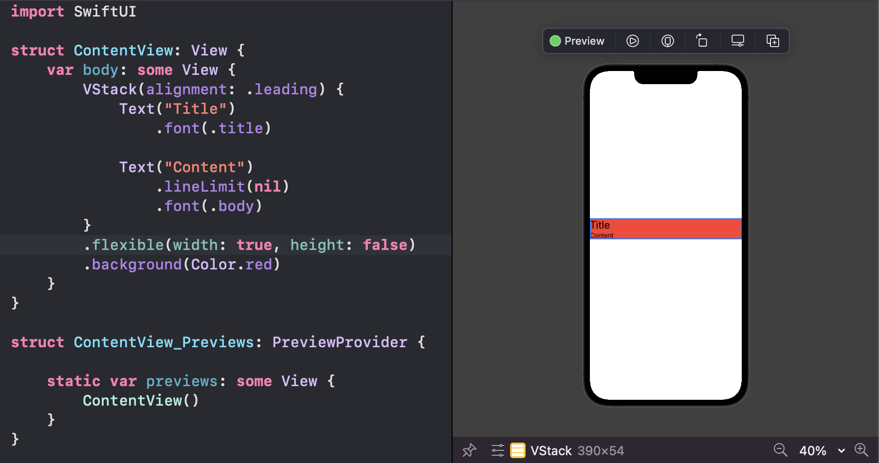
Note how contents are aligned exactly as you assign in the original stack
The code behind this ( FlexibleViewModifier.swift )
extension View {
    func flexible(width: Bool, height: Bool) -> some View {
        self.modifier(MatchingParentModifier(width: width, height: height))
    }
}

struct MatchingParentModifier: ViewModifier {
    @State private var intrinsicSize: CGSize = UIScreen.main.bounds.size
    private let intrinsicWidth:  Bool
    private let intrinsicHeight:  Bool

    init(width: Bool, height: Bool) {
        intrinsicWidth = !width
        intrinsicHeight = !height
    }

    func body(content: Content) -> some View {
        GeometryReader { _ in
            content.modifier(intrinsicSizeModifier(intrinsicSize: $intrinsicSize))
        }
        .frame(
            maxWidth: intrinsicWidth ? intrinsicSize.width : nil,
            maxHeight: intrinsicHeight ? intrinsicSize.height : nil
        )
    }
}

struct intrinsicSizeModifier: ViewModifier {
    @Binding var intrinsicSize: CGSize

    func body(content: Content) -> some View {
        content.readIntrinsicContentSize(to: $intrinsicSize)
    }
}

struct IntrinsicContentSizePreferenceKey: PreferenceKey {
    static let defaultValue: CGSize = .zero

    static func reduce(value: inout CGSize, nextValue: () -> CGSize) {
        value = nextValue()
    }
}

extension View {
    func readIntrinsicContentSize(to size: Binding<CGSize>) -> some View {
        background(
            GeometryReader {
                Color.clear.preference(
                    key: IntrinsicContentSizePreferenceKey.self,
                    value: $0.size
                )
            }
        )
        .onPreferenceChange(IntrinsicContentSizePreferenceKey.self) {
            size.wrappedValue = $0
        }
    }
}