Rounded corners on material button
AndroidMaterial DesignAndroid Support-LibraryAndroid ButtonAndroid Support-DesignAndroid Problem Overview
I'm following the tips from questions like this to create a button style like suggested on Material Design.

However, I need to change the corner radius and haven't been able to do so by inheriting Widget.AppCompat.Button.Colored style and setting the radius parameter.
How can I have the same style but with rounded corners?
Android Solutions
Solution 1 - Android
With the Material Components Library:.
Add the dependency to your build.gradle:
dependencies { implementation ‘com.google.android.material:material:1.3.0’ }
In this case you can use a MaterialButton in your layout file:
<com.google.android.material.button.MaterialButton
   ....
   style="@style/Widget.MaterialComponents.Button"
   app:cornerRadius=".."
   app:strokeColor="@color/colorPrimary"/>
Use app:cornerRadius attribute to change the size of corner radius. This will round off the corners with specified dimensions.
You can also customize the corners using the shapeAppearanceOverlay attribute.
<style name="MyButton" parent="Widget.MaterialComponents.Button.OutlinedButton">
    <item name="shapeAppearanceOverlay">@style/MyShapeAppearance</item>
</style>
<style name="MyShapeAppearance">
    <item name="cornerFamily">rounded</item>
    <item name="cornerFamilyTopRight">cut</item>
    <item name="cornerFamilyBottomRight">cut</item>
    <item name="cornerSizeTopLeft">32dp</item>
    <item name="cornerSizeBottomLeft">32dp</item>
</style>
The official doc is here and all the android specs here.
With Jetpack Compose 1.0.x use the shape parameter:
    Button( onClick = { /* Do something! */ },
            shape = RoundedCornerShape(8.dp)) {
        Text("Button")
    }

    Button(modifier = Modifier.padding(16.dp),
            onClick = { /* Do something! */ },
            shape = RoundedCornerShape(
                50,  // topEndPercent
                0,   // topEndPercent
                0,   // bottomEndPercent
                50.  // bottomStartPercent
            )
    ) {
        Text("Button")
    }

OLD Support Library:
With the new Support Library 28.0.0, the Design Library now contains the Material Button.
You can add this button to our layout file with:
<android.support.design.button.MaterialButton
    android:layout_width="wrap_content"
    android:layout_height="wrap_content"
    android:text="XXXXX"
    android:textSize="18sp"
    android:backgroundTint="@color/colorPrimary"
    app:icon="@drawable/ic_android_white_24dp" />
You can set the corner radius with this attribute:
app:cornerRadius: Used to define the radius used for the corners of the button

dependencies {
  implementation 'com.android.support:design:28.0.0'
}
Solution 2 - Android
Update:
Answer by Gabriele Mariotti below is now better.
Old answer:
You need to inherit that style.
Add into your styles.xml:
 <style name="AppTheme.RoundedCornerMaterialButton" parent="Widget.AppCompat.Button.Colored">
        <item name="android:background">@drawable/rounded_shape</item>
 </style>
Add file drawable/rounded_shape.xml:
<shape
    xmlns:android="http://schemas.android.com/apk/res/android"
    android:shape="rectangle"   >

    <solid
        android:color="@color/colorAccent" >
    </solid>

    <corners
        android:radius="11dp"   >
    </corners>

</shape>
And finally in your layout:
 <Button
       android:layout_width="wrap_content"
       android:layout_height="wrap_content"
       android:text="Test Text"
       style="@style/AppTheme.RoundedCornerMaterialButton"/>
Edit: updated answer to use theme's color rather than hardcoded one.
Solution 3 - Android
Rounded Material Button with Ripple effect
Create a file in drawable folder ripple.xml
<?xml version="1.0" encoding="utf-8"?>
<ripple xmlns:android="http://schemas.android.com/apk/res/android"
    android:color="?android:attr/colorControlHighlight">
    <item android:id="@android:id/mask">
        <shape android:shape="rectangle">
            <solid android:color="@color/colorPrimary" />
            <corners android:radius="20dp" />
        </shape>
    </item>
    <item android:drawable="@drawable/rounded_shape" />
</ripple>
Create a file in drawable folder rounded_shape.xml
<?xml version="1.0" encoding="utf-8"?>
<shape
    xmlns:android="http://schemas.android.com/apk/res/android"
    android:shape="rectangle"   >
    <solid
        android:color="@color/colorPrimary" >
    </solid>
    <corners
        android:radius="20dp"   >
    </corners>
</shape>
And on your Button:
<Button
android:id="@+id/button1"
android:background="@drawable/ripple"
android:text="Login"/>
Solution 4 - Android
Now use MaterialButton for rounded button many more thing you can do with this. please follow link
and add app:cornerRadius="8dp"for rounded corner
and don't forget to add google material libs in build.gradle
implementation "com.google.android.material:material:1.1.0"
Solution 5 - Android
I will tell you my exact solution for this . Inside selector tags, you can put items (functionality of the buttons)
Second item of the selector tag has the opposite behaviour. You can add as much as selector (button behaviour) ADD THIS DRAWABLE XML AS A BACKGROUND OF THE BUTTON android:background="@drawable/this xml"
    <?xml version="1.0" encoding="utf-8"?>
<ripple xmlns:android="http://schemas.android.com/apk/res/android"
    android:color="#ffffff"> <!-- this is the ripple color(first touch color changes into this color) -->
    <item>
        <selector>
            <item android:state_enabled="true">
                <shape xmlns:android="http://schemas.android.com/apk/res/android"
                    android:shape="rectangle">
                    <!-- default button color -->

                    <solid android:color="@color/colorPrimary"></solid>

                    <corners android:radius="151dp"></corners>

                </shape>
            </item>
            <item> //first item was state enabled so this is automatically state disabled
                <shape xmlns:android="http://schemas.android.com/apk/res/android"
                    android:shape="rectangle">
                    <!-- button disabled color opposite behaviour -->
                    <solid android:color="#e9d204"></solid>

                    <corners android:radius="151dp"></corners>

                </shape>
            </item>
        </selector>
    </item>
    <item>
        <selector>
            <item android:state_pressed="true">
                <shape xmlns:android="http://schemas.android.com/apk/res/android"
                    android:shape="rectangle">
                    <!-- button first touch of your finger color -->
                    <solid android:color="#1989fa"></solid>

                    <corners android:radius="151dp"></corners>

                </shape>
            </item>
        </selector>
    </item>
    <item>
        <selector>
            <item android:state_hovered="true">
                <shape xmlns:android="http://schemas.android.com/apk/res/android"
                    android:shape="rectangle">
                    <!-- hovered with a note pencil -->
                    <solid android:color="#4affffff"></solid>

                    <corners android:radius="151dp"></corners>

                </shape>
            </item>
        </selector>
    </item>

</ripple>
Solution 6 - Android
Also another simple way is wrap it around cardView,Remember to set the layout_width and layout_height of the cardView to wrap_content, also all the needed margin the button will need should be applied to the cardView
<android.support.v7.widget.CardView
            android:layout_width="wrap_content"
            android:layout_height="wrap_content"
            app:cardCornerRadius="8dp"
            android:layout_marginLeft="10dp"
            android:layout_marginRight="10dp"
            android:layout_marginBottom="40dp"
            app:elevation="10dp">

            <android.support.v7.widget.AppCompatButton
                android:id="@+id/login_twitter"
                android:tag="login_twitter"
                android:layout_width="300dp"
                android:layout_height="60dp"
                android:paddingLeft="10dp"
           android:foreground="?attr/selectableItemBackgroundBorderless"
                android:textColor="@color/blue_grey_ligthen_5"
                android:drawableLeft="@drawable/twitter"
                android:background="@color/twitter"
                android:text="@string/login_with_twitter" />
        </android.support.v7.widget.CardView>
Solution 7 - Android
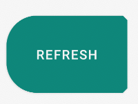
Try below code Create a drawable file called circular_button.xml and insert the below
<?xml version="1.0" encoding="utf-8"?>
<shape xmlns:android="http://schemas.android.com/apk/res/android"
android:shape="rectangle">
<solid android:color="#008577" />
<corners android:bottomRightRadius="100dp"
    android:bottomLeftRadius="100dp"
    android:topRightRadius="100dp"
    android:topLeftRadius="100dp"/>
</shape>
Then change the background of the button to this drawable file
 <Button
      android:layout_width="wrap_content"
      android:layout_height="wrap_content"
      android:background="@drawable/circle_button"
      android:text="Button"/>
If you want a full circle button you can use the below drawable
<?xml version="1.0" encoding="utf-8"?>
<shape
    xmlns:android="http://schemas.android.com/apk/res/android"
    android:shape="oval">

    <solid
        android:color="#008577"/>

    <size
        android:width="120dp"
        android:height="120dp"/>
</shape>
Solution 8 - Android
If you don't want to change the theme for the whole app.You can use the material theme for this view specifically:
<com.google.android.material.button.MaterialButton
    android:id="@+id/fooButon"
    android:layout_width="wrap_content"
    android:layout_height="wrap_content"
    android:layout_margin="16dp"
    android:fontFamily="sans-serif"
    android:padding="8dp"
==> android:theme="@style/Theme.MaterialComponents.Light"
    app:backgroundTint="@color/base_white" />