Phonegap Application text and layout too small
JavascriptHtmlCssJquery MobileCordovaJavascript Problem Overview
I recently build an android app using html, css, javascript and running them through phonegap to create the actual app. One of the problems I encountered in one phone is that the text looks too small. Also some images are a little small as well. I added a viewport meta tag but it doesnt seem to work either. Here are the meta tags:
    <meta http-equiv="Content-Type" content="text/html; charset=UTF-8" />
    <meta name="format-detection" content="telephone=no" />
    <meta name="viewport" content="width=device-width, initial-scale=1.0, minimum-scale=1.0, user-scalable=no, target-densitydpi=device-dpi" />`
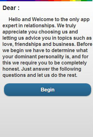
This is how it looks

This is how its supposed to look:
Javascript Solutions
Solution 1 - Javascript
I had the same problem and solved it changing the viewport. I also thought the problem was phonegap, but it really was that the devices used for testing had different dpi.
My solution was to change the target-densitydpi on the viewport to:
<meta name="viewport" content="width=device-width, initial-scale=1.0, maximum-scale=1.0, target-densitydpi=medium-dpi, user-scalable=0" />
Hope it helps
Solution 2 - Javascript
I had a similar problem and did some research I thought is worth sharing:
-
Set the viewport's
target-densitydpitomedium-dpi(=160dpi), as already suggested. This virtualizes thepxunit, e.g.1pxin html/css then corresponds to 2 physical pixels on a 320dpi device. Note that images are scaled (and blurred) as well.<meta name="viewport" content="user-scalable=no, initial-scale=1, maximum-scale=1, minimum-scale=1, width=device-width, height=device-height, target-densitydpi=medium-dpi" /> -
CSS: Use media queries to implement conditional styling. Adapting for different screen sizes dependent on width, height, aspect or orientation is straight-forward. Different pixel densities can be handled with
device-pixel-ratio(thanks to Marc Edwards for providing an example: https://gist.github.com/marcedwards/3446599).@media screen and (-webkit-min-device-pixel-ratio: 1.5), screen and (-o-min-device-pixel-ratio: 15/10) { body { background-image: ... } /* provide high-res image */ }
The media feature resolution is cleaner than device-pixel-ratio, but it lacks mobile browser support.
-
Javascript: Adapt button sizes, images etc. based on
window.devicePixelRatioandwindow.screen.widthandwindow.screen.height. Layouting per Javascript is considered as bad practice. Also flickering might result during loading as the execution starts after thepageloadevent. -
-webkit-image-setand imagesrc-setmake it easy to provide high-res images for retina displays, see http://www.html5rocks.com/en/mobile/high-dpi/#toc-bff. Browser support is limited.background-image: -webkit-image-set( url(icon1x.jpg) 1x, url(icon2x.jpg) 2x );
Solution 3 - Javascript
It appears that removing the target-densitydpi altogether brings the best results.
<meta name="viewport" content="user-scalable=no, initial-scale=1, maximum-scale=1, minimum-scale=1, width=device-width, height=device-height" />
This should be more than enough to control your app's appearance in most cases.
Solution 4 - Javascript
target-densitydpi=medium-dpi Worked for us.
Scenario Faced this issue when ee upgraded from PhoneGap 2.2 to 3.3.
Solution 5 - Javascript
Updated answer: for Android
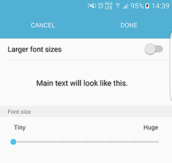
The problem is on Android devices has this Accessibilly settings, You can try to change font-size (search font size on android setting) and run you app again.
So your fonts on app will be changed as your setting
So here is a solution for Cordova
Use : mobile-accessibility to disabling PreferredTextZoom
Install mobile-accessibility on your Cordova project
$ cordova plugin add https://github.com/phonegap/phonegap-mobile-accessibility.git
And JS part is something like :
document.addEventListener("deviceready", onDeviceReady, false);
function onDeviceReady() {
   if (window.MobileAccessibility) {
      window.MobileAccessibility.usePreferredTextZoom(false);
   }
}
Solution 6 - Javascript
For Windows Phone (WP8) I've found the following solution: https://github.com/phonegap/phonegap-app-developer/issues/92
-
add to css: @-ms-viewport{ width: device-width; }
-
add to html:
<meta name="viewport" content="width=device-width, initial-scale=1" /> -
add to to patch IE 10:
(function() { if ("-ms-user-select" in document.documentElement.style && navigator.userAgent.match(/IEMobile/10.0/)) { var msViewportStyle = document.createElement("style"); msViewportStyle.appendChild( document.createTextNode("@-ms-viewport{width:auto!important}") ); document.getElementsByTagName("head")[0].appendChild(msViewportStyle); } })();
Solution 7 - Javascript
Adding this solution here
For me, some text were rendering really big, others were the correct size. The problem was with the use of rem values for font-size in the css. For some reason, elements where the font-size was the base value (defined in the body) were rendered way bigger than they should.
The fix was to reassign a global value for the rem font-size in a wrapper element for the entire site.
(my .font-size(1.4) is only a mixin rendering: font-size: 1.4rem; )
So this
html {
  font-size: 62.5%;
}

body {
  .font-size(1.4);
}

h1 {
  .font-size(2.6);
}
Can be fixed with this
html {
  font-size: 62.5%;
}

body {
  .font-size(1.4);
}

.wrapper {
  .font-size(1.4);
}

h1 {
  .font-size(2.6);
}