Outline effect to text
CssCss Problem Overview
Are there any ways in CSS to give outlines to text with different colors ? I want to highlight some parts of my text to make it more intuitive - like the names, links, etc. Changing the link colors etc. are common nowadays, so I want something new.
Css Solutions
Solution 1 - Css
There is an experimental webkit property called text-stroke in CSS3, I've been trying to get this to work for some time but have been unsuccessful so far.
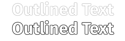
What I have done instead is used the already supported text-shadow property (supported in Chrome, Firefox, Opera, and IE 9 I believe).
Use four shadows to simulate a stroked text:
.strokeme {
  color: white;
  text-shadow: -1px -1px 0 #000, 1px -1px 0 #000, -1px 1px 0 #000, 1px 1px 0 #000;
}
<div class="strokeme">
  This text should have a stroke in some browsers
</div>
I have made a demo for you here
And a hovered example is available here
As Jason C has mentioned in the comments, the text-shadow CSS property is now supported by all major browsers, with the exception of Opera Mini. Where this solution will work for backwards compatibility (not really an issue regarding browsers that auto-update) I believe the text-stroke CSS should be used.
Solution 2 - Css
Easy! SVG to the rescue.
This is a simplified method:
svg{
  font   : bold 70px Century Gothic, Arial;
  width  : 100%;
  height : 120px;
}

text{
  fill            : none;
  stroke          : black;
  stroke-width    : .5px;
  stroke-linejoin : round;
  animation       : 2s pulsate infinite;
}

@keyframes pulsate {
  50%{ stroke-width:5px }
}
<svg viewBox="0 0 450 50">
  <text y="50">Scalable Title</text>
</svg>
Here's a more complex demo.
Solution 3 - Css
Edit: text-stroke is now fairly mature and implemented in most browsers. It is easier, sharper and more precise. If your browser audience can support it, you should now use text-stroke first, instead of text-shadow.
You can and should do this with just the text-shadow effect without any offsets:
.outline {
    color: #fff;
    text-shadow: #000 0px 0px 1px;
    -webkit-font-smoothing: antialiased;
}
Why? When you offset multiple shadow effects, you’ll begin to notice ungainly, jagged corners:

Having text-shadow effects in just one position eliminates the offsets, meaning
If you feel that’s too thin and would prefer a darker outline instead, no problem — you can repeat the same effect (keeping the same position and blur), several times. Like so:
text-shadow: #000 0px 0px 1px,   #000 0px 0px 1px,   #000 0px 0px 1px,
             #000 0px 0px 1px,   #000 0px 0px 1px,   #000 0px 0px 1px;
Here’s a sample of just one effect (top), and the same effect repeated 14 times (bottom):
Also note: Because the lines become so thin, it’s a very good idea to turn off sub-pixel rendering using-webkit-font-smoothing: antialiased.
Solution 4 - Css
You could try stacking multiple blured shadows until the shadows look like a stroke, like so:
.shadowOutline {
  text-shadow: 0 0 4px black, 0 0 4px black, 0 0 4px black, 0 0 4px black, 0 0 4px black, 0 0 4px black, 0 0 4px black, 0 0 4px black, 0 0 4px black, 0 0 4px black, 0 0 4px black, 0 0 4px black, 0 0 4px black, 0 0 4px black, 0 0 4px black, 0 0 4px black, 0 0 4px black, 0 0 4px black, 0 0 4px black, 0 0 4px black;
}
Here's a fiddle: http://jsfiddle.net/GGUYY/
I mention it just in case someone's interested, although I wouldn't call it a solution because it fails in various ways:
- it doesn't work in old IE
- it renders quite differently in every browser
- applying so many shadows is very heavy to process :S
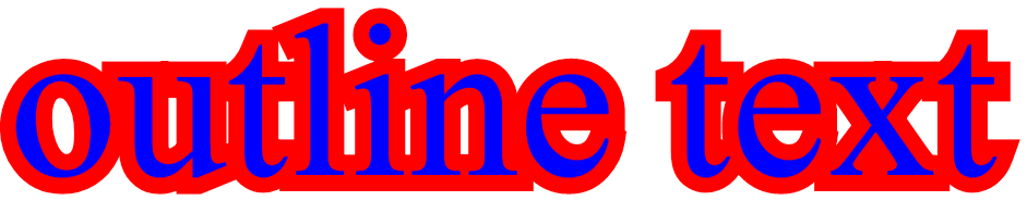
Solution 5 - Css
Just adding this answer. "Stroking" the text is not the same as "Outlining"
Outlining looks great. Stroking looks horrid.
https://i.stack.imgur.com/tPCgt.png" width="319">
The SVG solution listed elsewhere has the same issue. Of you want an outline you need to put the text twice. Once stroked and again not stroked.
Stroking IS NOT Outlining
body {
  font-family: sans-serif;
  margin: 20px;
}

.stroked {
  color: white;
  -webkit-text-stroke: 1px black;
}

.thickStroked {
  color: white;
  -webkit-text-stroke: 10px black;
}

.outlined {
  color: white;
  text-shadow:
    -1px -1px 0 #000,
     0   -1px 0 #000,
     1px -1px 0 #000,
     1px  0   0 #000,
     1px  1px 0 #000,
     0    1px 0 #000,
    -1px  1px 0 #000,
    -1px  0   0 #000;
}

.thickOutlined {
  color: white;
text-shadow: 0.0px 10.0px 0.02px #000, 9.8px 2.1px 0.02px #000, 4.2px -9.1px 0.02px #000, -8.0px -6.0px 0.02px #000, -7.6px 6.5px 0.02px #000, 4.8px 8.8px 0.02px #000, 9.6px -2.8px 0.02px #000, -0.7px -10.0px 0.02px #000, -9.9px -1.5px 0.02px #000, -3.5px 9.4px 0.02px #000, 8.4px 5.4px 0.02px #000, 7.1px -7.0px 0.02px #000, -5.4px -8.4px 0.02px #000, -9.4px 3.5px 0.02px #000, 1.4px 9.9px 0.02px #000, 10.0px 0.8px 0.02px #000, 2.9px -9.6px 0.02px #000, -8.7px -4.8px 0.02px #000, -6.6px 7.5px 0.02px #000, 5.9px 8.0px 0.02px #000, 9.1px -4.1px 0.02px #000, -2.1px -9.8px 0.02px #000, -10.0px -0.1px 0.02px #000, -2.2px 9.8px 0.02px #000, 9.1px 4.2px 0.02px #000, 6.1px -8.0px 0.02px #000, -6.5px -7.6px 0.02px #000, -8.8px 4.7px 0.02px #000, 2.7px 9.6px 0.02px #000, 10.0px -0.6px 0.02px #000, 1.5px -9.9px 0.02px #000, -9.3px -3.6px 0.02px #000, -5.5px 8.4px 0.02px #000, 7.0px 7.2px 0.02px #000, 8.5px -5.3px 0.02px #000, -3.4px -9.4px 0.02px #000, -9.9px 1.3px 0.02px #000, -0.8px 10.0px 0.02px #000, 9.6px 2.9px 0.02px #000, 4.9px -8.7px 0.02px #000, -7.5px -6.7px 0.02px #000, -8.1px 5.9px 0.02px #000, 4.0px 9.2px 0.02px #000, 9.8px -2.0px 0.02px #000, 0.2px -10.0px 0.02px #000, -9.7px -2.3px 0.02px #000, -4.3px 9.0px 0.02px #000, 7.9px 6.1px 0.02px #000
}

svg {
  font-size: 40px;
  font-weight: bold;
  width: 450px;
  height: 70px;
  fill: white;
}

.svgStroke {
  fill: white;
  stroke: black;
  stroke-width: 20px;
  stroke-linejoin: round;
}
<h1 class="stroked">Properly stroked!</h1>
<h1 class="outlined">Properly outlined!</h1>

<h1 class="thickStroked">Thickly stroked!</h1>
<h1 class="thickOutlined">Thickly outlined!</h1>

<svg viewBox="0 0 450 70">
  <text class="svgStroke" x="10" y="45">SVG Thickly Stroked!</text>
</svg>
<svg viewBox="0 0 450 70">
  <text class="svgStroke" x="10" y="45">SVG Thickly Outlined!</text>
  <text class="svgText" x="10" y="45">SVG Thickly Outlined!</text>
</svg>
PS: I'd love to know how to make the SVG be the correct size of any arbitrary text. I have a feeling it's fairly complicated involving generating the svg, querying it with javascript to get the extents then applying the results. If there is an easier non-js way I'd love to know.
Solution 6 - Css
I was looking for a cross-browser text-stroke solution that works when overlaid on background images. think I have a solution for this that doesn't involve extra mark-up, js and works in IE7-9 (I haven't tested 6), and doesn't cause aliasing problems.
This is a combination of using CSS3 text-shadow, which has good support except IE (http://caniuse.com/#search=text-shadow), then using a combination of filters for IE. CSS3 text-stroke support is poor at the moment.
IE Filters
The glow filter (http://www.impressivewebs.com/css3-text-shadow-ie/) looks terrible, so I didn't use that.
David Hewitt's answer involved adding dropshadow filters in a combination of directions. ClearType is then removed unfortunately so we end up with badly aliased text.
I then combined some of the elements suggested on useragentman with the dropshadow filters.
Putting it together
This example would be black text with a white stroke. I'm using conditional html classes by the way to target IE (http://paulirish.com/2008/conditional-stylesheets-vs-css-hacks-answer-neither/).
#myelement {
	color: #000000;
	text-shadow:
	-1px -1px 0 #ffffff,
	1px -1px 0 #ffffff,
	-1px 1px 0 #ffffff,
	1px 1px 0 #ffffff;
}

html.ie7 #myelement,
html.ie8 #myelement,
html.ie9 #myelement {
	background-color: white;
	filter: progid:DXImageTransform.Microsoft.Chroma(color='white') progid:DXImageTransform.Microsoft.Alpha(opacity=100) progid:DXImageTransform.Microsoft.dropshadow(color=#ffffff,offX=1,offY=1) progid:DXImageTransform.Microsoft.dropshadow(color=#ffffff,offX=-1,offY=1) progid:DXImageTransform.Microsoft.dropshadow(color=#ffffff,offX=1,offY=-1) progid:DXImageTransform.Microsoft.dropshadow(color=#ffffff,offX=-1,offY=-1);
	zoom: 1;
}
Solution 7 - Css
I got better results with 6 different shadows:
.strokeThis{
    text-shadow:
    -1px -1px 0 #ff0,
    0px -1px 0 #ff0,
    1px -1px 0 #ff0,
    -1px 1px 0 #ff0,
    0px 1px 0 #ff0,
    1px 1px 0 #ff0;
}
Solution 8 - Css
h1 {
   color: black;
   -webkit-text-fill-color: white; /* Will override color (regardless of order) */
   -webkit-text-stroke-width: 1px;
   -webkit-text-stroke-color: black;
}
<h1>Properly stroked!</h1>
Solution 9 - Css
This mixin for SASS will give smooth results, using 8-axis:
@mixin stroke($size: 1px, $color: #000) {
  text-shadow:
    -#{$size} -#{$size} 0 $color,
     0        -#{$size} 0 $color,
     #{$size} -#{$size} 0 $color,
     #{$size}  0        0 $color,
     #{$size}  #{$size} 0 $color,
     0         #{$size} 0 $color,
    -#{$size}  #{$size} 0 $color,
    -#{$size}  0        0 $color;
}
And normal CSS:
text-shadow:
  -1px -1px 0 #000,
   0   -1px 0 #000,
   1px -1px 0 #000,
   1px  0   0 #000,
   1px  1px 0 #000,
   0    1px 0 #000,
  -1px  1px 0 #000,
  -1px  0   0 #000;
Solution 10 - Css
Working with thicker strokes gets a bit messy, if you have the pleasure of sass try this mixin, not perfect and depending on stroke weight it generates a fair amount of css.
 @mixin stroke($width, $colour: #000000) {
      $shadow: 0 0 0 $colour; // doesn't do anything but I couldn't work out how to create a blank string and maintain commas
      @for $i from 0 through $width {
          $shadow: $shadow,
          -$i + px -$width + px 0 $colour,
          $i + px -$width + px 0 $colour,
          -$i + px $width + px 0 $colour,
          $i + px $width + px 0 $colour,
          -$width + px -$i + px 0 $colour,
          $width + px -$i + px 0 $colour,
          -$width + px $i + px 0 $colour,
          $width + px $i + px 0 $colour,
      }
      text-shadow: $shadow;
}
Solution 11 - Css
I had this issue as well, and the text-shadow wasn't an option because the corners would look bad (unless I had many many shadows), and I didn't want any blur, therefore my only other option was to do the following: Have 2 divs, and for the background div, put a -webkit-text-stroke on it, which then allows for as big of an outline as you like.
div { font-size: 200px; position: absolute; white-space: nowrap; }
.front {
 color: blue;
}

.outline {
  -webkit-text-stroke: 30px red;
  user-select: none;
}
<div class="front">
 outline text
</div>
Using this, I was able to achieve an outline, because the stroke-width method was not an option if you want your text to remain legible with a very large outline (because with stroke-width the outline will start inside the lettering which makes it not legible when the width gets larger than the letters.
Note: the reason I needed such a fat outline was I was emulating the street labels in "google maps" and I wanted a fat white halo around the text. This solution worked perfectly for me.
Here is a fiddle showing this solution
Solution 12 - Css
We can use text-stroke
HTML
<h1>Sample Text</h1>
CSS
  h1{
    -webkit-text-stroke: 2px red;
    text-stroke: 2px red;
    }
Just piece of cake. Try this instead of using text-shadow
Solution 13 - Css
Text Shadow Generator
There are lots of great answers here. It would appear the text-shadow is probably the most reliable way to do this. I won't go into detail about how to do this with text-shadow since others have already done that, but the basic idea is that you create multiple text shadows around the text element. The larger the text outline, the more text shadows you need.
All of the answers submitted (as of this posting) provide static solutions for the text-shadow. I have taken a different approach and have written this JSFiddle that accepts outline color, blur, and width values as inputs and generates the appropriate text-shadow property for your element. Just fill in the blanks, check the preview, and click to copy the css and paste it into your stylesheet.
Needless Appendix
Apparently, answers that include a link to a JSFiddle cannot be posted unless they also contain code. You can completely ignore this appendix if you want to. This is the JavaScript from my fiddle that generates the text-shadow property. Please note that you do not need to implement this code in your own works:
function computeStyle() {
	var width = document.querySelector('#outline-width').value;
  width = (width === '') ? 0 : Number.parseFloat(width);
  var blur = document.querySelector('#outline-blur').value;
  blur = (blur === '') ? 0 : Number.parseFloat(blur);
  var color = document.querySelector('#outline-color').value;
  if (width < 1 || color === '') {
  	document.querySelector('.css-property').innerText = '';
    return;
  }
	var style = 'text-shadow: ';
  var indent = false;
	for (var i = -1 * width; i <= width; ++i) {
  	for (var j = -1 * width; j <= width; ++j) {
    	if (! (i === 0 && j === 0 && blur === 0)) {
      	var indentation = (indent) ? '\u00a0\u00a0\u00a0\u00a0' : '';
	    	style += indentation + i + "px " + j + "px " + blur + "px " + color + ',\n';
        indent = true;
      }
    }
  }
  style = style.substring(0, style.length - 2) + '\n;';
  document.querySelector('.css-property').innerText = style;

  var exampleBackground = document.querySelector('#example-bg');
  var exampleText = document.querySelector('#example-text');
  exampleBackground.style.backgroundColor = getOppositeColor(color);
  exampleText.style.color = getOppositeColor(color);
  var textShadow = style.replace(/text-shadow: /, '').replace(/\n/g, '').replace(/.$/, '').replace(/\u00a0\u00a0\u00a0\u00a0/g, '');
  exampleText.style.textShadow = textShadow;
}
Solution 14 - Css
Simple outline behind the letters. Works with any font. With any outline width.

<style>
  text {
    stroke-linejoin: round;
    text-anchor: middle;
    fill: black;
    stroke: white;
    stroke-width: 12px;
    paint-order: stroke;
  }
</style>

<svg xmlns="http://www.w3.org/2000/svg" width="100%" height="100%">
  <text x="50%" y="50%" dominant-baseline="central" text-anchor="middle">Text</text>
</svg>
Solution 15 - Css
Multiple text-shadows..
Something like this:
var steps = 10,
	i,
	R = 0.6,
	x,
	y,
	theStyle = '1vw 1vw 3vw #005dab';
for (i = -steps; i <= steps; i += 1) {
	x = (i / steps) / 2;
	y = Math.sqrt(Math.pow(R, 2) - Math.pow(x, 2));
	theStyle = theStyle + ',' + x.toString() + 'vw ' + y.toString() + 'vw 0 #005dab';
	theStyle = theStyle + ',' + x.toString() + 'vw -' + y.toString() + 'vw 0 #005dab';
	theStyle = theStyle + ',' + y.toString() + 'vw ' + x.toString() + 'vw 0 #005dab';
	theStyle = theStyle + ',-' + y.toString() + 'vw ' + x.toString() + 'vw 0 #005dab';
}
document.getElementsByTagName("H1")[0].setAttribute("style", "text-shadow:" + theStyle);