Is there a way I can overwrite the colour the Material UI Icons npm package provides in React?
ReactjsSassReactjs Problem Overview
I am new to React and am using the npm package Material UI icons (https://www.npmjs.com/package/@material-ui/icons) and displaying icons within a React component as such:
Importing:
import KeyboardArrowRightIcon from 'material-ui/svg-icons/hardware/keyboard-arrow-right';
and rendering:
readMoreLink={<a href={someUrl} >Read more <KeyboardArrowRightIcon /></a>}
However, since KeyboardArrowRightIcon is an SVG provided by the npm package, it comes with it's own fill colour:
Eg: <svg viewBox="0 0 24 24" style="display: inline-block; color: rgba(0, 0, 0, 0.54);...
I know I can override this colour by having a style attribute within the element, eg:
<KeyboardArrowRightIcon style={{ fill: '#0072ea' }} />
But is there anyway to make this a SCSS variable (style={{ fill: $link-color }})?
I worry if the link colour changes in the style sheet someone will have to hunt down all these hard coded instances later.
Reactjs Solutions
Solution 1 - Reactjs
Change Icon Color
<HomeIcon />
<HomeIcon color="primary" />
<HomeIcon color="secondary" />
<HomeIcon color="action" />
<HomeIcon color="disabled" />
<HomeIcon style={{ color: green[500] }} />
<HomeIcon style={{ color: 'red' }} />
Change Icon Size
<HomeIcon fontSize="small" />
<HomeIcon />
<HomeIcon fontSize="large" />
<HomeIcon style={{ fontSize: 40 }} />
MDI using Icon component
<Icon>add_circle</Icon>
<Icon color="primary">add_circle</Icon>
<Icon color="secondary">add_circle</Icon>
<Icon style={{ color: green[500] }}>add_circle</Icon>
<Icon fontSize="small">add_circle</Icon>
<Icon style={{ fontSize: 30 }}>add_circle</Icon>
For the Font
<Icon className="fa fa-plus-circle" />
<Icon className="fa fa-plus-circle" color="primary" />
<Icon className="fa fa-plus-circle" color="secondary" />
<Icon className="fa fa-plus-circle" style={{ color: green[500] }} />
<Icon className="fa fa-plus-circle" fontSize="small" />
<Icon className="fa fa-plus-circle" style={{ fontSize: 30 }} />
Solution 2 - Reactjs
Just add a style fill: "green"
Example: <Star style={{fill: "green"}}/>
Solution 3 - Reactjs
The simplest way to specify/override the color of an Icon in Material-UI is to use a custom CSS class name.
Suppose that you want to show a green checkbox rather than a red triangle, depending on the outcome of some process.
You create a function somewhere inside your code, for example like this:
function iconStyles() {
  return {
    successIcon: {
      color: 'green',
    },
    errorIcon: {
      color: 'red',
    },
  }
}
You then apply makeStyles to that function, and run the result.
import { makeStyles } from '@material-ui/core/styles';
...

const classes = makeStyles(iconStyles)();
Inside your render function, you can now use the object classes:
  const chosenIcon = outcome
    ? <CheckCircleIcon className={classes.successIcon} />
    : <ReportProblemIcon className={classes.errorIcon} />;
The function I mentioned first in this answer actually accepts a theme as input and allows you to modify/enrich that theme: this ensures that your custom classes aren't seen as exceptions, but rather as integrations inside a more comprehensive visual solution (for example, icon colors in a theme are best seen as encodings).
Material-UI is very rich and I'd encourage you to explore also other existing customisation mechanisms.
Solution 4 - Reactjs
The simplest way I found is using the following.
import { styled } from '@material-ui/styles';
import { Visibility } from '@material-ui/icons';

const MyVisibility = styled(Visibility)({
    color: 'white',
});
Solution 5 - Reactjs
This is what I do

I use MUI v4.5.1. Use the color prop API with value inherit and add a div or span wrapper around and add your color there.
From the API docs
> color default value:inherit. The color of the component. It supports those theme colors that make sense for this component.
Add star icon
import React from 'react';
import Star from '@material-ui/icons/StarRounded';
import './styles.css';

export function FavStar() {
  return (
    <div className="star-container">
      <Star size="2em" fontSize="inherit" />
    </div>
  );
}
In style.css
.star-container {
  color: red;
  font-size: 30px;
}
Solution 6 - Reactjs
Overwriting the material UI Icon color like below

in js
        const [activeStar, setActiveStar] = useState(false);

        <IconButton onClick={() => setActiveStar(!activeStar)}>
          {activeStar ? (
            <StarOutlined className="starBorderOutlined" />
          ) : (
            <StarBorderOutlined />
          )}
        </IconButton>
in Css
      .starBorderOutlined {
        color: #f4b400 !important;
       }
Solution 7 - Reactjs
You can set a default color for all icons by creating a custom theme with createMuiTheme():
createMuiTheme({
  props: {
    MuiSvgIcon: {
      htmlColor: '#aa0011',
    }
  }
})
This will set the default value of the htmlColor prop for every icon like <KeyboardArrowRightIcon/>. Here's a list of other props you can set.
Solution 8 - Reactjs
You can do like this: <PlusOne htmlColor="#ffaaee" />
Solution 9 - Reactjs
Surprised that no one has suggested a site-wide solution yet.
You can override the colors that are assigned for the "colors" option here https://material-ui.com/api/icon/#props
by adding an override to your theme (you'll have to define a custom theme if you aren't already) https://material-ui.com/customization/theming/#createmuitheme-options-args-theme
After defining a theme though, it's as simple as
const theme = createMuiTheme({
  "overrides": {
    MuiSvgIcon: {
      colorPrimary: {
        color: ["#625b5b", "!important"],
      },
      colorSecondary: {
        color: ["#d5d7d8", "!important"],
      },
    },
    ...
});
Solution 10 - Reactjs
Only correct solution that covers two tone (TwoTone) icons is to pass it htmColor property:
React.createElement(Icon, {htmlColor: "#00688b"})
Solution 11 - Reactjs
You can use SvgIcon, from the documentation:
> The SvgIcon component takes an SVG path element as its child and
> converts it to a React component that displays the path, and allows
> the icon to be styled and respond to mouse events. SVG elements should
> be scaled for a 24x24px viewport.
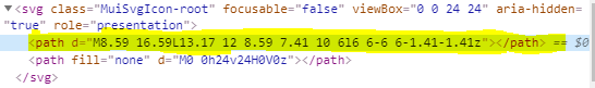
You must use the devTools to extract the path of the KeyboardArrowRightIcon icon:
Then use it with your custom color like this:
<SvgIcon
  component={svgProps => {
    return (
      <svg {...svgProps}>
        {React.cloneElement(svgProps.children[0], {
          fill: myColorVariable
        })}
      </svg>
    );
  }}
>
   <path d="M8.59 16.59L13.17 12 8.59 7.41 10 6l6 6-6 6-1.41-1.41z"></path>
</SvgIcon>
Solution 12 - Reactjs
I had the same problem, me solution was:
import React from 'react';
import pure from 'recompose/pure';
import {SvgIcon} from '@material-ui/core';

let smile = (props) => (
 <SvgIcon {...props}
  component={props => {
    return (
      <svg {...props}>
        {React.cloneElement(props.children[0], {
          fill: "#4caf50"
        })}
      </svg>
    );
  }}
>
   <path d="M256,32C132.281,32,32,132.281,32,256s100.281,224,224,224s224-100.281,224-224S379.719,32,256,32z M256,448
            c-105.875,0-192-86.125-192-192S150.125,64,256,64s192,86.125,192,192S361.875,448,256,448z M160,192c0-26.5,14.313-48,32-48
            s32,21.5,32,48c0,26.531-14.313,48-32,48S160,218.531,160,192z M288,192c0-26.5,14.313-48,32-48s32,21.5,32,48
            c0,26.531-14.313,48-32,48S288,218.531,288,192z M384,288c-16.594,56.875-68.75,96-128,96c-59.266,0-111.406-39.125-128-96"></path>
</SvgIcon>
);
smile = pure(smile);
smile.displayName = 'smile';
smile.muiName = 'SvgIcon';

export default smile;
Solution 13 - Reactjs
Solution that works the best for myself:

const EditableIcon = ({ icon, color, sx }: PropsWithChildren<EditableIconProps>) => {
  const c = useIconStyles()
  return React.cloneElement(icon, {
    ...(color && { color }),
    ...(sx && { sx }),
    classes: {
      colorPrimary: c.colorPrimary,
      colorSecondary: c.colorSecondary,
      colorAction: c.colorAction
    }
  })
}
If color is set, your classes would override default values.
Solution 14 - Reactjs
Just add styling on the icon component
<KeyboardArrowRightIcon style={{color:"red"}} />
But you can use conditional styling like below
    import React from "react";
import { makeStyles } from "@material-ui/core/styles";
import Icon from "@material-ui/core/Icon";

const useStyles = makeStyles((theme) => ({
  root: {
    "& > span": {
      margin: theme.spacing(2)
    }
  }
}));

export default function Icons() {
  //let we want chnage the icon color of
  // somecontition varaiable is not empty
  const somecontition = "some";
  //here is some different style objects
  const style = {  // old style object
    color: "red"
  };
  const new_style = { //new style  object
    color: "blue"
  };
  const classes = useStyles();

  return (
    <div className={classes.root}>
      {/* if somecondition var is not empty the use new_style other wise it will use old style*/}
      <Icon style={somecontition ? style : new_style}>add_circle</Icon>
    </div>
  );
}