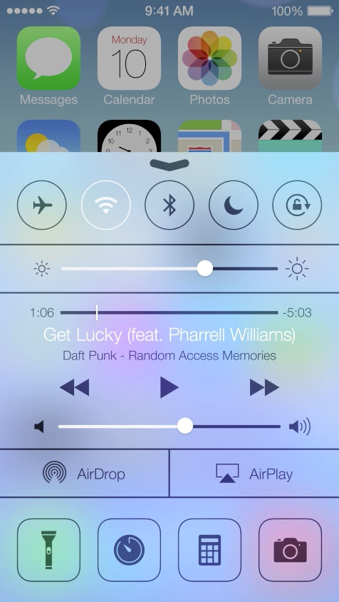
iOS 7's blurred overlay effect using CSS?
JavascriptCssUser InterfaceBlurJavascript Problem Overview
It seems Apple's overlay is more than just a transparency. Any ideas on how to achieve this effect with CSS and possibly JS?
Javascript Solutions
Solution 1 - Javascript
It is possible with CSS3 :
#myDiv {
    -webkit-filter: blur(20px);
    -moz-filter: blur(20px);
    -o-filter: blur(20px);
    -ms-filter: blur(20px);
    filter: blur(20px);
    opacity: 0.4;
}
Example here => jsfiddle
Solution 2 - Javascript
You made me want to try, so I did, check out the example here:
http://codepen.io/Edo_B/pen/cLbrt
Using:
-
HW Accelerated CSS filters
-
JS for class assigning and arrow key events
-
Images CSS Clip property
that's it.
I also believe this could be done dynamically for any screen if using canvas to copy the current dom and blurring it.
Solution 3 - Javascript
[Edit]
In the future (mobile) Safari 9 there will be -webkit-backdrop-filter for exactly this. See this pen I made to showcase it.
I thought about this for the last 4 weeks and came up with this solution.
[Edit] I wrote a more indepth post on CSS-Tricks
This technique is using CSS Regions so the browser support is not the best at this moment. (http://caniuse.com/#feat=css-regions)
The key part of this technique is to split apart content from layout by using CSS Region. First define a .content element with flow-into:content and then use the appropriate structure to blur the header.
The layout structure:
<div class="phone">
 <div class="phone__display">
  <div class="header">
    <div class="header__text">Header</div>
    <div class="header__background"></div>
  </div>
  <div class="phone__content">
  </div>
 </div>
</div>
The two important parts of this layout are .header__background and .phone__content - these are the containers where the content should flow though.
Using CSS Regions it is simple as flow-from:content (.content is flowing into the named region content)
Now comes the tricky part. We want to always flow the content through the .header__background because that is the section where the content will be blured. (using webkit-filter:blur(10px);)
This is done by transfrom:translateY(-$HeightOfTheHeader) the .content to ensure that the content will always flow though the .header__background. This transform while always hide some content beneath the header. Fixing this is ease adding
.header__background:before{
  display:inline-block;
  content:'';
  height:$HeightOfTheHEader
}
to accommodate for the transform.
This is currently working in:
- Chrome 29+ (enable 'experimental-webkit-features'/'enable-experimental-web-platform-features')
- Safari 6.1 Seed 6
- iOS7 (slow and no scrolling)
Solution 4 - Javascript
This is sort of possible with FireFox now thanks to the element style attribute.
This experimental attribute lets you use any HTML content as a background image. So, to create the background you need three overlays:
- Simple overlay with a solid background (to hide the real overlay content).
- Overlay with a
-moz-elementbackground that sets the content. Note that FX doesn't support thefilter: blur()attribute, so we need to us an SVG. - Overlay with non blurred content.
So, put together:
SVG blur filter (works in FX, other browsers could use filter:blur()):
<svg>
  <defs>
    <filter id="svgBlur">
      <feGaussianBlur stdDeviation="10"/>
    </filter>
  </defs>
</svg>
CSS blur style:
.behind-blur
{
    filter         : url(#svgBlur);
    opacity: .4;
    background: -moz-element(#content);
    background-repeat: no-repeat;
}
Finally 3 layers:
<div class="header" style="background-color: #fff"> </div>
<div class="header behind-blur"> </div>
<div class="header">
Header Text, content blurs behind
</div>
Then to move this around just set the background-position (sample in jQuery but you could use anything):
$('.behind-blur').css({
    'background-position': '-' + left + 'px -' + top + 'px'
});
Solution 5 - Javascript
Check out this demo page.
This demo uses html2canvas for rendering document as an image.
http://blurpopup.labs.daum.net/
- When the "Show popup" link is clicked, the 'makePopup' function is called.
- 'makePopup' runs html2canvas for rendering document as an image.
- The image is converted to data-url string and it is painted as the popup's background-image.
- Popup's bg is blurred by -webkit-filter:blur
- Append the popup into document.
- While you're dragging the popup, it changes its own background-position.
Solution 6 - Javascript
This pen I found the other day seemed to do it beautifully, just a bit of css and 21 lines of javascript. I hadn't heard of the cloneNode js command until I found this, but it totally worked for what I needed for sure.
http://codepen.io/rikschennink/pen/zvcgx
Detail: A. Basically it looks at your content div and invokes a cloneNode on it so it creates a duplicate which it then places inside the overflow:hidden header object sitting on top of the page. B. Then it simply listens for scrolling so that both images seem to match and blurs the header image... annnnd BAM. Effect achieved.
Not really fully do-able in CSS until they get the lil bit of scriptability built into the language.
Solution 7 - Javascript
- clone the element you want to blur
- append it to the element you want to be on top (the frosted window)
- blur cloned element with webkit-filter
- make sure cloned element is positioned absolute
- when scrolling the original element's parent, catch scrollTop and scrollLeft
- using requestAnimationFrame, now set the webkit-transform dynamically to translate3d with x and y values to scrollTop and scrollLeft
Example is here:
- make sure to open in webkit-browser
- scroll inside phone view (best with apple mouse...)
- see blurring footer in action
Solution 8 - Javascript
made a quick demo yesterday that actually does what your talking about. http://bit.ly/10clOM9 this demo does the parallax based on the accelerometer so it works best on an iPhone itself. I basically just copy the content we are overlaying into a fixed position element that gets blurred.
note: swipe up to see the panel.
(i used horrible css id's but you get the idea)
#frost{
 position: fixed;
 bottom: 0;
 left:0;
 width: 100%;
 height: 100px;
 overflow: hidden;
 -webkit-transition: all .5s;
}
#background2{
 -webkit-filter: blur(15px) brightness(.2);
}

#content2fixed{
 position: fixed;
 bottom: 9px;
 left: 9px;
 -webkit-filter: blur(10px);
}
Solution 9 - Javascript
Am not very sure about that, I believe that CSS isn't capable of doing this at the moment
However Chris Coyier has blogged about an old technique with multiple images to achieve such effect, http://css-tricks.com/blurry-background-effect/
Solution 10 - Javascript
Check this one out http://codepen.io/GianlucaGuarini/pen/Hzrhf Seems like it does the effect without duplication the background image of the element under itself. See texts are blurring also in the example.
Vague.js
var vague = $blurred.find('iframe').Vague({
  intensity:5 //blur intensity
});
vague.blur();
Solution 11 - Javascript
Good News
As of today 11th April 2020, this is easily possible with backdrop-filter CSS property which is now a stable feature in Chrome, Safari & Edge.
I wanted this in our Hybrid mobile app so also available in Android/Chrome Webview & Safari WebView.
- https://developer.mozilla.org/en-US/docs/Web/CSS/backdrop-filter
- https://caniuse.com/#search=backdrop-filter
Code Example:
Simply add the CSS property:
.my-class {
    backdrop-filter: blur(30px);
    background: transparent;     // Make sure there is not backgorund
}
UI Example 1
See it working in this pen or try the demo:
#main-wrapper {
  width: 300px;
  height: 300px;
  background: url("https://i.picsum.photos/id/1001/500/500.jpg") no-repeat center;
  background-size: cover;
  position: relative;
  overflow: hidden;
}

.my-effect {
  position: absolute;
  top: 300px;
  left: 0;
  width: 100%;
  height: 100%;
  font-size: 22px;
  display: flex;
  justify-content: center;
  align-items: center;
  color: black;
  -webkit-backdrop-filter: blur(15px);
  backdrop-filter: blur(15px);
  transition: top 700ms;
}

#main-wrapper:hover .my-effect {
  top: 0;
}
<h4>Hover over the image to see the effect</h4>

<div id="main-wrapper">
  <div class="my-effect">
    Glossy effect worked!
  </div>
</div>
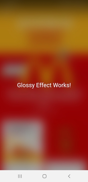
UI Example 2
Let's take an example of McDonald's app because it's quite colourful. I took its screenshot and added as the background in the body of my app.
I wanted to show a text on top of it with the glossy effect. Using backdrop-filter: blur(20px); on the overlay above it, I was able to see this:

Solution 12 - Javascript
I've been using svg filters to achieve similar effects for sprites
<svg id="gray_calendar" xmlns:xlink="http://www.w3.org/1999/xlink" viewBox="0 48 48 48">
  <filter id="greyscale">
    <feColorMatrix type="saturate" values="0"/>
  </filter>
  <image width="48" height="10224" xlink:href="tango48i.png" filter="url(#greyscale)"/>
</svg>
- The viewBox attribute will select just the portion of your included image that you want.
- Just change the filter to any that you want, such as Keith's
<feGaussianBlur stdDeviation="10"/>example. - Use the
<image ...>tag to apply it to any image or even use multiple images. - You can build this up with js and use it as an image or use the id in your css.
Solution 13 - Javascript
This might help you!!
This Dynamically changes the background just IOS does
.myBox {
  width: 750px;
  height: 500px;
  border: rgba(0, 0, 0, 0.5) 1px solid;
  background-color: #ffffff;
}

.blurBg {
  width: 100%;
  height: 100%;
  overflow: hidden;
  z-index: 0;
}

.blurBg img {
  -webkit-filter: blur(50px);
  margin-top: -150px;
  margin-left: -150px;
  width: 150%;
  opacity: 0.6;
}
Solution 14 - Javascript
Here is my take on this with jQuery. Solution isn't universal, meaning one would have to tweak some of the positions and stuff depending on the actual design.
Basically what I did is: on trigger clone/remove the whole background (what should be blurred) to a container with unblurred content (which, optionally, has hidden overflow if it is not full width) and position it correctly. Caveat is that on window resize blurred div will mismatch the original in terms of position, but this could be solved with some on window resize function (honestly I couldn't be bothered with that now).
I would really appreciate your opinion on this solution!
Thanks
Here is the fiddle, not tested in IE.
HTML
<div class="slide-up">
<div class="slide-wrapper">
    <div class="slide-background"></div>
    <div class="blured"></div>
    <div class="slide-content">
         <h2>Pop up title</h2>

        <p>Pretty neat!</p>
    </div>
</div>
</div>
<div class="wrapper">
<div class="content">
     <h1>Some title</h1>
    <p>Lorem ipsum dolor sit amet, consectetur adipiscing elit. Quisque molestie magna elit, quis pulvinar lectus gravida sit amet. Phasellus lacinia massa et metus blandit fermentum. Cras euismod gravida scelerisque. Fusce molestie ligula diam, non porta ipsum faucibus sed. Nam interdum dui at fringilla laoreet. Donec sit amet est eu eros suscipit commodo eget vitae velit.</p>
</div> <a class="trigger" href="#">trigger slide</a>

</div>
<svg version="1.1" xmlns="http://www.w3.org/2000/svg">
<filter id="blur">
    <feGaussianBlur stdDeviation="3" />
</filter>
</svg>
CSS
body {
margin: 0;
padding: 0;
font-family:'Verdana', sans-serif;
color: #fff;
}
.wrapper {
position: relative;
height: 100%;
overflow: hidden;
z-index: 100;
background: #CD535B;
}
img {
width: 100%;
height: auto;
}
.blured {
top: 0;
height: 0;
-webkit-filter: blur(3px);
-moz-filter: blur(3px);
-ms-filter: blur(3px);
filter: blur(3px);
filter: url(#blur);
filter:progid:DXImageTransform.Microsoft.Blur(PixelRadius='3');
position: absolute;
z-index: 1000;
}
.blured .wrapper {
position: absolute;
width: inherit;
}
.content {
width: 300px;
margin: 0 auto;
}
.slide-up {
top:10px;
position: absolute;
width: 100%;
z-index: 2000;
display: none;
height: auto;
overflow: hidden;
}
.slide-wrapper {
width: 200px;
margin: 0 auto;
position: relative;
border: 1px solid #fff;
overflow: hidden;
}
.slide-content {
z-index: 2222;
position: relative;
text-align: center;
color: #333333;
}
.slide-background {
position: absolute;
top: 0;
width: 100%;
height: 100%;
background-color: #fff;
z-index: 1500;
opacity: 0.5;
}
jQuery
// first just grab some pixels we will use to correctly position the blured element
var height = $('.slide-up').outerHeight();
var slide_top = parseInt($('.slide-up').css('top'), 10);
$wrapper_width = $('body > .wrapper').css("width");
$('.blured').css("width", $wrapper_width);

$('.trigger').click(function () {
    if ($(this).hasClass('triggered')) { // sliding up
        $('.blured').animate({
            height: '0px',
            background: background
        }, 1000, function () {
            $('.blured .wrapper').remove();
        });
        $('.slide-up').slideUp(700);
        $(this).removeClass('triggered');
    } else { // sliding down
        $('.wrapper').clone().appendTo('.blured');
        $('.slide-up').slideDown(1000);
        $offset = $('.slide-wrapper').offset();
        $('.blured').animate({
            height: $offset.top + height + slide_top + 'px'
        }, 700);
        $('.blured .wrapper').animate({
            left: -$offset.left,
            top: -$offset.top
        }, 100);
        $(this).addClass('triggered');
    }
});