Input group - two inputs close to each other
Twitter BootstrapTwitter Bootstrap-3Twitter Bootstrap Problem Overview
How can I make input group involves two inputs?
<div class="input-group">
    <input type="text" class="form-control" placeholder="MinVal">
    <input type="text" class="form-control" placeholder="MaxVal">
</div>
This doesn't work, they are horizontal instead of inline
Twitter Bootstrap Solutions
Solution 1 - Twitter Bootstrap
working workaround:
<div class="input-group">
    <input type="text" class="form-control input-sm" value="test1" />
    <span class="input-group-btn" style="width:0px;"></span>
    <input type="text" class="form-control input-sm" value="test2" />
</div>
downside: no border-collapse between the two text-fields, but they keep next to each other
Update
thanks to https://stackoverflow.com/users/2244262/stalinko">Stalinko</a>
This technique allows to glue more than 2 inputs.
Border-collapsing is achieved using "margin-left: -1px" (-2px for the 3rd input and so on)
<div class="input-group">
  <input type="text" class="form-control input-sm" value="test1" />
  <span class="input-group-btn" style="width:0px;"></span>
  <input type="text" class="form-control input-sm" value="test2" style="margin-left:-1px" />
  <span class="input-group-btn" style="width:0px;"></span>
  <input type="text" class="form-control input-sm" value="test2" style="margin-left:-2px" />
</div>
Solution 2 - Twitter Bootstrap
It almost never makes intuitive sense to have two inputs next to each other without labels. Here is a solution with labels mixed in, which also works quite well with just a minor modification to existing Bootstrap styles.
Preview:

HTML:
<div class="input-group">
  <span class="input-group-addon">Between</span>
  <input type="text" class="form-control" placeholder="Type something..." />
  <span class="input-group-addon" style="border-left: 0; border-right: 0;">and</span>
  <input type="text" class="form-control" placeholder="Type something..." />
</div>
CSS:
.input-group-addon {
  border-left-width: 0;
  border-right-width: 0;
}
.input-group-addon:first-child {
  border-left-width: 1px;
}
.input-group-addon:last-child {
  border-right-width: 1px;
}
JSFiddle: http://jsfiddle.net/yLvk5mn1/31/
Solution 3 - Twitter Bootstrap
Assuming you want them next to each other:
<form action="" class="form-inline">
    <div class="form-group">
        <input type="text" class="form-control" placeholder="MinVal">
    </div>
    <div class="form-group">
         <input type="text" class="form-control" placeholder="MaxVal">
    </div>
</form>
Update Nr.1: Should you want to use .input-group with this example:
<form action="" class="form-inline">
    <div class="form-group">
        <div class="input-group">
          <span class="input-group-addon">@</span>
          <input type="text" class="form-control" placeholder="Username">
        </div>
    </div>
    <div class="form-group">
        <div class="input-group">
          <input type="text" class="form-control">
          <span class="input-group-addon">.00</span>
        </div>
    </div>
</form>
The class .input-group is there to extend inputs with buttons and such (directly attached). Checkboxes or radio buttons are possible as well. I don't think it works with two input fields though.
Update Nr. 2: With .form-horizontal the .form-group tag basically becomes a .row tag so you can use the column classes such as .col-sm-8:
<form action="" class="form-horizontal">
    <div class="form-group">
        <div class="col-sm-8">
            <input type="text" class="form-control" placeholder="MinVal">
        </div>
        <div class="col-sm-4">
            <input type="text" class="form-control" placeholder="MaxVal">
        </div>
    </div>
</form>
Solution 4 - Twitter Bootstrap
To show more than one inputs inline without using "form-inline" class you can use the next code:
<div class="input-group">
    <input type="text" class="form-control" value="First input" />
    <span class="input-group-btn"></span>
    <input type="text" class="form-control" value="Second input" />
</div>
Then using CSS selectors:
/* To remove space between text inputs */
.input-group > .input-group-btn:empty {
    width: 0px;
}
Basically you have to insert an empty span tag with "input-group-btn" class between input tags.
If you want to see more examples of input groups and bootstrap-select groups take a look at this URL: http://jsfiddle.net/vkhusnulina/gze0Lcm0
Solution 5 - Twitter Bootstrap
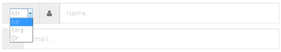
If you want to include a "Title" field within it that can be selected with the <select> HTML element, that too is possible
PREVIEW
CODE SNIPPET
<div class="form-group">
  <div class="input-group input-group-lg">
    <div class="input-group-addon">
      <select>
        <option>Mr.</option>
        <option>Mrs.</option>
        <option>Dr</option>
      </select>
    </div>
    <div class="input-group-addon">
      <span class="fa fa-user"></span>
    </div>
    <input type="text" class="form-control" placeholder="Name...">
  </div>
</div>
Solution 6 - Twitter Bootstrap
Create a input-group-glue class with this:
.input-group-glue {
  width: 0;
  display: table-cell;
}

.input-group-glue + .form-control {
  border-left: none;
}
<link href="https://maxcdn.bootstrapcdn.com/bootstrap/3.3.5/css/bootstrap.min.css" rel="stylesheet"/>
<div class="input-group">
  <input type="text" class="form-control" value="test1" />
  <span class="input-group-glue"></span>
  <input type="text" class="form-control" value="test2" />
  <span class="input-group-glue"></span>
  <input type="text" class="form-control" value="test2" />
</div>
Solution 7 - Twitter Bootstrap
I have searched for this a few minutes and i couldn't find any working code.
But now i finaly did it ! Take a look:
<div class="input-group" id="unified-inputs">
<input type="text" class="form-control" placeholder="MinVal" />
<input type="text" class="form-control" placeholder="MaxVal" />
</div>
And css
#unified-inputs.input-group { width: 100%; }
#unified-inputs.input-group input { width: 50% !important; }
#unified-inputs.input-group input:last-of-type { border-left: 0; }
Solution 8 - Twitter Bootstrap
I was not content with any of the answers on this page, so I fiddled with this myself for a bit. I came up with the following
angular.module('showcase', []).controller('Ctrl', function() {
  var vm = this;
  vm.focusParent = function(event) {
    angular.element(event.target).parent().addClass('focus');
  };

  vm.blurParent = function(event) {
    angular.element(event.target).parent().removeClass('focus');
  };
});
.input-merge .col-xs-2,
.input-merge .col-xs-4,
.input-merge .col-xs-6 {
  padding-left: 0;
  padding-right: 0;
}
.input-merge div:first-child .form-control {
  border-top-right-radius: 0;
  border-bottom-right-radius: 0;
}
.input-merge div:last-child .form-control {
  border-top-left-radius: 0;
  border-bottom-left-radius: 0;
}
.input-merge div:not(:first-child) {
  margin-left: -1px;
}
.input-merge div:not(:first-child):not(:last-child) .form-control {
  border-radius: 0;
}
.focus {
  z-index: 2;
}
<html ng-app="showcase">

<head>
  <script src="https://ajax.googleapis.com/ajax/libs/angularjs/1.4.8/angular.min.js"></script>
  <link href="https://maxcdn.bootstrapcdn.com/bootstrap/3.3.5/css/bootstrap.min.css" rel="stylesheet" />
</head>

<body class="container">
  <label class="control-label">Person</label>
  <div class="input-merge" ng-controller="Ctrl as showCase">
    <div class="col-xs-4">
      <input class="form-control input-sm" name="initials" type="text" id="initials"
             ng-focus="showCase.focusParent($event)" ng-blur="showCase.blurParent($event)"
             ng-model="person.initials" placeholder="Initials" />
    </div>

    <div class="col-xs-2">
      <input class="form-control input-sm" name="prefixes" type="text" id="prefixes"
             ng-focus="showCase.focusParent($event)" ng-blur="showCase.blurParent($event)"
             ng-model="persoon.prefixes" placeholder="Prefixes" />
    </div>

    <div class="col-xs-6">
      <input class="form-control input-sm" name="surname" type="text" id="surname"
             ng-focus="showCase.focusParent($event)" ng-blur="showCase.blurParent($event)"
             ng-model="persoon.surname" placeholder="Surname" />
    </div>
  </div>
</body>

</html>
With this it is possible to set the width of the individual inputs to your liking. Also a minor issue with the above snippets was that the input looks incomplete when focussed or when it is not valid. I fixed this with some angular code, but you can just as easily do this with jQuery or native javascript or whatever.
The code adds the class .focus to the containing div's, so it can get a higher z-index then the others when the input is focussed.
Solution 9 - Twitter Bootstrap
My solution requires no additional css and works with any combination of input-addon, input-btn and form-control. It just uses pre-existing bootstrap classes
<script src="https://ajax.googleapis.com/ajax/libs/jquery/2.1.1/jquery.min.js"></script>
<script src="http://netdna.bootstrapcdn.com/bootstrap/3.0.0/js/bootstrap.min.js"></script>
<link href="http://netdna.bootstrapcdn.com/bootstrap/3.0.0/css/bootstrap.min.css" type="text/css" rel="stylesheet" />
<form style="padding:10px; margin:10px" action="" class=" form-inline">
  <div class="form-group">
    <div class="input-group">
    <div class="form-group">
        <div class="input-group">
          <input type="text" class="form-control" placeholder="MinVal">
        </div>
      </div>
      <div class="form-group">
        <div class="input-group">
          <input type="text" class="form-control" placeholder="MaxVal">
        </div>
      </div>
    </div>
  </div>
</form>
This will be inline if there is space and wrap for smaller screens.
Full Example ( input-addon, input-btn and form-control. )
<script src="https://ajax.googleapis.com/ajax/libs/jquery/2.1.1/jquery.min.js"></script>
<script src="http://netdna.bootstrapcdn.com/bootstrap/3.0.0/js/bootstrap.min.js"></script>
<link href="http://netdna.bootstrapcdn.com/bootstrap/3.0.0/css/bootstrap.min.css" type="text/css" rel="stylesheet" />
<form style="padding:10px; margin:10px" action="" class=" form-inline">
  <div class="form-group">
    <div class="input-group">
      <div class="form-group">
        <div class="input-group">
          <span class="input-group-addon" id="basic-addon1">@</span>
          <input type="text" class="form-control" placeholder="Username" aria-describedby="basic-addon1">
          <span></span>
        </div>
      </div>
      <div class="form-group">
        <div class="input-group">
          <span></span>
          <span class="input-group-addon" id="basic-addon1">@</span>
          <input type="text" class="form-control" placeholder="Username" aria-describedby="basic-addon1">
          <span></span>
        </div>
      </div>
      <br>

      <div class="form-group">
        <div class="input-group">
          <input type="text" class="form-control" placeholder="Username" aria-describedby="basic-addon1">
          <span></span>
        </div>
      </div>
      <div class="form-group">
        <div class="input-group">
          <span></span>
          <input type="text" class="form-control" placeholder="Username" aria-describedby="basic-addon1">
        </div>
      </div>
    </div>
  </div>
</form>
Solution 10 - Twitter Bootstrap
Combining two inputs, where the group take up all width (100%), and the size is not 50% - 50%, no additional css. I made it nicely by the following code:
<script src="https://ajax.googleapis.com/ajax/libs/jquery/3.3.1/jquery.min.js"></script>
<script src="https://maxcdn.bootstrapcdn.com/bootstrap/3.3.7/js/bootstrap.min.js"></script>
<link href="https://maxcdn.bootstrapcdn.com/bootstrap/3.3.7/css/bootstrap.min.css" rel="stylesheet"/>

<div class="container">
    <form>
        <div class="form-group">
            <label>Name</label>
            <div class="input-group" style="width:100%">
                <span class="input-group-btn" style="width:100px;">
					<select class="form-control">
                    	<option>Mr.</option>
                    	<option>Mrs.</option>
                    	<option>Dr</option>
                	</select>
				</span>
				<input class="form-control" id="name" name="name" placeholder="Type your name" type="text">
            </div>
        </div>
    </form>
</div>
Solution 11 - Twitter Bootstrap
With Bootstrap 4.1 I found a width solution by percentage:
The following shows an input-group with 4 Elements: 1 text an 3 selects - working well:
https://stackpath.bootstrapcdn.com/bootstrap/4.1.3/css/bootstrap.min.css" integrity="sha384-MCw98/SFnGE8fJT3GXwEOngsV7Zt27NXFoaoApmYm81iuXoPkFOJwJ8ERdknLPMO" crossorigin="anonymous">
<div class="input-group input-group-sm">
	<div class="input-group-prepend">
		<div class="input-group-text">TEXT:</div>
	</div>
	<select name="name1" id="name1" size="1" style="width:4%;" class="form-control">
		<option value="">option</option>
		<!-- snip -->
	</select>
	<select name="name2" id="name2" size="1" style="width:60%;" class="form-control">
		<option value="">option</option>
		<!-- snip -->
	</select>
	<select name="name3" id="name3" size="1" style="width:25%;" class="form-control">
		<option value="">option</option>
		<!-- snip -->
	</select>
</div>