How do I add a margin between bootstrap columns without wrapping
HtmlCssTwitter BootstrapTwitter Bootstrap-3Html Problem Overview
My layout currently looks like this
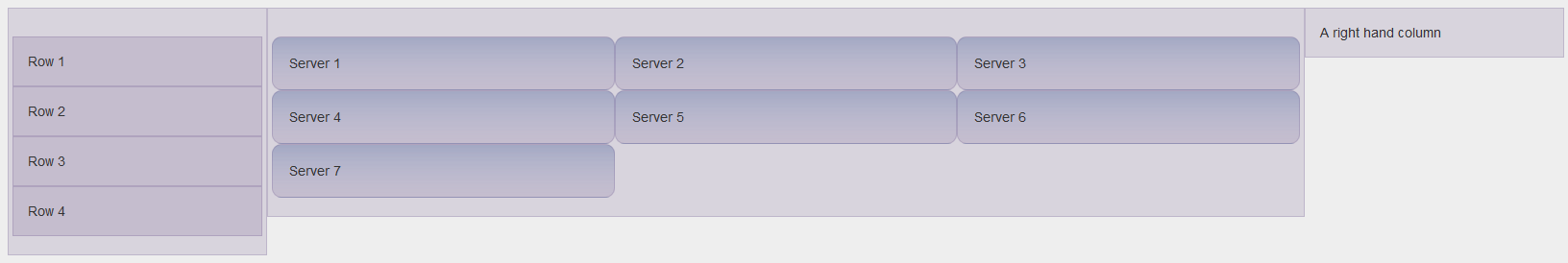
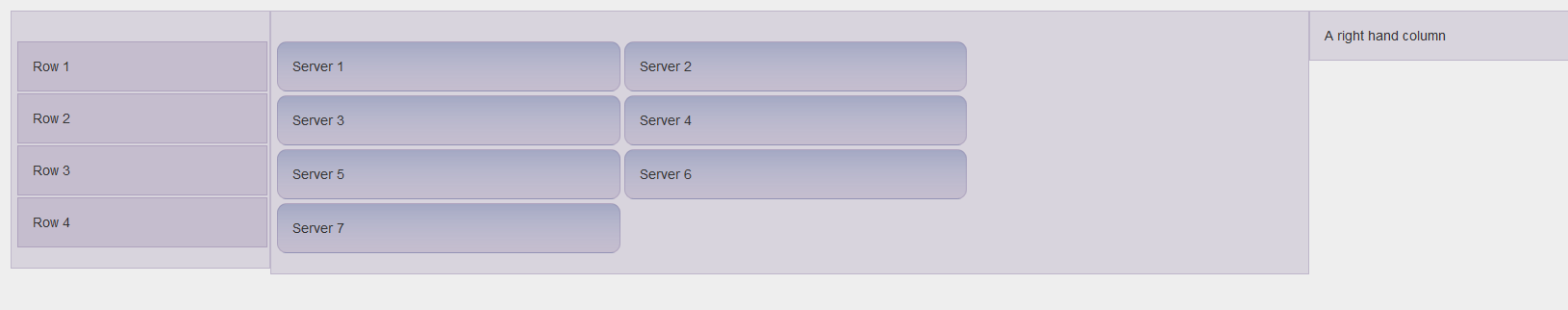
In the center column, I want to add a small margin between each Server Div. But, if I add a margin to the CSS, it ends up line wrapping and looking like this
<div class="row info-panel">
	<div class="col-md-4 server-action-menu" id="server_1">
        <div>
            Server 1
        </div>
    </div>
	<div class="col-md-4 server-action-menu" id="server_2">
        <div>
            Server 2
        </div>
    </div>
	<div class="col-md-4 server-action-menu" id="server_3">
        <div>
            Server 3
        </div>
    </div>
	<div class="col-md-4 server-action-menu" id="server_4">
        <div>
            Server 4
        </div>
    </div>
	<div class="col-md-4 server-action-menu" id="server_5">
        <div>
            Server 5
        </div>
    </div>
	<div class="col-md-4 server-action-menu" id="server_6">
        <div>
            Server 6
        </div>
    </div>
	<div class="col-md-4 server-action-menu" id="server_7">
        <div>
            Server 7
        </div>
    </div>
</div>
And the CSS
.server-action-menu {
	background-color: transparent;
	background-image: linear-gradient(to bottom, rgba(30, 87, 153, 0.2) 0%, rgba(125, 185, 232, 0) 100%);
	background-repeat: repeat;
	border-radius:10px;
}

.info-panel {
	padding: 4px;
}
I attempted to add the margins by doing this
.info-panel  > div {
	margin: 4px;
}
How can I add a margin to the DIVs so that they don't leave so much space on the right hand side?
Html Solutions
Solution 1 - Html
You should work with padding on the inner container rather than with margin. Try this!
HTML
<div class="row info-panel">
    <div class="col-md-4" id="server_1">
       <div class="server-action-menu">
           Server 1
       </div>
   </div>
</div>
CSS
.server-action-menu {
    background-color: transparent;
    background-image: linear-gradient(to bottom, rgba(30, 87, 153, 0.2) 0%, rgba(125, 185, 232, 0) 100%);
    background-repeat: repeat;
    border-radius:10px;
    padding: 5px;
}
Solution 2 - Html
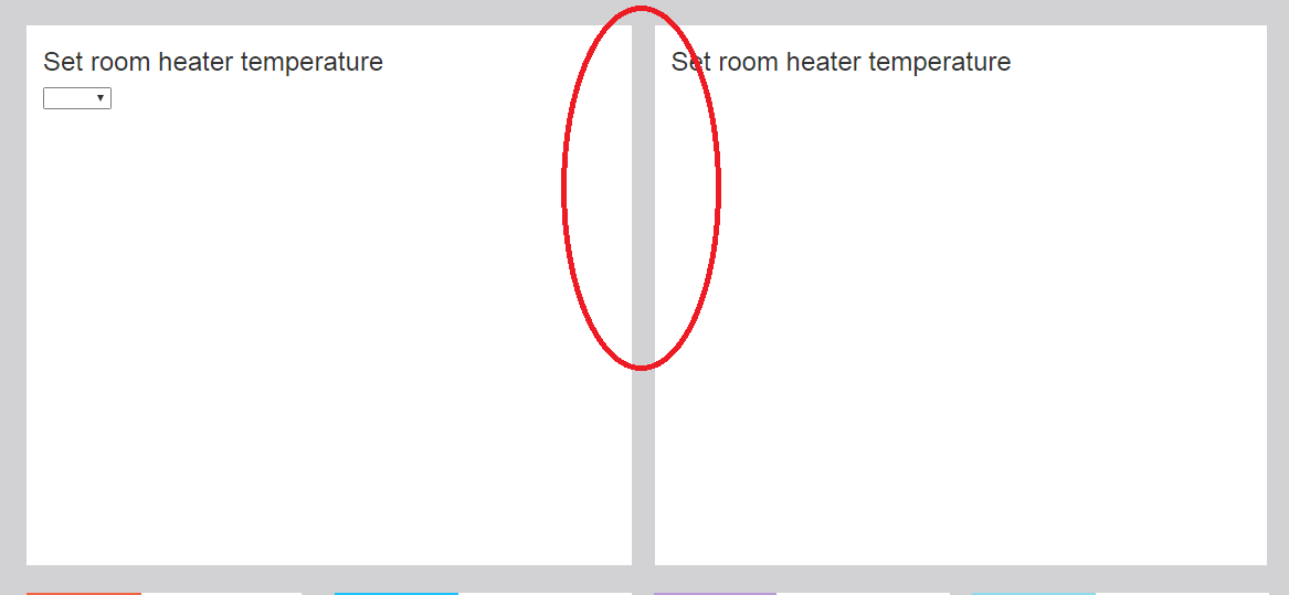
I was facing the same issue; and the following worked well for me. Hope this helps someone landing here:
<div class="row">
    <div class="col-md-6">
        <div class="col-md-12">
            Set room heater temperature
        </div>
    </div>
    <div class="col-md-6">
        <div class="col-md-12">
            Set room heater temperature
        </div>
    </div>
</div>
This will automatically render some space between the 2 divs.
Solution 3 - Html
If you do not need to add a border on columns, you can also simply add a transparent border on them:
[class*="col-"] {
    background-clip: padding-box;
    border: 10px solid transparent;
}
Solution 4 - Html
Change the number of @grid-columns. Then use -offset. Changing the number of columns will allow you to control the amount of space between columns. E.g.
variables.less (approx line 294).
@grid-columns: 20;
someName.html
<div class="row">
  <div class="col-md-4 col-md-offset-1">First column</div>
  <div class="col-md-13 col-md-offset-1">Second column</div>
</div>
Solution 5 - Html
The simple way to do this is doing a div within a div
<div class="col-sm-4" style="padding: 5px;border:2px solid red;">
   <div class="server-action-menu" id="server_1">Server 1
   </div>
 </div>
<div class="col-sm-4" style="padding: 5px;border:2px solid red;">
   <div class="server-action-menu" id="server_1">Server 2
   </div>
 </div>
<div class="col-sm-4" style="padding: 5px;border:2px solid red;">
   <div class="server-action-menu" id="server_1">Server 3
   </div>
 </div>