How to stretch div height to fill parent div - CSS
HtmlCssHtml Problem Overview
I have a page with divs like below
<div id="container">
    <div id="A"></div>
    <div id="B">
        <div id="B1"></div>
        <div id="B2"></div>
    </div>
    <div id="C"></div>
    <div id="D"></div>
</div>
with styling as;
html, body {
    margin: 0;
    padding: 0;
    border: 0;
}
#B, #C, #D {
    position: absolute;
}
#A{
    top: 0;
    width: 100%;
    height: 35px;
    background-color: #99CC00;
}
#B {
    top: 35px;
    width: 200px;
    bottom: 35px;
    background-color: #999999;
    z-index:100;
}
#B2 {
    margin-top: -35px;
    bottom: 0;
    background-color: #FFFFFF;
    width: 200px;
    overflow: scroll;
}
#B1 {
    height: 35px;
    width: 35px;
    margin-left: 200px;
    background-color: #CC0066;
}
#C {
    top: 35px;
    left: 200px;
    right: 0;
    bottom: 35px;
    background-color: #CCCCCC;
}
#D {
    bottom: 0;
    width: 100%;
    height: 35px;
    background-color: #3399FF;
}
See the layout / screenshot below;
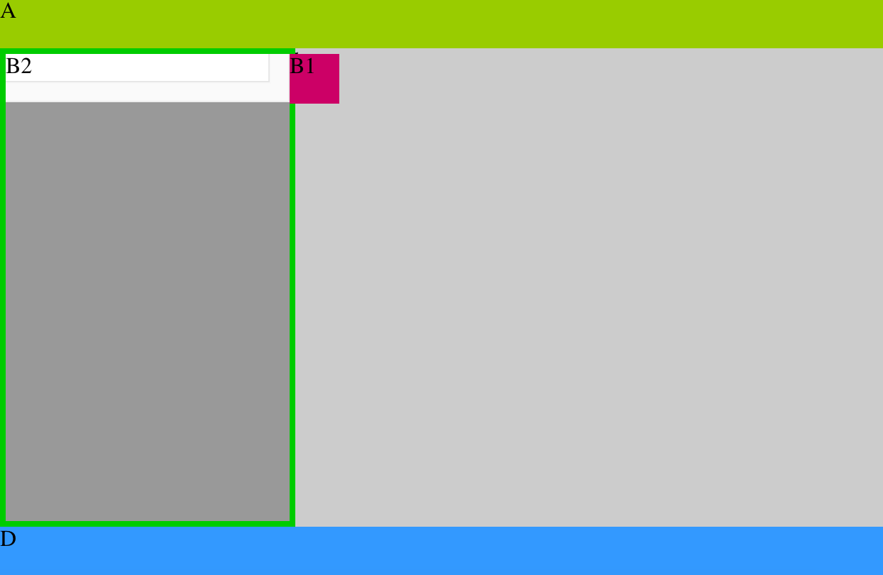
I want to adjust the height of div B2 to fill (or stretch to) entire div B (marked with a green border) and don't want to cross footer div D. Here is a working fiddle demo(updated). How can I solve this??
Html Solutions
Solution 1 - Html
Suppose you have
<body>
  <div id="root" />
</body>
With normal CSS, you can do the following. See a working app https://github.com/onmyway133/Lyrics/blob/master/index.html
#root {
  position: absolute;
  top: 0;
  left: 0;
  height: 100%;
  width: 100%;
}
With flexbox, you can
html, body {
  height: 100%
}
body {
  display: flex;
  align-items: stretch;
}

#root {
  width: 100%
}
Solution 2 - Html
Use the "min-height" property
Be wary of paddings, margins and borders :)
html, body {
    margin: 0;
    padding: 0;
    border: 0;
}
#B, #C, #D {
    position: absolute;
}
#A{
    top: 0;
    width: 100%;
    height: 35px;
    background-color: #99CC00;
}
#B {
    top: 35px;
    width: 200px;
    bottom: 35px;
    background-color: #999999;
    z-index:100;
}
#B2 {
    min-height: 100%;
    height: 100%;
    margin-top: -35px;
    bottom: 0;
    background-color: red;
    width: 200px;
    overflow: scroll;
}
#B1 {
    height: 35px;
    width: 35px;
    margin-left: 200px;
    background-color: #CC0066;
}
#C {
    top: 35px;
    left: 200px;
    right: 0;
    bottom: 35px;
    background-color: #CCCCCC;
}
#D {
    bottom: 0;
    width: 100%;
    height: 35px;
    background-color: #3399FF;
}
Solution 3 - Html
If you're gonna use B2 for styling purposes you can try this "hack"
#B { overflow: hidden;}
#B2 {padding-bottom: 9999px; margin-bottom: -9999px}
Solution 4 - Html
What suited my purpose was to create a div that was always bounded within the overall browser window by a fixed amount.
What worked, at least on firefox, was this
<div style="position: absolute; top: 127px; left: 75px;right: 75px; bottom: 50px;">
Insofar as the actual window is not forced into scrolling, the div preserves its boundaries to the window edge during all re-sizing.
Hope this saves someone some time.
Solution 5 - Html
B2 container position relative
Top position B2 + of remaining height
Height of B2 + height B1 or remaining height
Solution 6 - Html
If you are using JQuery, you can do this:
<body onload="$('nav').height($('main').height());">
Solution 7 - Html
I've always noticed this is possible with tables, so just change your div display types to table types and it works.
To control width: Set container div to display:table (or inline-table) and inside divs to display:table-cell like this:
<div style='width: 100%; height: 100%; display: table;'>
  <div style='background-color: red; width: 50%; height: 100%; display: table-cell;'>
    Left Side
  </div>
  <div style='background-color: green; height: 100%; display: table-cell;'>
    Right Side<br>
    <div style='background-color: blue; width = 100%;'>
      This is 100% of remainder!
    <div>
  </div>
</div>
The above will have the left div is 50% and the right inner div will fill the remainder. You can even place another div in the right inner with 100% width and it will fill the remainder.
To control height you just use table-row instead of table-cell:
<div style='width: 100%; height: 100%; display: table;'>
  <div style='background-color: red; width: 100%; height: 100%; display: table;'>
    <div style='background-color: red; width: 100%; height: 20%; display: table-row;'>
      Top Side
    </div>
    <div style='background-color: green; height: 100%; display: table-row;'>
      Bottom Side<br>
    </div>
  </div>
</div>