How to apply box-shadow on all four sides?
CssBox ShadowCss Problem Overview
I'm trying to apply a box-shadow on all four sides. I could only get it on 2 sides:

Css Solutions
Solution 1 - Css
It's because of x and y offset. Try this:
-webkit-box-shadow: 0 0 10px #fff;
        box-shadow: 0 0 10px #fff;
edit (year later..): Made the answer more cross-browser, as requested in comments :)
btw: there are many css3 generator nowadays.. css3.me, css3maker, css3generator etc...
Solution 2 - Css
See: http://jsfiddle.net/thirtydot/cMNX2/8/
input {
    -webkit-box-shadow: 0 0 5px 2px #fff;
    -moz-box-shadow: 0 0 5px 2px #fff;
    box-shadow: 0 0 5px 2px #fff;
}
Solution 3 - Css
Just simple as this code:
box-shadow: 0px 0px 2px 2px black; /*any color you want*/
Solution 4 - Css
This looks cool.
-moz-box-shadow: 0 0 5px #999;
-webkit-box-shadow: 0 0 5px #999;
box-shadow: 0 0 5px #999;
Solution 5 - Css
Understand box-shadow syntax and write it accordingly
box-shadow: h-offset v-offset blur spread color;
h-offset: Horizontal offset of the shadow. A positive value puts the shadow on the right side of the box, a negative value puts the shadow on the left side of the box - Required
v-offset: Vertical offset of the shadow. A positive value puts the shadow below the box, a negative value puts the shadow above the box - Required
blur: Blur radius (The higher the number, the more blurred the shadow will be) - Optional
color: Color of the shadow - Optional
spread: Spread radius. A positive value increases the size of the shadow, a negative value decreases the size of the shadow - Optional
inset: Changes the shadow from an outer shadow to an inner shadow - Optional
box-shadow: 0 0 10px #999;
box-shadow works better with spread
box-shadow: 0 0 10px 8px #999;
use 'inset' to apply shadow inside of the box
box-shadow: 0 0 8px inset #999;
(or)
box-shadow: 0 0 8px 8px inset #999;
use rgba (red green blue alpha) to adjust the shadow more efficiently
box-shadow: 0 0 8px inset rgba(153, 153, 153, 0.8);
(or)
box-shadow: 0 0 8px 8px inset rgba(153, 153, 153, 0.8);
Solution 6 - Css
The most simple solution and easiest way is to add shadow for all four side. CSS
box-shadow: 0 0 2px 2px #ccc; /* with blur shadow*/
box-shadow: 0 0 0 2px #ccc; /* without blur shadow*/
Solution 7 - Css
I found the http://css-tricks.com/forums/topic/how-to-add-shadows-on-all-4-sides-of-a-block-with-css/ site.
.allSides
{
    width:350px;height:200px;
    border: solid 1px #555;
    background-color: #eed;
    box-shadow: 0 0 10px rgba(0,0,0,0.6);
    -moz-box-shadow: 0 0 10px rgba(0,0,0,0.6);
    -webkit-box-shadow: 0 0 10px rgba(0,0,0,0.6);
    -o-box-shadow: 0 0 10px rgba(0,0,0,0.6);
}
Solution 8 - Css
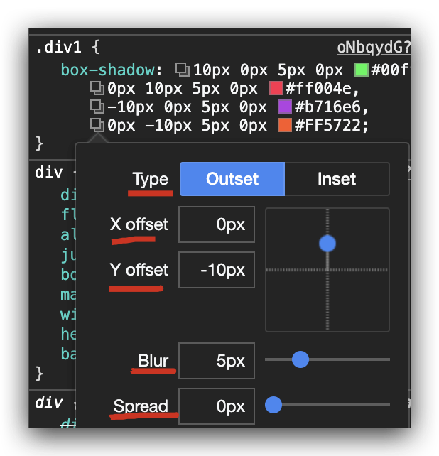
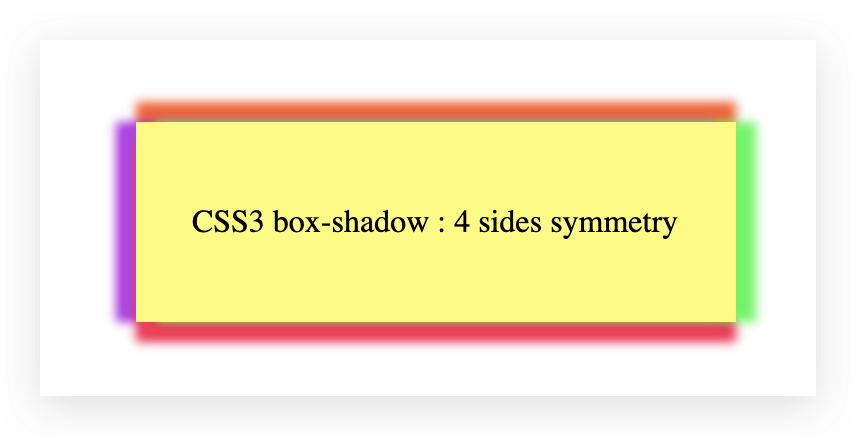
CSS3 box-shadow: 4 sides symmetry
> 1. each side with the same color
:root{
  --color: #f0f;
}

div {
  display: flex;
  flex-flow: row nowrap;
  align-items: center;
  justify-content: center;
  box-sizing: border-box;
  margin: 50px auto;
  width: 200px;
  height: 100px;
  background: #ccc;
}

.four-sides-with-same-color {
  box-shadow: 0px 0px 10px 5px var(--color);
}
<div class="four-sides-with-same-color"></div>
> 2. each side with a different color
:root{
  --color1: #00ff4e;
  --color2: #ff004e;
  --color3: #b716e6;
  --color4: #FF5722;
}

div {
  display: flex;
  flex-flow: row nowrap;
  align-items: center;
  justify-content: center;
  box-sizing: border-box;
  margin: 50px auto;
  width: 200px;
  height: 100px;
  background-color: rgba(255,255,0,0.7);
}

.four-sides-with-different-color {
  box-shadow:
    10px 0px 5px 0px var(--color1),
    0px 10px 5px 0px var(--color2),
    -10px 0px 5px 0px var(--color3),
    0px -10px 5px 0px var(--color4);
}
<div class="four-sides-with-different-color"></div>
screenshots
refs
Solution 9 - Css
Just simple as this:
box-shadow: 3px 3px 5px rgb(186 195 78), -3px -3px 5px rgb(186 195 78);
Solution 10 - Css
Use this css code for all four sides: box-shadow: 0px 1px 7px 0px rgb(106, 111, 109);
Solution 11 - Css
You can different combinations at the following link.
https://www.cssmatic.com/box-shadow
The results which you need can be achieved by the following CSS
-webkit-box-shadow: 0px 0px 11px 1px rgba(0,0,0,1);
-moz-box-shadow: 0px 0px 11px 1px rgba(0,0,0,1);
box-shadow: 0px 0px 11px 1px rgba(0,0,0,1);
Solution 12 - Css
Using (v1)px (v2)px (v3)px (v4)px as an example. v1px when positive gives right side shadow whiles negative value gives left side shadow. v2px when positive gives top side shadow whiles negative value gives bottom side shadow. v3 is used for making the shadow blur. 10px will make shadow more blur than 5px and so on So using a div (mydiv) with style below. We will get the image below
box-shadow:
30px 0px 5px 0px red,
0px 30px 5px 0px blue,
-30px 0px 5px 0px green,
0px -30px 5px 0px yellow;
width:200px;
height:200px;
margin-left:100px;
}

<br><br>

<div class="mydiv"></div>

This should give you the div below
view the result from this link: https://i.stack.imgur.com/bUjRN.jpg
Solution 13 - Css
Add this line to your box style.
box-shadow: 0 0 0 width color;
as example:
box-shadow: 0 0 0 5px yellow;
You can find more details here MDN Web Docs - Setting zero for offset and blur
Solution 14 - Css
Make the x and y offsets negative to apply the shadows on left and top sides of the container as well.
div { box-shadow: 1px 1px 1px 1px #BDBDBD, -1px -1px 1px 1px #BDBDBD; }
In the above code block,
1px 1px 1px 1px #BDBDBDis for adding shadows to the right and bottom sides.-1px -1px 1px 1px #BDBDBDis for adding shadows to the top and left sides.