How to change the border color of MUI TextField
ReactjsMaterial UiJssReactjs Problem Overview
I can't seem to figure out how to change the outline color of an outlined variant TextField
I looked around GitHub issues and people seem to be pointing towards using the TextField "InputProps" Property but this seems to do nothing.

Here is my code in its current state
import React from 'react';
import { withStyles } from '@material-ui/core/styles';
import TextField from '@material-ui/core/TextField';
import PropTypes from 'prop-types';

const styles = theme => ({
  field: {
    marginLeft: theme.spacing.unit,
    marginRight: theme.spacing.unit,
    height: '30px !important'
  },
});

class _Field extends React.Component {
      render() {
          const { classes, fieldProps } = this.props;
             return (
                <TextField
                {...fieldProps}
                label={this.props.label || "<Un-labeled>"}
                InputLabelProps={{ shrink: true }} // stop from animating.
                inputProps={{ className: classes.fieldInput }}
                className={classes.field}
                margin="dense"
               variant="outlined"
            />
        );
    }
}

_Field.propTypes = {
    label: PropTypes.string,
    fieldProps: PropTypes.object,
    classes: PropTypes.object.isRequired
}

export default withStyles(styles)(_Field);
Reactjs Solutions
Solution 1 - Reactjs
https://codesandbox.io/s/6rx8p
                      <CssTextField

                       label="Username"

                       className="username"
                       name="username"
                       onChange={this.onChange}
                       type="text"
                       autoComplete="current-password"
                       margin="normal"
                       inputProps={{ style: { fontFamily: 'nunito', color: 'white'}}}

                    />
//declare the const and add the material UI style
const CssTextField = withStyles({
  root: {
    '& label.Mui-focused': {
      color: 'white',
    },
    '& .MuiInput-underline:after': {
      borderBottomColor: 'yellow',
    },
    '& .MuiOutlinedInput-root': {
      '& fieldset': {
        borderColor: 'white',
      },
      '&:hover fieldset': {
        borderColor: 'white',
      },
      '&.Mui-focused fieldset': {
        borderColor: 'yellow',
      },
    },
  },
})(TextField);
Solution 2 - Reactjs
Take a look at this, I made a quick demo:
https://stackblitz.com/edit/material-ui-custom-outline-color
It changes the default border color and the label color of the Material-UI TextField but keeps the primary color when focused.
Also, take a look at this link, it gave me the "idea":
https://github.com/mui-org/material-ui/issues/13347
If you want to change the color when focused look at these examples from the documentation:
Solution 3 - Reactjs
const styles = theme => ({
notchedOutline: {
borderWidth: "1px",
borderColor: "yellow !important"
}
});
<TextField
variant="outlined"
rows="10"
fullWidth
InputProps={{
classes: {
notchedOutline: classes.notchedOutline
}
}}
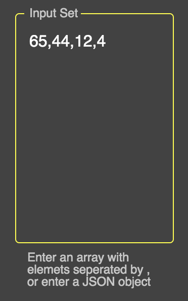
id="standard-textarea"
label="Input Set"
helperText="Enter an array with elemets seperated by , or enter a JSON object"
placeholder="Placeholder"
multiline
value={"" + this.props.input}
onChange={this.props.handleChangeValue("input")}
className={classes.textField}
margin="normal"
/>
Solution 4 - Reactjs
In case anyone wants to do this with styled-components:
import styled from "styled-components";
import {TextField} from "@material-ui/core";

const WhiteBorderTextField = styled(TextField)`
  & label.Mui-focused {
    color: white;
  }
  & .MuiOutlinedInput-root {
    &.Mui-focused fieldset {
      border-color: white;
    }
  }
`;
This took me WAY too long to figure out. Hope it helps someone.
Solution 5 - Reactjs
The Problem with the Textfield border is that the color you want to set has a lower specificity than the original style that Material-UI (MUI) sets.
E.g. MUI sets this class when focused:
.MuiOutlinedInput-root.Mui-focused .MuiOutlinedInput-notchedOutline {
    border-color: (some color);
}
which is more specific than a custom selector like:
.Component-cssNotchedOutline {
    border-color: #f0f;
}
Solution A (not recommended)
You can add the !important exception to the color, but this is 'bad practice':
import React from 'react';
import { createStyles, TextField, WithStyles, withStyles } from '@material-ui/core';
interface IProps extends WithStyles<typeof styles> {}

const styles = createStyles({
    notchedOutline: { borderColor: '#f0f !important' },
});

export const TryMuiA = withStyles(styles)((props: IProps) => {
    const { classes } = props;
    return ( <TextField variant={ 'outlined' } label={ 'my label' }
        InputProps={ {
            classes: {
                notchedOutline: classes.notchedOutline,
            },
        } }
    /> );
});
Solution B (recommended)
The official MUI example uses other ways to increase specificity.
The 'trick' is not to style the Element directly, like:
.someChildElement { border-color: #f0f }
but to add some extra selectors (more than MUI does*), e.g.:
.myRootElement.someExtra { border-color: #f0f }
.myRootElement .someChildElement { border-color: #f0f }
...
*(Actually it is enough to use the same selectors as MUI does, because if specificity of the selectors is the same, then the 'later' ones are used)
Include the parent: You might have noticed that setting notchedOutline does set the color for the un-focused element, but not for the focused.
That is because the MUI style includes the parent element of the input box (.MuiOutlinedInput-root.Mui-focused).
So you need to include the parent as well.
import React from 'react';
import { withStyles } from '@material-ui/core/styles';
import TextField from '@material-ui/core/TextField';

const styles = {
    root: {                           // - The TextField-root
        border: 'solid 3px #0ff',     // - For demonstration: set the TextField-root border
        padding: '3px',               // - Make the border more distinguishable

        // (Note: space or no space after `&` matters. See SASS "parent selector".)
        '& .MuiOutlinedInput-root': {  // - The Input-root, inside the TextField-root
            '& fieldset': {            // - The <fieldset> inside the Input-root
                borderColor: 'pink',   // - Set the Input border
            },
            '&:hover fieldset': {
                borderColor: 'yellow', // - Set the Input border when parent has :hover
            },
            '&.Mui-focused fieldset': { // - Set the Input border when parent is focused
                borderColor: 'green',
            },
        },
    },
};

export const TryMui = withStyles(styles)(function(props) {
    const { classes } = props;
    return (<TextField label="my label" variant="outlined"
        classes={ classes }
    />);
})
Note that you can increase specificity in different ways, e.g. this would work as well (a bit different):
    '& fieldset.MuiOutlinedInput-notchedOutline': {
        borderColor: 'green',
    },
Remark: It might seem a little bit 'dirty' to add selectors only to increase specificity, when you don't really 'need' them. I think it is, but this workaround was sometimes the only solution since CSS was invented, so it is considered kind of acceptable.
Solution 6 - Reactjs
inputProps={{ style: { fontFamily: 'nunito', color: 'white'}}}
The Inputprops works by styling the enterd input data in the textfield and also we can use className for custom coloring..
      const CssTextField = withStyles({
     root: {
    '& label.Mui-focused': {
     color: 'white',
      },
     '& .MuiInput-underline:after': {
      borderBottomColor: 'yellow',
     },
    '& .MuiOutlinedInput-root': {
     '& fieldset': {
     borderColor: 'white',
     },
     '&:hover fieldset': {
      borderColor: 'white',
       },
     '&.Mui-focused fieldset': {
       borderColor: 'yellow',
     },
     },
    },
This const style works the outer potion of the text filed...
The styling of the outer portion of material UI is above asked for change...
Solution 7 - Reactjs
use this overrides CSS property
.MuiFormLabel-root.Mui-focused {
  color: red !important;
}
.MuiOutlinedInput-root.Mui-focused .MuiOutlinedInput-notchedOutline {
  border-color: red !important;
}
Solution 8 - Reactjs
For the latest MUI v5.2.2: There are two main ways of changing TextField color properties:
1st one is by using InputProps and InputLabelProps: First you can create a some.module.css file, where you can create your classes:
.input-border {
    border-color: #3E68A8 !important;
}

.inputLabel {
    color: #3E68A8 !important;
}

.helper-text {
    text-transform: initial;
    font-size: 1rem !important;
}
after that you can apply them like:
            <TextField
              sx={{
                textTransform: 'uppercase',
              }}
              FormHelperTextProps={{
                classes: {
                  root: classes['helper-text'],
                },
              }}
              InputProps={{
                classes: {
                  notchedOutline: classes['input-border'],
                },
              }}
              InputLabelProps={{
                classes: {
                  root: classes.inputLabel,
                  focused: classes.inputLabel,
                },
              }}
            />
Note the above shows also how to change the color of the FormHelperText!
But if you have multiple input fields, the best way is to override the components that you need by using createTheme from @mui/material/styles
The below example shows some of the components, the rest you can just check in the dev tools, and later on inside the theme file just Ctrl + Space will show you all available components. Example:
import { createTheme, responsiveFontSizes } from '@mui/material/styles';

const theme = createTheme({
  components: {
    // CTRL + SPACE to find the component you would like to override.
    // For most of them you will need to adjust just the root...
    MuiTextField: {
      styleOverrides: {
        root: {
          '& label': {
            color: '#3E68A8',
          },
          '& label.Mui-focused': {
            color: '#3E68A8',
          },
          '& .MuiInput-underline:after': {
            borderBottomColor: '#3E68A8',
          },
          '& .MuiOutlinedInput-root': {
            '& fieldset': {
              borderColor: '#3E68A8',
            },
            '&:hover fieldset': {
              borderColor: '#3E68A8',
              borderWidth: '0.15rem',
            },
            '&.Mui-focused fieldset': {
              borderColor: '#3E68A8',
            },
          },
        },
      },
    },
    MuiFormHelperText: {
      styleOverrides: {
        root: {
          textTransform: 'initial',
          fontSize: '1rem',
        },
      },
    },
  },
});

export default responsiveFontSizes(theme);
Solution 9 - Reactjs
Extending Peter's answer. You could also change all event colors without the !important:
 cssOutlinedInput: {
        "&:not(hover):not($disabled):not($cssFocused):not($error) $notchedOutline": {
          borderColor: "red" //default
        },
        "&:hover:not($disabled):not($cssFocused):not($error) $notchedOutline": {
          borderColor: "blue" //hovered
        },
        "&$cssFocused $notchedOutline": {
          borderColor: "purple" //focused
        }
      },
      notchedOutline: {},
      cssFocused: {},
      error: {},
      disabled: {}
https://stackblitz.com/edit/material-ui-custom-outline-color-c6zqxp
Solution 10 - Reactjs
This is how I solved mine.
I wanted to change the color of the TextField when on foucused. As you already know, material Ui textField default color when on focused is blue. Blue the primary color.
So here was the hack, I went to the outer component App, and then defined a function called createMuiTheme. This fuctions returns an object called pallete. Inside the pallete is where you provide your color overides. You will use ThemeProvider from materia ui to apply your new defined color theme to your app just as below. For more clarification, follow this link https://material-ui.com/customization/palette/
import {createMuiTheme, ThemeProvider} from '@material-ui/core';
import FormInput from './FormInput';

const theme = createMuiTheme({
  palette: {
    primary: {
      main: "your own color", //this overide blue color
      light: "your own color", //overides light blue
      dark: "your own color", //overides dark blue color
    },
  },
});


//apply your new color theme to your app component
function App(){
return(
<ThemeProvider theme={theme}> //applies custom theme
   <FormInput/>
</ThemeProvider>
)
}
Solution 11 - Reactjs
Here's how I did it for hover and focused states of the TextField component.
MuiTextField: {
  styleOverrides: {
    root: {
      "& .MuiOutlinedInput-root:hover .MuiOutlinedInput-notchedOutline": {
        borderColor: "#ffb535",
      },
      "& .MuiOutlinedInput-root.Mui-focused  .MuiOutlinedInput-notchedOutline":
        {
          borderColor: "#ffb535",
        },
    },
  },
},
Solution 12 - Reactjs
> The overrides key enables you to customize the appearance of all instances of a component type,... Material-Ui
In this case there is a short answer, you have to use ThemeProvider and createMuiTheme
import React from 'react';
import {
  createMuiTheme,
  ThemeProvider
} from '@material-ui/core/styles';
import TextField from '@material-ui/core/TextField';

const theme = createMuiTheme({
  palette: {
    primary: {
      main: '#ff5722' //your color
    }
  }
});

function CustomTextfield(props) {
  return (
    <ThemeProvider theme={theme}>
      <TextField variant='outlined'/>
    </ThemeProvider>
  );
}
For a more complete customization you can use the default theme names pallete. If you dont know where are the names or naming conventions. Using de browser inspector in the style section is your savior, you can notice how the css chain is made in material-ui.
.MuiFilledInput-root {
position: relative;
transition: background-color 200ms cubic-bezier(0.0, 0, 0.2, 1) 0ms;
background-color: rgba(255,255,255,0.8);
border-top-left-radius: 4px;
border-top-right-radius: 4px;
}
MuiFilledInput > root > background-color:
we have to create de theme using the data from the inspector, we only have to place the chain in overrides:{}
const theme = createMuiTheme({
  overrides: {
    MuiFilledInput: {
      root: {
        backgroundColor: 'rgba(255,255,255,0.8)',
        '&:hover': {
          backgroundColor: 'rgba(255,255,255,1)'
        },
        '&.Mui-focused': {
          backgroundColor: 'rgba(255,255,255,1)'
        }
      }
    }
  }
});
Now you can make the override using ThemeProvider
import {
  createMuiTheme,
  ThemeProvider
} from '@material-ui/core/styles';

const theme = createMuiTheme({
  overrides: {
    MuiFilledInput: {
      root: {
        backgroundColor: 'rgba(255,255,255,0.8)',
        '&:hover': {
          backgroundColor: 'rgba(255,255,255,1)'
        },
        '&.Mui-focused': {
          backgroundColor: 'rgba(255,255,255,1)'
        }
      }
    }
  }
});

function CustomTextfield(props) {
  return (
    <ThemeProvider theme={theme}>
      <TextField variant='filled' />
    </ThemeProvider>
  );
}
So for this question you have to search your own components, because have different names.
Solution 13 - Reactjs
you can override this style like below
/* for change border color*/
.MuiOutlinedInput-root.Mui-focused .MuiOutlinedInput-notchedOutline{
    border-color: #5EA841 !important;
}

/*for change label color in focus state*/
.MuiFormLabel-root.Mui-focused{
    color: #212121 !important;
}
Solution 14 - Reactjs
you can refer this code:
styles.js
cssLabel: {
  color : 'rgb(61, 158, 116) !important'
},
notchedOutline: {
  borderWidth: '1px',
  borderColor: 'rgb(61, 158, 116) !important',
  color: 'rgb(61, 158, 116)',
},
form.js
<TextField
                name="creator"
                focused="true"
                variant="outlined"
                label="Creator"
                fullwidth
                InputLabelProps={{
                    classes: {
                      root: classes.cssLabel,
                      focused: classes.cssLabel,
                    },
                }}
                InputProps={{
                    classes: {
                      root: classes.notchedOutline,
                      focused: classes.notchedOutline,
                      notchedOutline: classes.notchedOutline,
                    },

                 }}

 />
basically, you need to set border color of notchedOutline of the InputProps appropriately.
Solution 15 - Reactjs
Here this example on a select input:
import {
  FormControl,
  InputLabel,
  Select,
  MenuItem,
  OutlinedInput as MuiOutlinedInput,
} from "@material-ui/core";

const OutlinedInput = withStyles((theme) => ({
  notchedOutline: {
    borderColor: "white !important",
  },
}))(MuiOutlinedInput);

const useStyles = makeStyles((theme) => ({
  select: {
    color: "white",
  },
  icon: { color: "white" },
  label: { color: "white" },
}));

function Component() {
  return (
    <FormControl variant="outlined">
      <InputLabel id="labelId" className={classes.label}>
        Label
      </InputLabel>
      <Select
        labelId="labelId"
        classes={{
          select: classes.select,
          icon: classes.icon,
        }}
        input={<OutlinedInput label="Label" />}
      >
        <MenuItem>A</MenuItem>
        <MenuItem>B</MenuItem>
      </Select>
    </FormControl>
  );
}
Solution 16 - Reactjs
Below is the code to customize its border color using styled() in MUI v5. The resulted TextField has an extra borderColor prop that lets you pass any color you want, not just the ones from MUI palette.
import { styled } from '@mui/material/styles';
import MuiTextField from '@mui/material/TextField';

const options = {
  shouldForwardProp: (prop) => prop !== 'borderColor',
};
const outlinedSelectors = [
  '& .MuiOutlinedInput-notchedOutline',
  '&:hover .MuiOutlinedInput-notchedOutline',
  '& .MuiOutlinedInput-root.Mui-focused .MuiOutlinedInput-notchedOutline',
];
const TextField = styled(
  MuiTextField,
  options,
)(({ borderColor }) => ({
  '& label.Mui-focused': {
    color: borderColor,
  },
  [outlinedSelectors.join(',')]: {
    borderWidth: 3,
    borderColor,
  },
}));
Usage
<TextField label="green" borderColor="green" />
<TextField label="red" borderColor="red" />
<TextField label="blue" borderColor="blue" />

Solution 17 - Reactjs
In MUI V5 :
const theme = createTheme({

     components: {
        MuiInputBase: {
          styleOverrides: {
            root: {
              "&:before":{
                borderBottom:"1px solid yellow !imporatnt",}
            },
          },
        },
      },

    })
Solution 18 - Reactjs
For me, I had to use pure css with this:
.mdc-text-field--focused .mdc-floating-label {
  color: #cfd8dc !important;
}
.mdc-text-field--focused .mdc-notched-outline__leading,
.mdc-text-field--focused .mdc-notched-outline__notch,
.mdc-text-field--focused .mdc-notched-outline__trailing {
  border-color: #cfd8dc !important;
}

// optional caret color
.mdc-text-field--focused .mdc-text-field__input {
  caret-color: #cfd8dc !important;
}
J
Solution 19 - Reactjs
You can override all the class names injected by Material-UI thanks to the classes property.
Have a look at overriding with classes section and the implementation of the component for more detail.
and finally :