How to center crop an image (<img>) in fluid width container
CssImageResponsive DesignFluid LayoutFluid ImagesCss Problem Overview
How do I get an image to stay centered when its fluid width (percentage based) container is too small to show the whole image?

How can I center the image inside it's container
This means it should show the middle of the image instead of the sides when container is too small.
Css Solutions
Solution 1 - Css
When It Works
You might have a container that holds some content such as two <div>s that are 50% wide each, sitting next to each other. For this example, we can illustrate just one child of the container:
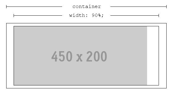
We'll name outer rectangle .container, the inner rectangle .content and the image img. This arrangement is perfectly fine, as long as .content is always wider than img.
When It Breaks
Since we're dealing with percentages and probably working with a responsive design, this may not always be the case. If .content is ever thinner than img, cropping will occur:
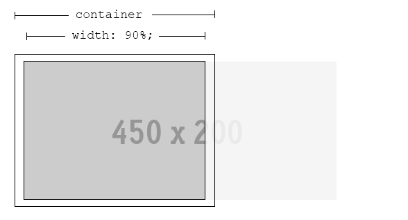
The Problem
If the most interesting part of img is in the center, we need to get the browser to crop both edges evenly - leaving the best part of it visible, no matter what width of .content is.
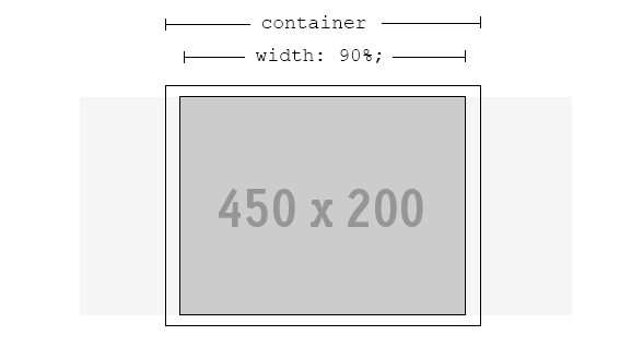
The Solution
Fortunately, a solution is possible. Even better, no extra markup is required.
.content {
    width: 90%; /* or whatever is required */
    text-align: center; /* ensures the image is always in the h-middle */
    overflow: hidden; /* hide the cropped portion */
}

img {
    position: relative; /* allows repositioning */
    left: 100%; /* move the whole width of the image to the right */
    margin-left: -200%; /* magic! */
}
Solution 2 - Css
For new browsers, you can translate it
figure{
    width: 100%;
    text-align: center;
    overflow: hidden;
}
img{
    position: relative;
    left: 50%;
    transform: translate(-50%,0)
}
To support IE8, you can still use the technique presented above by @BryceHanscomb.
.no-csstransforms figure img {
    left: 100%; /* move the whole width of the image to the right */
    margin-left: -200%; /* magic! */
}
Solution 3 - Css
If you are anticipating that the image to be displayed will be so much longer than the display container, setting left: 100%; and margin-left: -200%; (from Bryce's answer) might not be enough to get the center part of the image. Just put a bigger percentage for both. Make sure that the other is half of the other though.
left: 500%;
margin-left: -1000%;
Solution 4 - Css
I had the same problem but the solutions here didn't help me (because I'm displaying inside a table and because I wanted the image to change without having to scale it manually every time as the image was sent by clients)
Here's what I found, much more effecitve and easier :
img {
 object-fit: cover;
 width: 150px;
 height: 150px;
 }