How to add padding and margin to all Material-UI components?
ReactjsMaterial UiCustomizationReactjs Problem Overview
I need to add padding or margin to some of Material-UI components, but could not find an easy way to do it. Can I add these properties to all components? something like this:
<Button color="default" padding={10} margin={5}>
I know that this is possible using pure CSS and classes but I want to do it the Material-UI way.
Reactjs Solutions
Solution 1 - Reactjs
You can use de "Spacing" in a BOX component just by importing the component first:
import Box from '@material-ui/core/Box';
The Box component works as a "Wrapper" for the component you want to "Modify" the spacing.
then you can use the next properties on the component:
The space utility converts shorthand margin and padding props to margin and padding CSS declarations. The props are named using the format {property}{sides}.
Where property is one of:
m - for classes that set margin p - for classes that set padding
Where sides is one of:
t - for classes that set margin-top or padding-top
b - for classes that set margin-bottom or padding-bottom
l - for classes that set margin-left or padding-left
r - for classes that set margin-right or padding-right
x - for classes that set both *-left and *-right
y - for classes that set both *-top and *-bottom
blank - for classes that set a margin or padding on all 4 sides of the element
as an example:
<Box m={2} pt={3}>
  <Button color="default">
    Your Text
  </Button>
</Box>
Solution 2 - Reactjs
> Material-UI's styling solution uses JSS at its core. It's a high performance JS to CSS compiler which works at runtime and server-side.
import { withStyles} from '@material-ui/core/styles';

const styles = theme => ({
  buttonPadding: {
    padding: '30px',
  },
});

function MyButtonComponent(props) {
  const { classes } = props;

  return (
      <Button
        variant="contained"
        color="primary"
        className={classes.buttonPadding}
      >
        My Button
      </Button>
  );
}

export default withStyles(styles)(MyButtonComponent);
You can inject styles with withStyle HOC into your component. This is how it works and it's very much optimized.
EDITED: To apply styles across all components you need to use createMuiTheme and wrap your component with MuiThemeprovider
const theme = createMuiTheme({
  overrides: {
    MuiButton: {
      root: {
        margin: "10px",
        padding: "10px"
      }
    }
  }
});

 <MuiThemeProvider theme={theme}>
  <Button variant="contained" color="primary">
    Custom CSS
  </Button>

  <Button variant="contained" color="primary">
    MuiThemeProvider
  </Button>

  <Button variant="contained" color="primary">
    Bootstrap
  </Button>
</MuiThemeProvider>
Solution 3 - Reactjs
In Material-UI v5, one can change the button style using the sx props. You can see the margin/padding system properties and its equivalent CSS property here.
<Button sx={{ m: 2 }} variant="contained">
  margin
</Button>
<Button sx={{ p: 2 }} variant="contained">
  padding
</Button>
<Button sx={{ pt: 2 }} variant="contained">
  padding top
</Button>
<Button sx={{ px: 2 }} variant="contained">
  padding left, right
</Button>
<Button sx={{ my: 2 }} variant="contained">
  margin top, bottom
</Button>
The property shorthands like m or p are optional if you want to quickly prototype your component, you can use normal CSS properties if you want your code more readable.
The code below is equivalent to the above but use CSS properties:
<Button sx={{ margin: 2 }} variant="contained">
  margin
</Button>
<Button sx={{ padding: 2 }} variant="contained">
  padding
</Button>
<Button sx={{ paddingTop: 2 }} variant="contained">
  padding top
</Button>
<Button sx={{ paddingLeft: 3, paddingRight: 3 }} variant="contained">
  padding left, right
</Button>
<Button sx={{ marginTop: 2, marginBottom: 2 }} variant="contained">
  margin top, bottom
</Button>
Live Demo

Solution 4 - Reactjs
import Box from '@material-ui/core/Box';

<Box m={1} p={2}>
  <Button color="default">
    Your Text
  </Button>
</Box>
Solution 5 - Reactjs
A wide range of shorthand responsive margin and padding utility classes to modify an element's appearance.
<Box sx={{ m: -2 }} /> // margin: -16px;
<Box sx={{ m: 0 }} /> // margin: 0px;
<Box sx={{ m: 0.5 }} /> // margin: 4px;
<Box sx={{ m: 2 }} /> // margin: 16px;

Solution 6 - Reactjs
We can use makeStyles of material-ui to achieve this without using Box component.
Create a customSpacing function like below.
customSpacing.js
import { makeStyles } from "@material-ui/core";

const spacingMap = {
  t: "Top", //marginTop
  b: "Bottom",//marginBottom
  l: "Left",//marginLeft
  r: "Right",//marginRight
  a: "", //margin (all around)
};

const Margin = (d, x) => {
  const useStyles = makeStyles(() => ({
    margin: () => {
      // margin in x-axis(left/right both)
      if (d === "x") {
        return {
          marginLeft: `${x}px`,
          marginRight: `${x}px`
        };
      }
      // margin in y-axis(top/bottom both)
      if (d === "y") {
        return {
          marginTop: `${x}px`,
          marginBottom: `${x}px`
        };
      }
      return { [`margin${spacingMap[d]}`]: `${x}px` };
    }
  }));
  const classes = useStyles();
  const { margin } = classes;
  return margin;
};

const Padding = (d, x) => {
  const useStyles = makeStyles(() => ({
    padding: () => {
      if (d === "x") {
        return {
          paddingLeft: `${x}px`,
          paddingRight: `${x}px`
        };
      }
      if (d === "y") {
        return {
          paddingTop: `${x}px`,
          paddingBottom: `${x}px`
        };
      }
      return { [`padding${spacingMap[d]}`]: `${x}px` };
    }
  }));
  const classes = useStyles();
  const { padding } = classes;
  return padding;
};

const customSpacing = () => {
  return {
    m: Margin,
    p: Padding
  };
};

export default customSpacing;
Now import above customSpacing function into your Component and use it like below. App.js
import React from "react";
import "./styles.css";
import customSpacing from "./customSpacing";

const App = () => {
  const { m, p } = customSpacing();
  return (
    <div className="App">
      <h1>Hello CodeSandbox</h1>
      <h2
        style={{ background: "red" }}
        className={`${m("x", 20)} ${p("x", 2)}`}
      >
        Start editing to see some magic happen!
      </h2>
    </div>
  );
};

export default App;
Solution 7 - Reactjs
We can use makeStyles or styles props on the Typography component to give margin until version 4.0.
I highly recommend to use version 5.0 of material ui and on this version Typography is having margin props and it makes life easy.
Solution 8 - Reactjs
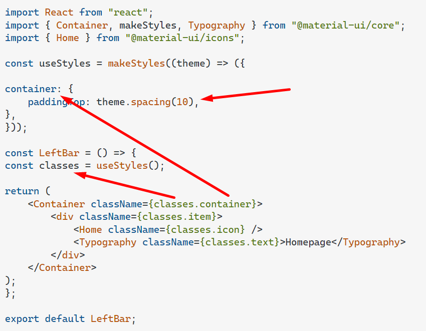
Specific for "padding-top" (10px) using Global style
import React from "react";
import { Container, makeStyles, Typography } from "@material-ui/core";
import { Home } from "@material-ui/icons";

const useStyles = makeStyles((theme) => ({

container: {
    paddingTop: theme.spacing(10),
},
}));

const LeftBar = () => {
const classes = useStyles();

return (
    <Container className={classes.container}>
        <div className={classes.item}>
            <Home className={classes.icon} />
            <Typography className={classes.text}>Homepage</Typography>
        </div>
    </Container>
);
};

export default LeftBar;
Solution 9 - Reactjs
set initial spacing first in the themeprovider i.e the tag enclosing you app entry. It should look like this
import { createMuiTheme } from '@material-ui/core/styles';
import purple from '@material-ui/core/colors/purple';
import green from '@material-ui/core/colors/green';

const theme = createMuiTheme({
  palette: {
    primary: {
      main: purple[500],
    },
    secondary: {
      main: green[500],
    },
  },
});
function App() {
  return (
      <ThemeProvider theme={theme}>
        <LandingPage />
      </ThemeProvider>
  );
 }
that's it. so add the theme section to the code and use margin/padding as you wish
const theme = {
  spacing: 8,
}

<Box m={-2} /> // margin: -16px;
<Box m={0} /> // margin: 0px;
<Box m={0.5} /> // margin: 4px;
<Box m={2} /> // margin: 16px;
you can use "margin" or "m" for short same applies to padding or
const theme = {
  spacing: value => value ** 2,
}

<Box m={0} /> // margin: 0px;
<Box m={2} /> // margin: 4px;
or
<Box m="2rem" /> // margin: 2rem;
<Box mx="auto" /> // margin-left: auto; margin-right: auto