How do I add a tool tip to a span element?
HtmlCssHtml Problem Overview
In the following code, I want a tool-tip to come up when the user hovers the span, how do I do that? I don't want to use any links.
<span> text </span>
Html Solutions
Solution 1 - Html
Here's the simple, built-in way:
<span title="My tip">text</span>
That gives you plain text tooltips. If you want rich tooltips, with formatted HTML in them, you'll need to use a library to do that. Fortunately there are loads of those.
Solution 2 - Html
Custom Tooltips with pure CSS - no JavaScript needed:
###Example here (with code) / Full screen example
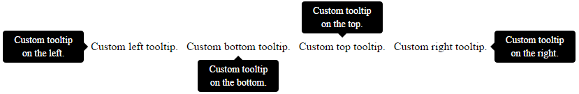
As an alternative to the default title attribute tooltips, you can make your own custom CSS tooltips using :before/:after pseudo elements and HTML5 data-* attributes.
Using the provided CSS, you can add a tooltip to an element using the data-tooltip attribute.
You can also control the position of the custom tooltip using the data-tooltip-position attribute (accepted values: top/right/bottom/left).
For instance, the following will add a tooltop positioned at the bottom of the span element.
<span data-tooltip="Custom tooltip text." data-tooltip-position="bottom">Custom bottom tooltip.</span>
How does this work?
You can display the custom tooltips with pseudo elements by retrieving the custom attribute values using the attr() function.
[data-tooltip]:before {
    content: attr(data-tooltip);
}
In terms of positioning the tooltip, just use the attribute selector and change the placement based on the attribute's value.
###Example here (with code) / Full screen example
Full CSS used in the example - customize this to your needs.
[data-tooltip] {
    display: inline-block;
    position: relative;
    cursor: help;
    padding: 4px;
}
/* Tooltip styling */
[data-tooltip]:before {
    content: attr(data-tooltip);
    display: none;
    position: absolute;
    background: #000;
    color: #fff;
    padding: 4px 8px;
    font-size: 14px;
    line-height: 1.4;
    min-width: 100px;
    text-align: center;
    border-radius: 4px;
}
/* Dynamic horizontal centering */
[data-tooltip-position="top"]:before,
[data-tooltip-position="bottom"]:before {
    left: 50%;
    -ms-transform: translateX(-50%);
    -moz-transform: translateX(-50%);
    -webkit-transform: translateX(-50%);
    transform: translateX(-50%);
}
/* Dynamic vertical centering */
[data-tooltip-position="right"]:before,
[data-tooltip-position="left"]:before {
    top: 50%;
    -ms-transform: translateY(-50%);
    -moz-transform: translateY(-50%);
    -webkit-transform: translateY(-50%);
    transform: translateY(-50%);
}
[data-tooltip-position="top"]:before {
    bottom: 100%;
    margin-bottom: 6px;
}
[data-tooltip-position="right"]:before {
    left: 100%;
    margin-left: 6px;
}
[data-tooltip-position="bottom"]:before {
    top: 100%;
    margin-top: 6px;
}
[data-tooltip-position="left"]:before {
    right: 100%;
    margin-right: 6px;
}

/* Tooltip arrow styling/placement */
[data-tooltip]:after {
    content: '';
    display: none;
    position: absolute;
    width: 0;
    height: 0;
    border-color: transparent;
    border-style: solid;
}
/* Dynamic horizontal centering for the tooltip */
[data-tooltip-position="top"]:after,
[data-tooltip-position="bottom"]:after {
    left: 50%;
    margin-left: -6px;
}
/* Dynamic vertical centering for the tooltip */
[data-tooltip-position="right"]:after,
[data-tooltip-position="left"]:after {
    top: 50%;
    margin-top: -6px;
}
[data-tooltip-position="top"]:after {
    bottom: 100%;
    border-width: 6px 6px 0;
    border-top-color: #000;
}
[data-tooltip-position="right"]:after {
    left: 100%;
    border-width: 6px 6px 6px 0;
    border-right-color: #000;
}
[data-tooltip-position="bottom"]:after {
    top: 100%;
    border-width: 0 6px 6px;
    border-bottom-color: #000;
}
[data-tooltip-position="left"]:after {
    right: 100%;
    border-width: 6px 0 6px 6px;
    border-left-color: #000;
}
/* Show the tooltip when hovering */
[data-tooltip]:hover:before,
[data-tooltip]:hover:after {
    display: block;
    z-index: 50;
}
Solution 3 - Html
In most browsers, the title attribute will render as a tooltip, and is generally flexible as to what sorts of elements it'll work with.
<span title="This will show as a tooltip">Mouse over for a tooltip!</span>
<a href="http://www.stackoverflow.com" title="Link to stackoverflow.com">stackoverflow.com</a>
<img src="something.png" alt="Something" title="Something">
All of those will render tooltips in most every browser.
Solution 4 - Html
For the basic tooltip, you want:
<span title="This is my tooltip"> Hover on me to see tooltip! </span>