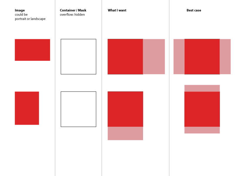
How can I fill a div with an image while keeping it proportional?
CssImagePositioningCss Problem Overview
I found this thread — https://stackoverflow.com/questions/1891857/how-do-you-stretch-an-image-to-fill-a-div-while-keeping-the-images-aspect-rat — that is not entirely the thing that I want.
I have a div with a certain size and an image inside of it. I want to always fill-out the div with the image regardless if the image is landscape or portrait. And it doesn't matter if the image is cut-off (the div itself has overflow hidden).
So if the image is portrait I want the width to be 100% and the height:auto so it stays in proportion. If the image is landscape I want the height to be 100% and the width to be auto`. Sounds complicated right?
<div class="container">
   <img src="some-image.jpg" alt="Could be portrait or landscape"/>
</div>
Since I don't know how to do it I simply created a quick image of what I mean. I can't even properly describe it.
So, I guess I'm not the first one asking this. However I couldn't really find a solution to this. Maybe there is some new CSS3 way of doing this - I'm thinking of flex-box. Any idea? Maybe it's even easier than I expect it to be?
Css Solutions
Solution 1 - Css
If I correctly understand what you want, you may leave the width and height attributes off the image to maintain aspect ratio and use flexbox to do the centering for you.
.fill {
    display: flex;
    justify-content: center;
    align-items: center;
    overflow: hidden
}
.fill img {
    flex-shrink: 0;
    min-width: 100%;
    min-height: 100%
}
<div class="fill">
    <img src="https://picsum.photos/id/237/320/240" alt="" />
</div>
I tested this successfully in IE9, Chrome 31, and Opera 18. But no other browsers were tested. As always you must consider your particular support requirements.
Solution 2 - Css
It's a bit late but I just had the same problem and finally solved it with the help of another stackoverflow post (https://stackoverflow.com/a/29103071).
img {
   object-fit: cover;
   width: 50px;
   height: 100px;
}
Hope this still helps somebody.
Ps: Also works together with max-height, max-width, min-width and min-height css properties. It's espacially handy with using lenght units like 100% or 100vh/100vw to fill the container or the whole browser window.
Solution 3 - Css
All answers below have fixed width and height, which makes solution "not responsive".
To achieve the result but keep image responsive I used following:
- Inside container place a transparent gif image with desired proportion
- Give an image tag inline css background with image you want to resize and crop
HTML:
<div class="container">
<img style="background-image: url("https://i.imgur.com/XOmNCwY.jpg");" src="img/blank.gif">
</div>
.container img{
width: 100%;
height: auto;
background-size: cover;
background-repeat: no-repeat;
background-position: center;
}
Solution 4 - Css
This should do it:
img {
min-width: 100%;
min-height: 100%;
width: auto;
height: auto;
}
Solution 5 - Css
An old question but deserves an update as now there is a way.
The correct CSS based answer is to use object-fit: cover, which works like background-size: cover. Positioning would be taken care of by object-position attribute, which defaults to centering.
But there is no support for it in any IE / Edge browsers, or Android < 4.4.4. Also, object-position is not supported by Safari, iOS or OSX. Polyfills do exist, object-fit-images seems to give best support.
For more details on how the property works, see CSS Tricks article on object-fit for explanation and demo.
Solution 6 - Css
You can achieve this using css flex properties. Please see the code below
.img-container {
  border: 2px solid red;
  justify-content: center;
  display: flex;
  flex-direction: row;
  overflow: hidden;

}
.img-container .img-to-fit {
  flex: 1;
  height: 100%;
}
<div class="img-container">
  <img class="img-to-fit" src="https://images.pexels.com/photos/8633/nature-tree-green-pine.jpg" />
</div>
Solution 7 - Css
A simple way I figured out to do this is by using object-fit: cover on the img inside the container
<div class="container">
  <img class="image" src="https://mymodernmet.com/wp/wp-content/uploads/2020/11/International-Landscape-Photographer-Year-PhotographER-1st-KelvinYuen-2.jpg">
</div>
.image {
  height: 100%;
  width: 100%;
  object-fit: cover
}

.container {
  height: 100px; /*Set any dimensions you like*/
  width: 50px;
}
As far as I tested, this works regardless of the dimensions of the image to use, and this satisfies the "Best case" as you state in the question, since the result is vertically and horizontally centered.
Solution 8 - Css
Consider using background-size: cover (IE9+) in conjunction with background-image. For IE8-, there is a polyfill.
Solution 9 - Css
Here is an answer with support to IE using object-fit so you won't lose ratio
Using a simple JS snippet to detect if the object-fit is supported and then replace the img for a svg
//ES6 version
if ('objectFit' in document.documentElement.style === false) {
  document.addEventListener('DOMContentLoaded', () => {
    document.querySelectorAll('img[data-object-fit]').forEach(image => {
      (image.runtimeStyle || image.style).background = `url("${image.src}") no-repeat 50%/${image.currentStyle ? image.currentStyle['object-fit'] : image.getAttribute('data-object-fit')}`
      image.src = `data:image/svg+xml,%3Csvg xmlns='http://www.w3.org/2000/svg' width='${image.width}' height='${image.height}'%3E%3C/svg%3E`
    })
  })
}

//ES5 version
if ('objectFit' in document.documentElement.style === false) {
  document.addEventListener('DOMContentLoaded', function() {
    Array.prototype.forEach.call(document.querySelectorAll('img[data-object-fit]').forEach(function(image) {
      (image.runtimeStyle || image.style).background = "url(\"".concat(image.src, "\") no-repeat 50%/").concat(image.currentStyle ? image.currentStyle['object-fit'] : image.getAttribute('data-object-fit'));
      image.src = "data:image/svg+xml,%3Csvg xmlns='http://www.w3.org/2000/svg' width='".concat(image.width, "' height='").concat(image.height, "'%3E%3C/svg%3E");
    }));
  });
}
img {
  display: inline-flex;
  width: 175px;
  height: 175px;
  margin-right: 10px;
  border: 1px solid red
}


/*for browsers which support object fit */

[data-object-fit='cover'] {
  object-fit: cover
}

[data-object-fit='contain'] {
  object-fit: contain
}
<img data-object-fit='cover' src='//picsum.photos/1200/600' />
<img data-object-fit='contain' src='//picsum.photos/1200/600' />
<img src='//picsum.photos/1200/600' />
Note: There are also a few object-fit polyfills out there that will make object-fit work.
Here are a few examples:
-
[object-fit-images][1]
-
[constancecchen /object-fit-pollyfill][2]
-
[Polyfill for CSS object-fit property][3]
[1]: https://github.com/bfred-it/object-fit-images "object-fit-images" [2]: https://github.com/constancecchen/object-fit-polyfill "constancecchen /object-fit-pollyfill" [3]: https://github.com/tonipinel/object-fit-polyfill "Polyfill for CSS object-fit property"
Solution 10 - Css
The only way I achieved the "best case" scenario described, was putting the image as a background:
<div class="container"></div>
.container {
width: 150px;
height: 100px;
background-image: url("http://i.stack.imgur.com/2OrtT.jpg");
background-size: cover;
background-repeat: no-repeat;
background-position: 50% 50%;
}
Solution 11 - Css
.image-wrapper{
    width: 100px;
    height: 100px;
    border: 1px solid #ddd;
}
.image-wrapper img {
    object-fit: contain;
    min-width: 100%;
    min-height: 100%;
    width: auto;
    height: auto;
    max-width: 100%;
    max-height: 100%;
}
<div class="image-wrapper">
  <img src="">
</div>
Solution 12 - Css
Try this:
img {
  position: relative;
  left: 50%;
  min-width: 100%;
  min-height: 100%;
  transform: translateX(-50%);
}
Hope this helps
Solution 13 - Css
Here you have my working example. I have used a trick that is setting the image as background of the div container with background-size:cover and background-position:center center
I have placed the image with width:100% and opacity:0 making it invisible. Note that I am showing my image only because I have an special interest on calling the child click event.
Please note that altought I am ussing angular it is completely irrelevant.
<div class="foto-item" ng-style="{'background-image':'url('+foto.path+')'}">
    <img class="materialboxed" ng-class="foto.picid" ng-src="{{foto.path}}" style="opacity: 0;filter: alpha(opacity=0);" width="100%" onclick="$('.materialboxed')/>
 </div>
<style>
.foto-item {
height: 75% !important;
width: 100%;
position: absolute;
top: 0;
left: 0;
overflow:hidden;
background-size: cover;
background-position: center center;
}
</style>
The result is the one that you define as optimal in all cases
Solution 14 - Css
You can use div to achieve this. without img tag :) hope this helps.
.img{
	width:100px;
	height:100px;
	background-image:url('http://www.mandalas.com/mandala/htdocs/images/Lrg_image_Pages/Flowers/Large_Orange_Lotus_8.jpg');
	background-repeat:no-repeat;
	background-position:center center;
	border:1px solid red;
	background-size:cover;
}
.img1{
	width:100px;
	height:100px;
	background-image:url('https://images.freeimages.com/images/large-previews/9a4/large-pumpkin-1387927.jpg');
	background-repeat:no-repeat;
	background-position:center center;
	border:1px solid red;
	background-size:cover;
}
<div class="img">
</div>
<div class="img1">
</div>
Solution 15 - Css
The CSS object-fit: cover and object-position: left center property values now address this issue.
Solution 16 - Css
Just fix the height of the image & provide width = auto
img{
    height: 95vh;
    width: auto;
}