How can I do width = 100% - 100px in CSS?
HtmlCssHtml Problem Overview
In CSS, how can I do something like this:
width: 100% - 100px;
I guess this is fairly simple but it is a bit hard to find examples showing that.
Html Solutions
Solution 1 - Html
Modern browsers now support the:
width: calc(100% - 100px);
To see the list of supported browser versions checkout: Can I use calc() as CSS unit value?
There is a jQuery fallback: css width: calc(100% -100px); alternative using jquery
Solution 2 - Html
Could you nest a div with margin-left: 50px; and margin-right: 50px; inside a <div> with width: 100%;?
Solution 3 - Html
You can try this...
<!--First Solution-->
width: calc(100% - 100px);
<!--Second Solution-->
width: calc(100vh - 100px);
vw: viewport width
vh: viewport height
Solution 4 - Html
It started to work for me only when I checked all the spaces.
So, it didn't work like this: width: calc(100%- 20px) or calc(100%-20px) and perfectly worked with width: calc(100% - 20px).
Solution 5 - Html
You need to have a container for your content div that you wish to be 100% - 100px
#container {
   width: 100%
}
#content {
   margin-right:100px;
   width:100%;
}

<div id="container">
  <div id="content">
      Your content here
  </div>
</div>
You might need to add a clearing div just before the last </div> if your content div is overflowing.
<div style="clear:both; height:1px; line-height:0"> </div>
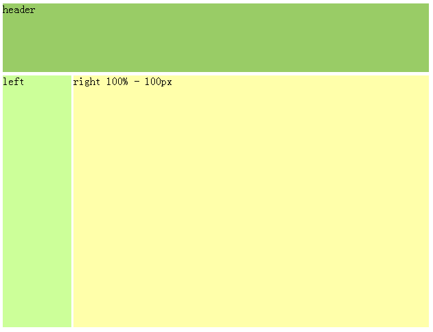
Solution 6 - Html
my code, and it works for IE6:
<style>
#container {margin:0 auto; width:100%;}
#header { height:100px; background:#9c6; margin-bottom:5px;}
#mainContent { height:500px; margin-bottom:5px;}
#sidebar { float:left; width:100px; height:500px; background:#cf9;}
#content { margin-left:100px; height:500px; background:#ffa;}

</style>

<div id="container">
  <div id="header">header</div>
  <div id="mainContent">
    <div id="sidebar">left</div>
    <div id="content">right 100% - 100px</div>
  <span style="display:none"></span></div>
</div>
Solution 7 - Html
Setting the body margins to 0, the width of the outer container to 100%, and using an inner container with 50px left/right margins seems to work.
<style>
body {
	margin: 0;
	padding: 0;
}

.full-width
{
	width: 100%;
}

.innerContainer
{
	margin: 0px 50px 0px 50px;
}
</style>

<body>
  <div class="full-width" style="background-color: #ff0000;">
    <div class="innerContainer" style="background-color: #00ff00;">
      content here
    </div>
  </div>
</body>
Solution 8 - Html
Working with bootstrap panels, I was seeking how to place "delete" link in header panel, which would not be obscured by long neighbour element. And here is the solution:
html:
<div class="with-right-link">
    <a class="left-link" href="#">Long link header Long link header</a>
    <a class="right-link" href="#">Delete</a>
</div>
css:
.with-right-link { position: relative; width: 275px; }
a.left-link { display: inline-block; margin-right: 100px; }
a.right-link { position: absolute; top: 0; right: 0; }
Of course you can modify "top" and "right" values, according to your indentations. Source
Solution 9 - Html
Could you do:
margin-right: 50px;
margin-left: 50px;
Edit: My solution is wrong. The solution posted by Aric TenEyck suggesting using a div with width 100% and then nesting another div using the margins seems more correct.
Solution 10 - Html
Padding on the outer div will get the desired effect.
<html>
<head>
<style>
	#outer{
		padding: 0 50px;
		border:1px solid black; /*for visualization*/
	}

	#inner{
		border:1px solid red; /*for visualization*/
	}
</style>
</head>
<body>
<div id="outer">
	<div id="inner">
		100px smaller than outer
	</div>
</div>
</body>
</html>
Solution 11 - Html
There are 2 techniques which can come in handy for this common scenario. Each have their drawbacks but can both be useful at times.
box-sizing: border-box includes padding and border width in the width of an item. For example, if you set the width of a div with 20px 20px padding and 1px border to 100px, the actual width would be 142px but with border-box, both padding and margin are inside the 100px.
.bb{
	-webkit-box-sizing: border-box; /* Safari/Chrome, other WebKit */
	-moz-box-sizing: border-box;    /* Firefox, other Gecko */
	box-sizing: border-box;
	width: 100%;
	height:200px;
	padding: 50px;
}
Here's an excellent article on it: http://css-tricks.com/box-sizing/ and here's a fiddle http://jsfiddle.net/L3Rvw/
And then there's position: absolute
.padded{
	position: absolute;
	top: 50px;
	right: 50px;
	left: 50px;
	bottom: 50px;
	background-color: #aefebc;
}
Neither are perfect of course, box-sizing doesn't exactly fit the question as the element is actually 100% width, rather than 100% - 100px (however a child div would be). And absolute positioning definitely can't be used in every situation, but is usually okay as long as the parent height is set.
Solution 12 - Html
CSS can not be used to animation, or any style modification on events.
The only way is to use a javascript function, which will return the width of a given element, then, subtract 100px to it, and set the new width size.
Assuming you are using jQuery, you could do something like that:
oldWidth = $('#yourElem').width();
$('#yourElem').width(oldWidth-100);
And with native javascript:
oldWidth = document.getElementById('yourElem').clientWidth;
document.getElementById('yourElem').style.width = oldWidth-100+'px';
We assume that you have a css style set with 100%;
Solution 13 - Html
<div style="width: 200px; border: 1px solid red;">
    <br>
    <div style="margin: 0px 50px 0px 50px; border: 1px solid blue;">
        <br>
    </div>
    <br>
</div>
Solution 14 - Html
Are you using standards mode? This solution depends on it I think.
If you're trying to make 2 columns you could do something like this:
<div id="outer">
    <div id="left">
        sidebar
    </div>
    <div id="main">
        lorem ispsum etc...
    </div>
</div>
Then use CSS to style it:
div#outer
{
    width:100%;
    height: 500px;
}

div#left
{
    width: 100px;
    height: 100%;
    float:left;
    background: green;
}

div#main
{
   width: auto;
   margin-left: 100px; /* same as div#left width */
   height: 100%;
   background:red;
}
If you don't want 2 columns you can probably remove <div id="left">
Solution 15 - Html
You can look into using LESS, which is a JavaScript file that pre-processes your CSS so you can include logic and variables into your CSS. So for your example, in LESS you would write width: 100% - 100px; to achieve exactly what you wanted :)
Solution 16 - Html
This works:
margin-right:100px;
width:auto;
Solution 17 - Html
You can't.
You can, however, use margins to effect the same result.
Solution 18 - Html
The short answer is you DON'T do this in CSS. Internet Explorer has support for something called CSS Expressions, but this isn't standard and is definitely not supported by other browsers like FireFox for instance.
You'd be better off doing this in JavaScript.