How can I center text (horizontally and vertically) inside a div block?
HtmlCssHtml Problem Overview
I have a div set to display:block (90px height and width), and I have some text inside.
I need the text to be aligned in the center both vertically and horizontally.
I have tried text-align:center, but it doesn't do the vertical centering part, so I tried vertical-align:middle, but it didn't work.
Any ideas?
Html Solutions
Solution 1 - Html
If it is one line of text and/or image, then it is easy to do. Just use:
text-align: center;
vertical-align: middle;
line-height: 90px;       /* The same as your div height */
That's it. If it can be multiple lines, then it is somewhat more complicated. But there are solutions on http://pmob.co.uk/. Look for "vertical align".
Since they tend to be hacks or adding complicated divs... I usually use a table with a single cell to do it... to make it as simple as possible.
Update for 2020:
Unless you need make it work on earlier browsers such as Internet Explorer 10, you can use flexbox. It is widely supported by all current major browsers. Basically, the container needs to be specified as a flex container, together with centering along its main and cross axis:
#container {
  display: flex;
  justify-content: center;
  align-items: center;
}
To specify a fixed width for the child, which is called a "flex item":
#content {
  flex: 0 0 120px;
}
Example: http://jsfiddle.net/2woqsef1/1/
To shrink-wrap the content, it is even simpler: just remove the flex: ... line from the flex item, and it is automatically shrink-wrapped.
Example: http://jsfiddle.net/2woqsef1/2/
The examples above have been tested on major browsers including MS Edge and Internet Explorer 11.
One technical note if you need to customize it: inside of the flex item, since this flex item is not a flex container itself, the old non-flexbox way of CSS works as expected. However, if you add an additional flex item to the current flex container, the two flex items will be horizontally placed. To make them vertically placed, add the flex-direction: column; to the flex container. This is how it works between a flex container and its immediate child elements.
There is an alternative method of doing the centering: by not specifying center for the distribution on the main and cross axis for the flex container, but instead specify margin: auto on the flex item to take up all extra space in all four directions, and the evenly distributed margins will make the flex item centered in all directions. This works except when there are multiple flex items. Also, this technique works on MS Edge but not on Internet Explorer 11.
Update for 2016 / 2017:
It can be more commonly done with transform, and it works well even in older browsers such as Internet Explorer 10 and Internet Explorer 11. It can support multiple lines of text:
position: relative;
top: 50%;
transform: translateY(-50%);
Example: https://jsfiddle.net/wb8u02kL/1/
To shrink-wrap the width:
The solution above used a fixed width for the content area. To use a shrink-wrapped width, use
position: relative;
float: left;
top: 50%;
left: 50%;
transform: translate(-50%, -50%);
Example: https://jsfiddle.net/wb8u02kL/2/
If the support for Internet Explorer 10 is needed, then flexbox won't work and the method above and the line-height method would work. Otherwise, flexbox would do the job.
Solution 2 - Html
Common techniques as of 2014:
-
Approach 1 -
transformtranslateX/translateY:
Example Here / Full Screen Example
In supported browsers (most of them), you can use top: 50%/left: 50% in combination with translateX(-50%) translateY(-50%) to dynamically vertically/horizontally center the element.
    .container {
        position: absolute;
        top: 50%;
        left: 50%;
        transform: translateX(-50%) translateY(-50%);
    }
-
Approach 2 - Flexbox method:
Example Here / Full Screen Example
In supported browsers, set the display of the targeted element to flex and use align-items: center for vertical centering and justify-content: center for horizontal centering. Just don't forget to add vendor prefixes for additional browser support (see example).
    html, body, .container {
        height: 100%;
    }
    .container {
        display: flex;
        align-items: center;
        justify-content: center;
    }
-
Approach 3 -
table-cell/vertical-align: middle:
Example Here / Full Screen Example
In some cases, you will need to ensure that the html/body element's height is set to 100%.
For vertical alignment, set the parent element's width/height to 100% and add display: table. Then for the child element, change the display to table-cell and add vertical-align: middle.
For horizontal centering, you could either add text-align: center to center the text and any other inline children elements. Alternatively, you could use margin: 0 auto assuming the element is block level.
    html, body {
        height: 100%;
    }
    .parent {
        width: 100%;
        height: 100%;
        display: table;
        text-align: center;
    }
    .parent > .child {
        display: table-cell;
        vertical-align: middle;
    }
-
Approach 4 - Absolutely positioned
50%from the top with displacement:
Example Here / Full Screen Example
This approach assumes that the text has a known height - in this instance, 18px. Just absolutely position the element 50% from the top, relative to the parent element. Use a negative margin-top value that is half of the element's known height, in this case - -9px.
    html, body, .container {
        height: 100%;
    }
    .container {
        position: relative;
        text-align: center;
    }
    .container > p {
        position: absolute;
        top: 50%;
        left: 0;
        right: 0;
        margin-top: -9px;
    }
-
Approach 5 - The
line-heightmethod (Least flexible - not suggested):
In some cases, the parent element will have a fixed height. For vertical centering, all you have to do is set a line-height value on the child element equal to the fixed height of the parent element.
Though this solution will work in some cases, it's worth noting that it won't work when there are multiple lines of text - like this.
    .parent {
        height: 200px;
        width: 400px;
        text-align: center;
    }
    .parent > .child {
        line-height: 200px;
    }
Methods 4 and 5 aren't the most reliable. Go with one of the first 3.
Solution 3 - Html
Using flexbox/CSS:
<div class="box">
<p>അ</p>
</div>
The CSS:
.box{
    display: flex;
    justify-content: center;
    align-items: center;
}
Taken from [Quick Tip: The Simplest Way To Center Elements Vertically And Horizontally][1]
[1]: http://tutorialzine.com/2015/09/quick-tip-the-simplest-way-to-center-elements-vertically-and-horizontally/ "Quick Tip: The Simplest Way To Center Elements Vertically And Horizontally"
Solution 4 - Html
Add the line display: table-cell; to your CSS content for that div.
Only table cells support the vertical-align: middle;, but you can give that [table-cell] definition to the div...
A live example is here: http://jsfiddle.net/tH2cc/
div{
    height: 90px;
    width: 90px;
    text-align: center;
    border: 1px solid silver;
    display: table-cell; // This says treat this element like a table cell
    vertical-align:middle; // Now we can center vertically like in a TD
}
Solution 5 - Html
Give this CSS class to the targeted <div>:
.centered {
  width: 150px;
  height: 150px;
  display: flex;
  align-items: center;
  justify-content: center;
  text-align: center;
  background: red; /* Not necessary just to see the result clearly */
}
<div class="centered">This text is centered horizontally and vertically</div>
Solution 6 - Html
You can try very easy code for this:
  display: flex;
  align-items: center;
  justify-content: center;
.box{
  height: 90px;
  width: 90px;
  background: green;
  display: flex;
  align-items: center;
  justify-content: center;
}
<div class="box">
  Lorem
</div>
Codepen link: http://codepen.io/santoshkhalse/pen/xRmZwr
Solution 7 - Html
I always use the following CSS for a container, to center its content horizontally and vertically.
display: -webkit-box;
display: -moz-box;
display: -ms-flexbox;
display: -webkit-flex;
display: flex;

-webkit-box-align: center;
-moz-box-align: center;
-ms-flex-align: center;
-webkit-align-items: center;
align-items: center;

-webkit-box-pack: center;
-moz-box-pack: center;
-ms-flex-pack: center;
-webkit-justify-content: center;
justify-content: center;
See it in action here: https://jsfiddle.net/yp1gusn7/
Solution 8 - Html
You can use the flex property at the parent div and add the margin:auto property to the children items:
.parent {
    display: flex;
    /* You can change this to `row` if you want the items side by side instead of stacked */
    flex-direction: column;
}

/* Change the `p` tag to what your items child items are */
.parent p {
    margin: auto;
}
You can see more options of flex here: https://css-tricks.com/snippets/css/a-guide-to-flexbox/
Solution 9 - Html
Approach 1
div {
  height: 90px;
  line-height: 90px;
  text-align: center;
  border: 2px dashed #f69c55;
}
<div>
  Hello, World!!
</div>
Approach 2
div {
  height: 200px;
  line-height: 200px;
  text-align: center;
  border: 2px dashed #f69c55;
}
span {
  display: inline-block;
  vertical-align: middle;
  line-height: normal;
}
<div>
  <span>Lorem ipsum dolor sit amet, consectetur adipiscing elit. Haec et tu ita posuisti, et verba vestra sunt. Non enim iam stirpis bonum quaeret, sed animalis. </span>
</div>
Approach 3
div {
  display: table;
  height: 100px;
  width: 100%;
  text-align: center;
  border: 2px dashed #f69c55;
}
span {
  display: table-cell;
  vertical-align: middle;
}
<div>
  <span>Lorem ipsum dolor sit amet, consectetur adipiscing elit.</span>
</div>
Solution 10 - Html
2020 Way
.parent{
  display: grid;
  place-items: center;
}
Solution 11 - Html
# Parent
{
  display:table;
}

# Child
{
  display: table-cell;
  width: 100%; // As large as its parent to center the text horizontally
  text-align: center;
  vertical-align: middle; // Vertically align this element on its parent
}
Solution 12 - Html
<div class="small-container">
    <span>Text centered</span>
</div>

<style>
.small-container {
    width:250px;
    height:250px;
    border:1px green solid;
    text-align:center;
    position: absolute;
    top: 50%;
    left: 50%;
    -moz-transform: translateX(-50%) translateY(-50%);
    -webkit-transform: translateX(-50%) translateY(-50%);
    transform: translateX(-50%) translateY(-50%);
}
.small-container span{
    position: absolute;
    top: 50%;
    left: 50%;
    -moz-transform: translateX(-50%) translateY(-50%);
    -webkit-transform: translateX(-50%) translateY(-50%);
    transform: translateX(-50%) translateY(-50%);
}
</style>
Solution 13 - Html
div {
  height: 90px;
  line-height: 90px;
  text-align: center;
  border: 2px dashed #f69c55;
}
<div>
  Hello, World!!
</div>
Solution 14 - Html
Add the following code in the parent div
 display: grid;
 place-items: center;
Solution 15 - Html
GRID
.center {
    display: grid;
    justify-items: center;
    align-items: center;
}
.center {
    display: grid;
    justify-items: center;
    align-items: center;
}

.box {
    width: 200px;
    height: 100px;
    background: red;
}
<div class="box center">My text</div>
Solution 16 - Html
Adjusting line height to get the vertical alignment.
line-height: 90px;
Solution 17 - Html
This works for me (tested OK!):
HTML:
<div class="mydiv">
    <p>Item to be centered!</p>
</div>
CSS:
.mydiv {
    height: 100%; /* Or other */
    position: relative;
}

.mydiv p {
    margin: 0;
    position: absolute;
    top: 50%;
    left: 50%;
    margin-right: -50%;
    transform: translate(-50%, -50%); /* To compensate own width and height */
}
You can choose other values than 50%. For example, 25% to center at 25% of parent.
Solution 18 - Html
You can try the following methods:
-
If you have a single word or one line sentence, then the following code can do the trick.
Have a text inside a div tag and give it an id. Define the following properties for that id.
 id-name {
   height: 90px;
   line-height: 90px;
   text-align: center;
   border: 2px dashed red;
 }
Note: Make sure the line-height property is same as the height of the division.
But, if the content is more than one single word or a line then this doesn’t work. Also, there will be times when you cannot specify the size of a division in px or % (when the division is really small and you want the content to be exactly in the middle).
-
To solve this issue, we can try the following combination of properties.
id-name { display: flex; justify-content: center; align-items: center; border: 2px dashed red; }These 3 lines of code sets the content exactly in the middle of a division (irrespective of the size of the display). The "align-items: center" helps in vertical centering while "justify-content: center" will make it horizontally centered.
Note: Flex does not work in all browsers. Make sure you add appropriate vendor prefixes for additional browser support.
Solution 19 - Html
.cell-row {display: table; width: 100%; height: 100px; background-color: lightgrey; text-align: center}
.cell {display: table-cell}
.cell-middle {vertical-align: middle}
<div class="cell-row">
  <div class="cell cell-middle">Center</div>
</div>
Solution 20 - Html
<!DOCTYPE html>
<html>
  <head>
    <style>
      .maindiv {
        height: 450px;
        background: #f8f8f8;
        display: -webkit-flex;
        align-items: center;
        justify-content: center;
      }
      p {
        font-size: 24px;
      }
    </style>
  </head>

  <body>
    <div class="maindiv">
      <h1>Title</h1>
    </div>
  </body>
</html>
Solution 21 - Html
For me this was the best solution:
HTML:
 <div id="outer">
     <img src="logo.png">
 </div>
CSS:
#outer {
  position: fixed;
  top: 50%;
  left: 50%;
  /* bring your own prefixes */
  transform: translate(-50%, -50%);
}
Solution 22 - Html
Really simple code that works for me! Just one line and your text will be centered horizontally.
.center-horizontally{
justify-content: center;
}
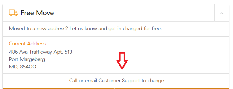
<Card.Footer className="card-body-padding center-horizontally">
<label className="support-expand-text-light">Call or email Customer Support to change</label>
</Card.Footer>
The output looks like this:
Solution 23 - Html
Apply style:
position: absolute;
top: 50%;
left: 0;
right: 0;
Your text would be centered irrespective of its length.
Solution 24 - Html
This worked for me:
.center-stuff{
    text-align: center;
    vertical-align: middle;
    line-height: 230px; /* This should be the div height */
}
Solution 25 - Html
This should be the right answer. Cleanest and simplest:
.element {
  position: relative;
  top: 50%;
  transform: translateY(-50%);
}
Solution 26 - Html
<!DOCTYPE html>
<html>
    <head>

    </head>
    <body>
        <div style ="text-align: center;">Center horizontal text</div>
        <div style ="position: absolute; top: 50%; left: 50%; transform: translateX(-50%) translateY(-50%);">Center vertical text</div>
    </body>
</html>
Solution 27 - Html
Try the following example. I have added examples for each category: horizontal and vertical
<!DOCTYPE html>
<html>
    <head>
        <style>
            #horizontal
            {
                text-align: center;
            }
            #vertical
            {
                position: absolute;
                top: 50%;
                left: 50%;
                transform: translateX(-50%) translateY(-50%);
            }
         </style>
    </head>
    <body>
         <div id ="horizontal">Center horizontal text</div>
         <div id ="vertical">Center vertical text</div>
    </body>
</html>