How can I align one item right with flexbox?
CssAlignmentFlexboxCss Problem Overview
https://jsfiddle.net/vhem8scs/
Is it possible to have two items align left and one item align right with flexbox? The link shows it more clearly. The last example is what I want to achieve.
In flexbox I have one block of code. With float I have four blocks of code. That is one reason why I prefer flexbox.
HTML
<div class="wrap">
  <div>One</div>
  <div>Two</div>
  <div>Three</div>
</div>

<!-- DESIRED RESULT -->

<div class="result">
  <div>One</div>
  <div>Two</div>
  <div>Three</div>
</div>
CSS
.wrap {
  display: flex;
  background: #ccc;
  width: 100%;
  justify-content: space-between;
}

.result {
  background: #ccc;
  margin-top: 20px;
}

.result:after {
  content: '';
  display: table;
  clear: both;
}

.result div {
  float: left;
}
.result div:last-child {
  float: right;
}
Css Solutions
Solution 1 - Css
To align one flex child to the right set it withmargin-left: auto;
From the flex spec:
> One use of auto margins in the main axis is to separate flex items > into distinct "groups". The following example shows how to use this to > reproduce a common UI pattern - a single bar of actions with some > aligned on the left and others aligned on the right.
.wrap div:last-child {
  margin-left: auto;
}
Updated fiddle
.wrap {
  display: flex;
  background: #ccc;
  width: 100%;
  justify-content: space-between;
}
.wrap div:last-child {
  margin-left: auto;
}
.result {
  background: #ccc;
  margin-top: 20px;
}
.result:after {
  content: '';
  display: table;
  clear: both;
}
.result div {
  float: left;
}
.result div:last-child {
  float: right;
}
<div class="wrap">
  <div>One</div>
  <div>Two</div>
  <div>Three</div>
</div>

<!-- DESIRED RESULT -->
<div class="result">
  <div>One</div>
  <div>Two</div>
  <div>Three</div>
</div>
Note:
You could achieve a similar effect by setting flex-grow:1 on the middle flex item (or shorthand flex:1) which would push the last item all the way to the right. (Demo)
The obvious difference however is that the middle item becomes bigger than it may need to be. Add a border to the flex items to see the difference.
Demo
.wrap {
  display: flex;
  background: #ccc;
  width: 100%;
  justify-content: space-between;
}
.wrap div {
  border: 3px solid tomato;
}
.margin div:last-child {
  margin-left: auto;
}
.grow div:nth-child(2) {
  flex: 1;
}
.result {
  background: #ccc;
  margin-top: 20px;
}
.result:after {
  content: '';
  display: table;
  clear: both;
}
.result div {
  float: left;
}
.result div:last-child {
  float: right;
}
<div class="wrap margin">
  <div>One</div>
  <div>Two</div>
  <div>Three</div>
</div>

<div class="wrap grow">
  <div>One</div>
  <div>Two</div>
  <div>Three</div>
</div>

<!-- DESIRED RESULT -->
<div class="result">
  <div>One</div>
  <div>Two</div>
  <div>Three</div>
</div>
Solution 2 - Css
For a terse, pure flexbox option, group the left-aligned items and the right-aligned items:
<div class="wrap">
  <div>
    <span>One</span>
    <span>Two</span>
  </div>
  <div>Three</div>
</div>
and use space-between:
.wrap {
  display: flex;
  background: #ccc;
  justify-content: space-between;
}
This way you can group multiple items to the right(or just one).
Solution 3 - Css
To align some elements (headerElement) in the center and the last element to the right (headerEnd).
.headerElement {
    margin-right: 5%;
    margin-left: 5%;
}
.headerEnd{
    margin-left: auto;
}
Solution 4 - Css
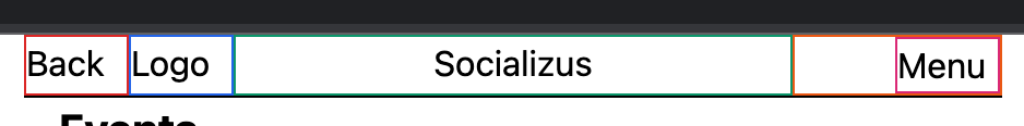
Here is what I did (with tailwind but it's just CSS):
<nav class="border-b border-black flex">
  <div class="border border-red-600 w-12">Back</div>
  <div class="border border-blue-600 w-12">Logo</div>
  <div class="border border-green-600 flex-grow text-center">Socializus</div>
  <div class="border border-orange-600 w-24">
    <div class="w-12 ml-auto border border-pink-600">Menu</div>
  </div>
</nav>
The idea is that the two parts on left and right are the same width, then a subpart of the right takes less space