Difference between static and relative positioning
CssStaticPositioningCss PositionCss Problem Overview
In CSS, what is the difference between static (default) positioning and relative positioning?
Css Solutions
Solution 1 - Css
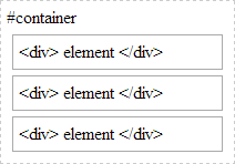
Static positioning is the default positioning model for elements. They are displayed in the page where they rendered as part of normal HTML flow. Statically positioned elements don't obey left, top, right and bottom rules:
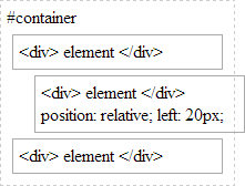
Relative positioning allows you to specify a specific offset (left, top etc) which is relative to the element's normal position in HTML flow. So if I have a textbox inside a div I could apply relative positioning on the textbox to have it display at specific place relative to where it would normally be placed within the div:
There is also absolute positioning - whereby you specify the exact location of the element relative to the entire document, or the next relatively positioned element further up the element tree:

And when a position: relative is applied to a parent element in the hierarchy:
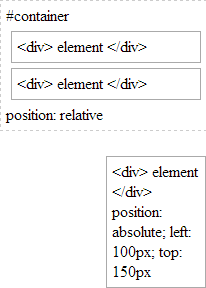
Note how our absolutely-position element is bound by the relatively-positioned element.
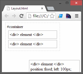
And lastly there is fixed. Fixed positioning restricts an element to a specific position in the viewport, which stays in place during scroll:
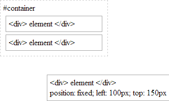
You may also observe the behaviour that fixed-positioned elements do not cause scroll because they are not considered to be bound by the viewport:
Whereas absolutely-positioned elements are still bound by the viewport and will cause scrolling:
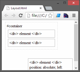
..unless of course your parent element uses overflow: ? to determine the behaviour of the scroll (if any).
With absolute positioning and fixed positioning, the elements are taken out of HTML flow.
Solution 2 - Css
You can see a simple overview here: W3School
Also, if I recall correctly, when declaring an element relative, it will by default stay in the same place as it otherwise should, but you gain the ability to absolutely position elements inside it relatively to this element, which I've found very useful in the past.
Solution 3 - Css
In answer to "why CSS would still implement position: static;" in one scenerio, using position:relative for a parent and position:absolute for the child limits the scaling width of the child. In a horizontal menu system, where you could have 'columns' of links, using 'width:auto' does not work with relative parents. In this case, changing it to 'static' will allow the width to be variable dependent on the content within.
I spent a good few hours wondering why I couldn't get my container to adjust based on the amount of content within it. Hope this helps!
Solution 4 - Css
Position relative lets you use top/bottom/left/right for positioning. Static won't let you do this unless you use margin parameters. There's a difference between Top and margin-top.
You won't need to use static much as it's default
Solution 5 - Css
Relative position is relative to the normal flow. The relative position of that element (with offsets) is relative to the position where that element would have been normally if not moved.
Solution 6 - Css
Matthew Abbott has a really good answer.
Absolute and relative positioned items obey top, left, right and bottom commands (offsets) where static positioned items do not.
Relatively positioned items move offsets from where they would normally be in the html.
Absolute positioned items move offsets from the document or the next relatively positioned element up the DOM tree.
Solution 7 - Css
static and relative are position attributes.relative is used for many uses. Not for one. But keep in mind that static and relative don't harm to normal document flow of the Html. static is the default position that when you write any element to Html. If an element has a relative position, that element can be positioned relative to its native place. when you want to adjust element from small spaces, use the relative position so that you don't need to add the margin, padding e.t.c if the element has a position relative and it has a child element. Here we can do measurements relatively to its parent. If you add width 10% to the child, that means (width+padding)x10%.but you don't add the relative keyword, you get widthx10%. Other than that, the most important usage of the relative is; you can position any element top of it.but you have to use "absolute" keyword to child.when adding absolute keyword to the child, the child is out of the normal document flow
Solution 8 - Css
Static: By default the position of elements is static. If you add property such as top, bottom, right, or left nothing will be implemented.
div{
    width:200px;
    height:200px;
    background-color:yellow;
    display:inline-block;
}

#middle{
    background-color:pink;
}

#static #middle{
    position:static;
    top:100px;
}
<!DOCTYPE html>
<html lang="en">
<head>
    <meta charset="UTF-8">
    <meta http-equiv="X-UA-Compatible" content="IE=edge">
    <meta name="viewport" content="width=device-width, initial-scale=1.0">
    <link rel="stylesheet" href="style.css">
    <title>Document</title>
</head>
<body>
   <h1>Position Property</h1>
   <section id="static">
       <h2>Static</h2>
       <div></div>
       <div id="middle"></div>
       <div></div>
   </section>
</body>
</html>
Relative: The change in position will be relevant to that div's original place.
div{
    width:200px;
    height:200px;
    background-color:yellow;
    display:inline-block;
}

#middle{
    background-color:pink;
}

#relative #middle{
    position:relative;
    top:100px;
    left:100px;
}
<!DOCTYPE html>
<html lang="en">
<head>
    <meta charset="UTF-8">
    <meta http-equiv="X-UA-Compatible" content="IE=edge">
    <meta name="viewport" content="width=device-width, initial-scale=1.0">
    <link rel="stylesheet" href="style.css">
    <title>Document</title>
</head>
<body>
   <h1>Position Property</h1>
 <section id="relative">
    <h2>Relative</h2>
    <div></div>
    <div id="middle"></div>
    <div></div>
</section>

</body>
</html>
Absolute: It is positioned relative to its closest positioned ancestor, if any; otherwise, it is placed relative to the initial containing block. Source:MDN
div{
    width:200px;
    height:200px;
    background-color:yellow;
    display:inline-block;
}

#middle{
    background-color:pink;
}

#absolute{
    position:relative;
}

#absolute #middle{
    position:absolute;
    top:10px;
    left:10px;
}
<!DOCTYPE html>
<html lang="en">
<head>
    <meta charset="UTF-8">
    <meta http-equiv="X-UA-Compatible" content="IE=edge">
    <meta name="viewport" content="width=device-width, initial-scale=1.0">
    <link rel="stylesheet" href="style.css">
    <title>Document</title>
</head>
<body>
<h1>Position Property</h1>
<section id="absolute">
    <h2>Absolute</h2>
    <div></div>
    <div id="middle"></div>
    <div></div>
</section>

</body>
</html>
Fixed: The fixed property would stay at the same place even after we scroll the page. The position is relative to the containing block always.
div{
    width:200px;
    height:200px;
    background-color:yellow;
    display:inline-block;
}

#middle{
    background-color:pink;
}

#fixed #middle{
    position:fixed;
    top:10px;
    left:10px;
}
<!DOCTYPE html>
<html lang="en">
<head>
    <meta charset="UTF-8">
    <meta http-equiv="X-UA-Compatible" content="IE=edge">
    <meta name="viewport" content="width=device-width, initial-scale=1.0">
    <link rel="stylesheet" href="style.css">
    <title>Document</title>
</head>
<body>
<h1>Position Property</h1>
<section id="fixed">
    <h2>Fixed</h2>
    <div></div>
    <div id="middle"></div>
    <div></div>
</section>
</body>
</html>