Easiest CSS for "red notification badge" with count
JavascriptHtmlCssNotificationsCss PositionJavascript Problem Overview
I need to show the popular red notification indicator with count such as the one shown below. Getting something that looks nice cross browser seems tricky. For example, different browsers seem to treat paddings differently, resulting in weird looking notifications.
What is the best cross-browser way of ensuring the notifications show up nicely? Not adverse to using javascript, but pure css is of course preferable

Javascript Solutions
Solution 1 - Javascript
The best way to achieve this is by using absolute positioning:
/* Create the blue navigation bar */ .navbar { background-color: #3b5998; font-size: 22px; padding: 5px 10px; }
/* Define what each icon button should look like */
.button {
  color: white;
  display: inline-block; /* Inline elements with width and height. TL;DR they make the icon buttons stack from left-to-right instead of top-to-bottom */
  position: relative; /* All 'absolute'ly positioned elements are relative to this one */
  padding: 2px 5px; /* Add some padding so it looks nice */
}

/* Make the badge float in the top right corner of the button */
.button__badge {
  background-color: #fa3e3e;
  border-radius: 2px;
  color: white;

  padding: 1px 3px;
  font-size: 10px;

  position: absolute; /* Position the badge within the relatively positioned button */
  top: 0;
  right: 0;
}
https://maxcdn.bootstrapcdn.com/font-awesome/4.6.3/css/font-awesome.min.css" rel="stylesheet"/>
<div class="navbar">
  <div class="button">
    <i class="fa fa-globe"></i>
    <span class="button__badge">2</span>
  </div>
  <div class="button">
    <i class="fa fa-comments"></i>
    <span class="button__badge">4</span>
  </div>
</div>
Solution 2 - Javascript
Here's one that includes animation for when the count changes.
http://jsfiddle.net/rahilsondhi/FdmHf/4/
<ul>
<li class="notification-container">
    <i class="icon-globe"></i>
    <span class="notification-counter">1</span>
</li>
    .notification-container {
    position: relative;
    width: 16px;
    height: 16px;
    top: 15px;
    left: 15px;

    i {
        color: #fff;
    }
}

.notification-counter {
    position: absolute;
    top: -2px;
    left: 12px;

    background-color: rgba(212, 19, 13, 1);
    color: #fff;
    border-radius: 3px;
    padding: 1px 3px;
    font: 8px Verdana;
}


$counter
.css({opacity: 0})
.text(val)
.css({top: '-10px'})
.transition({top: '-2px', opacity: 1})
Animation with jQuery:
$('button').click(function()
{
    var $counter = $('.notification-counter')
    var val = parseInt $counter.text();
    val++;
    $counter.css({opacity: 0}).text(val).css({top:'-10px'}).animate({top: '-1px', opacity: 1}, 500);
});
It uses Font Awesome for the globe icon and jQuery Transit for the animation.
Solution 3 - Javascript
Probably absolute positioning:
<div id="globe" style="height: 30px; width: 30px; position: relative;">
 <img src="/globe.gif" />
 <div id="notification" style="position: absolute; top: 0; right;0;">1</div>
</div>
Something like that. Obviously you would want to change the specifics and probably use background images. The point is to emphasis the absolute positioning which it really consistent across browsers, at least in my experiences.
Solution 4 - Javascript
Markup:
<div id="ContainerDiv">
    <div id="MainImageDiv"> //Add the image here or whatever you want </div>
    <div id="NotificationDiv"> </div>
</div>
Css:
#NotificationDiv {
    position: absolute;
    left: -10 //use negative values to push it above the #MainImageDiv
    top: -4
    ...
}
Solution 5 - Javascript
I am sure that the answers about absolute positioning are correct. For the sake of experiment, I tried to make an SVG-only solution. The result is far from ideal, maybe someone knows a more elegant solution to a similar svg puzzle? :)
http://jsfiddle.net/gLdsco5p/3/
<svg width="64" height="64" viewBox="0 0 91 91">
    <rect id="Artboard1" x="0" y="0" width="90.326" height="90.326" style="fill:none;"/>
    <g id="Artboard11" serif:id="Artboard1">
        <g id="user-circle-o" transform="matrix(2.69327,0,0,2.69327,7.45723,7.45723)">
            <path d="M14,0C21.734,0 28,6.266 28,14C28,21.688 21.766,28 14,28C6.25,28 0,21.703 0,14C0,6.266 6.266,0 14,0ZM23.672,21.109C25.125,19.109 26,16.656 26,14C26,7.391 20.609,2 14,2C7.391,2 2,7.391 2,14C2,16.656 2.875,19.109 4.328,21.109C4.89,18.312 6.25,16 9.109,16C10.375,17.234 12.093,18 14,18C15.907,18 17.625,17.234 18.891,16C21.75,16 23.11,18.312 23.672,21.109ZM20,11C20,7.687 17.312,5 14,5C10.688,5 8,7.688 8,11C8,14.312 10.688,17 14,17C17.312,17 20,14.312 20,11Z" style="fill:rgb(190,190,190);fill-rule:nonzero;"/>
        </g>
        <g transform="matrix(1,0,0,1,1.36156,0)">
            <circle cx="63.708" cy="18.994" r="9.549" style="fill:rgb(255,0,0);"/>
        </g>
        <g transform="matrix(1.66713,0,0,1.66713,-51.5278,-2.33264)">
            <text  id="counter" x="68.034px" y="15.637px" style="font-family:'ArialMT', 'Arial', sans-serif;font-size:7.915px;fill:white;">1</text>
        </g>
    </g>
</svg>
Solution 6 - Javascript
A responsive solution using font-relative sizing and shaping
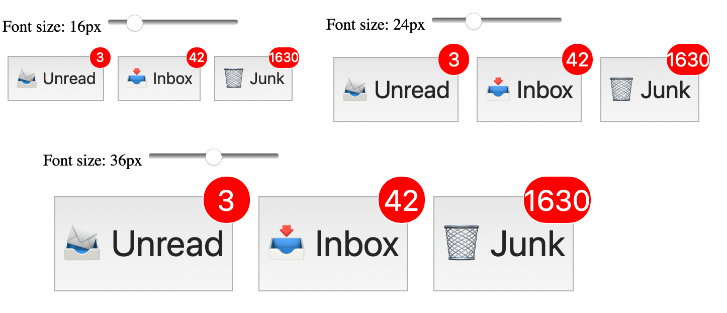
The above image is a snapshot of running the Live Demo below. Scroll down and try it yourself. Scroll further down to see a demo of the currently accepted answer.
As other answers say, absolute positioning with a relatively positioned parent is a very reliable way to position the indicator in the upper right corner (or any corner you prefer).
But there are other very important considerations:
- Size: not just relative to what it tags, but also what happens if the number gets long?
- Shape: ideally round, but what happens if the number gets long?
- Floating appearance: It should appearing to float above the corner, rather than be inside.
- Border: optionally, depending on the colors involved, you may need a subtle border or shadow.
- Accessibility: proper tagging of the notification so that it is accessible to the sight impaired.
Doing the above in px units as the accepted answer does is very messy, brittle, and not at all responsive.
The following CSS address all of the above issues in an elegant responsive way:
.notification {

  /* circle shape, size and position */
  position: absolute;
  right: -0.7em;
  top: -0.7em;
  min-width: 1.6em; /* or width, explained below. */
  height: 1.6em;
  border-radius: 0.8em; /* or 50%, explained below. */
  border: 0.05em solid white;
  background-color: red;

  /* number size and position */
  display: flex;
  justify-content: center;
  align-items: center;
  font-size: 0.8em;
  color: white;
}
Key things:
-
The element with the
.notificationclass will display in the upper-right corner of the element that contains it.For example it will display in the upper right corner of this mailbox button:
<button class="mailbox">📥 Inbox
    <div class="notification" role="status">42</div>
</button>
If its position looks wrong, inspect that true boundaries of the parent element to debug.
-
If you want the indicator to be a circle no matter how big the count, change
min-widthtowidthand setborder-radiusto50%. The CSS above is designed to stretch horizontally if the count gets large, as shown below (and like so many people's inboxes 藍). -
For accessibility, you should include
role="status"on the notification element, as shown above.
Live Demo
Here is a live demo, along with a slider so that you can see how it responds to font size changes:
/* IGNORE this Javascript part.
   It's just here to let you change the size with
   a slider. Press Run and try it.                  */

var boxes = document.getElementsByClassName("mailbox");

function updateFontSize(size) {
  for (var i = 0; i < boxes.length; i++) {
    boxes[i].style.fontSize = size + "px";
  }
}

var px = getComputedStyle(boxes[0]).fontSize

var label = document.getElementById("label");
label.innerHTML = px

var slider = document.getElementById('slider');
slider.value = px.slice(0, -2)
slider.onchange = () => {
  label.innerHTML = slider.value + "px";
  updateFontSize(slider.value);
}
.mailbox {
  position: relative;
  font-size: 16px;
  line-height: 2.5em;
  margin: 0.3em;
}

.notification {
  /* circle shape, size and position */
  position: absolute;
  right: -0.7em;
  top: -0.7em;
  min-width: 1.6em; /* or width, explained below. */
  height: 1.6em;
  border-radius: 0.8em; /* or 50%, explained below. */
  border: 0.05em solid white;
  background-color: red;

  /* number size and position */
  display: flex;
  justify-content: center;
  align-items: center;
  font-size: 0.8em;
  color: white;
}
<p>Font size:
  <span id="label">16</span>
  <input id="slider" type="range" min="6" max="66" step="1" value="16"></p>

<button class="mailbox">📨 Unread
    <div class="notification" role="status">3</div>
</button>
<button class="mailbox">📥 Inbox
    <div class="notification" role="status">42</div>
</button>
<button class="mailbox">🗑 Junk
    <div class="notification" role="status">1630</div>
</button>
Comparing the accepted answer:
To see the difference, run this live demo of the accepted answer's approach:
var boxes = document.getElementsByClassName("mailbox");

function updateFontSize(size) {
  for (var i = 0; i < boxes.length; i++) {
    boxes[i].style.fontSize = size + "px";
  }
}

var px = getComputedStyle(boxes[0]).fontSize

var label = document.getElementById("label");
label.innerHTML = px

var slider = document.getElementById('slider');
slider.value = px.slice(0, -2)
slider.onchange = () => {
  label.innerHTML = slider.value + "px";
  updateFontSize(slider.value);
}
.mailbox {
  display: inline-block;
  position: relative;
  padding: 10px 10px;
  font-size: 16px;
}

.notification {
  background-color: #fa3e3e;
  border-radius: 2px;
  color: white;
  padding: 1px 3px;
  font-size: 10px;
  position: absolute;
  top: 0;
  right: 0;
}
<p>Font size:
  <span id="label">16</span>
  <input id="slider" type="range" min="6" max="66" step="1" value="16"></p>

<button class="mailbox">📨 Unread
    <div class="notification" role="status">3</div>
</button>
<button class="mailbox">📥 Inbox
    <div class="notification" role="status">42</div>
</button>
<button class="mailbox">🗑 Junk
    <div class="notification" role="status">1630</div>
</button>