CSS Floating Divs At Variable Heights
CssHtmlCss FloatCss Problem Overview
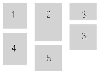
I have infinite number of divs of a 100px width, which can fit into a 250px width parent. Regardless of height, I need the divs to be displayed in rows, as shown in the image. I've tried resolving this, but the div height seems to be screwing it up.
I'd really appreciate your help. Thanks :)
		<style>
			#holder{
			width:250px;
			border:1px dotted blue;
			display:inline-block;
		}
		.box{
			width:100px;
			height:150px;
			background-color:#CCC;
			float:left;
			text-align:center;
			font-size:45px;
			display:inline-block;
		}
		.one{
			background-color:#0F0;
			height:200px;
		}

		.two{
			background-color:#0FF;
		}

		.three{
			background-color:#00F;
		}

		.four{
			background-color:#FF0;
		}
	</style>

	<div id="holder">
		<div class="box one">1</div>
		<div class="box two">2</div>
		<div class="box three">3</div>
		<div class="box four">4</div>
	</div>
Here is the jsfiddle
Here is what I did and achieved using javascript https://jsfiddle.net/8o0nwft9/
Css Solutions
Solution 1 - Css
To my knowledge, there's no way to fix this problem with pure CSS (that works in all common browsers):
- Floats don't work.
display: inline-blockdoesn't work.position: relativewithposition: absoluterequires manual pixel tuning. If you're using a server-side language, and you're working with images (or something with predictable height), you can handle the pixel tuning "automatically" with server-side code.
Instead, use jQuery Masonry.
Solution 2 - Css
on the assumption that your needs are more like your colored example code then:
.box:nth-child(odd){
    clear:both;
}
if it's going to be 3 rows then nth-child(3n+1)
Solution 3 - Css
I'm providing this answer because even when there are good ones which do provide a solution(using Masonry) still isn't crystal clear why it isn't possible to achieve this by using floats.
(this is important - #1). > A floated element will move as far to the left or right as it can in > the position where it was originally
So put it in this way:
We have 2 div
<div class="div5">div5</div>
<div class="div6">div6</div>

.div-blue{
    width:100px;
    height:100px;
    background: blue;
}

.div-red{
    width:50px;
    height:50px;
    background: red;
}
without float they'll be one below the other
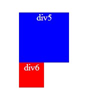
If we float: right the div5, the div6 is positioned on the line where the div5 was ,
/*the lines are just for illustrate*/
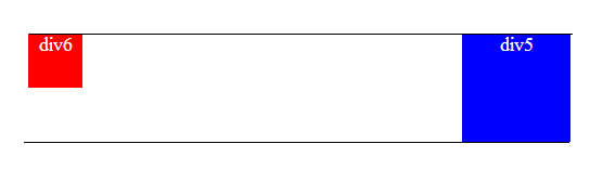
So if now we float: left the div6 it will move as far to the left as it can, "in this line" (see #1 above), so if div5 changes its line, div6 will follow it.
Now let's add other div into the equation
<div class="div4">div4</div>
<div class="div5">div5</div>
<div class="div6">div6</div>

.div-gree{
    width:150px;
    height:150px;
    background: green;

    float:right;
}
We have this
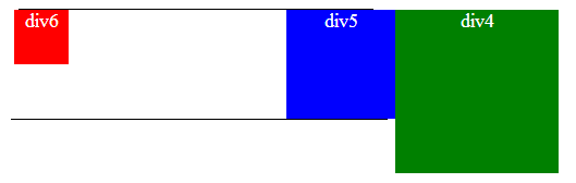
If we set clear: right to the div5, we are forcing it to take the line bellow div4
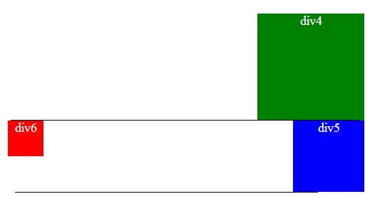
and div6 will float in this new line wether to the right or to the left.
Now lets use as example the question that brought me here due to a duplicate https://stackoverflow.com/questions/32102623/forcing-div-stack-from-left-to-right#32102623
Here the snippet to test it:
div{
    width:24%;
    margin-right: 1%;
    float: left;
    margin-top:5px;
    color: #fff;
    font-size: 24px;
    text-align: center;
}

.one{
    background-color:red;
    height: 50px;
}

.two{
    background-color:green;
    height:40px;
}

.three{
    background-color:orange;
    height:55px;
}

.four{
    background-color:magenta;
    height:25px;
}

.five{
    background-color:black;
    height:55px;
}
<div class="one">1</div>
<div class="two">2</div>
<div class="three">3</div>
<div class="four">4</div>
<div class="five">5</div>

<div class="one">1*</div>
<div class="three">2*</div>
<div class="four">3*</div>
<div class="two">4*</div>
<div class="five">5*</div>
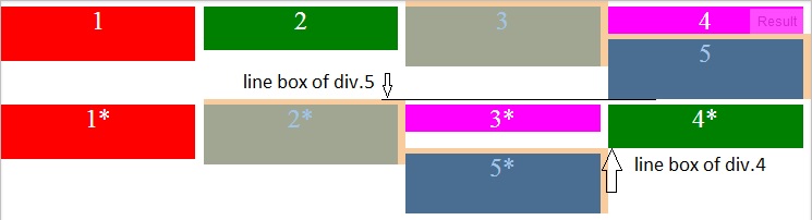
In the above image you can see how div.5 is stocked just next to div.3 that is because in its line (defined by the line box of div.4) that is as far it can go, div.1*, div.2*, etc, also float left of div.5 but as they don't fit in that line they go to the line bellow (defined by the line box of div.5)
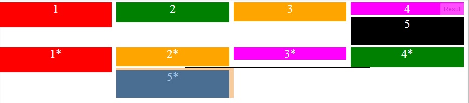
Now notice that when we reduce the height of div.2* enough to be less than div.4* how it let pass to div.5*:
I hope this helps to clarify why this can not be achieved using floats. I only clarify using floats (not inline-block) because of the title "CSS Floating Divs At Variable Heights" and because right now the answer is quite long.
Solution 4 - Css
As has been rightly pointed out, this is impossible with CSS alone... thankfully, I've now found a solution in http://isotope.metafizzy.co/
It seems to solve the problem fully.
Solution 5 - Css
With a little help from this comment (https://stackoverflow.com/questions/4889230/css-block-float-left) I figured out the answer.
On every "row" that I make, I add a class name left.
On every other "row" that I make, I add a class name right.
Then I float left and float right for each of these class names!
The only complication is that my content order is reversed on the "right" rows, but that can be resolved using PHP.
Thanks for your help folks!
#holder{
  width:200px;
  border:1px dotted blue;
  display:inline-block;
}
.box{
  width:100px;
  height:150px;
  background-color:#CCC;
  float:left;
  text-align:center;
  font-size:45px;
}
.one{
  background-color:#0F0;
  height:200px;
}

.two{
  background-color:#0FF;
}

.three{
  background-color:#00F;
  float:right;
}

.four{
  background-color:#FF0;
  float:right;
}
.left{float:left;}
.right{float:right;}
<div id="holder">
  <div class="box one left">1</div>
  <div class="box two left">2</div>
  <div class="box four right">4</div>
  <div class="box three right">3</div>
</div>
</body>
Solution 6 - Css
Thanks to thirtydot, I have realised my previous answer did not properly resolve the problem. Here is my second attempt, which utilizes JQuery as a CSS only solution appears impossible:
<html>
	<head>
		<script type="text/javascript" src="http://ajax.googleapis.com/ajax/libs/jquery/1.5.1/jquery.min.js"></script>
		<script type="text/javascript" language="javascript">
			$(document).ready(function() {
				var numberOfColumns = 3;
				var numberOfColumnsPlusOne = numberOfColumns+1;
				var marginBottom = 10;	//Top and bottom margins added
				var kids = $('#holder:first-child').children();
				var add;
				$.each(kids, function(key, value) {
					add = numberOfColumnsPlusOne+key;
					if (add <= kids.length){
						$('#holder:first-child :nth-child('+(numberOfColumnsPlusOne+key)+')').offset({ top: $('#holder:first-child :nth-child('+(key+1)+')').offset().top+$('#holder:first-child :nth-child('+(key+1)+')').height()+marginBottom });
					}
				});
			});
		</script>
		<style>
			#holder{
				width:270px;
				border:1px dotted blue;
				display:inline-block; /* Enables the holder to hold floated elements (look at dotted blue line with and without */
			}
			.box{
				width:80px;
				height:150px;
				background-color:#CCC;
				margin:5px;
				text-align:center;
				font-size:45px;
			}
			.one{
				height:86px;
			}
			.two{
				height:130px;
			}
			.three{
				height:60px;
			}
			.four{
				clear:both;
				height:107px;
			}
			.five{
				height:89px;
			}
			.six{
				height:89px;
			}
			.left{float:left;}
			.right{float:right;}
		</style>
	</head>
	<body>
		<div id="holder">
			<div class="box one left">1</div>
			<div class="box two left">2</div>
			<div class="box three left">3</div>
			<div class="box four left">4</div>
			<div class="box five left">5</div>
			<div class="box six left">6</div>
		</div>
	</body>
</body>
The only problem that remains for my solution is, what happens when a box is two-box-widths instead of just one. I'm still working on this solution. I'll post when complete.
Solution 7 - Css
If any one is still looking for alternatives, here's one. Try using the (-moz-/-webkit-) column-width property. It takes care of the variable div height issue. However column-width adds new div at the end of column.
Else, jQuery Masonry works best.
Solution 8 - Css
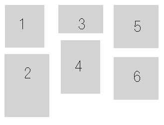
This may not be the exact solution for everybody but I find that (quite literally) thinking outside the box works for many cases: in stead of displaying the the boxes from left to right, in many cases you can fill the left column first, than go to the middle, fill that with boxes and finally fill the right column with boxes. Your image would then be:
 :
:
If you are using a scripting language like php you can also fill the columns from left to right by adding a new box to it and outputting when all columns are filled. eg (untested php code):
$col1 = '<div class="col1"> <div>box1</div>';
$col2 = '<div class="col2"> <div>box2</div>';
$col3 = '<div class="col3"> <div>box3</div>';
$col1 .= '<div>box4</div> </div>'; //last </div> closes the col1 div
$col2 .= '<div>box5</div> </div>';
$col3 .= '<div>box6</div> </div>';
echo $col1.$col2.$col3;
$col1, $col2 and $col3 can have float:left and width: 33%, set the boxes inside the div to full width and no float.
Obviously if you are using javascript / jquery to load the boxes dynamically you are better of styling them this way as well, as explained in other answers to this thread.
Solution 9 - Css
to display just put this css to your div and then you have the desired layout. no need of any plug in or JS.
 .Your_Outer {
	background-color: #FFF;
	border: 1px solid #aaaaaa;
	float: none;
	display:inline-block;
	vertical-align:top;
	margin-left: 5px;
	margin-bottom: 5px;
	min-width: 152.5px;
	max-width: 152.5px;
}
you can edit the code as per your requirements :)
Solution 10 - Css
On modern browsers you can simply do:
display: inline-block;
vertical-align: top;