CSS checkbox input styling
CssCss Problem Overview
Any style for input affects every input element. Is there a way to specify styling to apply for only checkboxes without applying a class to each check box element?
Css Solutions
Solution 1 - Css
With CSS 2 you can do this:
input[type='checkbox'] { ... }
This should be pretty widely supported by now. See support for browsers
Solution 2 - Css
I create my own solution without label
input[type=checkbox] {
         position: relative;
	       cursor: pointer;
    }
    input[type=checkbox]:before {
         content: "";
         display: block;
         position: absolute;
         width: 16px;
         height: 16px;
         top: 0;
         left: 0;
         border: 2px solid #555555;
         border-radius: 3px;
         background-color: white;
}
    input[type=checkbox]:checked:after {
         content: "";
         display: block;
         width: 5px;
         height: 10px;
         border: solid black;
         border-width: 0 2px 2px 0;
         -webkit-transform: rotate(45deg);
         -ms-transform: rotate(45deg);
         transform: rotate(45deg);
         position: absolute;
         top: 2px;
         left: 6px;
}
<input type="checkbox" name="a">
<input type="checkbox" name="a">
<input type="checkbox" name="a">
<input type="checkbox" name="a">
input[type=checkbox] {
         position: relative;
	       cursor: pointer;
    }
    input[type=checkbox]:before {
         content: "";
         display: block;
         position: absolute;
         width: 20px;
         height: 20px;
         top: 0;
         left: 0;
         background-color:#e9e9e9;
}
input[type=checkbox]:checked:before {
         content: "";
         display: block;
         position: absolute;
         width: 20px;
         height: 20px;
         top: 0;
         left: 0;
         background-color:#1E80EF;
}
    input[type=checkbox]:checked:after {
         content: "";
         display: block;
         width: 5px;
         height: 10px;
         border: solid white;
         border-width: 0 2px 2px 0;
         -webkit-transform: rotate(45deg);
         -ms-transform: rotate(45deg);
         transform: rotate(45deg);
         position: absolute;
         top: 2px;
         left: 6px;
}
<input type="checkbox" name="a">
<input type="checkbox" name="a">
<input type="checkbox" name="a">
<input type="checkbox" name="a">
Solution 3 - Css
Something I recently discovered for styling Radio Buttons AND Checkboxes. Before, I had to use jQuery and other things. But this is stupidly simple.
input[type=radio] {
	padding-left:5px;
	padding-right:5px;
	border-radius:15px;

	-webkit-appearance:button;

	border: double 2px #00F;

	background-color:#0b0095;
	color:#FFF;
	white-space: nowrap;
	overflow:hidden;

	width:15px;
	height:15px;
}

input[type=radio]:checked {
	background-color:#000;
	border-left-color:#06F;
	border-right-color:#06F;
}

input[type=radio]:hover {
	box-shadow:0px 0px 10px #1300ff;
}
You can do the same for a checkbox, obviously change the input[type=radio] to input[type=checkbox] and change border-radius:15px; to border-radius:4px;.
Hope this is somewhat useful to you.
Solution 4 - Css
Classes also work well, such as:
<style>
  form input .checkbox
  {
    /* your checkbox styling */
  }
</style>

<form>
  <input class="checkbox" type="checkbox" />
</form>
Solution 5 - Css
Thanks to everyone who contributed to this post. Take a look at just what I was able to accomplish using pure CSS.
input[type=checkbox] {
  position: absolute;
  cursor: pointer;
  width: 0px;
  height: 0px;
}

input[type=checkbox]:checked:before {
	  content: "";
  display: block;
  position: absolute;
  width: 34px;
  height: 34px;
  border: 4px solid #FFCB9A;
  border-radius: 20px;
  background-color: #445768;
  transition: all 0.2s linear;
}


input[type=checkbox]:before {
  content: "";
  display: block;
  position: absolute;
  width: 34px;
  height: 34px;
  border: 4px solid #FFCB9A;
  border-radius: 3px;
  background-color: #445768;
}


input[type=checkbox]:after {
  content: "";
  display: block;
  width: 0px;
  height: 0px;
  border: solid #FFCB9A;
  border-width: 0 0px 0px 0;
  -webkit-transform: rotate(180deg);
  -ms-transform: rotate(180deg);
  transform: rotate(180deg);
  position: absolute;
  top: 0px;
  left: 50px;
  transition: all 0.2s linear;
}

input[type=checkbox]:checked:after {
  content: "";
  display: block;
  width: 12px;
  height: 21px;
  border: solid #FFCB9A;
  border-width: 0 5px 5px 0;
  -webkit-transform: rotate(45deg);
  -ms-transform: rotate(45deg);
  transform: rotate(45deg);
  position: absolute;
  top: 2px;
  left: 14px;
}
<input type="checkbox">
SUMMARY
So the following controls the actual checkbox which we've hidden by adding h:0 & w:0.
input[type=checkbox] {...}
And the rest controls the virtual checkbox.
This controls the virtual checkbox's background when CHECKED.
input[type=checkbox]:checked:before {...}
This controls the virtual checkbox's background when UNCHECKED.
input[type=checkbox]:before {...}
This controls the virtual checkbox's foreground when UNCHECKED.
input[type=checkbox]:after {...}
This controls the virtual checkbox's foreground when CHECKED.
input[type=checkbox]:checked:after {...}
I really hope it helps you as much as it helped me :)
Solution 6 - Css
Solution 7 - Css
input[type="checkbox"] {
 /* your style */
}
But this will only work for browsers except IE7 and below, for those you will have to use a class.
Solution 8 - Css
Trident provides the ::-ms-check pseudo-element for checkbox and radio button controls. For example:
<input type="checkbox">
<input type="radio">

::-ms-check {
    color: red;
    background: black;
    padding: 1em;
}
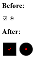
This displays as follows in IE10 on Windows 8:
Solution 9 - Css
Although CSS does provide a way for you to do the style specific to the checkbox type or another type, there are going to be problems with browsers that do not support this.
I think your only option in this case is going to be to apply classes to your checkboxes.
just add the class="checkbox" to your checkboxes.
Then create that style in your css code.
One thing you could do is this:
main.css
input[type="checkbox"] { /* css code here */ }
ie.css
.checkbox{ /* css code here for ie */ }
Then use the IE specific css include:
<!--[if lt IE 7]>
   <link rel="stylesheet" type="text/css" href="ie.css" />
<![endif]-->
You will still need to add the class for it to work in IE, and it will not work in other non-IE browsers that do not support IE. But it will make your website forward-thinking with css code and as IE gets support, you will be able to remove the ie specific css code and also the css classes from the checkboxes.
Solution 10 - Css
As IE6 doesn't understand attribute selectors, you can combine a script only seen by IE6 (with conditional comments) and jQuery or IE7.js by Dean Edwards.
> IE7(.js) is a JavaScript library to make Microsoft Internet Explorer behave like a standards-compliant browser. It fixes many HTML and CSS issues and makes transparent PNG work correctly under IE5 and IE6.
The choice of using classes or jQuery or IE7.js depends on your likes and dislikes and your other needs (maybe PNG-24 transparency throughout your site without having to rely on PNG-8 with complete transparency that fallbacks to 1-bit transparency on IE6 - only created by Fireworks and pngnq, etc)