Column order manipulation using col-lg-push and col-lg-pull in Twitter Bootstrap 3
CssTwitter Bootstrap-3Css Problem Overview
I'm now reading documentation on Twitter Bootstrap 3, and tried to follow column ordering as shown in this page but hit the wall. I don't understand why such a code works nor how to correctly specify the setting. What I want to show is one grid, which is consisted of length 5, and the other length 5, and finally one length 2 grid.
So mine is something like this:
[5] [5] [2]
And what I want to achieve is, when it's viewed on Desktop the layout above is displayed, but when it's viewed on mobile, I want to show the second length 5 object first, then the first length 5 object, and finally the length 2 object, vertically. Like this:
[5] (second)
[5] (first)
[2]
While I tried to follow the step explained in the above documentation, I got the first length 5 object over the second one despite being on mobile platforms, which as I said should display second length 5 object on the top. In other words, I got this:
[5] (first)
[5] (second)
[2]
So how can I correctly put the second one over the first? Or since I use the same length object, could the column ordering not work?
Here's my code for your information:
<div class='row'>
<div class='col-lg-5 col-lg-push-5'></div>
<div class='col-lg-5 col-lg-pull-5'></div>
<div class='col-lg-2'></div>
</div>
Also, the documentation doesn't clarify what pull or push means. So am I missing something?
Thanks.
Css Solutions
Solution 1 - Css
This answer is in three parts, see below for the official release (v3 and v4)
I couldn't even find the col-lg-push-x or pull classes in the original files for RC1 i downloaded, so check your bootstrap.css file. hopefully this is something they will sort out in RC2.
anyways, the col-push-* and pull classes did exist and this will suit your needs. Here is a demo
<div class="row">
    <div class="col-sm-5 col-push-5">
        Content B
    </div>
    <div class="col-sm-5 col-pull-5">
        Content A
    </div>
    <div class="col-sm-2">
        Content C
    </div>
</div>
EDIT: BELOW IS THE ANSWER FOR THE OFFICIAL RELEASE v3.0
Also see This blog post on the subject
-
col-vp-push-x= push the column to the right by x number of columns, starting from where the column would normally render ->position: relative, on a vp or larger view-port. -
col-vp-pull-x= pull the column to the left by x number of columns, starting from where the column would normally render ->position: relative, on a vp or larger view-port.vp = xs, sm, md, or lg
x = 1 thru 12
I think what messes most people up, is that you need to change the order of the columns in your HTML markup (in the example below, B comes before A), and that it only does the pushing or pulling on view-ports that are greater than or equal to what was specified. i.e. col-sm-push-5 will only push 5 columns on sm view-ports or greater. This is because Bootstrap is a "mobile first" framework, so your HTML should reflect the mobile version of your site. The Pushing and Pulling are then done on the larger screens.
- (Desktop) Larger view-ports get pushed and pulled.
- (Mobile) Smaller view-ports render in normal order.
<div class="row">
    <div class="col-sm-5 col-sm-push-5">
        Content B
    </div>
    <div class="col-sm-5 col-sm-pull-5">
        Content A
    </div>
    <div class="col-sm-2">
        Content C
    </div>
</div>
View-port >= sm
|A|B|C|
View-port < sm
|B|
|A|
|C|
EDIT: BELOW IS THE ANSWER FOR v4.0
With v4 comes flexbox and other changes to the grid system and the push\pull classes have been removed in favor of using flexbox ordering.
- Use
.order-*classes to control visual order (where * = 1 thru 12) - This can also be grid tier specific
.order-md-* - Also
.order-first(-1) and.order-last(13) avalable
<div class="row">
  <div class="col order-2">1st yet 2nd</div>
  <div class="col order-1">2nd yet 1st</div>
</div>
Solution 2 - Css
Pull "pulls" the div towards the left of the browser and and Push "pushes" the div away from left of browser.
Like:
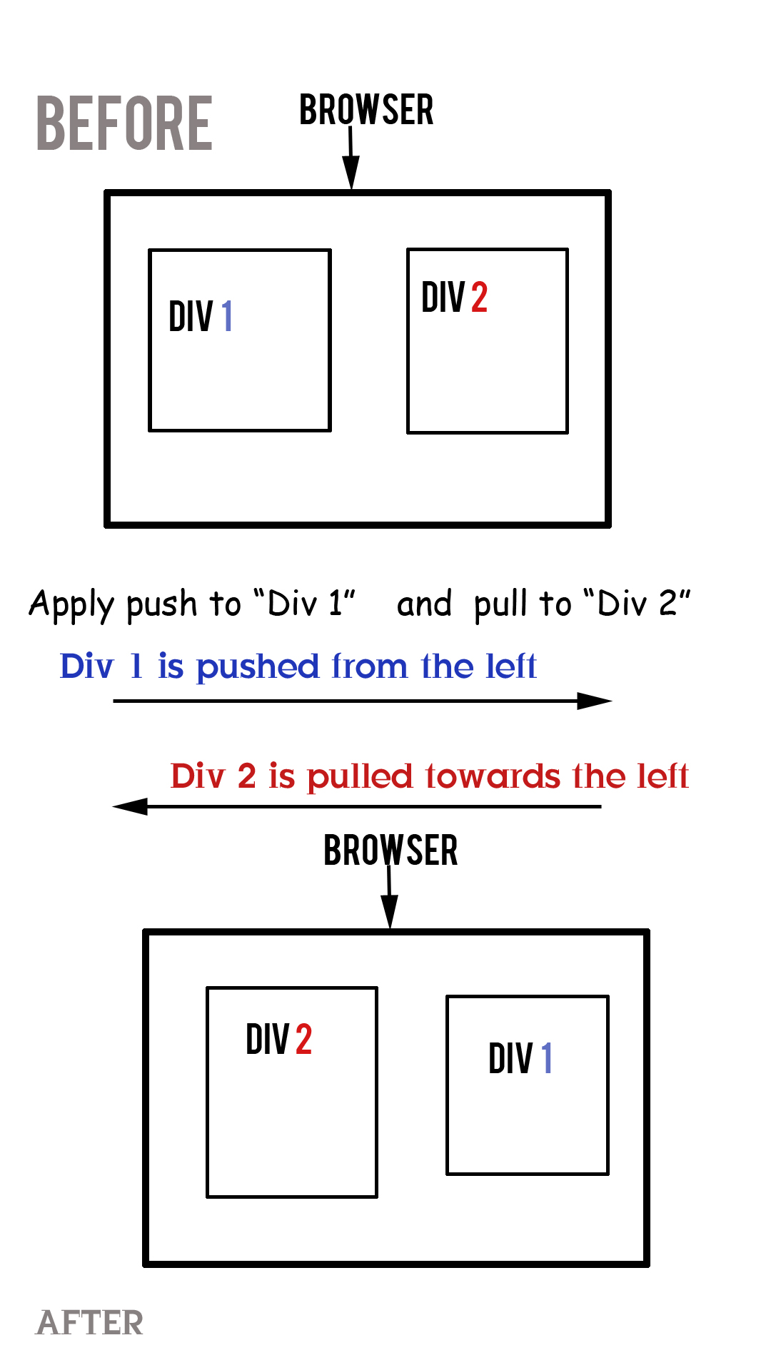
So basically in a 3 column layout of any web page the "Main Body" appears at the "Center" and in "Mobile" view the "Main Body" appears at the "Top" of the page. This is mostly desired by everyone with 3 column layout.
<div class="container">
	<div class="row">
		<div id="content" class="col-lg-4 col-lg-push-4 col-sm-12">
		<h2>This is Content</h2>
		<p>orem Ipsum ...</p>
		</div>

		<div id="sidebar-left" class="col-lg-4  col-sm-6 col-lg-pull-4">
		<h2>This is Left Sidebar</h2>
		<p>orem Ipsum...</p>
		</div>


		<div id="sidebar-right" class="col-lg-4 col-sm-6">
		<h2>This is Right Sidebar</h2>
		<p>orem Ipsum.... </p>
		</div>
	</div>
</div>
You can view it here: http://jsfiddle.net/DrGeneral/BxaNN/1/
Hope it helps
Solution 3 - Css
Misconception Common misconception with column ordering is that, I should (or could) do the pushing and pulling on mobile devices, and that the desktop views should render in the natural order of the markup. This is wrong.
Reality Bootstrap is a mobile first framework. This means that the order of the columns in your HTML markup should represent the order in which you want them displayed on mobile devices. This mean that the pushing and pulling is done on the larger desktop views. not on mobile devices view..
> Brandon Schmalz - Full Stack Web Developer Have a look at full description here
Solution 4 - Css
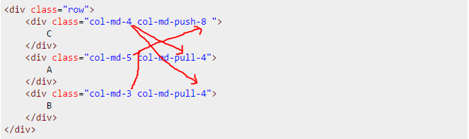
I just felt like I'll add my $0.2 to those 2 good answers. I had a case when I had to move the last column all the way to the top in a 3-column situation.
[A][B][C]
to
[C]
[A]
[B]
Boostrap's class .col-xx-push-Xdoes nothing else but pushes a column to the right with left: XX%;
so all you have to do to push a column right is to add the number of pseudo columns going left.
In this case:
-
two columns (
col-md-5andcol-md-3) are going left, each with the value of the one that is going right; -
one(
col-md-4) is going right by the sum of the first two going left (5+3=8);
<div class="row">
	<div class="col-md-4 col-md-push-8 ">
		C
	</div>
	<div class="col-md-5 col-md-pull-4">
		A
	</div>
	<div class="col-md-3 col-md-pull-4">
		B
	</div>
</div>
Solution 5 - Css
If you need to organize data in columns of 1 / 2 / 4 depending of the viewport size then push and pull may be no option at all. No matter how you order your items in the first place, one of the sizes may give you a wrong order.
A solution in this case is to use nested rows and cols without any push or pull classes.
Example
In XS you want...
A
B
C
D
E
F
G
H
In SM you want...
A   E
B   F
C   G
D   H
In MD and above you want...
A   C   E   G
B   D   F   H
Solution
Use nested two-column child elements in a surrounding two-column parent element:
Here is a working snippet:
<script src="https://code.jquery.com/jquery-1.12.4.min.js" type="text/javascript" ></script>
<link href="//maxcdn.bootstrapcdn.com/bootstrap/3.3.6/css/bootstrap.min.css" rel="stylesheet">
<script src="//maxcdn.bootstrapcdn.com/bootstrap/3.3.6/js/bootstrap.min.js"></script>

<div class="row">
  <div class="col-sm-6">
    <div class="row">
      <div class="col-md-6"><p>A</p><p>B</p></div>
      <div class="col-md-6"><p>C</p><p>D</p></div>
    </div>
  </div>
  <div class="col-sm-6">
    <div class="row">
      <div class="col-md-6"><p>E</p><p>F</p></div>
      <div class="col-md-6"><p>G</p><p>H</p></div>
    </div>
  </div>
</div>
Another beauty of this solution is, that the items appear in the code in their natural order (A, B, C, ... H) and don't have to be shuffled, which is nice for CMS generation.