Bootstrap 3 Navbar Collapse
Twitter BootstrapTwitter Bootstrap-3NavbarTwitter Bootstrap Problem Overview
Is there any way to increase the point at which the bootstrap 3 navbar collapses (i.e. so that it collapses into a drop down on portrait tablets)?
These two were applicable to bootstrap 2 but not now!
Twitter Bootstrap Solutions
Solution 1 - Twitter Bootstrap
I had the same problem today.
Bootstrap 4
It's a native functionality: https://getbootstrap.com/docs/4.0/components/navbar/#responsive-behaviors
You have to use .navbar-expand{-sm|-md|-lg|-xl} classes:
<nav class="navbar navbar-expand-md navbar-light bg-light">
Bootstrap 3
@media (max-width: 991px) {
    .navbar-header {
        float: none;
    }
    .navbar-toggle {
        display: block;
    }
    .navbar-collapse {
        border-top: 1px solid transparent;
        box-shadow: inset 0 1px 0 rgba(255,255,255,0.1);
    }
    .navbar-collapse.collapse {
        display: none!important;
    }
    .navbar-nav {
        float: none!important;
        margin: 7.5px -15px;
    }
    .navbar-nav>li {
        float: none;
    }
    .navbar-nav>li>a {
        padding-top: 10px;
        padding-bottom: 10px;
    }
    .navbar-text {
        float: none;
        margin: 15px 0;
    }
    /* since 3.1.0 */
    .navbar-collapse.collapse.in {
        display: block!important;
    }
    .collapsing {
        overflow: hidden!important;
    }
}
Just change 991px by 1199px for md sizes.
Solution 2 - Twitter Bootstrap
The big difference between Bootstrap 2 and Bootstrap 3 is that Bootstrap 3 is "mobile first".
That means the default styles are designed for mobile devices and in the case of Navbars, that means it's "collapsed" by default and "expands" when it reaches a certain minimum size.
Bootstrap 3's site actually has a "hint" as to what to do: http://getbootstrap.com/components/#navbar
> Customize the collapsing point > > Depending on the content in your navbar, you might need to change the point at which your navbar switches between collapsed and horizontal mode. Customize the @grid-float-breakpoint variable or add your own media query.
If you're going to re-compile your LESS, you'll find the noted LESS variable in the variables.less file. It's currently set to "expand" @media (min-width: 768px) which is a "small screen" (ie. a tablet) by Bootstrap 3 terms.
@grid-float-breakpoint: @screen-tablet;
If you want to keep the collapsed a little longer you can adjust it like such:
@grid-float-breakpoint: @screen-desktop; (992px break-point)
or expand sooner
@grid-float-breakpoint: @screen-phone (480px break-point)
If you want to have it expand later, and not deal with re-compiling the LESS, you'll have to overwrite the styles that get applied at the 768px media query and have them return to the previous value. Then re-add them at the appropriate time.
I'm not sure if there's a better way to do it. Recompiling the Bootstrap LESS to your needs is the best (easiest) way. Otherwise, you'll have to find all the CSS media queries that affect your Navbar, overwrite them to default styles @ the 768px width and then revert them back at a higher min-width.
Recompiling the LESS will do all that magic for you just by changing the variable. Which is pretty much the point of LESS/SASS pre-compilers. =)
(note, I did look them all up, it's about 100 lines of code, which is annoy enough for me to drop the idea and just re-compile Bootstrap for a given project and avoid messing something up by accident)
I hope that helps!
Cheers!
Solution 3 - Twitter Bootstrap
http://getbootstrap.com/customize/#less-variables">**Easiest way is to customize bootstrap**
find variable:
@grid-float-breakpoint
which is set to @screen-sm, you can change it according to your needs. Hope it helps!
Solution 4 - Twitter Bootstrap
these are controlled in variables, no need to muck around in source. with bootstrap, try variables first, then overrides. then go back and try variables again ;)
i used bootstrap-sass with rails, but it's the same with the default LESS.
FILE: main.css.scss
-------------------

// control the screen sizes
$screen-xs-min: 300px;
$screen-sm-min: 400px;
$screen-md-min: 800px;
$screen-lg-min: 1200px;

// this tells which screen size to use to start breaking on
// will tell navbar when to collapse
$grid-float-breakpoint: $screen-md-min;

// then import your bootstrap
@import "bootstrap";
that's it! this variables reference page is super handy: https://github.com/twbs/bootstrap/blob/master/less/variables.less
Solution 5 - Twitter Bootstrap
Thanks to Seb33300 I got this working. However, an important part seems to be missing. At least in Bootstrap version 3.1.1.
My problem was that the navbar collapsed accordingly at the correct width, but the menu button didn't work. I couldn't expand and collapse the menu.
This is because the collapse.in class is overrided by the !important in .navbar-collapse.collapse, and can be solved by also adding the "collapse.in". Seb33300's example completed below:
@media (max-width: 991px) {
    .navbar-header {
        float: none;
    }
    .navbar-toggle {
        display: block;
    }
    .navbar-collapse {
        border-top: 1px solid transparent;
        box-shadow: inset 0 1px 0 rgba(255,255,255,0.1);
    }
    .navbar-collapse.collapse {
        display: none!important;
    }
    .navbar-collapse.collapse.in {
        display: block!important;
    }
    .navbar-nav {
        float: none!important;
        margin: 7.5px -15px;
    }
    .navbar-nav>li {
        float: none;
    }
    .navbar-nav>li>a {
        padding-top: 10px;
        padding-bottom: 10px;
    }
}
Solution 6 - Twitter Bootstrap
I wanted to upvote and comment on jmbertucci's answer, but I'm not yet to be trusted with the controls. I had the same issue and resolved it as he said. If you are using Bootstrap 3.0, edit the LESS variables in variables.less The responsive break points are set around line 200:
@screen-xs:                  480px;
@screen-phone:               @screen-xs;

// Small screen / tablet
@screen-sm:                  768px;
@screen-tablet:              @screen-sm;

// Medium screen / desktop
@screen-md:                  992px;
@screen-desktop:             @screen-md;

// Large screen / wide desktop
@screen-lg:                  1200px;
@screen-lg-desktop:          @screen-lg;

// So media queries don't overlap when required, provide a maximum
@screen-xs-max:              (@screen-sm - 1);
@screen-sm-max:              (@screen-md - 1);
@screen-md-max:              (@screen-lg - 1);
Then set the collapse value for the navbar using the @grid-float-breakpoint variable at about line 232. By default it's set to @screen-tablet . If you want you can use a pixel value, but I prefer to use the LESS variables.
Solution 7 - Twitter Bootstrap
If the problem you face is the menu breaking into multiple lines, you can try one of the following:
-
Try to reduce the number of menu items or their length, like removing menu items or shortening the words.
-
Reducing the padding between the menu items, like this:
.navbar .nav > li > a { padding: 10px 15px 10px; /* Change here the second value for padding-left and padding right */ }
Default padding is 15px both sides (left and right).
If you prefer to change each individual side use:
padding-left: 7px;
padding-right: 8px;
This setting affects the dropdown list too.
This doesn't answer the question but it could help others who don't want to mess with the CSS or using LESS variables. The two common approaches to solve this problem.
Solution 8 - Twitter Bootstrap
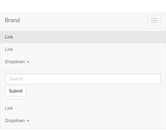
The nabvar will collapse on small devices. The point of collapsing is defined by @grid-float-breakpoint in variables. By default this will by before 768px. For screens below the 768 pixels screen width, the navbar will look like:
It's possible to change the @grid-float-breakpoint in variables.less and recompile Bootstrap. When doing this you also will have to change @screen-xs-max in navbar.less. You will have to set this value to your new @grid-float-breakpoint -1. See also: https://github.com/twbs/bootstrap/pull/10465. This is needed to change navbar forms and dropdowns at the @grid-float-breakpoint to their mobile version too.
Solution 9 - Twitter Bootstrap
I am concerned about maintenance and upgrade problems down the road from customizing Bootstrap. I can document the customization steps today and hope that the person upgrading Bootstrap three years from now will find the documentation and reapply the steps (that may or may not work at that point). An argument can be made either way, I suppose, but I prefer keeping any customizations in my code.
I don't quite understand how Seb33300's approach can work, though. It certainly did not work with Bootstrap 4.0.3. For the nav bar to expand at 1200 instead of 768, rules for both media queries must be overridden to prevent expanding at 768 and force expanding at 1200.
I have a longer menu that would wrap on the iPad in Portrait mode. The following keeps the menu collapsed until the 1200 breakpoint:
@media (min-width: 768px) {
    .navbar-header {
        float: none; }
    .navbar-toggle {
        display: block; }
    .navbar-fixed-top .navbar-collapse,
    .navbar-static-top .navbar-collapse,
    .navbar-fixed-bottom .navbar-collapse {
        padding-right: 15px;
        padding-left: 15px; }
    .navbar-collapse.collapse {
        display: none !important; }
        .navbar-collapse.collapse.in {
        display: block!important;
        margin-top: 0px; }
}
@media (min-width: 1200px) {
    .navbar-header {
        float: left; }
    .navbar-toggle {
    display: none; }
    .navbar-fixed-top .navbar-collapse,
    .navbar-static-top .navbar-collapse,
    .navbar-fixed-bottom .navbar-collapse {
        display: block !important; }
}
Solution 10 - Twitter Bootstrap
I did the CSS way with my install of Bootstrap 3.0.0, since I am not that familiar with LESS. Here is the code that I added to my custom css file (which I load after bootstrap.css) which allowed me to control so the menu was always working like an accordion.
Note: I wrapped my whole navbar inside a div with the class sidebar to separate out the behavior I wanted so it did not affect other navbars on my site, like the main menu. Adjust along your needs, hope it is of help.
/* Sidebar Menu Fix */

.sidebar .navbar-nav {
  margin: 7.5px -15px;
}
.sidebar .navbar-nav > li > a {
  padding-top: 10px;
  padding-bottom: 10px;
  line-height: 20px;
}
.sidebar .navbar-collapse {
  max-height: 500px;
}
.sidebar .navbar-nav .open .dropdown-menu {
  position: static;
  float: none;
  width: auto;
  margin-top: 0;
  background-color: transparent;
  border: 0;
  box-shadow: none;
}
.sidebar .dropdown-menu > li > a {
  color: #777777;
}
.sidebar .navbar-default .navbar-nav .open .dropdown-menu > li > a:hover,
.sidebar .navbar-default .navbar-nav .open .dropdown-menu > li > a:focus {
  color: #333333;
  background-color: transparent;
}
.sidebar .navbar-default .navbar-nav .open .dropdown-menu > .active > a,
.sidebar .navbar-default .navbar-nav .open .dropdown-menu > .active > a:hover,
.sidebar .navbar-default .navbar-nav .open .dropdown-menu > .active > a:focus {
  color: #555555;
  background-color: #e7e7e7;
}
.sidebar .navbar-nav {
  float: none;
}
.sidebar .navbar-nav > li {
  float: none;
}
Additional note: I also added a change to the toggle of the main menu navbar (since the code above on my site is used for a "submenu" on the side.
I changed:
<button type="button" class="navbar-toggle" data-toggle="collapse" data-target=".navbar-collapse">
into:
<button type="button" class="navbar-toggle" data-toggle="collapse" data-target=".navbar-collapse-topmenu">
And then also adjusted:
<div class="navbar-collapse collapse navbar-collapse">
into:
<div class="navbar-collapse collapse navbar-collapse-topmenu">
If you will only have one navbar I guess you will not need to worry about this, but it helped me in my case.
Solution 11 - Twitter Bootstrap
And for those who want to collapse at a width less than the standard 768px (expand at a width less than 768px), this is the css needed:
@media (min-width: 600px) {
.navbar-header {
        float: left;
}
.navbar-toggle {
    display: none;
}
.navbar-collapse {
    border-top: 0 none;
    box-shadow: none;
    width: auto;
}
.navbar-collapse.collapse {
    display: block !important;
    height: auto !important;
    padding-bottom: 0;
    overflow: visible !important;
}
.navbar-nav {
    float: left !important;
    margin: 0;
}
.navbar-nav>li {
    float: left;
}
.navbar-nav>li>a {
    padding-top: 15px;
    padding-bottom: 15px;
}
}
Solution 12 - Twitter Bootstrap
I think I found a simple solution to changing the collapse breakpoint, only through css.
I hope others can confirm it since I didn't test it thoroughly and I'm not sure if there are side effects to this solution.
You have to change the media query values for the following class definitions:
@media (min-width: BREAKPOINT px ){
    .navbar-toggle{display:none}
}

@media (min-width: BREAKPOINT px){
    .navbar-collapse{
        width:auto;
        border-top:0;box-shadow:none
    }
    .navbar-collapse.collapse{
        display:block!important;height:auto!important;padding-bottom:0;overflow:visible!important
    }
    .navbar-collapse.in{
        overflow-y:visible
   }
   .navbar-fixed-top .navbar-collapse,.navbar-static-top .navbar-collapse,.navbar-fixed-bottom .navbar-collapse{
        padding-left:0;padding-right:0
    }
}
This is what worked for me on my current project, but I still need to change some css definitions to arrange the menu properly for all screen sizes.
Hope this helps.