Change Bootstrap input focus blue glow
HtmlCssTwitter BootstrapHtml Problem Overview
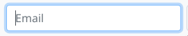
Does anyone know the how to change Bootstrap's input:focus? The blue glow that shows up when you click on an input field?
Html Solutions
Solution 1 - Html
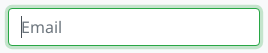
In the end I changed the following css entry in bootstrap.css
textarea:focus,
input[type="text"]:focus,
input[type="password"]:focus,
input[type="datetime"]:focus,
input[type="datetime-local"]:focus,
input[type="date"]:focus,
input[type="month"]:focus,
input[type="time"]:focus,
input[type="week"]:focus,
input[type="number"]:focus,
input[type="email"]:focus,
input[type="url"]:focus,
input[type="search"]:focus,
input[type="tel"]:focus,
input[type="color"]:focus,
.uneditable-input:focus {
  border-color: rgba(126, 239, 104, 0.8);
  box-shadow: 0 1px 1px rgba(0, 0, 0, 0.075) inset, 0 0 8px rgba(126, 239, 104, 0.6);
  outline: 0 none;
}
Solution 2 - Html
You can use the .form-control selector to match all inputs. For example to change to red:
.form-control:focus {
  border-color: #FF0000;
  box-shadow: inset 0 1px 1px rgba(0, 0, 0, 0.075), 0 0 8px rgba(255, 0, 0, 0.6);
}
Put it in your custom css file and load it after bootstrap.css. It will apply to all inputs including textarea, select etc...
Solution 3 - Html
You can modify the .form-control:focus color without altering the bootstrap style in this way:
Quick fix
.form-control:focus {
		border-color: #28a745;
		box-shadow: 0 0 0 0.2rem rgba(40, 167, 69, 0.25);
	}
Full explanation
- Find the bootstrapCDN version that you are using. E.g. for me right now is 4.3.1: https://maxcdn.bootstrapcdn.com/bootstrap/4.3.1/css/bootstrap.css
- Search for the class you want to modify. E.g.
.form-control:focusand copy the parameters that you want to modify into your css. In this case isborder-colorandbox-shadow. - Choose a color for the
border-color. In this case I choose to pick up the same green the bootstrap uses for their.btn-successclass, by searching for that particular class in the bootstrap.css page mentioned in the step 1. - Convert the color you have picked to RGB and add that to the
box-shadowparameter without altering the fourth RGBA parameter (0.25) that bootstrap has for transparency.
Solution 4 - Html
If you are using Bootstrap 3.x, you can now change the color with the new @input-border-focus variable.
See the commit for more info and warnings.
In _variables.scss update @input-border-focus.
To modify the size/other parts of this glow modify the mixins/_forms.scss
@mixin form-control-focus($color: $input-border-focus) {
  $color-rgba: rgba(red($color), green($color), blue($color), .6);
  &:focus {
    border-color: $color;
    outline: 0;
    @include box-shadow(inset 0 1px 1px rgba(0,0,0,.075), 0 0 4px $color-rgba);
  }
}
Solution 5 - Html
For Bootstrap v4.0.0 beta release you will need the following added to a stylesheet that overrides Bootstrap (either add in after CDN/local link to bootstrap v4.0.0 beta or add !important to the stylings:
.form-control:focus {
  border-color: #6265e4 !important;
  box-shadow: 0 0 5px rgba(98, 101, 228, 1) !important;
}
Replace the border-color and the rgba on the box-shadow with which ever colour style you'd like*.
Solution 6 - Html
In Bootstrap 4, if you compile SASS by yourself, you can change the following variables to control the styling of the focus shadow:
$input-btn-focus-width:       .2rem !default;
$input-btn-focus-color:       rgba($component-active-bg, .25) !default;
$input-btn-focus-box-shadow:  0 0 0 $input-btn-focus-width $input-btn-focus-color !default;
Note: as of Bootstrap 4.1, the $input-btn-focus-color and $input-btn-focus-box-shadow variables are used only for input elements, but not for buttons. The focus shadow for buttons is hardcoded as box-shadow: 0 0 0 $btn-focus-width rgba($border, .5);, so you can only control the shadow width via the $input-btn-focus-width variable.
Solution 7 - Html
Here are the changes if you want Chrome to show the platform default "yellow" outline.
textarea:focus, input[type="text"]:focus, input[type="password"]:focus, input[type="datetime"]:focus, input[type="datetime-local"]:focus, input[type="date"]:focus, input[type="month"]:focus, input[type="time"]:focus, input[type="week"]:focus, input[type="number"]:focus, input[type="email"]:focus, input[type="url"]:focus, input[type="search"]:focus, input[type="tel"]:focus, input[type="color"]:focus, .uneditable-    input:focus {
    border-color: none;
    box-shadow: none;
    -webkit-box-shadow: none;
    outline: -webkit-focus-ring-color auto 5px;
}
Solution 8 - Html
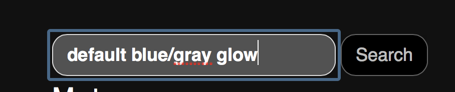
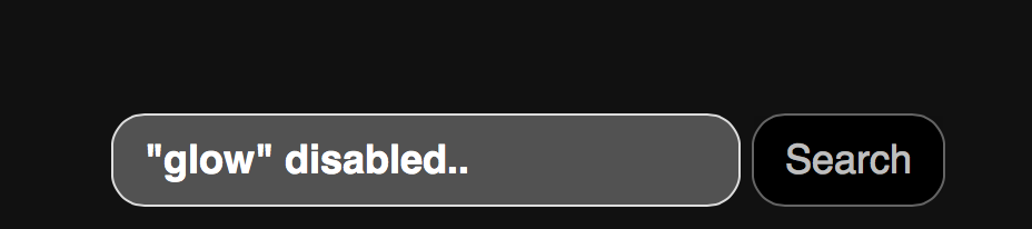
To disable the blue glow (but you can modify the code to change color, size, etc), add this to your css:
.search-form input[type="search"] {
    -webkit-box-shadow: none;
    outline: -webkit-focus-ring-color auto 0px;
}
Here's a screencapture showing the effect: before and after:
Solution 9 - Html
I landed to this thread looking for the way to disable glow altogether. Many answers were overcomplicated for my purpose. For easy solution, I just needed one line of CSS as follows.
input, textarea, button {outline: none; }
Solution 10 - Html
Add an Id to the body tag. In your own Css (not the bootstrap.css) point to the new body ID and set the class or tag you want to override and the new properties. Now you can update bootstrap anytime without loosing your changes.
html file:
<body id="bootstrap-overrides">
css file:
#bootstrap-overrides input[type="text"]:focus, input[type="password"]:focus, input[type="email"]:focus, input[type="url"]:focus, textarea:focus{
  border-color: red;
  box-shadow: 0 1px 1px rgba(0, 0, 0, 0.075) inset, 0 0 8px rgba(126, 239, 104, 0.6);
  outline: 0 none;
}
See also: https://stackoverflow.com/questions/20721248/best-way-to-override-bootstrap-css
Solution 11 - Html
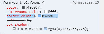
Actually, in Bootstrap 4.0.0-Beta (as of October 2017) the input element isn't referenced by input[type="text"], all Bootstrap 4 properties for the input element are actually form based.
So it's using the .form-control:focus styles. The appropriate code for the "on focus" highlighting of an input element is the following:
.form-control:focus {
  color: #495057;
  background-color: #fff;
  border-color: #80bdff;
  outline: none;
}
Pretty easy to implement, just change the border-color property.
Solution 12 - Html
Simple one
To remove it:
.form-control, .btn {
    box-shadow: none !important;
    outline: none !important;
}
To change it
.form-control, .btn {
    box-shadow: new-value !important;
    outline: new-value !important;
}
Solution 13 - Html
If you want to remove the shadow completely add the class shadow-none to your input element.
Solution 14 - Html
Building up on @wasinger's reply above, in Bootstrap 4.5 I had to override not only the color variables but also the box-shadow itself.
$input-focus-width: .2rem !default;
$input-focus-color: rgba($YOUR_COLOR, .25) !default;
$input-focus-border-color: rgba($YOUR_COLOR, .5) !default;
$input-focus-box-shadow: 0 0 0 $input-focus-width $input-focus-color !default;
Solution 15 - Html
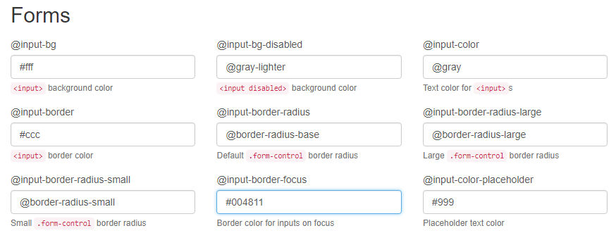
In Bootstrap 3.3.7 you can change the @input-border-focus value in the Forms section of the customizer:
Solution 16 - Html
For the input border before the focus. You can specify your favorite color you want to use and other css like padding etc
.input {
    padding: 6px 190px 6px 15px;
    outline: #2a65ea auto 105px ;
}
When we focus on input. You can specify your favorite color outline you wish
.input:focus{
    box-shadow: none;
    border-color: none;
    outline: lightgreen auto 5px ;
}
Solution 17 - Html
Why not just use ?
 input:focus{
        outline-color : #7a0ac5;
    }
Solution 18 - Html
I could not resolve this with CSS. It seems like Boostrap is getting the last say even though I have by site.css after bootstrap. In any event, this worked for me.
$(document).ready(function () {
    var elements = document.getElementsByClassName("form-control");

    Array.from(elements).forEach(function () {
        this.addEventListener("click", cbChange, false);
    })

    });

function cbChange(event) {
    var ele = event.target;
    var obj = document.getElementById(ele.id);
    obj.style.borderColor = "lightgrey";
}
Later I found this to work in the css. Obviously with form-controls only
.form-control.focus, .form-control:focus {
    border-color: gainsboro;
}
Here are before and after shots from Chrome Developer tool. Notice the difference in border color between focus on and focus off. On a side note, this does not work for buttons. With buttons. With buttons you have to change outline property to none.
Solution 19 - Html
This will work 100% use this:
.form-control, .form-control:focus{
   box-shadow: 0 0 0 0 rgba(255, 255, 255, 0);
   border: rgba(255, 255, 255, 0);
}
Solution 20 - Html
This should help remove it!
input[type = text] {
  border: none;
}

input[type = text]:focus {
  border: none;
  box-shadow: none;
 }
Solution 21 - Html
Try this, it's same as bootstrap's input...
input:focus{
  color: #212529;
  background-color: #FFF;
  border-color: #86B7FE;
  outline: 0;
  box-shadow: 0 0 0 .25rem rgba(13, 110, 253, .25);
}