Table scroll with HTML and CSS
HtmlCssHtml TableHtml Problem Overview
I have a table like that which i fill with a data
<table id="products-table"  style="overflow-y:scroll" >
    <thead>
        <tr>
            <th>Product (Parent Product)</th>
            <th>Associated Sites</th>
            <th>Actions</th>
        </tr>
    </thead>
    <tbody>
        @for (int i = 0; i < Model.Count(); i++)
        {
        <tr>
            <td>
                <a href="Edit"><strong>@Model.ElementAt(i).Name</strong></a><br />
            </td>
            <td>
                <span class="lesser"></span>
            </td>
            <td>@Html.ActionLink("Edit Product", "Edit", "Products")<br />
                @Html.ActionLink("Associate Site", "Associate", "Products")
            </td>
         </tr>
        }
        <tr>
</tbody>
</table>
and CSS like that
    #products-table
{
     width: 200px;
    height: 400px;
    overflow:scroll;
}
but scroll doesn't work, I want to fix the height of the table and if it exceeds, then work with scrollbar
Html Solutions
Solution 1 - Html
Table with Fixed Header
<table cellspacing="0" cellpadding="0" border="0" width="325">
  <tr>
    <td>
       <table cellspacing="0" cellpadding="1" border="1" width="300" >
         <tr style="color:white;background-color:grey">
            <th>Header 1</th>
            <th>Header 2</th>
         </tr>
       </table>
    </td>
  </tr>
  <tr>
    <td>
       <div style="width:320px; height:80px; overflow:auto;">
         <table cellspacing="0" cellpadding="1" border="1" width="300" >
           <tr>
             <td>new item</td>
             <td>new item</td>
           </tr>
           <tr>
             <td>new item</td>
             <td>new item</td>
           </tr>
              <tr>
             <td>new item</td>
             <td>new item</td>
           </tr>
              <tr>
             <td>new item</td>
             <td>new item</td>
           </tr>
              <tr>
             <td>new item</td>
             <td>new item</td>
           </tr>
              <tr>
             <td>new item</td>
             <td>new item</td>
           </tr>
              <tr>
             <td>new item</td>
             <td>new item</td>
           </tr>
              <tr>
             <td>new item</td>
             <td>new item</td>
           </tr>
              <tr>
             <td>new item</td>
             <td>new item</td>
           </tr>
              <tr>
             <td>new item</td>
             <td>new item</td>
           </tr>
         </table>
       </div>
    </td>
  </tr>
</table>
Result
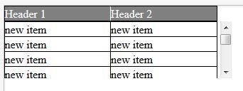
This is working in all browser
Demo jsfiddle http://jsfiddle.net/nyCKE/6302/
Solution 2 - Html
Late answer, another idea, but very short.
- put the contents of header cells into div
- fix the header contents, see CSS
table  { margin-top:  20px; display: inline-block; overflow: auto; }
th div { margin-top: -20px; position: absolute; }
Note that it is possible to display table as inline-block due to anonymous table objects:
> "missing" [in HTML table tree structure] elements must be assumed in order for the table model to work. Any table element will automatically generate necessary anonymous table objects around itself.
/* scrolltable rules */
table  { margin-top:  20px; display: inline-block; overflow: auto; }
th div { margin-top: -20px; position: absolute; }

/* design */
table { border-collapse: collapse; }
tr:nth-child(even) { background: #EEE; }
<table style="height: 150px">
  <tr> <th><div>first</div> <th><div>second</div>
  <tr> <td>foo <td>bar
  <tr> <td>foo foo foo foo foo <td>bar
  <tr> <td>foo <td>bar
  <tr> <td>foo <td>bar bar bar
  <tr> <td>foo <td>bar
  <tr> <td>foo <td>bar
  <tr> <td>foo <td>bar
  <tr> <td>foo <td>bar
  <tr> <td>foo <td>bar
  <tr> <td>foo <td>bar
  <tr> <td>foo <td>bar
  <tr> <td>foo <td>bar
  <tr> <td>foo <td>bar
  <tr> <td>foo <td>bar
</table>
As of 2016
The proper way to achieve this is position: sticky - see the demo in the link.
Solution 3 - Html
For those wondering how to implement Garry's solution with more than one header this is it:
#wrapper {
  width: 235px;
}

table {
  border: 1px solid black;
  width: 100%;
}

th,
td {
  width: 100px;
  border: 1px solid black;
}

thead>tr {
  position: relative;
  display: block;
}

tbody {
  display: block;
  height: 80px;
  overflow: auto;
}
<div id="wrapper">
  <table>
    <thead>
      <tr>
        <th>column1</th>
        <th>column2</th>
      </tr>
    </thead>
    <tbody>
      <tr>
        <td>row1</td>
        <td>row1</td>
      </tr>
      <tr>
        <td>row2</td>
        <td>row2</td>
      </tr>
      <tr>
        <td>row3</td>
        <td>row3</td>
      </tr>
      <tr>
        <td>row4</td>
        <td>row4</td>
      </tr>
    </tbody>
  </table>
</div>
Solution 4 - Html
Works only in Chrome but it can be adapted to other modern browsers. Table falls back to common table with scroll bar in other brws. Uses CSS3 FLEX property.
<table border="1px" class="flexy">
	<caption>Lista Sumnjivih vozila:</caption>
	<thead>
	    <tr>
	        <td>Opis Sumnje</td>
		<td>Registarski<br>broj vozila</td>
		<td>Datum<br>Vreme</td>
		<td>Brzina<br>(km/h)</td>
		<td>Lokacija</td>
		<td>Status</td>
		<td>Akcija</td>
	    </tr>
    </thead>
    <tbody>

	    <tr>
		<td>Osumnjičen tranzit</td>
		<td>NS182TP</td>
		<td>23-03-2014 20:48:08</td>
		<td>11.3</td>
		<td>Raskrsnica kod pumpe<br></td>
		<td></td>
		<td>Prikaz</td>
	    </tr>
	    <tr>

	    <tr>
		<td>Osumnjičen tranzit</td>
		<td>NS182TP</td>
		<td>23-03-2014 20:48:08</td>
		<td>11.3</td>
		<td>Raskrsnica kod pumpe<br></td>
		<td></td>
		<td>Prikaz</td>
	    </tr>
	    <tr>

	    <tr>
		<td>Osumnjičen tranzit</td>
		<td>NS182TP</td>
		<td>23-03-2014 20:48:08</td>
		<td>11.3</td>
		<td>Raskrsnica kod pumpe<br></td>
		<td></td>
		<td>Prikaz</td>
	    </tr>
	    <tr>


	    <tr>
		<td>Osumnjičen tranzit</td>
		<td>NS182TP</td>
		<td>23-03-2014 20:48:08</td>
		<td>11.3</td>
		<td>Raskrsnica kod pumpe<br></td>
		<td></td>
		<td>Prikaz</td>
	    </tr>

	</tbody>
</table>
Style (CSS 3):
caption {
	display: block;
	line-height: 3em;
	width: 100%;
	-webkit-align-items: stretch;
	border: 1px solid #eee;
}

       .flexy {
        	display: block;
            width: 90%;
            border: 1px solid #eee;
        	max-height: 320px;
        	overflow: auto;
        }

        .flexy thead {
        	display: -webkit-flex;
        	-webkit-flex-flow: row;
        }

        .flexy thead tr {
        	padding-right: 15px;
        	display: -webkit-flex;
        	width: 100%;
        	-webkit-align-items: stretch;
        }

        .flexy tbody {
        	display: -webkit-flex;
        	height: 100px;
        	overflow: auto;
        	-webkit-flex-flow: row wrap;
        }
        .flexy tbody tr{
        	display: -webkit-flex;
        	width: 100%;
        }

        .flexy tr td {
        	width: 15%;
        }
Solution 5 - Html
This work for me
Demo: jsfiddle
$(function()
{
  	Fixed_Header();
});
function Fixed_Header()
{
    $('.User_Table thead').css({'position': 'absolute'});
    $('.User_Table tbody tr:eq("2") td').each(function(index,e){
        $('.User_Table thead tr th:eq("'+index+'")').css({'width' : $(this).outerWidth() +"px" });
    });
    var Header_Height = $('.User_Table thead').outerHeight();
    $('.User_Table thead').css({'margin-top' : "-"+Header_Height+"px"});
    $('.User_Table').css({'margin-top' : Header_Height+"px"});
}
Solution 6 - Html
<div style="overflow:auto">
    <table id="table2"></table>
</div>
Try this code for overflow table it will work only on div tag
Solution 7 - Html
  .outer {
    overflow-y: auto;
    height: 300px;
  }

  .outer {
    width: 100%;
    -layout: fixed;
  }

  .outer th {
    text-align: left;
    top: 0;
    position: sticky;
    background-color: white;
  }
<!DOCTYPE html>
<html lang="en">
<head>
    <meta charset="UTF-8">
    <meta name="viewport" content="width=device-width, initial-scale=1.0">
    <meta http-equiv="X-UA-Compatible" content="ie=edge">
    <title>MYCRUD</title>
    <link rel="stylesheet" href="https://use.fontawesome.com/releases/v5.7.0/css/all.css" integrity="sha384-lZN37f5QGtY3VHgisS14W3ExzMWZxybE1SJSEsQp9S+oqd12jhcu+A56Ebc1zFSJ" crossorigin="anonymous">
    <link rel="stylesheet" href="https://stackpath.bootstrapcdn.com/bootstrap/4.3.1/css/bootstrap.min.css" integrity="sha384-ggOyR0iXCbMQv3Xipma34MD+dH/1fQ784/j6cY/iJTQUOhcWr7x9JvoRxT2MZw1T" crossorigin="anonymous">
</head>
<body>

<div class="container-fluid col-md-11">
  <div class="row">

    <div class="col-lg-12">


        <div class="card-body">
          <div class="outer">

            <table class="table table-hover bg-light">
              <thead>
                <tr>
                  <th scope="col">ID</th>
                  <th scope="col">Marca</th>
                  <th scope="col">Editar</th>
                  <th scope="col">Eliminar</th>
                </tr>
              </thead>
              <tbody>


                  <tr>
                    <td>4</td>
                    <td>Toyota</td>
                    <td> <a class="btn btn-success" href="#">
                        <i class="fa fa-edit"></i>
                      </a>
                    </td>
                    <td> <a class="btn btn-danger" href="#">
                        <i class="fa fa-trash"></i>
                      </a>
                    </td>
                  </tr>

                                  <tr>
                    <td>3</td>
                    <td>Honda </td>
                    <td> <a class="btn btn-success" href="#">
                        <i class="fa fa-edit"></i>
                      </a>
                    </td>
                    <td> <a class="btn btn-danger" href="#">
                        <i class="fa fa-trash"></i>
                      </a>
                    </td>
                  </tr>

                                  <tr>
                    <td>5</td>
                    <td>Myo</td>
                    <td> <a class="btn btn-success" href="#">
                        <i class="fa fa-edit"></i>
                      </a>
                    </td>
                    <td> <a class="btn btn-danger" href="#">
                        <i class="fa fa-trash"></i>
                      </a>
                    </td>
                  </tr>

                                  <tr>
                    <td>6</td>
                    <td>Acer</td>
                    <td> <a class="btn btn-success" href="#">
                        <i class="fa fa-edit"></i>
                      </a>
                    </td>
                    <td> <a class="btn btn-danger" href="#">
                        <i class="fa fa-trash"></i>
                      </a>
                    </td>
                  </tr>

                                  <tr>
                    <td>7</td>
                    <td>HP</td>
                    <td> <a class="btn btn-success" href="#">
                        <i class="fa fa-edit"></i>
                      </a>
                    </td>
                    <td> <a class="btn btn-danger" href="#">
                        <i class="fa fa-trash"></i>
                      </a>
                    </td>
                  </tr>

                                  <tr>
                    <td>8</td>
                    <td>DELL</td>
                    <td> <a class="btn btn-success" href="#">
                        <i class="fa fa-edit"></i>
                      </a>
                    </td>
                    <td> <a class="btn btn-danger" href="#">
                        <i class="fa fa-trash"></i>
                      </a>
                    </td>
                  </tr>

                                  <tr>
                    <td>9</td>
                    <td>LOGITECH</td>
                    <td> <a class="btn btn-success" href="#">
                        <i class="fa fa-edit"></i>
                      </a>
                    </td>
                    <td> <a class="btn btn-danger" href="#">
                        <i class="fa fa-trash"></i>
                      </a>
                    </td>
                  </tr>

                              </tbody>
            </table>
          </div>

        </div>


    </div>

  </div>

</div>

</body>
</html>
Solution 8 - Html
Adds a fading gradient to an overflowing HTML table element to better indicate there is more content to be scrolled.
- Table with fixed header
- Overflow scroll gradient
- Custom scrollbar
See the live example below:
$("#scrolltable").html("<table id='cell'><tbody></tbody></table>");
$("#cell").append("<thead><tr><th><div>First col</div></th><th><div>Second col</div></th></tr></thead>");

for (var i = 0; i < 40; i++) {
  $("#scrolltable > table > tbody").append("<tr><td>" + "foo" + "</td><td>" + "bar" + "</td></tr>");
}
/* Table with fixed header */

table,
thead {
  width: 100%;
  text-align: left;
}

#scrolltable {
  margin-top: 50px;
  height: 120px;
  overflow: auto;
  width: 200px;
}

#scrolltable table {
  border-collapse: collapse;
}

#scrolltable tr:nth-child(even) {
  background: #EEE;
}

#scrolltable th div {
  position: absolute;
  margin-top: -30px;
}


/* Custom scrollbar */

::-webkit-scrollbar {
  width: 8px;
}

::-webkit-scrollbar-track {
  box-shadow: inset 0 0 6px rgba(0, 0, 0, 0.3);
  border-radius: 10px;
}

::-webkit-scrollbar-thumb {
  border-radius: 10px;
  box-shadow: inset 0 0 6px rgba(0, 0, 0, 0.5);
}


/* Overflow scroll gradient */

.overflow-scroll-gradient {
  position: relative;
}

.overflow-scroll-gradient::after {
  content: '';
  position: absolute;
  bottom: 0;
  width: 240px;
  height: 25px;
  background: linear-gradient( rgba(255, 255, 255, 0.001), white);
  pointer-events: none;
}
<script src="https://ajax.googleapis.com/ajax/libs/jquery/2.1.1/jquery.min.js"></script>
<div class="overflow-scroll-gradient">
  <div id="scrolltable">
  </div>
</div>
Solution 9 - Html
For whatever it's worth now: here is yet another solution:
- create two divs within a
display: inline-block - in the first div, put a table with only the header (header table
tabhead) - in the 2nd div, put a table with header and data (data table / full table
tabfull) - use JavaScript, use
setTimeout(() => {/*...*/})to execute code after render / after filling the table with results fromfetch - measure the width of each th in the data table (using
clientWidth) - apply the same width to the counterpart in the header table
- set visibility of the header of the data table to hidden and set the margin top to -1 * height of data table thead pixels
With a few tweaks, this is the method to use (for brevity / simplicity, I used d3js, the same operations can be done using plain DOM):
setTimeout(() => { // pass one cycle
  d3.select('#tabfull')
    .style('margin-top', (-1 * d3.select('#tabscroll').select('thead').node().getBoundingClientRect().height) + 'px')
    .select('thead')
      .style('visibility', 'hidden');
  let widths=[]; // really rely on COMPUTED values
  d3.select('#tabfull').select('thead').selectAll('th')
    .each((n, i, nd) => widths.push(nd[i].clientWidth));
  d3.select('#tabhead').select('thead').selectAll('th')
    .each((n, i, nd) => d3.select(nd[i])
          .style('padding-right', 0)
          .style('padding-left', 0)
          .style('width', widths[i]+'px'));
})
Waiting on render cycle has the advantage of using the browser layout engine thoughout the process - for any type of header; it's not bound to special condition or cell content lengths being somehow similar. It also adjusts correctly for visible scrollbars (like on Windows)
I've put up a codepen with a full example here: https://codepen.io/sebredhh/pen/QmJvKy