Bootstrap 4 - Responsive cards in card-columns
HtmlCssTwitter BootstrapBootstrap 4Html Problem Overview
I'm playing with Bootstrap 4 and I can't find a solution to add responsiveness to cards while in a div with class="card-columns" (this class applies a Masonry-like effect to the cards inside the div having this class).
In Bootstrap 3 it was easy to style and make "cards" responsive since it was possible to apply something like class="col-md-3 col-sm-6 col-xs-12" to a div containing thumbnail, caption, etc.
How to have the same effect while using cards in Bootstrap 4?
Here is the HTML:
<body>

<div class="container-fluid">
    <div class="row">

        <div class="col-md-4 hidden-sm-down" id="map_container">
            <p>here we put the map</p>
        </div>

        <div class="col-md-8 col-sm-12 right_box">

            <div class="row">

                // here there's code for navbar

            </div><!-- row -->

            <div class=row">
                <div class="card-columns">
                    <?php
                    // Create and check connection

                    if ($result->num_rows > 0) {

                        // output card design
                        while($row = $result->fetch_assoc()) {

                            echo '<div class="card">
                                    <img class="card-img-top" src="dance' . $row["id"] . '.jpg" alt="' . $row["name"] . '">
                                    <div class="card-block">
                                        <h4 class="card-title">' . $row["name"] . '</h4>
                                        <p class="card-text">Text. Card content.</p>
                                    </div>
                                    <div class="card-footer text-muted">
                                        <ul class="list-inline">
                                            <li><i class="fa fa-user"></i></li>
                                            <li>14</li>
                                        </ul>
                                    </div>
                                  </div><!-- card -->';
                        }
                    } else {
                        echo "0 results";
                    }

                    $conn->close();
                    ?>
                </div><!-- container card-columns -->
            </div><!-- row -->
        </div><!-- col-md-8 right_box -->
    </div><!-- row -->
</div><!-- container-fluid -->
</body>
And here is the CSS I've used:
#map_container {
background-image: url(map.png);
height: 100vh;
}

.right_box {
-webkit-box-shadow: -2px 0px 2px 0px rgba(0,0,0,0.75);
-moz-box-shadow: -2px 0px 2px 0px rgba(0,0,0,0.75);
box-shadow: -2px 0px 2px 0px rgba(0,0,0,0.75);
}

.card {
border-radius: 0 !important;
border: 0 none;
-webkit-box-shadow: 0px 2px 5px 0px rgba(0,0,0,0.5);
-moz-box-shadow: 0px 2px 5px 0px rgba(0,0,0,0.5);
box-shadow: 0px 2px 5px 0px rgba(0,0,0,0.5);
margin-left: 1px;
margin-right: 1px;
}

.card-img-top {
width: 100%;
border-radius: 0 !important;
}

.card-columns {
padding-top: 15px;
}
Given below are two images to make my situation clearer:
I'd like cards to stack up vertically on smaller screens.
Thanks for your suggestions!
Html Solutions
Solution 1 - Html
Update 2019 - Bootstrap 4
You can simply use the SASS mixin to change the number of cards across in each breakpoint / grid tier.
.card-columns {
  @include media-breakpoint-only(xl) {
    column-count: 5;
  }
  @include media-breakpoint-only(lg) {
    column-count: 4;
  }
  @include media-breakpoint-only(md) {
    column-count: 3;
  }
  @include media-breakpoint-only(sm) {
    column-count: 2;
  }
}
SASS Demo: http://www.codeply.com/go/FPBCQ7sOjX
Or, CSS only like this...
@media (min-width: 576px) {
    .card-columns {
        column-count: 2;
    }
}

@media (min-width: 768px) {
    .card-columns {
        column-count: 3;
    }
}

@media (min-width: 992px) {
    .card-columns {
        column-count: 4;
    }
}

@media (min-width: 1200px) {
    .card-columns {
        column-count: 5;
    }
}
CSS-only Demo: https://www.codeply.com/go/FIqYTyyWWZ
Solution 2 - Html
Bootstrap 4 (4.0.0-alpha.2) uses the css property column-count in the card-columns class to define how many columns of cards would be displayed inside the div element.
But this property has only two values:
- The default value 1 for small screens (
max-width: 34em) - The value 3 for all other sizes (
min-width: 34em)
Here's how it is implemented in bootstrap.min.css :
@media (min-width: 34em) {
    .card-columns {
        -webkit-column-count:3;
        -moz-column-count:3;
        column-count:3;
        ⋮
    }
    ⋮
}
To make the card stacking responsive, you can add the following media queries to your css file and modify the values for min-width as per your requirements :
@media (min-width: 34em) {
	.card-columns {
		-webkit-column-count: 2;
    	-moz-column-count: 2;
    	column-count: 2;
	}
}

@media (min-width: 48em) {
	.card-columns {
		-webkit-column-count: 3;
    	-moz-column-count: 3;
    	column-count: 3;
	}
}

@media (min-width: 62em) {
	.card-columns {
		-webkit-column-count: 4;
    	-moz-column-count: 4;
    	column-count: 4;
	}
}

@media (min-width: 75em) {
	.card-columns {
		-webkit-column-count: 5;
    	-moz-column-count: 5;
    	column-count: 5;
	}
}
Solution 3 - Html
I have created a Cards Layout - 3 cards in a row using Bootstrap 4 / CSS3 (of course its responsive). The following example uses basic Bootstrap 4 classes such as container, row, col-x, list-group and list-group-item. Thought to share here if someone is interested in this sort of a layout.
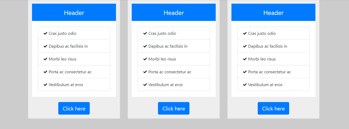
HTML
<div class="container">
  <div class="row">
    <div class="col-sm-12 col-md-4">
      <div class="custom-column">
        <div class="custom-column-header">Header</div>
        <div class="custom-column-content">
          <ul class="list-group">
            <li class="list-group-item"><i class="fa fa-check"></i> Cras justo odio</li>
            <li class="list-group-item"><i class="fa fa-check"></i> Dapibus ac facilisis in</li>
            <li class="list-group-item"><i class="fa fa-check"></i> Morbi leo risus</li>
            <li class="list-group-item"><i class="fa fa-check"></i> Porta ac consectetur ac</li>
            <li class="list-group-item"><i class="fa fa-check"></i> Vestibulum at eros</li>
          </ul>
        </div>
        <div class="custom-column-footer"><button class="btn btn-primary btn-lg">Click here</button></div>
      </div>
    </div>
  </div>
</div>
CSS / SCSS
$primary-color: #ccc;
$col-bg-color: #eee;
$col-footer-bg-color: #eee;
$col-header-bg-color: #007bff;
$col-content-bg-color: #fff;

body {
  background-color: $primary-color;
}

.custom-column {
  background-color: $col-bg-color;
  border: 5px solid $col-bg-color;
  padding: 10px;
  box-sizing: border-box;
}

.custom-column-header {
  font-size: 24px;
  background-color: #007bff;
  color: white;
  padding: 15px;
  text-align: center;
}

.custom-column-content {
  background-color: $col-content-bg-color;
  border: 2px solid white;
  padding: 20px;
}

.custom-column-footer {
  background-color: $col-footer-bg-color;
  padding-top: 20px;
  text-align: center;
}
Solution 4 - Html
If you are using Sass:
$card-column-sizes: (
    xs: 2,
    sm: 3,
    md: 4,
    lg: 5,
);

@each $breakpoint-size, $column-count in $card-column-sizes {
	@include media-breakpoint-up($breakpoint-size) {
	  .card-columns {
	    column-count: $column-count;
	    column-gap: 1.25rem;

	    .card {
	      display: inline-block;
	      width: 100%; // Don't let them exceed the column width
	    }
	  }
	}
}
Solution 5 - Html
I realize this question was posted a while ago; nonetheless, Bootstrap v4.0 has card layout support out of the box. You can find the documentation here: Bootstrap Card Layouts.
I've gotten back into using Bootstrap for a recent project that relies heavily on the card layout UI. I've found success with the following implementation across the standard breakpoints:
<link href="https://unpkg.com/[email protected]/css/tachyons.min.css" rel="stylesheet"/>
<link href="https://stackpath.bootstrapcdn.com/bootstrap/4.3.1/css/bootstrap.min.css" rel="stylesheet"/>
<script src="https://cdnjs.cloudflare.com/ajax/libs/jquery/3.3.1/jquery.min.js"></script>
<div class="flex justify-center" id="cars" v-cloak>
    <!-- RELEVANT MARKUP BEGINS HERE -->
    <div class="container mh0 w-100">
        <div class="page-header text-center mb5">
            <h1 class="avenir text-primary mb-0">Cars</h1>
            <p class="text-secondary">Add and manage your cars for sale.</p>
            <div class="header-button">
                <button class="btn btn-outline-primary" @click="clickOpenAddCarModalButton">Add a car for sale</button>
            </div>
        </div>
        <div class="container pa0 flex justify-center">
            <div class="listings card-columns">
                <div class="card mv2">
                    <img src="https://farm4.staticflickr.com/3441/3361756632_8d84aa8560.jpg" class="card-img-top"
                        alt="Mazda hatchback">
                    <div class="card-body">
                        <h5 class="card-title">Card title</h5>
                        <p class="card-text">Some quick example text to build on the card title and make up the bulk of the card's
                            content.
                        </p>
                        <a href="#" class="btn btn-primary">Go somewhere</a>
                    </div>
                    <div class="card-footer">
                        buttons here
                    </div>
                </div>
            </div>
        </div>
    </div>
</div>
After trying both the Bootstrap .card-group and .card-deck card layout classes with quirky results at best across the standard breakpoints, I finally decided to give the .card-columns class a shot. And it worked!
Your results may vary, but .card-columns seems to be the most stable implementation here.
Solution 6 - Html
Another late answer, but I was playing with this and came up with a general purpose Sass solution that I found useful and many others might as well. To give an overview, this introduces new classes that can modify the column count of a .card-columns element in very similar ways to columns with .col-4 or .col-lg-3:
@import "bootstrap";

$card-column-counts: 1, 2, 3, 4, 5;

.card-columns {
    @each $column-count in $card-column-counts {
        &.card-columns-#{$column-count} {
            column-count: $column-count;
        }
    }

    @each $breakpoint in map-keys($grid-breakpoints) {
        @include media-breakpoint-up($breakpoint) {
            $infix: breakpoint-infix($breakpoint, $grid-breakpoints);
            @each $column-count in $card-column-counts {
                &.card-columns#{$infix}-#{$column-count} {
                    column-count: $column-count;
                }
            }
        }
    }
}
The end result of this is if you have the following:
<div class="card-columns card-columns-2 card-columns-md-3 card-columns-xl-4">
   ...
</div>
Then you would have 2 columns by default, 3 for medium devices and up and 4 for xl devices and up. Additionally if you change your grid breakpoints this will automatically support those, and the $card-column-counts can be overridden to change the allowed numbers of columns.