Missing visible-** and hidden-** in Bootstrap v4
Twitter BootstrapBootstrap 4Twitter Bootstrap Problem Overview
In Bootstrap v3 I often use the hidden-** classes combined with clearfix to control multi column layouts at different screen widths. For example,
I could combine multiple hidden-** in one DIV to make my multi columns appear correctly at different screen widths.
As an example if I wanted to display rows of product photos, 4 per row on larger screen sizes, 3 on smaller screens, then 2 on very small screens. The product photos might be different heights so I need the clearfix to ensure the row breaks properly.
Here's an example in v3...
http://jsbin.com/tosebayode/edit?html,css,output
Now that v4 has done away with these classes, and replaced them with the visible/hidden-**-up/down classes I seem to have to do the same thing with multiple DIVs instead.
Here's a similar example in v4...
http://jsbin.com/sagowihowa/edit?html,css,output
So I've gone from single DIVs to having to add multiple DIVs with lots of up/down classes to achieve the same thing.
From...
<div class="clearfix visible-xs-block visible-sm-block"></div>
to...
<div class="clearfix hidden-sm-up"></div>
<div class="clearfix hidden-md-up hidden-xs-down"></div>
<div class="clearfix hidden-md-down"></div>
Is there a better way of doing this in v4 that I have overlooked?
Twitter Bootstrap Solutions
Solution 1 - Twitter Bootstrap
Update for Bootstrap 5 (2020)
Bootstrap 5 (currently alpha) has a new xxl breakpoint. Therefore display classes have a new tier to support this:
Hidden only on xxl: d-xxl-none
Visible only on xxl: d-none d-xxl-block
Bootstrap 4 (2018)
The hidden-* and visible-* classes no longer exist in Bootstrap 4. If you want to hide an element on specific tiers or breakpoints in Bootstrap 4, use the d-* display classes accordingly.
Remember that extra-small/mobile (formerly xs) is the default (implied) breakpoint, unless overridden by a larger breakpoint. Therefore, the -xs infix no longer exists in Bootstrap 4.
Show/hide for breakpoint and down:
hidden-xs-down (hidden-xs)=d-none d-sm-blockhidden-sm-down (hidden-sm hidden-xs)=d-none d-md-blockhidden-md-down (hidden-md hidden-sm hidden-xs)=d-none d-lg-blockhidden-lg-down=d-none d-xl-blockhidden-xl-down(n/a 3.x) =d-none(same ashidden)
Show/hide for breakpoint and up:
hidden-xs-up=d-none(same ashidden)hidden-sm-up=d-sm-nonehidden-md-up=d-md-nonehidden-lg-up=d-lg-nonehidden-xl-up(n/a 3.x) =d-xl-none
Show/hide only for a single breakpoint:
hidden-xs(only) =d-none d-sm-block(same ashidden-xs-down)hidden-sm(only) =d-block d-sm-none d-md-blockhidden-md(only) =d-block d-md-none d-lg-blockhidden-lg(only) =d-block d-lg-none d-xl-blockhidden-xl(n/a 3.x) =d-block d-xl-nonevisible-xs(only) =d-block d-sm-nonevisible-sm(only) =d-none d-sm-block d-md-nonevisible-md(only) =d-none d-md-block d-lg-nonevisible-lg(only) =d-none d-lg-block d-xl-nonevisible-xl(n/a 3.x) =d-none d-xl-block
Demo of the responsive display classes in Bootstrap 4
Also, note that d-*-block can be replaced with d-*-inline, d-*-flex, d-*-table-cell, d-*-table etc.. depending on the display type of the element. Read more on the display classes
Solution 2 - Twitter Bootstrap
Unfortunately all classes hidden-*-up and hidden-*-down were removed from Bootstrap (as of Bootstrap Version 4 Beta, in Version 4 Alpha and Version 3 these classes still existed).
Instead, new classes d-* should be used, as mentioned here: https://getbootstrap.com/docs/4.0/migration/#utilities
I found out that the new approach is less useful under some circumstances. The old approach was to HIDE elements while the new approach is to SHOW elements. Showing elements is not that easy with CSS since you need to know if the element is displayed as block, inline, inline-block, table etc.
You might want to restore the former "hidden-*" styles known from Bootstrap 3 with this CSS:
/*\
 * Restore Bootstrap 3 "hidden" utility classes.
\*/

/* Breakpoint XS */
@media (max-width: 575px)
{
    .hidden-xs-down, .hidden-sm-down, .hidden-md-down, .hidden-lg-down, .hidden-xl-down,
    .hidden-xs-up,
    .hidden-unless-sm, .hidden-unless-md, .hidden-unless-lg, .hidden-unless-xl
    {
        display: none !important;
    }

}

/* Breakpoint SM */
@media (min-width: 576px) and (max-width: 767px)
{
    .hidden-sm-down, .hidden-md-down, .hidden-lg-down, .hidden-xl-down,
    .hidden-xs-up, .hidden-sm-up,
    .hidden-unless-xs, .hidden-unless-md, .hidden-unless-lg, .hidden-unless-xl
    {
        display: none !important;
    }
}

/* Breakpoint MD */
@media (min-width: 768px) and (max-width: 991px)
{
    .hidden-md-down, .hidden-lg-down, .hidden-xl-down,
    .hidden-xs-up, .hidden-sm-up, .hidden-md-up,
    .hidden-unless-xs, .hidden-unless-sm, .hidden-unless-lg, .hidden-unless-xl
    {
        display: none !important;
    }
}

/* Breakpoint LG */
@media (min-width: 992px) and (max-width: 1199px)
{
    .hidden-lg-down, .hidden-xl-down,
    .hidden-xs-up, .hidden-sm-up, .hidden-md-up, .hidden-lg-up,
    .hidden-unless-xs, .hidden-unless-sm, .hidden-unless-md, .hidden-unless-xl
    {
        display: none !important;
    }
}

/* Breakpoint XL */
@media (min-width: 1200px)
{
    .hidden-xl-down,
    .hidden-xs-up, .hidden-sm-up, .hidden-md-up, .hidden-lg-up, .hidden-xl-up,
    .hidden-unless-xs, .hidden-unless-sm, .hidden-unless-md, .hidden-unless-lg
    {
        display: none !important;
    }
}
The classes hidden-unless-* were not included in Bootstrap 3, but they are useful as well and should be self-explanatory.
Solution 3 - Twitter Bootstrap
Bootstrap v4.1 uses new classnames for hiding columns on their grid system.
For hiding columns depending on the screen width, use d-none class or any of the d-{sm,md,lg,xl}-none classes.
To show columns on certain screen sizes, combine the above mentioned classes with d-block or d-{sm,md,lg,xl}-block classes.
Examples are:
<div class="d-lg-none">hide on screens wider than lg</div>
<div class="d-none d-lg-block">hide on screens smaller than lg</div>
More of these here.
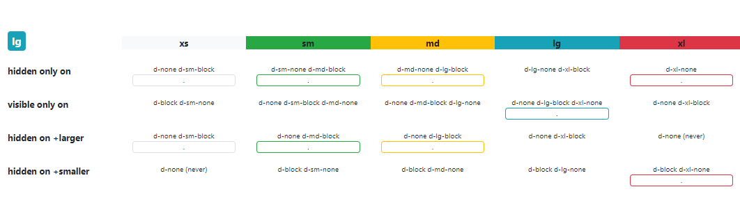
Solution 4 - Twitter Bootstrap
For bootstrap 4, here's a matrix image explaining the classes used to show / hide elements depends on the screen size:
Solution 5 - Twitter Bootstrap
BOOTSTRAP 5
Hiding elements:
To hide elements simply use the .d-none class or one of the .d-{sm,md,lg,xl,xxl}-none classes for any responsive screen variation.
To show an element only on a given interval of screen sizes you can combine one .d-*-none class with a .d-*-* class, for example .d-none .d-md-block .d-xl-none .d-xxl-none will hide the element for all screen sizes except on medium and large devices.
| Screen size | Class |
|---|---|
| Hidden on all | .d-none |
| Hidden only on xs | .d-none .d-sm-block |
| Hidden only on sm | .d-sm-none .d-md-block |
| Hidden only on md | .d-md-none .d-lg-block |
| Hidden only on lg | .d-lg-none .d-xl-block |
| Hidden only on xl | .d-xl-none .d-xxl-block |
| Hidden only on xxl | .d-xxl-none |
| Visible on all | .d-block |
| Visible only on xs | .d-block .d-sm-none |
| Visible only on sm | .d-none .d-sm-block .d-md-none |
| Visible only on md | .d-none .d-md-block .d-lg-none |
| Visible only on lg | .d-none .d-lg-block .d-xl-none |
| Visible only on xl | .d-none .d-xl-block .d-xxl-none |
| Visible only on xxl | .d-none .d-xxl-block |
Display in print:
Change the display value of elements when printing with our print display utility classes. Includes support for the same display values as our responsive .d-* utilities.
-
.d-print-none -
.d-print-inline -
.d-print-inline-block -
.d-print-block -
.d-print-grid -
.d-print-table -
.d-print-table-row -
.d-print-table-cell -
.d-print-flex -
.d-print-inline-flex
Solution 6 - Twitter Bootstrap
I do no expect that multiple div's is a good solution.
I also think you can replace .visible-sm-block with .hidden-xs-down and .hidden-md-up (or .hidden-sm-down and .hidden-lg-up to act on the same media queries).
hidden-sm-up compiles into:
.visible-sm-block {
  display: none !important;
}
@media (min-width: 768px) and (max-width: 991px) {
  .visible-sm-block {
    display: block !important;
  }
}
.hidden-sm-down and .hidden-lg-up compiles into:
@media (max-width: 768px) {
  .hidden-xs-down {
    display: none !important;
  }
}
@media (min-width: 991px) {
  .hidden-lg-up {
    display: none !important;
  }
}
Both situation should act the same.
You situation become different when you try to replace .visible-sm-block and .visible-lg-block. Bootstrap v4 docs tell you:
> These classes don’t attempt to accommodate less common cases where an > element’s visibility can’t be expressed as a single contiguous range > of viewport breakpoint sizes; you will instead need to use custom CSS > in such cases.
.visible-sm-and-lg {
  display: none !important;
}
@media (min-width: 768px) and (max-width: 991px) {
  .visible-sm-and-lg {
    display: block !important;
  }
}
@media (min-width: 1200px) {
  .visible-sm-and-lg {
    display: block !important;
  }
}
Solution 7 - Twitter Bootstrap
The user Klaro suggested to restore the old visibility classes, which is a good idea. Unfortunately, their solution did not work in my project.
I think that it is a better idea to restore the old mixin of bootstrap, because it is covering all breakpoints which can be individually defined by the user.
Here is the code:
// Restore Bootstrap 3 "hidden" utility classes.
@each $bp in map-keys($grid-breakpoints) {
  .hidden-#{$bp}-up {
    @include media-breakpoint-up($bp) {
      display: none !important;
    }
  }
  .hidden-#{$bp}-down {
    @include media-breakpoint-down($bp) {
      display: none !important;
    }
  }
  .hidden-#{$bp}-only{
    @include media-breakpoint-only($bp){
      display:none !important;
    }
  }
}
In my case, I have inserted this part in a _custom.scss file which is included at this point in the bootstrap.scss:
/*!
 * Bootstrap v4.0.0-beta (https://getbootstrap.com)
 * Copyright 2011-2017 The Bootstrap Authors
 * Copyright 2011-2017 Twitter, Inc.
 * Licensed under MIT (https://github.com/twbs/bootstrap/blob/master/LICENSE)
 */

@import "functions";
@import "variables";
@import "mixins";
@import "custom"; // <-- my custom file for overwriting default vars and adding the snippet from above
@import "print";
@import "reboot";
[..]
Solution 8 - Twitter Bootstrap
http://v4-alpha.getbootstrap.com/layout/responsive-utilities/
You now have to define the size of what is being hidden as so
.hidden-xs-down
Will hide anythinging from xs and smaller, only xs
.hidden-xs-up
Will hide everything
Solution 9 - Twitter Bootstrap
Bootstrap 4 to hide whole content use this class '.d-none' it will be hide everything regardless of breakpoints same like previous bootstrap version class '.hidden'
Solution 10 - Twitter Bootstrap
Unfortunately these new bootstrap 4 classes do not work like the old ones on a div using collapse as they set the visible div to block which starts out visible rather than hidden and if you add an extra div around the collapse functionality no longer works.
Solution 11 - Twitter Bootstrap
i like the bootstrap3 style as the device width of bootstrap4
so i modify the css as below
<pre>
.visible-xs, .visible-sm, .visible-md, .visible-lg { display:none !important; }
.visible-xs-block, .visible-xs-inline, .visible-xs-inline-block,
.visible-sm-block, .visible-sm-inline, .visible-sm-inline-block,
.visible-md-block, .visible-md-inline, .visible-md-inline-block,
.visible-lg-block, .visible-lg-inline, .visible-lg-inline-block { display:none !important; }
@media (max-width:575px) {
table.visible-xs				{ display:table !important; }
tr.visible-xs					{ display:table-row !important; }
th.visible-xs, td.visible-xs	{ display:table-cell !important; }

.visible-xs					{ display:block !important; }
.visible-xs-block { display:block !important; }
.visible-xs-inline { display:inline !important; }
.visible-xs-inline-block { display:inline-block !important; }
}

@media (min-width:576px) and (max-width:767px) {
table.visible-sm { display:table !important; }
tr.visible-sm { display:table-row !important; }
th.visible-sm,
td.visible-sm { display:table-cell !important; }

.visible-sm { display:block !important; }
.visible-sm-block { display:block !important; }
.visible-sm-inline { display:inline !important; }
.visible-sm-inline-block { display:inline-block !important; }
}

@media (min-width:768px) and (max-width:991px) {
table.visible-md { display:table !important; }
tr.visible-md { display:table-row !important; }
th.visible-md,
td.visible-md { display:table-cell !important; }

.visible-md { display:block !important; }
.visible-md-block { display:block !important; }
.visible-md-inline { display:inline !important; }
.visible-md-inline-block { display:inline-block !important; }
}

@media (min-width:992px) and (max-width:1199px) {
table.visible-lg { display:table !important; }
tr.visible-lg { display:table-row !important; }
th.visible-lg,
td.visible-lg { display:table-cell !important; }

.visible-lg { display:block !important; }
.visible-lg-block { display:block !important; }
.visible-lg-inline { display:inline !important; }
.visible-lg-inline-block { display:inline-block !important; }
}

@media (min-width:1200px) {
table.visible-xl { display:table !important; }
tr.visible-xl { display:table-row !important; }
th.visible-xl,
td.visible-xl { display:table-cell !important; }

.visible-xl { display:block !important; }
.visible-xl-block { display:block !important; }
.visible-xl-inline { display:inline !important; }
.visible-xl-inline-block { display:inline-block !important; }
}

@media (max-width:575px)						{ .hidden-xs{display:none !important;} }
@media (min-width:576px) and (max-width:767px)  { .hidden-sm{display:none !important;} }
@media (min-width:768px) and (max-width:991px)  { .hidden-md{display:none !important;} }
@media (min-width:992px) and (max-width:1199px) { .hidden-lg{display:none !important;} }
@media (min-width:1200px)						{ .hidden-xl{display:none !important;} }
</pre>
Solution 12 - Twitter Bootstrap
The hidden-* and visible-* classes no longer exist in Bootstrap 4. The same function can be achieved in Bootstrap 4 by using the d-* for the specific tiers.