Android 5.0 android:elevation Works for View, but not Button?
AndroidAndroid 5.0-LollipopAndroid Problem Overview
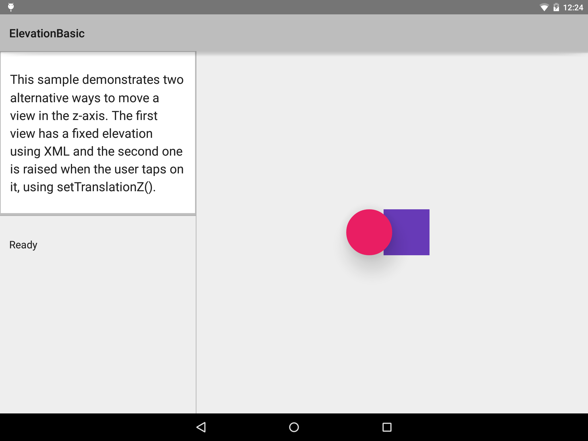
In the Android 5.0 samples from the SDK Manager, there is the ElevationBasic sample. It shows two View objects: a circle and a square. The circle has android:elevation set to 30dp:
<?xml version="1.0" encoding="utf-8"?>
<!--
 Copyright 2014 The Android Open Source Project

 Licensed under the Apache License, Version 2.0 (the "License");
 you may not use this file except in compliance with the License.
 You may obtain a copy of the License at

     http://www.apache.org/licenses/LICENSE-2.0

 Unless required by applicable law or agreed to in writing, software
 distributed under the License is distributed on an "AS IS" BASIS,
 WITHOUT WARRANTIES OR CONDITIONS OF ANY KIND, either express or implied.
 See the License for the specific language governing permissions and
 limitations under the License.
-->

<FrameLayout xmlns:android="http://schemas.android.com/apk/res/android"
             xmlns:tools="http://schemas.android.com/tools"
             android:layout_width="match_parent"
             android:layout_height="match_parent">
    <View
            android:id="@+id/floating_shape"
            android:layout_width="80dp"
            android:layout_height="80dp"
            android:layout_marginRight="40dp"
            android:background="@drawable/shape"
            android:elevation="30dp"
            android:layout_gravity="center"/>
    <View
            android:id="@+id/floating_shape_2"
            android:layout_width="80dp"
            android:layout_height="80dp"
            android:layout_marginLeft="25dp"
            android:background="@drawable/shape2"
            android:layout_gravity="center"/>
</FrameLayout>
On a Nexus 9, running the sample as-is, we get a drop shadow on the circle:
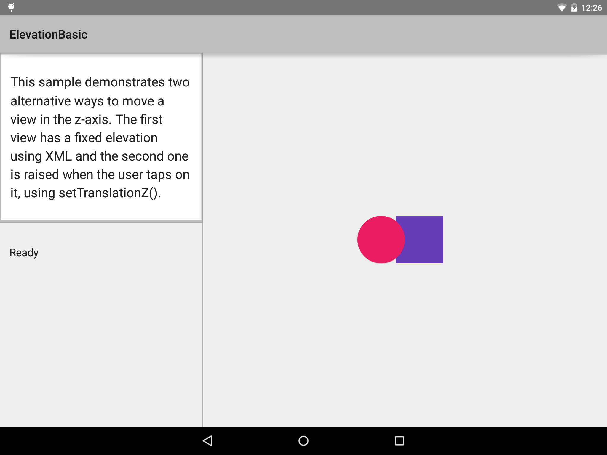
If we change the widget class to Button, leaving all other attributes as-is, we lose the drop shadow on the circle:
The questions:
-
Why is the
android:elevationbehavior changing? It cannot be due to the background, because it is the same background in both cases. -
Which classes support
android:elevation, and which do not? For example, usingTextViewinstead ofVieworButtonstill gives us the drop shadow, so this change in behavior is not introduced at theTextViewlevel, but rather at theButtonlevel. -
As seen in this question from yesterday, how do we get
android:elevationto be honored on aButton? Is there someandroid:allowElevationToWorkAsDocumented="true"value that we have to put in a theme or something?
Android Solutions
Solution 1 - Android
The default Button style under Material has a StateListAnimator that controls the android:elevation and android:translationZ properties. You can remove the existing animator or set your own using the android:stateListAnimator property.
<Button
    ...
    android:stateListAnimator="@null" />

<Button
    ...
    android:stateListAnimator="@anim/my_animator" />
The default animator is defined in button_state_list_anim_material.xml. Here is a sample showing the enabled and pressed states:
<?xml version="1.0" encoding="utf-8"?>
<selector xmlns:android="http://schemas.android.com/apk/res/android">
    <item android:state_pressed="true" android:state_enabled="true">
        <set>
            <objectAnimator android:propertyName="translationZ"
                            android:duration="@integer/button_pressed_animation_duration"
                            android:valueTo="@dimen/button_pressed_z_material"
                            android:valueType="floatType"/>
            <objectAnimator android:propertyName="elevation"
                            android:duration="0"
                            android:valueTo="@dimen/button_elevation_material"
                            android:valueType="floatType"/>
        </set>
    </item>
    <!-- base state -->
    <item android:state_enabled="true">
        <set>
            <objectAnimator android:propertyName="translationZ"
                            android:duration="@integer/button_pressed_animation_duration"
                            android:valueTo="0"
                            android:startDelay="@integer/button_pressed_animation_delay"
                            android:valueType="floatType"/>
            <objectAnimator android:propertyName="elevation"
                            android:duration="0"
                            android:valueTo="@dimen/button_elevation_material"
                            android:valueType="floatType" />
        </set>
    </item>
    ...
</selector>
Solution 2 - Android
In my experience with Appcompat v7 running on Lollipop device, Button works with default features as ripple effect, elevation and z-animation on click, but misses them if is set a personalized android:background property (as color or selector) in xml element.
Solution 3 - Android
This is because you are setting the background of the button manually which will replace all its effects.
As of the version 23.0.0 release of AppCompat, there is a new Widget.AppCompat.Button.Colored style which uses your theme's colorButtonNormal for the disabled color and colorAccent for the enabled color.
    <Button
  ...
  style="@style/Widget.AppCompat.Button.Colored" />
If you want different colors than specified you can create a new theme and apply it to the button via android:theme. Then you can use this theme on all your buttons where you want same effect.
Solution 4 - Android
I had a similar problem i thought was due to wrongly inflated layouts, but it appeared that adding clipToPadding did the trick.
This must be set to the parent ViewGroup containing the view you want to cast a shadow.
... android:clipToPadding="false" ...
Solution 5 - Android
This solution works for all the API versions of Android
Create a shadow @android:drawable/dialog_holo_light_frame & if you want to customize the color of the background instead of white then create a layer-list background with customizable color on top of the shadow as shown below
Create a separate drawable file white_background_shadow.xml
<?xml version="1.0" encoding="utf-8"?>
<layer-list xmlns:android="http://schemas.android.com/apk/res/android">
    <!--the shadow comes from here-->
    <item
        android:bottom="0dp"
        android:drawable="@android:drawable/dialog_holo_light_frame"
        android:left="0dp"
        android:right="0dp"
        android:top="0dp">

    </item>

    <item
        android:bottom="0dp"
        android:left="0dp"
        android:right="0dp"
        android:top="0dp">
        <!--whatever you want in the background, here i preferred solid white -->
        <shape android:shape="rectangle">
            <solid android:color="@android:color/white" />

        </shape>
    </item>
</layer-list>
and use this drawable as the background like this
android:background="@drawable/shadow"