Xcode 6 Storyboard the wrong size?
IosIphoneInterface BuilderXcode6Ios Problem Overview
Built a new project from scratch in Swift in Xcode 6 (Beta 1) and have seen some strange behaviour with Storyboards and the output that I am viewing.
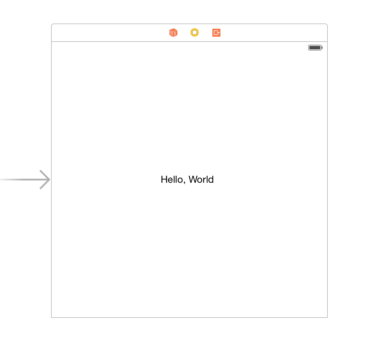
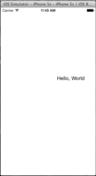
I have built a simple interface (as shown below) - with properties of View Controller included. When I run this in the simulator I would expect 'Hello, World' to be central in the user interface - however it seems that this 'Square' is simply being fit into the iPhone screen and thus the wrong view is being shown (see below).
My question is: has anyone else seen this behaviour and how did they fix it?
Thanks!
Ios Solutions
Solution 1 - Ios
Do the following steps to resolve the issue
In Storyboard, select any view, then go to the File inspector. Uncheck the "Use Size Classes", you will ask to keep size class data for: iPhone/iPad. And then Click the "Disable Size Classes" button. Doing this will make the storyboard's view size with selected device.
Solution 2 - Ios
While Asif Bilal's answer is a simpler solution that doesn't involve Size Classes (which were introduced in iOS 8.) it is strongly recommended you to get used to size classes as they are the future, and you will eventually jump in anyway at some point."
You probably haven't added the layout constraints.
Select your label, tap the layout constraints button on the bottom:
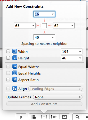
On that menu add width and height (it should NOT be the same as mine) by checking their checkbox and click add constraints. Then Control-drag your label to your main view, and then when you de-click, you should have the options to center horizontally and vertically in container. Add both, and you should be set up.
Solution 3 - Ios
If you are using Xcode 6 and designing for iOS 8, none of these solutions are correct. To get your iPhone-only views to be sized correctly, don't turn off size classes, don't turn off inferred metrics, and don't set constraints (yet). Instead, use the size class control, which is an easy to miss text button at the bottom of Interface Builder that initially reads "wAny hAny".
Click the button, and choose Compact Width, Regular Height. This resize your views and cover all iPhone portrait orientations. Apple's docs here: https://developer.apple.com/library/ios/recipes/xcode_help-IB_adaptive_sizes/chapters/SelectingASizeClass.html or search on "Selecting a Size Class in Interface Builder"
Solution 4 - Ios
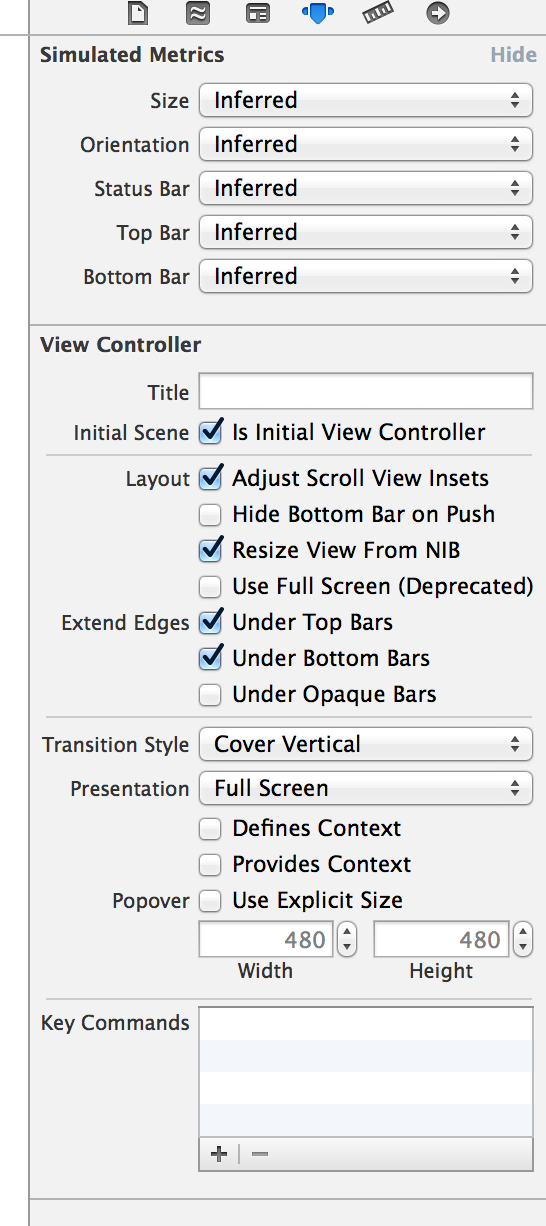
In Storyboard, select your ViewController and go to Atribute Inspector. At the very top, under Simulated Metrics you have Size and Orientation properties which are set to Inferred. Change them to desired values.
In order for an application to display properly on another screen size, you also have to setup constraints, as described by Can Poyrazoğlu in the first post.
Solution 5 - Ios
I had this issue in xcode 6 and there is a way to resolve the resize conflicts. If you select your view, at the bottom you will see an icon that looks like |-Δ-|. If you click on it, you're project will resize for different devices.
Solution 6 - Ios
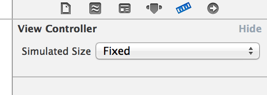
Go to Attributes Inspector(right top corner) In the Simulated Metrics, which has Size, Orientation, Status Bar, Top Bar, Bottom Bar properties. For SIZE, change Inferred --> Freeform.
Solution 7 - Ios
On your storyboard page, go to File Inspector and uncheck 'Use Size Classes'. This should shrink your view controller to regular IPhone size you were familiar with. Note that using 'size classes' will let you design your project across many devices. Once you uncheck this the Xcode will give you a warning dialogue as follows. This should be self-explainatory.
"Disabling size classes will limit this document to storing data for a single device family. The data for the size class best representing the targeted device will be retained, and all other data will be removed. In addition, segues will be converted to their non-adaptive equivalents."
Solution 8 - Ios
For anyone using XCode 7, it's very easy to design for a specific device size (instead of the default square-ish canvas).
In Interface Builder, select your ViewController or Scene from the left menu. Then under Show the Attributes Inspector, go to the Simulated Metrics, and pick the desired Size from the dropdown menu.
Solution 9 - Ios
You shall probably use the "Resolve Auto Layout Issues" (bottom right - triangle icon in the storyboard view) to add/reset to suggested constraints (Xcode 6.0.1).