What methods of ‘clearfix’ can I use?
CssClearfixCss Problem Overview
I have the age-old problem of a div wrapping a two-column layout. My sidebar is floated, so my container div fails to wrap the content and sidebar.
<div id="container">
  <div id="content"></div>
  <div id="sidebar"></div>
</div>
There seem to be numerous methods of fixing the clear bug in Firefox:
<br clear="all"/>overflow:autooverflow:hidden
In my situation, the only one that seems to work correctly is the <br clear="all"/> solution, which is a little bit scruffy. overflow:auto gives me nasty scrollbars, and overflow:hidden must surely have side effects.
Also, IE7 apparently shouldn't suffer from this problem due to its incorrect behaviour, but in my situation it's suffering the same as Firefox.
Which method currently available to us is the most robust?
Css Solutions
Solution 1 - Css
Depending upon the design being produced, each of the below clearfix CSS solutions has its own benefits.
The clearfix does have useful applications but it has also been used as a hack. Before you use a clearfix perhaps these modern css solutions can be useful:
Modern Clearfix Solutions
Container with overflow: auto;
The simplest way to clear floated elements is using the style overflow: auto on the containing element. This solution works in every modern browsers.
<div style="overflow: auto;">
  <img
    style="float: right;"
    src="path/to/floated-element.png"
    width="500"
    height="500"
  >
  <p>Your content here…</p>
</div>
One downside, using certain combinations of margin and padding on the external element can cause scrollbars to appear but this can be solved by placing the margin and padding on another parent containing element.
Using ‘overflow: hidden’ is also a clearfix solution, but will not have scrollbars, however using hidden will crop any content positioned outside of the containing element.
Note: The floated element is an img tag in this example, but could be any html element.
Clearfix Reloaded
Thierry Koblentz on CSSMojo wrote: The very latest clearfix reloaded. He noted that by dropping support for oldIE, the solution can be simplified to one css statement. Additionally, using display: block (instead of display: table) allows margins to collapse properly when elements with clearfix are siblings.
.container::after {
  content: "";
  display: block;
  clear: both;
}
This is the most modern version of the clearfix.
⋮
⋮
Older Clearfix Solutions
The below solutions are not necessary for modern browsers, but may be useful for targeting older browsers.
Note that these solutions rely upon browser bugs and therefore should be used only if none of the above solutions work for you.
They are listed roughly in chronological order.
"Beat That ClearFix", a clearfix for modern browsers
Thierry Koblentz' of CSS Mojo has pointed out that when targeting modern browsers, we can now drop the zoom and ::before property/values and simply use:
.container::after {
    content: "";
    display: table;
    clear: both;
}
This solution does not support for IE 6/7 …on purpose!
Thierry also offers: "A word of caution: if you start a new project from scratch, go for it, but don’t swap this technique with the one you have now, because even though you do not support oldIE, your existing rules prevent collapsing margins."
Micro Clearfix
The most recent and globally adopted clearfix solution, the Micro Clearfix by Nicolas Gallagher.
Known support: Firefox 3.5+, Safari 4+, Chrome, Opera 9+, IE 6+
.container::before, .container::after {
  content: "";
  display: table;
}
.container::after {
  clear: both;
}
.container {
  zoom: 1;
}
Overflow Property
This basic method is preferred for the usual case, when positioned content will not show outside the bounds of the container.
<http://www.quirksmode.org/css/clearing.html>
- explains how to resolve common issues related to this technique, namely, setting
width: 100%on the container.
.container {
  overflow: hidden;
  display: inline-block;
  display: block;
}
Rather than using the display property to set "hasLayout" for IE, other properties can be used for triggering "hasLayout" for an element.
.container {
  overflow: hidden;
  zoom: 1;
  display: block;
}
Another way to clear floats using the overflow property is to use the underscore hack. IE will apply the values prefixed with the underscore, other browsers will not. The zoom property triggers hasLayout in IE:
.container {
  overflow: hidden;
  _overflow: visible; /* for IE */
  _zoom: 1; /* for IE */
}
While this works... it is not ideal to use hacks.
PIE: Easy Clearing Method
This older "Easy Clearing" method has the advantage of allowing positioned elements to hang outside the bounds of the container, at the expense of more tricky CSS.
This solution is quite old, but you can learn all about Easy Clearing on Position Is Everything: <http://www.positioniseverything.net/easyclearing.html>
Element using "clear" property
The quick and dirty solution (with some drawbacks) for when you’re quickly slapping something together:
<br style="clear: both" /> <!-- So dirty! -->
Drawbacks
- It's not responsive and thus may not provide the desired effect if layout styles change based upon media queries. A solution in pure CSS is more ideal.
- It adds html markup without necessarily adding any semantic value.
- It requires a inline definition and solution for each instance rather than a class reference to a single solution of a “clearfix” in the css and class references to it in the html.
- It makes code difficult to work with for others as they may have to write more hacks to work around it.
- In the future when you need/want to use another clearfix solution, you won't have to go back and remove every
<br style="clear: both" />tag littered around the markup.
Solution 2 - Css
What problems are we trying to solve?
There are two important considerations when floating stuff:
- Containing descendant floats. This means that the element in question makes itself tall enough to wrap all floating descendants. (They don't hang outside.)
- Insulating descendants from outside floats. This means that descendants inside of an element should be able to use
clear: bothand have it not interact with floats outside the element.
Block formatting contexts
There's only one way to do both of these. And that is to establish a new block formatting context. Elements that establish a block formatting context are an insulated rectangle in which floats interact with each other. A block formatting context will always be tall enough to visually wrap its floating descendants, and no floats outside of a block formatting context may interact with elements inside. This two-way insulation is exactly what you want. In IE, this same concept is called hasLayout, which can be set via zoom: 1.
There are several ways to establish a block formatting context, but the solution I recommend is display: inline-block with width: 100%. (Of course, there are the usual caveats with using width: 100%, so use box-sizing: border-box or put padding, margin, and border on a different element.)
The most robust solution
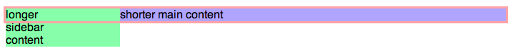
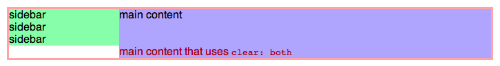
Probably the most common application of floats is the two-column layout. (Can be extended to three columns.)
First the markup structure.
<div class="container">
  <div class="sidebar">
    sidebar<br/>sidebar<br/>sidebar
  </div>
  <div class="main">
    <div class="main-content">
      main content
      <span style="clear: both">
        main content that uses <code>clear: both</code>
      </span>
    </div>
  </div>
</div>
And now the CSS.
/* Should contain all floated and non-floated content, so it needs to
 * establish a new block formatting context without using overflow: hidden.
 */
.container {
  display: inline-block;
  width: 100%;
  zoom: 1; /* new block formatting context via hasLayout for IE 6/7 */
}

/* Fixed-width floated sidebar. */
.sidebar {
  float: left;
  width: 160px;
}

/* Needs to make space for the sidebar. */
.main {
  margin-left: 160px;
}

/* Establishes a new block formatting context to insulate descendants from
 * the floating sidebar. */
.main-content {
  display: inline-block;
  width: 100%;
  zoom: 1; /* new block formatting context via hasLayout for IE 6/7 */
}
Try it yourself
Go to JS Bin to play around with the code and see how this solution is built from the ground up.
Traditional clearfix methods considered harmful
The problem with the traditional clearfix solutions is that they use two different rendering concepts to achieve the same goal for IE and everyone else. In IE they use hasLayout to establish a new block formatting context, but for everyone else they use generated boxes (:after) with clear: both, which does not establish a new block formatting context. This means things won't behave the same in all situations. For an explanation of why this is bad, see Everything you Know about Clearfix is Wrong.
Solution 3 - Css
The newest standard, as used by Inuit.css and Bourbon - two very widely used and well-maintained CSS/Sass frameworks:
.btcf:after {
    content:"";
    display:block;
    clear:both;
}
Notes
Keep in mind that clearfixes are essentially a hack for what flexbox layouts can now provide in a much easier and smarter way. CSS floats were originally designed for inline content to flow around - like images in a long textual article - and not for grid layouts and the like. Unless you're specifically targeting old (not Edge) Internet Explorer, your target browsers support flexbox, so it's worth the time to learn.
This doesn't support IE7. You shouldn't be supporting IE7. Doing so continues to expose users to unfixed security exploits and makes life harder for all other web developers, as it reduces the pressure on users and organisations to switch to safer modern browsers.
This clearfix was announced and explained by Thierry Koblentz in July 2012. It sheds unnecessary weight from Nicolas Gallagher's 2011 micro-clearfix. In the process, it frees a pseudo-element for your own use. This has been updated to use display: block rather than display: table (again, credit to Thierry Koblentz).
Solution 4 - Css
I recommend using the following, which is taken from http://html5boilerplate.com/
/* >> The Magnificent CLEARFIX << */
.clearfix:after {
  content: ".";
  display: block;
  height: 0;
  clear: both;
  visibility: hidden;
}
.clearfix {
  display: inline-block;
}
* html .clearfix {
  height: 1%;
} /* Hides from IE-mac \*/
.clearfix {
  display: block;
}
Solution 5 - Css
The overflow property can be used to clear floats with no additional mark-up:
.container { overflow: hidden; }
This works for all browsers except IE6, where all you need to do is enable hasLayout (zoom being my preferred method):
.container { zoom: 1; }
Solution 6 - Css
I've found a bug in the official CLEARFIX-Method:
The DOT doesn't have a font-size.
And if you set the height = 0 and the first Element in your DOM-Tree has the class "clearfix" you'll allways have a margin at the bottom of the page of 12px :)
You have to fix it like this:
/* float clearing for everyone else */
.clearfix:after{
  clear: both;
  content: ".";
  display: block;
  height: 0;
  visibility: hidden;
  font-size: 0;
}
It's now part of the YAML-Layout ... Just take a look at it - it's very interesting! http://www.yaml.de/en/home.html
Solution 7 - Css
This is quite a tidy solution:
/* For modern browsers */
.cf:before,
.cf:after {
    content:"";
    display:table;
}

.cf:after {
    clear:both;
}

/* For IE 6/7 (trigger hasLayout) */
.cf {
    zoom:1;
}
> It's known to work in Firefox 3.5+, Safari 4+, Chrome, Opera 9+, IE 6+ > > Including the :before selector is not necessary to clear the floats, > but it prevents top-margins from collapsing in modern browsers. This > ensures that there is visual consistency with IE 6/7 when zoom:1 is > applied.
Solution 8 - Css
Clearfix from bootstrap:
.clearfix {
  *zoom: 1;
}

.clearfix:before,
.clearfix:after {
  display: table;
  line-height: 0;
  content: "";
}

.clearfix:after {
  clear: both;
}
Solution 9 - Css
I just use :-
.clear:after{
  clear: both;
  content: "";
  display: block;
}
Works best and compatible with IE8+ :)
Solution 10 - Css
Given the huge amount of replies I was not gonna post. However, this method may help someone, as it did help me.
Stay way from floats whenever possible
It's worth to mention, I avoid floats like Ebola. There are many reasons and I am not alone; Read Rikudo answer about what is a clearfix and you'll see what I mean. In his own words: ...the use of floated elements for layout is getting more and more discouraged with the use of better alternatives...
There are other good (and sometimes better) options out there other than floats. As technology advances and improves, flexbox (and other methods) are going to be widely adopted and floats will become just a bad memory. Maybe a CSS4?
Float misbehavior and failed clears
First off, sometimes, you may think that you are safe from floats until your lifesaver is punctured and your html flow starts to sink:
In the codepen http://codepen.io/omarjuvera/pen/jEXBya below, the practice of clearing a float with <div classs="clear"></div> (or other element) is common but frown upon and anti-semantic.
<div class="floated">1st</div>
<div class="floated">2nd</div>
<div class="floated">3nd</div>
<div classs="clear"></div> <!-- Acts as a wall -->
<section>Below</section>
CSS
div {
    border: 1px solid #f00;
    width: 200px;
    height: 100px;
}

div.floated {
    float: left;
}

.clear {
    clear: both;
}
section {
    border: 1px solid #f0f;
}
However, just when you thought your float is sail worthy...boom! As the screen size becomes smaller and smaller you see weird behaviors in like the graphic below (Same http://codepen.io/omarjuvera/pen/jEXBya):
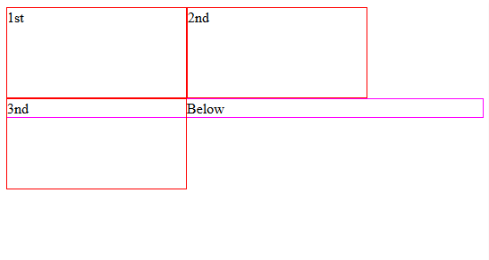
Why should you care? Roughly, about 80% (or more) of the devices used are mobile devices with small screens. Desktop computers/laptops are no longer king.
It does not end there
This is not the only problem with floats. There are many, but in this example, some may say all you have to do is to place your floats in a container. But as you can see in the codepen and graphic, that is not the case. It apparently made things worst:
HTML
<div id="container" class="">
  <div class="floated">1st</div>
  <div class="floated">2nd</div>
  <div class="floated">3nd</div>
</div> <!-- /#conteiner -->
<div classs="clear"></div> <!-- Acts as a wall -->
<section>Below</section>
CSS
#container {
  min-height: 100px; /* To prevent it from collapsing */
  border: 1px solid #0f0;
}
.floated {
    float: left;
    border: 1px solid #f00;
    width: 200px;
    height: 100px;
}

.clear {
    clear: both;
}
section {
    border: 1px solid #f0f;
}
As for the result?
It's the *** same!
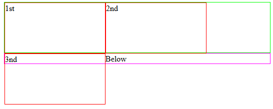
Least you know, you'll start a CSS party, inviting all kinds of selectors and properties to the party; making a bigger mess of your CSS than what you started with. Just to fix your float.
CSS Clearfix to the rescue
This simple and very adaptable piece of CSS is a beauty and a "savior":
.clearfix:before, .clearfix:after {
	content: "";
	display: table;
	clear: both;
	zoom: 1; /* ie 6/7 */
}
That's it! It really works without breaking semantics and did I mention it works?:
From the same sample...HTML
<div class="clearfix">
    <div class="floated">1st</div>
    <div class="floated">2nd</div>
    <div class="floated">3nd</div>
</div>
<section>Below</section>
CSS
div.floated {
    float: left;
    border: 1px solid #f00;
    width: 200px;
    height: 100px;
}
section {
        border: 4px solid #00f;
}


.clearfix:before, .clearfix:after {
	content: "";
	display: table;
	clear: both;
	zoom: 1; /* ie 6/7 */
}
Now we no longer need <div classs="clear"></div> <!-- Acts as a wall --> and keep the semantic police happy. This is not the only benefit. This clearfix is responsive to any screen size without the use of @media in it's simplest form. In other words, it will keep your float container in check and preventing floodings. Lastly, it provides support for old browsers all in one small karate chop =)
Here's the clearfix again
.clearfix:before, .clearfix:after {
	content: "";
	display: table;
	clear: both;
	zoom: 1; /* ie 6/7 */
}
Solution 11 - Css
I always float the main sections of my grid and apply clear: both; to the footer. That doesn't require an extra div or class.
Solution 12 - Css
honestly; all solutions seem to be a hack to fix a rendering bug ... am i wrong?
i've found <br clear="all" /> to be the easiest, simplest. seeing class="clearfix" everywhere can't stroke the sensibilities of someone who objects to extraneous markeup elements, can it? you're just painting the problem on a different canvas.
i also use the display: hidden solution, which is great and requires no extra class declarations or html markup ... but sometimes you need the elements to overflow the container, for eg. pretty ribbons and sashes
Solution 13 - Css
.clearFix:after {
    content: "";
    display: table;
    clear: both;
}
Solution 14 - Css
Using overflow:hidden/auto and height for ie6 will suffice if the floating container has a parent element.
Either one of the #test could work, for the HTML stated below to clear floats.
#test {
  overflow:hidden; // or auto;
  _height:1%; forces hasLayout in IE6
}

<div id="test">
  <div style="floatLeft"></div>
  <div style="random"></div>
</div>
In cases when this refuses to work with ie6, just float the parent to clear float.
#test {
  float: left; // using float to clear float
  width: 99%;
}
Never really needed any other kind of clearing yet. Maybe it's the way I write my HTML.
Solution 15 - Css
With LESS (http://lesscss.org/), one can create a handy clearfix helper:
.clearfix() {
  zoom: 1;
  &:before {
    content: '';
    display: block;
  }
  &:after {
    content: '';
    display: table;
    clear: both;
  }
}
And then use it with problematic containers, for example:
<!-- HTML -->
<div id="container">
  <div id="content"></div>
  <div id="sidebar"></div>
</div>
/* LESS */
div#container {
  .clearfix();
}
Solution 16 - Css
With SASS, the clearfix is:
@mixin clearfix {
    &:before, &:after {
        content: '';
        display: table;
    }
    &:after {
        clear: both;
    }
    *zoom: 1;
}
and it's used like:
.container {
    @include clearfix;
}
if you want the new clearfix:
@mixin newclearfix {
    &:after {
        content:"";
        display:table;
        clear:both;
    }
}
Solution 17 - Css
A new display value seems to the job in one line.
display: flow-root;
From the W3 spec: "The element generates a block container box, and lays out its contents using flow layout. It always establishes a new block formatting context for its contents."
Information: https://www.w3.org/TR/css-display-3/#valdef-display-flow-root https://www.chromestatus.com/feature/5769454877147136
※As shown in the link above, support is currently limited so fallback support like below may be of use: https://github.com/fliptheweb/postcss-flow-root
Solution 18 - Css
I have tried all these solutions, a big margin will be added to <html> element automatically when I use the code below:
.clearfix:after {
    visibility: hidden;
    display: block;
    content: ".";
    clear: both;
    height: 0;
}
Finally, I solved the margin problem by adding font-size: 0; to the above CSS.
Solution 19 - Css
I'd float #content too, that way both columns contain floats. Also because it will allow you to clear elements inside #content without clearing the side bar.
Same thing with the wrapper, you'd need to make it a block formatting context to wrap the two columns.
This article mentions a few triggers you can use: http://www.tjkdesign.com/articles/block-formatting-contexts_and_hasLayout.asp">block formatting contexts.
Solution 20 - Css
A clearfix is a way for an element to automatically clear after itself, so that you don't need to add additional markup.
.clearfix:after {
   content: " "; /* Older browser do not support empty content */
   visibility: hidden;
   display: block;
   height: 0;
   clear: both;
}
.cleaner {
  clear: both;
}
Normally you would need to do something as follows:
<div style="float: left;">Sidebar</div>
<div class="cleaner"></div> <!-- Clear the float -->
With clearfix, you only need to
<div style="float: left;" class="clearfix">Sidebar</div>
<!-- No Clearing div! -->
Solution 21 - Css
Why just trying to use css hack to do what 1 line of HTML do the job. And why not to use semantic html tu put break to return to the line?
Fo me is realy better to use :
<br style="clear:both" />
And if you don't want any style in your html you just have to use class for your break
and put .clear { clear:both; } in your CSS.
Advantage of this:
- Semantic use of html for return to the line
- If no CSS load it will be working
- No need extra CSS code and Hack
- no need to simulate the br with CSS, it's already exist in HTML
Solution 22 - Css
Assuming you're using this HTML structure:
<div id="container">
  <div id="content">
  </div>
  <div id="sidebar">
  </div>
</div>
Here's the CSS that I would use:
div#container {
    overflow: hidden;    /* makes element contain floated child elements */
}

div#content, div#sidebar {
    float: left;
    display: inline;    /* preemptively fixes IE6 dobule-margin bug */
}
I use this set all the time and it works fine for me, even in IE6.
Solution 23 - Css
I always use the micro-clearfix :
.cf:before,
.cf:after {
    content: " ";
    display: table;
}

.cf:after {
    clear: both;
}

/**
 * For IE 6/7 only
 */
.cf {
    *zoom: 1;
}
In Cascade Framework I even apply it by default on block level elements. IMO, applying it by default on block level elements gives block level elements more intuitive behavior than their traditonal behavior. It also made it a lot easier for me to add support for older browsers to Cascade Framework (which supports IE6-8 as well as modern browsers).
Solution 24 - Css
Unlike other clearfixes, here is an open-ended one without containers
Other clearfixes either require the floated element to be in a well marked off container or need an extra, semantically empty <div>. Conversely, clear separation of content and markup requires a strict CSS solution to this problem.
The mere fact that one needs to mark off the end of a float, does not allow for unattended CSS typesetting.
If the latter is your goal, the float should be left open for anything (paragraphs, ordered and unordered lists etc.) to wrap around it, until a "clearfix" is encountered. For example, the clearfix might be set by a new heading.
This is why I use the following clearfix with new headings:
h1 {
    clear: both;
    display: inline-block;
    width: 100%;
}
This solution gets used extensively on my website to solve the problem: The text next to a floated miniature is short and the top-margin of the next clearing object is not respected.
It also prevents any manual intervention when automatically generating PDFs from the site. Here is an example page.
Solution 25 - Css
You could also put this in your CSS:
.cb:after{
  visibility: hidden;
  display: block;
  content: ".";
  clear: both;
  height: 0;
}

*:first-child+html .cb{zoom: 1} /* for IE7 */
And add class "cb" to your parent div:
<div id="container" class="cb">
You will not need to add anything else to your original code...
Solution 26 - Css
#content{float:left;}
#sidebar{float:left;}
.clear{clear:both; display:block; height:0px; width:0px; overflow:hidden;}
<div id="container">
  <div id="content">text 1 </div>
  <div id="sidebar">text 2</div>
  <div class="clear"></div>
</div>
Solution 27 - Css
Have you tried this:
<div style="clear:both;"/>
I haven't had any problems with this method.
Solution 28 - Css
My Favourite Method is to create a clearfix class in my css / scss document as below
.clearfix{
    clear:both;
}
And then call it in my html document as shown below
<html>
  <div class="div-number-one">
    Some Content before the clearfix
  </div>

  <!-- Let's say we need to clearfix Here between these two divs --->
  <div class="clearfix"></div>

  <div class="div-number-two">
    Some more content after the clearfix
  </div>
</html>
Solution 29 - Css
It is so simple clearfix clears the issue by when we using the float properties inside the div element.If we use two div elements one as float:left; and other one as float:right; we can use clearfix for the parent of the two div element. If we refuse to use clearfix unnecessary spaces fill with contents below and site structure will be broken.