What is the difference between display: inline and display: inline-block?
CssDisplayCss Problem Overview
What exactly is the difference between the inline and inline-block values of CSS display?
Css Solutions
Solution 1 - Css
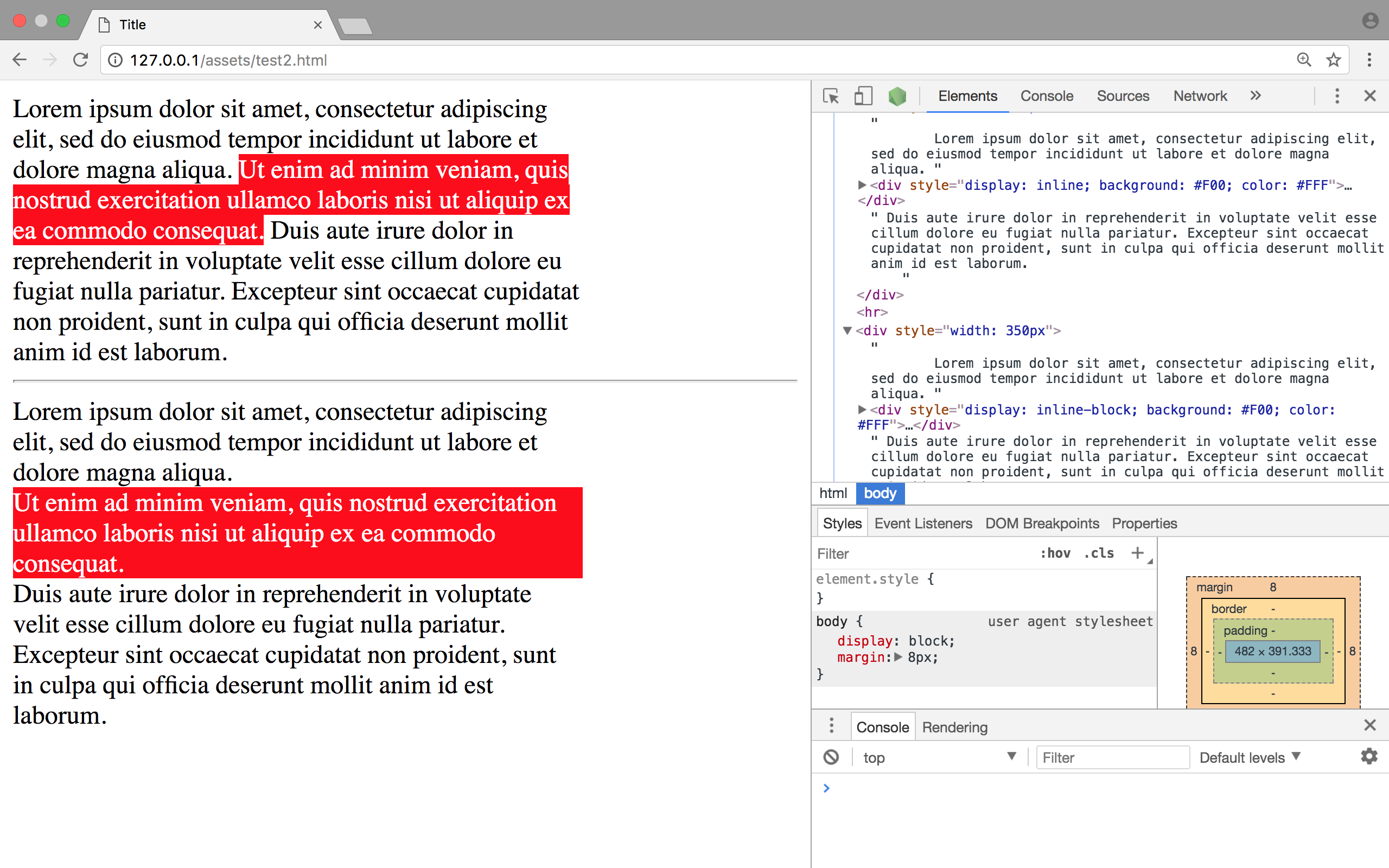
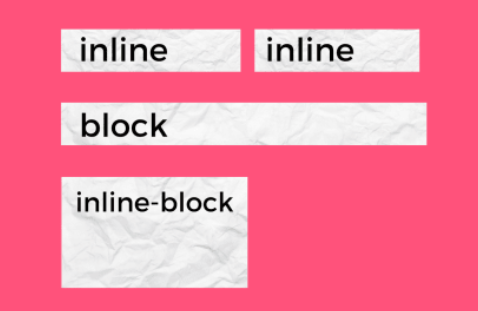
A visual answer
Imagine a <span> element inside a <div>. If you give the <span> element a height of 100px and a red border for example, it will look like this with
display: inline
display: inline-block
display: block
Code: http://jsfiddle.net/Mta2b/
Elements with display:inline-block are like display:inline elements, but they can have a width and a height. That means that you can use an inline-block element as a block while flowing it within text or other elements.
Difference of supported styles as summary:
-
inline: only
margin-left,margin-right,padding-left,padding-right -
inline-block:
margin,padding,height,width
Solution 2 - Css
display: inline; is a display mode to use in a sentence. For instance, if you have a paragraph and want to highlight a single word you do:
<p>
    Pellentesque habitant morbi <em>tristique</em> senectus
    et netus et malesuada fames ac turpis egestas.
</p>
The <em> element has a display: inline; by default, because this tag is always used in a sentence.
The <p> element has a display: block; by default, because it's neither a sentence nor in a sentence, it's a block of sentences.
An element with display: inline; cannot have a height or a width or a vertical margin. An element with display: block; can have a width, height and margin.
If you want to add a height to the <em> element, you need to set this element to display: inline-block;. Now you can add a height to the element and every other block style (the block part of inline-block), but it is placed in a sentence (the inline part of inline-block).
Solution 3 - Css
One thing not mentioned in answers is inline element can break among lines while inline-block can't (and obviously block)! So inline elements can be useful to style sentences of text and blocks inside them, but as they can't be padded you can use line-height instead.
Solution 4 - Css
All answers above contribute important info on the original question. However, there is a generalization that seems wrong.
It is possible to set width and height to at least one inline element (that I can think of) – the <img> element.
Both accepted answers here and on this duplicate state that this is not possible but this doesn’t seem like a valid general rule.
Example:
img {
  width: 200px;
  height: 200px;
  border: 1px solid red;
}
<img src="#" />
The img has display: inline, but its width and height were successfully set.
Solution 5 - Css
splattne's answer probably covered most of everything so I won't repeat the same thing, but: inline and inline-block behave differently with the direction CSS property.
Within the next snippet you see one two (in order) is rendered, like it does in LTR layouts. I suspect the browser here auto-detected the English part as LTR text and rendered it from left to right.
body {
  text-align: right;
  direction: rtl;
}

h2 {
  display: block; /* just being explicit */
}

span {
  display: inline;
}
<h2>
  هذا عنوان طويل
  <span>one</span>
  <span>two</span>
</h2>
However, if I go ahead and set display to inline-block, the browser appears to respect the direction property and render the elements from right to left in order, so that two one is rendered.
body {
  text-align: right;
  direction: rtl;
}

h2 {
  display: block; /* just being explicit */
}

span {
  display: inline-block;
}
<h2>
  هذا عنوان طويل
  <span>one</span>
  <span>two</span>
</h2>
I don't know if there are any other quirks to this, I only found about this empirically on Chrome.
Solution 6 - Css
inline elements
- Have respect for their left & right margin and padding. not for top/bottom.
- Cannot set width or height.
- Allow other elements to sit to their left and right.
Inline-Block elements:
- Respect all sides for margin and padding.
- Can set width and height.
- Allow other elements to sit to their left & right.
Block elements:
- Respect all sides for margin and padding
- Acquire full-width (in case the width is not defined)
- Force a line break after them
A visual example looks like this:
Check out the snippet below for an extra visualization example
.block{
  background: green;
  width: 50px;
  height: 50px;
  margin-top: 10px;
  margin-bottom: 10px;
  display: block;
}

.inline-block{
  background: green;
  width: 50px;
  height: 50px;
  margin-top: 10px;
  margin-bottom: 10px;
  display: inline-block;
}
.inline{
  background: green;
  width: 50px;
  height: 50px;
  margin-top: 10px;
  margin-bottom: 10px;
  display: inline;
}
<div class="block">
block
</div>
<div class="block">
block
</div>
<div class="inline-block">
inline block
</div>
<div class="inline-block">
inline block
</div>
<div class="inline">
inline
</div>
<div class="inline">
inline
</div>
Solution 7 - Css
Block - Element take complete width.All properties height , width, margin , padding work
Inline - element take height and width according to the content. Height , width , margin bottom and margin top do not work .Padding and left and right margin work. Example span and anchor.
Inline block - 1. Element don't take complete width, that is why it has *inline* in its name. All properties including height , width, margin top and margin bottom work on it. Which also work in block level element.That's why it has *block* in its name.