The 'justify-content' property isn't working
CssFlexboxSpacingArticleCss Problem Overview
I have an odd issue that I'm having trouble with. I've been working on this prototype HTML5 template that uses Flexbox. Though I've been running into one slight problem.
I'm trying to a small space to the sidebar and content area of the template by applying the "justify-content" property to the parent div. Though it's not adding that space between the sidebar and content area. I'm not sure what it is that I'm doing wrong. So if any could help me that would be great.
Here's my HTML content:
<!DOCTYPE html>
<html lang="en">
<head>
    <meta charset="utf-8">
    <meta name="viewport" content="width=device-width">
    <script src="//ajax.googleapis.com/ajax/libs/jquery/1.11.0/jquery.min.js"></script>
    <script src="../scripts/javascript/responsive_drop_down.js"></script>
    <link href="../css/protoflexcss.css" rel="stylesheet" type="text/css" media="screen"/>
    <title>Welcome to My Domain</title>
</head>

<body>
    <header>
        <h1>This is a placeholder <br />
            for header</h1>
    </header>
        <nav class="main">
            <div class="mobilmenu"></div>
                <ul>
                    <li><a href="#">Home</a></li>
                    <li><a href="#">Video</a></li>
                    <li><a href="#">Pictures</a></li>
                    <li><a href="#">Audio</a></li>
                    <li><a href="#">Other Work</a></li>
                    <li><a href="#">About Me</a></li>
                    <li><a href="#">Contact Me</a></li>
                </ul>
        </nav>
        <div id="wrapper">
            <article class="content-main">
                <section>
                    <h2>Heading goes here...</h2>
                    <time datetime="2014-05-21T02:43:00">Officialy Posted On May 21<sup>st</sup> 2:35 A.M.</time>
                    <p>Content will go here...</p>
                </section>
            </article>
            <aside>
                <p>More content soon...</p>
            </aside>
    </div>
    <footer>
            <div class="copyright">
                <span>All rights reserved 2014.</span>
            </div>
        <nav class="foot">
            <ul>
                <li><a href="#">Home</a></li>
                <li><a href="#">Video</a></li>
                <li><a href="#">Pictures</a></li>
                <li><a href="#">Audio</a></li>
                <li><a href="#">Other Work</a></li>
                <li><a href="#">About Me</a></li>
                <li><a href="#">Contact Me</a></li>
            </ul>
        </nav>
    </footer>
</body>

</html>
Here's the relevant CSS:
#wrapper
{
    display: flex;
    flex-direction: row;
    justify-content: space-around;
    flex-flow: row wrap;
    flex: 1 100%;
    width:92.5%;
    align-self: center;
    padding-top: 3.5em;
    padding-bottom: 2.5em;
    margin: 0;
}

#wrapper article.content-main
{
    flex: 6;
    order: 2;
}

#wrapper article.content-main section
{
    background-color: rgba(149, 21, 130, 0.61);
    border: 2px solid #c31cd9;
    padding: 0.9em;
}

#wrapper aside
{
    flex: 1;
    padding: 0.4em;
    background-color: rgba(17, 208, 208, 0.56);
    border: 2px solid #15d0c3;
    position: sticky;
}
NOTE: If anyone needs any other piece of my CSS code relating to any of other elements of my html please let me know, and I will happily add it into the question as well.
Css Solutions
Solution 1 - Css
justify-content only has an effect if there's space left over after your flex items have flexed to absorb the free space. In most/many cases, there won't be any free space left, and indeed justify-content will do nothing.
Some examples where it would have an effect:
-
if your flex items are all inflexible (
flex: noneorflex: 0 0 auto), and smaller than the container. -
if your flex items are flexible, BUT can't grow to absorb all the free space, due to a
max-widthon each of the flexible items.
In both of those cases, justify-content would be in charge of distributing the excess space.
In your example, though, you have flex items that have flex: 1 or flex: 6 with no max-width limitation. Your flexible items will grow to absorb all of the free space, and there will be no space left for justify-content to do anything with.
Solution 2 - Css
This answer might be stupid, but I spent quite some time to figure it out.
What happened to me was I didn't set display: flex to the container. And of course, justify-content won't work without a container with that property.
Solution 3 - Css
I had a further issue that foxed me for a while when theming existing code from a CMS. I wanted to use flexbox with justify-content:space-between but the left and right elements weren't flush.
In that system the items were floated and the container had a :before and/or an :after to clear floats at beginning or end. So setting those sneaky :before and :after elements to display:none did the trick.
Solution 4 - Css
I was having a lot of problems with justify-content, and I figured out the problem was "margin: 0 auto"
The auto part overrides the justify-content so its always displayed according to the margin and not to the justify-content.
Solution 5 - Css
Sometimes justify-content just isn't the property you should use. This is especially true when your flex-direction is column which makes the main axis vertical (y). You should try the align-item property, that may be the charm.
Solution 6 - Css
> 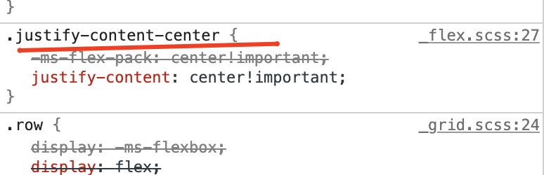
Go to inspect element and check if .justify-content-center is listed as a class name under 'Styles' tab. If not, probably you are using bootstrap v3 in which justify-content-center is not defined.
If so, please update bootstrap, worked for me.