Textarea to fill a parent container exactly, with padding
HtmlCssHtml Problem Overview
I want a <textarea> to completely fill an absolutely-sized parent container, with padding in the textarea. I have this working for Chrome using the following code:
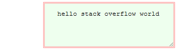
<div id="wrap"><textarea>hello stack overflow world</textarea></div>
/* Color and border CSS omitted for simplicity */
#wrap    { position:absolute; top:10%; left:20%; right:30%; bottom:60%      }
textarea { position:absolute; top:0; left:0; right:0; bottom:0; padding:1em }
Unfortunately, Firefox (v5) does not properly honor the right/bottom position, producing these results:
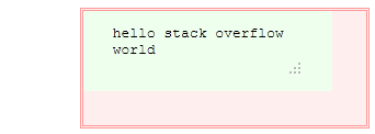
Here's a fiddle showing the problem in action: http://jsfiddle.net/ZEhwR/
How can I achieve the result stated in the first sentence across Chrome and FF (and ideally IE9 as well)?
Html Solutions
Solution 1 - Html
Use width: 100%; height: 100%; to make the <textarea> fill up the wrapping <div>. Unfortunately, you won't be able to put on margins/padding, as they get ADDED to the 100%, so the right/bottom edges will overflow.
Edit: To use width: 100%; along with padding, you can change the box sizing model:
    width: 100%;
    height: 100%;
    box-sizing: border-box;
With this change, 100% now refers to the distance between the outsides of the borders, instead of the distance between the outside of the content.
Solution 2 - Html
I have a solution where you can have 100% width and height with padding in the text area. I use negative margins to achieve the desired effect.
HTML:
<div class="container">
    <textarea class="text"/></textarea>
</div>
CSS:
.container{
  padding: 10px
  border: 1px solid silver
}

.container .text{
  resize: none;
  outline: none;
  width: 100%;
  padding: 10px;
  border: none;
  height: 100%;
  margin: -10px;
}
Tested this working on Google Chrome and Firefox
Solution 3 - Html
This is a case where I highly recommend changing the markup (it wont even hurt the semantics):
HTML
<div id="wrap">
  <label class="textarea-label">
    <textarea></textarea>
  </label>
</div>
CSS
.textarea-label
{
  display: block;
  /* border, padding, and other styles go here,
  don't set the height, and don't use floats or positioning */
}

.textarea-label textarea
{
  border: 0 none;
  margin: 0;
  outline: 0 none;
  padding: 0;
  width: 100%;
}
You should still be able to resize the textarea vertically without issues. If you use inline-block for the label, you should be able to resize horizontally as well.
The advantage of using the label is that clicking on the label will still focus the textarea as if you had clicked on the textarea. Additionally, using the descendant selector, you'll preserve your default textarea styles when you just need a plain-ol' textarea.
Solution 4 - Html
If the only problem your facing is the padding will be added to the 100% width and height, you may consider the box-sizing CSS3 property. here is an example
.box {
  box-sizing: border-box;
  -moz-box-sizing: border-box;
  -webkit-box-sizing: border-box;
  width: 100px;
  padding: 10px;
}
In this case the box will have a total width of 100px instead of 120px.
More about this property values check this link