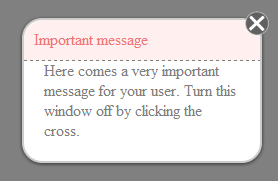
Pure css close button
JavascriptJqueryCssOverlayJavascript Problem Overview
Javascript Solutions
Solution 1 - Javascript
I spent more time on this than I should have, and haven't tested in IE for obvious reasons. That being said, it's pretty much identical.
a.boxclose{
    float:right;
    margin-top:-30px;
    margin-right:-30px;
    cursor:pointer;
    color: #fff;
    border: 1px solid #AEAEAE;
    border-radius: 30px;
    background: #605F61;
    font-size: 31px;
    font-weight: bold;
    display: inline-block;
    line-height: 0px;
    padding: 11px 3px;
}

.boxclose:before {
    content: "×";
}
Solution 2 - Javascript
My attempt at a close icon, no text
.close-icon
{
  display:block;
  box-sizing:border-box;
  width:20px;
  height:20px;
  border-width:3px;
  border-style: solid;
  border-color:red;
  border-radius:100%;
  background: -webkit-linear-gradient(-45deg, transparent 0%, transparent 46%, white 46%,  white 56%,transparent 56%, transparent 100%), -webkit-linear-gradient(45deg, transparent 0%, transparent 46%, white 46%,  white 56%,transparent 56%, transparent 100%);
  background-color:red;
  box-shadow:0px 0px 5px 2px rgba(0,0,0,0.5);
  transition: all 0.3s ease;
}
<a href="#" class="close-icon"></a>
Solution 3 - Javascript
I become frustrated trying to implement something that looked consistent in all browsers and went with an svg button which can be styled with css.
html
<svg>
    <circle cx="12" cy="12" r="11" stroke="black" stroke-width="2" fill="white" />
    <path stroke="black" stroke-width="4" fill="none" d="M6.25,6.25,17.75,17.75" />
    <path stroke="black" stroke-width="4" fill="none" d="M6.25,17.75,17.75,6.25" />
</svg>
css
svg {
    cursor: pointer;
    height: 24px;
    width: 24px;
}
svg > circle {
    stroke: black;
    fill: white;
}
svg > path {
    stroke: black;
}
svg:hover > circle {
    fill: red;
}
svg:hover > path {
    stroke: white;
}
Solution 4 - Javascript
Basic idea: For the a.boxclose:
border-radius: 40px;
width:20px;
height 10px;
background-color: #c0c0c0;
border: 1px solid black;
color: white;
padding-left: 10px;
padding-top: 4px;
Adding a "X" to the content of the close box.
Quick and dirty, but works.
Solution 5 - Javascript
Hi you can used this code in pure css
as like this
css
.arrow {
cursor: pointer;
color: white;
border: 1px solid #AEAEAE;
border-radius: 30px;
background: #605F61;
font-size: 31px;
font-weight: bold;
display: inline-block;
line-height: 0px;
padding: 11px 3px;
}
.arrow:before{
 content: "×";
}
HTML
<a href="#" class="arrow">
</a>
Live demo http://jsfiddle.net/rohitazad/VzZhU/
Solution 6 - Javascript
Edit: Updated css to match with what you have..
HTML
<div>
    <span class="close-btn"><a href="#">X</a></span>
</div>
CSS
.close-btn {
    border: 2px solid #c2c2c2;
    position: relative;
    padding: 1px 5px;
    top: -20px;
    background-color: #605F61;
    left: 198px;
    border-radius: 20px;
}

.close-btn a {
    font-size: 15px;
    font-weight: bold;
    color: white;
    text-decoration: none;
}
Solution 7 - Javascript
The disappointing thing here is that the "X" isn't transparent (which is how I would likely create a PNG, at least).
I put together this quick test. http://jsfiddle.net/UM3a2/22/embedded/result/ which allows you to color the positive space while leaving the negative space transparent. Since it is made entirely of borders it is easy to color since border-color defaults to the text color.
It doesn't fully support I.E. 8 and earlier (border-radius issues), but it degrades to a square fairly nicely (if you're okay with a square close button).
It also requires two HTML elements since you are only allowed two pseudo elements per selector. I don't know exactly where I learned this, but I think it was in an article by Chris Coyier.
<div id="close" class="arrow-t-b">
  Close
  <div class="arrow-l-r"> </div>
</div>

#close {
  border-width: 4px;
  border-style: solid;
  border-radius: 100%;
  color: #333;
  height: 12px;
  margin:auto;
  position: relative;
  text-indent: -9999px;
  width: 12px;
}
#close:hover {
  color: #39F;
}
.arrow-t-b:after,
.arrow-t-b:before,
.arrow-l-r:after,
.arrow-l-r:before {
  border-color: transparent;
  border-style: solid;
  border-width: 4px;
  content: "";
  left: 2px;
  top: 0px;
  position: absolute;
}
.arrow-t-b:after {
  border-top-color: inherit;
}
.arrow-l-r:after {
  border-right-color: inherit;
  left: 4px;
  top: 2px;
}
.arrow-t-b:before {
  border-bottom-color: inherit;
  bottom: 0;
}
.arrow-l-r:before {
  border-left-color: inherit;
  left: 0;
  top: 2px;
}
Solution 8 - Javascript
You can create close (or any) button on http://www.cssbuttongenerator.com/. It gives you pure css value of button.
HTML
<span class="classname hightlightTxt">x</span>
CSS
<style type="text/css">
.hightlightTxt {
  -webkit-touch-callout: none;
  -webkit-user-select: none;
  -moz-user-select: none;
}
.classname {
	-moz-box-shadow:inset 0px 3px 24px -1px #fce2c1;
	-webkit-box-shadow:inset 0px 3px 24px -1px #fce2c1;
	box-shadow:inset 0px 3px 24px -1px #fce2c1;
	background:-webkit-gradient( linear, left top, left bottom, color-stop(0.05, #ffc477), color-stop(1, #fb9e25) );
	background:-moz-linear-gradient( center top, #ffc477 5%, #fb9e25 100% );
	filter:progid:DXImageTransform.Microsoft.gradient(startColorstr='#ffc477', endColorstr='#fb9e25');
	background-color:#ffc477;
	-webkit-border-top-left-radius:20px;
	-moz-border-radius-topleft:20px;
	border-top-left-radius:20px;
	-webkit-border-top-right-radius:20px;
	-moz-border-radius-topright:20px;
	border-top-right-radius:20px;
	-webkit-border-bottom-right-radius:20px;
	-moz-border-radius-bottomright:20px;
	border-bottom-right-radius:20px;
	-webkit-border-bottom-left-radius:20px;
	-moz-border-radius-bottomleft:20px;
	border-bottom-left-radius:20px;
	text-indent:0px;
	border:1px solid #eeb44f;
	display:inline-block;
	color:#ffffff;
	font-family:Arial;
	font-size:28px;
	font-weight:bold;
	font-style:normal;
	height:32px;
	line-height:32px;
	width:32px;
	text-decoration:none;
	text-align:center;
	text-shadow:1px 1px 0px #cc9f52;
}
.classname:hover {
	background:-webkit-gradient( linear, left top, left bottom, color-stop(0.05, #fb9e25), color-stop(1, #ffc477) );
	background:-moz-linear-gradient( center top, #fb9e25 5%, #ffc477 100% );
	filter:progid:DXImageTransform.Microsoft.gradient(startColorstr='#fb9e25', endColorstr='#ffc477');
	background-color:#fb9e25;
}.classname:active {
	position:relative;
	top:1px;
}</style>
/* This button was generated using CSSButtonGenerator.com */
Solution 9 - Javascript
Just a thought - if you're not targeting IE7, you could get away with any image being base64-encoded and embedded into css. I'm assuming your goal is to avoid an unnecessary http request rather than to actually make a css button as its own goal.
Solution 10 - Javascript
If you want pure css, without the letter "x"....
Here are some awesome experimental icons that include an "x" in a circle that is made with CSS: http://nicolasgallagher.com/pure-css-gui-icons/demo/
Solution 11 - Javascript
I Think It Is Best!
And Use The Simple JS to make this work.
<script>
function privacypolicy(){
	var privacypolicy1 = document.getElementById('privacypolicy');
	var privacypolicy2 = ('display: inline;');
	privacypolicy1.style= privacypolicy2;
}
function hideprivacypolicy(){
	var privacypolicy1 = document.getElementById('privacypolicy');
	var privacypolicy2 = ('display: none;');
	privacypolicy1.style= privacypolicy2;
}
</script>
<style type="text/css">
    		.orthi-textlightbox-background{
    			background-color: rgba(30, 23, 23, 0.82);
    			font-family: siyam rupali;
    			position: fixed; top:0px;
    			bottom:0px;
    			right:0px;
    			width: 100%;
    			border: none;
    			margin:0;
    			padding:0;
    			overflow: hidden;
    			z-index:999999;
    			height: 100%;
    			}

    			.orthi-textlightbox-area {
    			background-color: #fff;
    			position: absolute;
    			width: 50%;
    			left: 300px;
    			top: 200px;
    			padding: 20px 10px;
    			border-radius: 6px;
    			}
    			.orthi-textlightbox-area-close{
    			font-weight: bold;
    			background-color:black;
    			color: white;
    			border-radius: 50%;
    			padding: 10px;
    			float: right;
    			border: 1px solid black;
    			box-shadow: 0 0 10px 0 rgba(33, 157, 216, 0.82);
    			margin-top:-30px;
    			margin-right:-30px;
    			cursor:pointer;
    			}
</style>
<button onclick="privacypolicy()">Show Content</button>
<div id="privacypolicy" class="orthi-textlightbox-background" style="display:none;">
<div class="orthi-textlightbox-area">
LOL<button class="orthi-textlightbox-area-close" onclick="hideprivacypolicy()">×</button>
</div>
</div>