Pure CSS checkbox image replacement
CssCheckboxCss SelectorsCss Problem Overview
I've got a checkbox list in a table. (one of a number of CB's on the row)
<tr><td><input type="checkbox" class="custom_image" value="1" id="CB1" /><label for='CB1'> </label></td></tr>
<tr><td><input type="checkbox" class="custom_image" value="2" id="CB2" /><label for='CB2'> </label></td></tr>
<tr><td><input type="checkbox" class="custom_image" value="3" id="CB3" /><label for='CB3'> </label></td></tr>
<tr><td><input type="checkbox" class="custom_image" value="4" id="CB4" /><label for='CB4'> </label></td></tr>
I'd like to replace the checkbox image with a pair of custom on/off images and I was wondering if anyone had some better understanding of how to do this with CSS?
I've found this "CSS ninja" tutorial, but I'll have to admit to finding it a bit complex for me. http://www.thecssninja.com/css/custom-inputs-using-css
As far as I can tell, you're allowed to use a pseudo class
 td:not(#foo) > input[type=checkbox] + label
 {
     background: url('/images/off.png') 0 0px no-repeat;
     height: 16px;
     padding: 0 0 0 0px;
 }
My expectation was that by adding the above CSS the checkbox would at least default to displaying the image in the OFF state and then I'd add the following to get the ON
 td:not(#foo) > input[type=checkbox]:checked + label {
     background: url('/images/on.png') 0 0px no-repeat;
 }
Unfortunately, it seems I'm missing a critical step somewhere. I've tried to use the custom CSS3 selector syntax to match my current setup - but must be missing something (The images are size 16x16 if that matters)
http://www.w3.org/TR/css3-selectors/#checked
EDIT: I'd been missing something in the tutorial where he applies the image change to the label and not the input itself. I'm still not getting the expected swapped image for checkbox result on page, but think I'm closer.
Css Solutions
Solution 1 - Css
You are close already. Just make sure to hide the checkbox and associate it with a label you style via input[checkbox] + label
Complete Code: http://gist.github.com/592332
JSFiddle: http://jsfiddle.net/4huzr/
Solution 2 - Css
Using javascript seems to be unnecessary if you choose CSS3.
By using :before selector, you can do this in two lines of CSS. (no script involved).
Another advantage of this approach is that it does not rely on <label> tag and works even it is missing.
Note: in browsers without CSS3 support, checkboxes will look normal. (backward compatible).
input[type=checkbox]:before { content:""; display:inline-block; width:12px; height:12px; background:red; }
input[type=checkbox]:checked:before { background:green; }
You can see a demo here: http://jsfiddle.net/hqZt6/1/
and this one with images:
Solution 3 - Css
If you are still looking for further more customization,
Check out the following library: https://lokesh-coder.github.io/pretty-checkbox/
Thanks
Solution 4 - Css
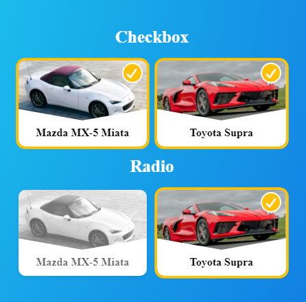
Use Images Like Checkboxes and Radios Pure Css
* {
  font-family: Lato;
  margin: 0;
  padding: 0;
  --transition: 0.15s;
  --border-radius: 0.5rem;
  --background: #ffc107;
  --box-shadow: #ffc107;
}

.cont-bg {
  min-height: 100vh;
  background-image: radial-gradient(
    circle farthest-corner at 7.2% 13.6%,
    rgba(37, 249, 245, 1) 0%,
    rgba(8, 70, 218, 1) 90%
  );
  padding: 1rem;
  display: flex;
  flex-direction: column;
  align-items: center;
  justify-content: center;
}

.cont-title {
  color: white;
  font-size: 1.25rem;
  font-weight: 600;
  margin-bottom: 1rem;
}

.cont-main {
  display: flex;
  flex-wrap: wrap;
  align-content: center;
  justify-content: center;
}

.cont-checkbox {
  width: 150px;
  height: 100px;
  border-radius: var(--border-radius);
  box-shadow: 0 0.125rem 0.25rem rgba(0, 0, 0, 0.075);
  background: white;
  transition: transform var(--transition);
}

.cont-checkbox:first-of-type {
  margin-bottom: 0.75rem;
  margin-right: 0.75rem;
}

.cont-checkbox:active {
  transform: scale(0.9);
}

input {
  display: none;
}

input:checked + label {
  opacity: 1;
  box-shadow: 0 0 0 3px var(--background);
}

input:checked + label img {
  -webkit-filter: none; /* Safari 6.0 - 9.0 */
  filter: none;
}

input:checked + label .cover-checkbox {
  opacity: 1;
  transform: scale(1);
}

input:checked + label .cover-checkbox svg {
  stroke-dashoffset: 0;
}

label {
  display: inline-block;
  cursor: pointer;
  border-radius: var(--border-radius);
  overflow: hidden;
  width: 100%;
  height: 100%;
  position: relative;
  opacity: 0.6;
}

label img {
  width: 100%;
  height: 70%;
  object-fit: cover;
  clip-path: polygon(0% 0%, 100% 0, 100% 81%, 50% 100%, 0 81%);
  -webkit-filter: grayscale(100%); /* Safari 6.0 - 9.0 */
  filter: grayscale(100%);
}

label .cover-checkbox {
  position: absolute;
  right: 5px;
  top: 3px;
  z-index: 1;
  width: 20px;
  height: 20px;
  border-radius: 50%;
  background: var(--box-shadow);
  border: 2px solid #fff;
  transition: transform var(--transition),
    opacity calc(var(--transition) * 1.2) linear;
  opacity: 0;
  transform: scale(0);
}

label .cover-checkbox svg {
  width: 13px;
  height: 11px;
  display: inline-block;
  vertical-align: top;
  fill: none;
  margin: 5px 0 0 3px;
  stroke: #fff;
  stroke-width: 2;
  stroke-linecap: round;
  stroke-linejoin: round;
  stroke-dasharray: 16px;
  transition: stroke-dashoffset 0.4s ease var(--transition);
  stroke-dashoffset: 16px;
}

label .info {
  text-align: center;
  margin-top: 0.2rem;
  font-weight: 600;
  font-size: 0.8rem;
}
<div class="cont-bg">
  <div class="cont-title">Checkbox</div>
  <div class="cont-main">
    <div class="cont-checkbox">
      <input type="checkbox" id="myCheckbox-1" />
      <label for="myCheckbox-1">
        <img
          src="https://hips.hearstapps.com/hmg-prod.s3.amazonaws.com/images/2021-mazda-mx-5-miata-mmp-1-1593459650.jpg?crop=0.781xw:0.739xh;0.109xw,0.0968xh&resize=480:*"
        />
        <span class="cover-checkbox">
          <svg viewBox="0 0 12 10">
            <polyline points="1.5 6 4.5 9 10.5 1"></polyline>
          </svg>
        </span>
        <div class="info">Mazda MX-5 Miata</div>
      </label>
    </div>
    <div class="cont-checkbox">
      <input type="checkbox" id="myCheckbox-2" />
      <label for="myCheckbox-2">
        <img
          src="https://hips.hearstapps.com/hmg-prod.s3.amazonaws.com/images/2020-chevrolet-corvette-c8-102-1571146873.jpg?crop=0.548xw:0.411xh;0.255xw,0.321xh&resize=980:*"
        />
        <span class="cover-checkbox">
          <svg viewBox="0 0 12 10">
            <polyline points="1.5 6 4.5 9 10.5 1"></polyline>
          </svg>
        </span>
        <div class="info">Toyota Supra</div>
      </label>
    </div>
  </div>
  <div class="cont-title">Radio</div>
  <div class="cont-main">
    <div class="cont-checkbox">
      <input type="radio" name="myRadio" id="myRadio-1" />
      <label for="myRadio-1">
        <img
          src="https://hips.hearstapps.com/hmg-prod.s3.amazonaws.com/images/2021-mazda-mx-5-miata-mmp-1-1593459650.jpg?crop=0.781xw:0.739xh;0.109xw,0.0968xh&resize=480:*"
        />
        <span class="cover-checkbox">
          <svg viewBox="0 0 12 10">
            <polyline points="1.5 6 4.5 9 10.5 1"></polyline>
          </svg>
        </span>
        <div class="info">Mazda MX-5 Miata</div>
      </label>
    </div>
    <div class="cont-checkbox">
      <input type="radio" name="myRadio" id="myRadio-2" />
      <label for="myRadio-2">
        <img
          src="https://hips.hearstapps.com/hmg-prod.s3.amazonaws.com/images/2020-chevrolet-corvette-c8-102-1571146873.jpg?crop=0.548xw:0.411xh;0.255xw,0.321xh&resize=980:*"
        />
        <span class="cover-checkbox">
          <svg viewBox="0 0 12 10">
            <polyline points="1.5 6 4.5 9 10.5 1"></polyline>
          </svg>
        </span>
        <div class="info">Toyota Supra</div>
      </label>
    </div>
  </div>
</div>