Prevent "overscrolling" of web page
HtmlCssMacosGoogle ChromeHtml Problem Overview
In Chrome for Mac, one can "overscroll" a page (for lack of a better word), as shown in the screenshot below, to see "what's behind", similar to the iPad or iPhone.
I've noticed that some pages have it disabled, like gmail and the "new tab" page.
How can I disable "overscrolling"? Are there other ways in which I can control "overscrolling"?
Html Solutions
Solution 1 - Html
The accepted solution was not working for me. The only way I got it working while still being able to scroll is:
html {
    overflow: hidden;
    height: 100%;
}

body {
    height: 100%;
    overflow: auto;
}
Solution 2 - Html
In Chrome 63+, Firefox 59+ and Opera 50+ you can do this in CSS:
body {
  overscroll-behavior-y: none;
}
This disables the rubberbanding effect on iOS shown in the screenshot of the question. It however also disables pull-to-refresh, glow effects and scroll chaining.
You can however elect to implement your own effect or functionality upon over-scrolling. If you for instance want to blur the page and add a neat animation:
<style>
  body.refreshing #inbox {
    filter: blur(1px);
    touch-action: none; /* prevent scrolling */
  }
  body.refreshing .refresher {
    transform: translate3d(0,150%,0) scale(1);
    z-index: 1;
  }
  .refresher {
    --refresh-width: 55px;
    pointer-events: none;
    width: var(--refresh-width);
    height: var(--refresh-width);
    border-radius: 50%;
    position: absolute;
    transition: all 300ms cubic-bezier(0,0,0.2,1);
    will-change: transform, opacity;
    ...
  }
</style>

<div class="refresher">
  <div class="loading-bar"></div>
  <div class="loading-bar"></div>
  <div class="loading-bar"></div>
  <div class="loading-bar"></div>
</div>

<section id="inbox"><!-- msgs --></section>

<script>
  let _startY;
  const inbox = document.querySelector('#inbox');

  inbox.addEventListener('touchstart', e => {
    _startY = e.touches[0].pageY;
  }, {passive: true});

  inbox.addEventListener('touchmove', e => {
    const y = e.touches[0].pageY;
    // Activate custom pull-to-refresh effects when at the top of the container
    // and user is scrolling up.
    if (document.scrollingElement.scrollTop === 0 && y > _startY &&
        !document.body.classList.contains('refreshing')) {
      // refresh inbox.
    }
  }, {passive: true});
</script>
Browser Support
As of this writing Chrome 63+, Firefox 59+ and Opera 50+ support it. Edge publically supported it while Safari is an unknown. Track progress here and current browser compatibility at MDN documentation
More information
- Chrome 63 release video
- Chrome 63 release post - contains links and details to everything I wrote above.
overscroll-behaviorCSS spec- MDN documentation
Solution 3 - Html
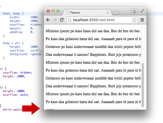
One way you can prevent this, is using the following CSS:
html, body {
    width: 100%;
    height: 100%;
    overflow: hidden;
}

body > div {
    height: 100%;
    overflow: scroll;
    -webkit-overflow-scrolling: touch;
}
This way the body has never any overflow and won't "bounce" when scrolling at the top and bottom of the page. The container will perfectly scroll its content within. This works in Safari and in Chrome.
Edit
Why the extra <div>-element as a wrapper could be useful:
Florian Feldhaus' solution uses slightly less code and works fine too. However, it can have a little quirk, when it comes to content that exceeds the viewport width. In this case the scrollbar at the bottom of the window is moved out of the viewport half way and is hard to recognize/reach. This can be avoided using body { margin: 0; } if suitable. In situation where you can't add this CSS the wrapper element is useful as the scrollbar is always fully visible.
Find a screenshot below:
Solution 4 - Html
Try this way
body {
    height: 100vh;
    background-size: cover;
    overflow: hidden;
}
Solution 5 - Html
You can use this code to remove touchmove predefined action:
document.body.addEventListener('touchmove', function(event) {
  console.log(event.source);
  //if (event.source == document.body)
    event.preventDefault();
}, false);
Solution 6 - Html
html,body {
	width: 100%;
	height: 100%;
}
body {
	position: fixed;
	overflow: hidden;
}
Solution 7 - Html
position: absolute works for me. I've tested on Chrome 50.0.2661.75 (64-bit) and OSX.
body {
  overflow: hidden;
}

// position is important
#element {
  position: absolute;
  top: 0;
  right: 0;
  bottom: 0;
  left: 0;
  overflow: auto;
}
Solution 8 - Html
Bounce effect cannot be disabled except the height of webpage equals to window.innerHeight, you can let your sub-elements scroll.
html {
    overflow: hidden;
}