Outline radius?
HtmlCssHtml Problem Overview
Is there any way of getting rounded corners on the outline of a div element, similar to border-radius?
Html Solutions
Solution 1 - Html
Old question now, but this might be relevant for somebody with a similar issue. I had an input field with rounded border and wanted to change colour of focus outline. I couldn't tame the horrid square outline to the input control.
So instead, I used box-shadow. I actually preferred the smooth look of the shadow, but the shadow can be hardened to simulate a rounded outline:
input, input:focus {
    border: none;
    border-radius: 2pt;
    box-shadow: 0 0 0 1pt grey;
    outline: none;
    transition: .1s;
}
/* Smooth outline with box-shadow: */
.text1:focus {
    box-shadow: 0 0 3pt 2pt cornflowerblue;
}

/* Hard "outline" with box-shadow: */
.text2:focus {
    box-shadow: 0 0 0 2pt red;
}
<input class="text1">
<br>
<br>
<input type=text class="text2">
Solution 2 - Html
I usually accomplish this using the :after pseudo-element:
of course it depends on usage, this method allows control over individual borders, rather than using the hard shadow method.
you could also set -1px offsets and use a background linear gradient (no border) for a different effect once again.
body {
  margin: 20px;
}

a {
  background: #999;
  padding: 10px 20px;
  border-radius: 5px;
  text-decoration: none;
  color: #fff;
  position: relative;
  border: 2px solid #000;
}

a:after {
  content: '';
  display: block;
  position: absolute;
  top: 0;
  bottom: 0;
  left: 0;
  right: 0;
  border-radius: 5px;
  border: 2px solid #ccc;
}
<a href="#">Button</a>
Solution 3 - Html
Similar to Lea Hayes above, but here's how I did it:
div {
  background: #999;
  height: 100px;
  width: 200px;
  border: #999 solid 1px;
  border-radius: 10px;
  margin: 15px;
  box-shadow: 0px 0px 0px 1px #fff inset;
}
<div></div>
No nesting of DIVs or jQuery necessary, Altho for brevity I have left out the -moz and -webkit variants of some of the CSS. You can see the result above
Solution 4 - Html
Use this one:
box-shadow: 0px 0px 0px 1px red;
Solution 5 - Html
I wanted some nice focus accessibility for dropdown menus in a Bootstrap navbar, and was pretty happy with this:
     a.dropdown-toggle:focus {
         display: inline-block;
         box-shadow: 0 0 0 2px #88b8ff;
         border-radius: 2px;
     }
<a href="https://stackoverflow.com" class="dropdown-toggle">Visit Stackoverflow</a>
Solution 6 - Html
We may see our wishes soonish by setting outline-style: auto It's on WebKits radar: http://trac.webkit.org/changeset/198062/webkit
See ya in 2030.
Solution 7 - Html
You're looking for something like this, I think.
div {
    -webkit-border-radius: 10px;
    -moz-border-radius: 10px;
    border-radius: 10px;
    border: 1px solid black;
    background-color: #CCC;
    height: 100px;
    width: 160px;
}
Edit
There is a Firefox-only -moz-outline-radius properly, but that won't work on IE/Chrome/Safari/Opera/etc. So, it looks like the most cross-browser-compatible way* to get a curved line around a border is to use a wrapper div:
div.inner {
  -webkit-border-radius: 10px;
  -moz-border-radius: 10px;
  border-radius: 10px;
  border: 1px solid black;
  background-color: #CCC;
  height: 100px;
  width: 160px;
}

div.outer {
  display: inline-block;
  -webkit-border-radius: 10px;
  -moz-border-radius: 10px;
  border-radius: 10px;
  border: 1px solid red;
}
<div class="outer">
  <div class="inner"></div>
</div>
*aside from using images
Solution 8 - Html
Firefox 88+: border-radius
From April 2021 you will be able to use a simple CSS for Firefox:
.actual {
  outline: solid red;
  border-radius: 10px;
}

.expected {
  border: solid red;
  border-radius: 10px;
}
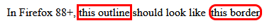
In Firefox 88+,
<span class="actual">this outline</span>
should look like
<span class="expected">this border</span>
Current behaviour in Firefox 86.0:
Webkit: no solution
Using outline-style: auto will tell the «user agent to render a custom outline style»: see [MDN](https://developer.mozilla.org/en-US/docs/Web/CSS/outline-style(.
Webkit-based browsers will then draw the outline over the border, when you use outline-style: auto. It's difficult to style it properly.
.actual {
  outline: auto red;
  border-radius: 10px;
}

.expected {
  border: solid red;
  border-radius: 10px;
}
In WebKit browsers (Chrome, Edge),
<span class="actual">this outline</span>
should look close to
<span class="expected">this border</span>
Current behaviour in Chrome 89.0:

More information
From Firefox 88 (to be released April 20 2021), outline will follow the shape of border-radius.
The current -moz-outline-radius will become redundant and will be removed.
See MDN's entry about -moz-outline-radius:
> From Firefox 88 onwards, the standard outline property will follow the shape of border-radius, making -moz-outline-radius properties redundant. As such, this property will be removed.
Solution 9 - Html
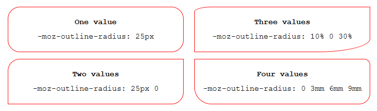
As far as I know, the Outline radius is only supported by Firefox and Firefox for android.
(Jul 2021)
-moz-outline-radius: 1em;
Solution 10 - Html
I just found a great solution for this, and after looking at all the responses so far, I haven't seen it posted yet. So, here's what I did:
I created a CSS Rule for the class and used a pseudo-class of :focus for that rule. I set outline: none to get rid of that default light-blue non-border-radius-able 'outline' that Chrome uses by default. Then, in that same :focus pseudo-class, where that outline no longer exists, I added my radius and border properties. Leading to the following
outline: none;
border-radius: 5px;
border: 2px solid maroon;
to have a maroon-colored outline with a border radius that now appears when the element is tab-selected by the user.
Solution 11 - Html
If you want to get an embossed look you could do something like the following:
.embossed {
  background: #e5e5e5;
  height: 100px;
  width: 200px;
  border: #FFFFFF solid 1px;
  outline: #d0d0d0 solid 1px;
  margin: 15px;
}

.border-radius {
  border-radius: 20px 20px 20px 20px;
  -webkit-border-radius: 20px;
  -moz-border-radius: 20px;
  -khtml-border-radius: 20px;
}

.outline-radius {
  -moz-outline-radius: 21px;
}
<div class="embossed"></div>
<div class="embossed border-radius"></div>
<div class="embossed border-radius outline-radius">-MOZ ONLY</div>
I have not found a work around to have this work in other browsers.
EDIT: The only other way you can do this is to use box-shadow, but then this wont work if you already have a box shadow on that element.
Solution 12 - Html
As others have said, only firefox supports this. Here is a work around that does the same thing, and even works with dashed outlines.
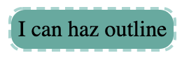
.has-outline {
    display: inline-block;
    background: #51ab9f;
    border-radius: 10px;
    padding: 5px;
    position: relative;
}
.has-outline:after {
  border-radius: 10px;
  padding: 5px;
  border: 2px dashed #9dd5cf;
  position: absolute;
  content: '';
  top: -2px;
  left: -2px;
  bottom: -2px;
  right: -2px;
}
<div class="has-outline">
  I can haz outline
</div>
Solution 13 - Html
Chrome 94.0+
I tested it in chrome 94.0 and it seems that the outline property honors the border-radius now.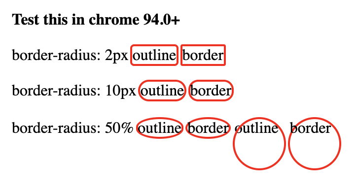
.outline {
  outline: 2px solid red;
}

.border {
  border: 2px solid red;
}

.outline-10 {
  border-radius: 10px;
}

.border-2 {
  border-radius: 2px;
}

.outline-2 {
  border-radius: 2px;
}

.border-10 {
  border-radius: 10px;
}

.outline-50 {
  border-radius: 50%;
}

.border-50 {
  border-radius: 50%;
}

.circle {
  display: inline-block;
  width:50px;
  height: 50px;
}
Test this in chrome 94.0+
border-radius: 2px
outline
border
border-radius: 10px
outline
border
border-radius: 50%
outline
border
outline
border
Solution 14 - Html
No. Borders sit on the outside of the element and on the inside of the box-model margin area. Outlines sit on the inside of the element and the box-model padding area ignores it. It isn't intended for aesthetics. It's just to show the designer the outlines of the elements. In the early stages of developing an html document for example, a developer might need to quickly discern if they have put all of the skeletal divs in the correct place. Later on they may need to check if various buttons and forms are the correct number of pixels apart from each other.
Borders are aesthetic in nature. Unlike outlines they are actually apart of the box-model, which means they do not overlap text set to margin: 0; and each side of the border can be styled individually.
If you're trying to apply a corner radius to outline I assume you are using it the way most people use border. So if you don't mind me asking, what property of outline makes it desirable over border?
Solution 15 - Html
There is the solution if you need only outline without border. It's not mine. I got if from Bootstrap css file. If you specify outline: 1px auto certain_color, you'll get thin outer line around div of certain color. In this case the specified width has no matter, even if you specify 10 px width, anyway it will be thin line. The key word in mentioned rule is "auto".
If you need outline with rounded corners and certain width, you may add css rule on border with needed width and same color. It makes outline thicker.
Solution 16 - Html
COMBINING BOX SHADOW AND OUTLINE.
A slight twist on Lea Hayes answer I found
input[type=text]:focus {
    box-shadow: 0 0 0 1pt red;
    outline-width: 1px;
    outline-color: red;
}
gets a really nice clean finish. No jumping in size which you get when using border-radius
Solution 17 - Html
I was making custom radio buttons and the best customisable way i've found is using pseudo elements like this: Codepen
/CSS is compiled from SCSS/
.product-colors {
  margin-bottom: 1em;
  display: flex;
  align-items: center;
}
.product-colors label {
  position: relative;
  width: 2.1em;
  height: 2.1em;
  margin-right: 0.8em;
  cursor: pointer;
}
.product-colors label:before {
  opacity: 0;
  width: inherit;
  height: inherit;
  padding: 2px;
  border: 2px solid red;
  border-radius: 0.2em;
  content: "";
  position: absolute;
  z-index: 1;
  background: transparent;
  top: -4px;
  left: -4px;
}
.product-colors input {
  position: absolute;
  opacity: 0;
  width: 0;
  height: 0;
}
.product-colors input:checked + label:before, .product-colors input:focus + label:before {
  opacity: 1;
}
<div class="product-colors">
  <input type="radio" name="cs" id="cs1" value="black">
  <label for="cs1" style="background:black"></label>
  <input type="radio" name="cs" id="cs2" value="green">
  <label for="cs2" style="background:green"></label>
  <input type="radio" name="cs" id="cs3" value="blue">
  <label for="cs3" style="background:blue"></label>
  <input type="radio" name="cs" id="cs4" value="yellow">
  <label for="cs4" style="background:yellow"></label>
</div>
Solution 18 - Html
clip-path: circle(100px at center);
This will actually make clickable only circle, while border-radius still makes a square, but looks as circle.
Solution 19 - Html
The simple answer to the basic question is no. The only cross-browser option is to create a hack that accomplishes what you want. This approach does carry with it certain potential issues when it comes to styling pre-existing content, but it provides for more customization of the outline (offset, width, line style) than many of the other solutions.
On a basic level, consider the following static example (run the snippent for demo):
.outline {
    border: 2px dotted transparent;
    border-radius: 5px;
    display: inline-block;
    padding: 2px;
    margin: -4px;
}

/* :focus-within does not work in Edge or IE */
.outline:focus-within, .outline.edge {
    border-color: blue;
}

br {
    margin-bottom: 0.75rem;
}
<h3>Javascript-Free Demo</h3>
<div class="outline edge"><input type="text" placeholder="I always have an outline"/></div><br><div class="outline"><input type="text" placeholder="I have an outline when focused"/></div> *<i>Doesn't work in Edge or IE</i><br><input type="text" placeholder="I have never have an outline" />
Note that the outline does not increase the spacing between the outlined input and other elements around it. The margin (-4px) compensates for the space that the outlines padding (-2px) and width (2px) take up, a total of 4px.
Now, on a more advanced level, it would be possible to use JavaScript to bootstrap elements of a given type or class so that they are wrapped inside a div that simulates an outline on page load. Furthermore, event bindings could be established to show or hide the outline on user interactions like this (run the snippet below or open in JSFiddle):
h3 {
  margin: 0;
}

div {
  box-sizing: border-box;
}

.flex {
  display: flex;
}

.clickable {
  cursor: pointer;
}

.box {
  background: red;
  border: 1px solid black;
  border-radius: 10px;
  height: 5rem;
  display: flex;
  align-items: center;
  text-align: center;
  color: white;
  font-weight: bold;
  padding: 0.5rem;
  margin: 1rem;
}
<h3>Javascript-Enabled Demo</h3>
<div class="flex">
  <div class="box outline-me">I'm outlined because I contain<br>the "outline-me" class</div>
  <div class="box clickable">Click me to toggle outline</div>
</div>
<hr>
<input type="text" placeholder="I'm outlined when focused" />

<script>
// Called on an element to wrap with an outline and passed a styleObject
// the styleObject can contain the following outline properties:
// 		style, width, color, offset, radius, bottomLeftRadius,
//		bottomRightRadius, topLeftRadius, topRightRadius
// It then creates a new div with the properties specified and
// moves the calling element into the div
// The newly created wrapper div receives the class "simulated-outline"
Element.prototype.addOutline = function (styleObject, hideOutline = true) {
    var element = this;

    // create a div for simulating an outline
    var outline = document.createElement('div');

    // initialize css formatting
    var css = 'display:inline-block;';

    // transfer any element margin to the outline div
    var margins = ['marginTop', 'marginBottom', 'marginLeft', 'marginRight'];
    var marginPropertyNames = {
        marginTop: 'margin-top',
        marginBottom: 'margin-bottom',
        marginLeft: 'margin-left',
        marginRight: 'margin-right'
    }
    var outlineWidth = Number.parseInt(styleObject.width);
    var outlineOffset = Number.parseInt(styleObject.offset);
    for (var i = 0; i < margins.length; ++i) {
        var computedMargin = Number.parseInt(getComputedStyle(element)[margins[i]]);
        var margin = computedMargin - outlineWidth - outlineOffset;
        css += marginPropertyNames[margins[i]] + ":" + margin + "px;";
    }
    element.style.cssText += 'margin:0px !important;';

    // compute css border style for the outline div
    var keys = Object.keys(styleObject);
    for (var i = 0; i < keys.length; ++i) {
        var key = keys[i];
        var value = styleObject[key];
        switch (key) {
            case 'style':
                var property = 'border-style';
                break;
            case 'width':
                var property = 'border-width';
                break;
            case 'color':
                var property = 'border-color';
                break;
            case 'offset':
                var property = 'padding';
                break;
            case 'radius':
                var property = 'border-radius';
                break;
            case 'bottomLeftRadius':
                var property = 'border-bottom-left-radius';
                break;
            case 'bottomRightRadius':
                var property = 'border-bottom-right-radius';
                break;
            case 'topLeftRadius':
                var property = 'border-top-left-radius-style';
                break;
            case 'topRightRadius':
                var property = 'border-top-right-radius';
                break;
        }
        css += property + ":" + value + ';';
    }

    // apply the computed css to the outline div
    outline.style.cssText = css;

    // add a class in case we want to do something with elements
    // receiving a simulated outline
    outline.classList.add('simulated-outline');

    // place the element inside the outline div
    var parent = element.parentElement;
    parent.insertBefore(outline, element);
    outline.appendChild(element);

    // determine whether outline should be hidden by default or not
    if (hideOutline) element.hideOutline();
}

Element.prototype.showOutline = function () {
    var element = this;
    // get a reference to the outline element that wraps this element
    var outline = element.getOutline();
    // show the outline if one exists
    if (outline) outline.classList.remove('hide-outline');
}


Element.prototype.hideOutline = function () {
    var element = this;
    // get a reference to the outline element that wraps this element
    var outline = element.getOutline();
    // hide the outline if one exists
    if (outline) outline.classList.add('hide-outline');
}

// Determines if this element has an outline. If it does, it returns the outline
// element. If it doesn't have one, return null.
Element.prototype.getOutline = function() {
    var element = this;
    var parent = element.parentElement;
    return (parent.classList.contains('simulated-outline')) ? parent : null;
}

// Determines the visiblity status of the outline, returning true if the outline is
// visible and false if it is not. If the element has no outline, null is returned.
Element.prototype.outlineStatus = function() {
    var element = this;
    var outline = element.getOutline();
    if (outline === null) {
        return null;
    } else {
        return !outline.classList.contains('hide-outline');
    }
}

// this embeds a style element in the document head for handling outline visibility
var embeddedStyle = document.querySelector('#outline-styles');
if (!embeddedStyle) {
    var style = document.createElement('style');
    style.innerText = `
        .simulated-outline.hide-outline {
            border-color: transparent !important;
        }
    `;
    document.head.append(style);
}


/*########################## example usage ##########################*/

// add outline to all elements with "outline-me" class
var outlineMeStyle = {
    style: 'dashed',
    width: '3px',
    color: 'blue',
    offset: '2px',
    radius: '5px'
};
document.querySelectorAll('.outline-me').forEach((element)=>{
  element.addOutline(outlineMeStyle, false);
});


// make clickable divs get outlines
var outlineStyle = {
    style: 'double',
    width: '4px',
    offset: '3px',
    color: 'red',
    radius: '10px'
};
document.querySelectorAll('.clickable').forEach((element)=>{
    element.addOutline(outlineStyle);
    element.addEventListener('click', (evt)=>{
        var element = evt.target;
        (element.outlineStatus()) ? element.hideOutline() : element.showOutline();
    });
});


// configure inputs to only have outline on focus
document.querySelectorAll('input').forEach((input)=>{
    var outlineStyle = {
        width: '2px',
        offset: '2px',
        color: 'black',
        style: 'dotted',
        radius: '10px'
    }
    input.addOutline(outlineStyle);
    input.addEventListener('focus', (evt)=>{
        var input = evt.target;
        input.showOutline();
    });
    input.addEventListener('blur', (evt)=>{
        var input = evt.target;
        input.hideOutline();
    });
});
</script>
In closing, let me reiterate, that implementing this approach may require more styling than what I have included in my demos, especially if you have already styled the element you want outlined.
Solution 20 - Html
I just set outline transparent.
input[type=text] {
  outline: rgba(0, 0, 0, 0);
  border-radius: 10px;
}

input[type=text]:focus {
  border-color: #0079ff;
}
Solution 21 - Html
Try using padding and a background color for the border, then a border for the outline:
.round_outline {
  padding: 8px;
  background-color: white;
  border-radius: 50%;
  border: 1px solid black;
}
Worked in my case.
Solution 22 - Html
I like this way.
.circle:before {
   content: "";
   width: 14px;
   height: 14px;
   border: 3px solid #fff;
   background-color: #ced4da;
   border-radius: 7px;
   display: inline-block;
   margin-bottom: -2px;
   margin-right: 7px;
   box-shadow: 0px 0px 0px 1px #ced4da;
}
It will create gray circle with wit border around it and again 1px around border!
Solution 23 - Html
outline-style: auto has had full browser support for ages now.
Shorthand is:
outline: auto blue;
This let's you set a custom color, but not a custom thickness, unfortunately (although I think the browser default thickness is a good default).
You can also set a custom outline-offset when using outline-style: auto.
outline: auto blue;
outline-offset: 0px;