Inline Form nested within Horizontal Form in Bootstrap 3
HtmlCssFormsTwitter BootstrapTwitter Bootstrap-3Html Problem Overview
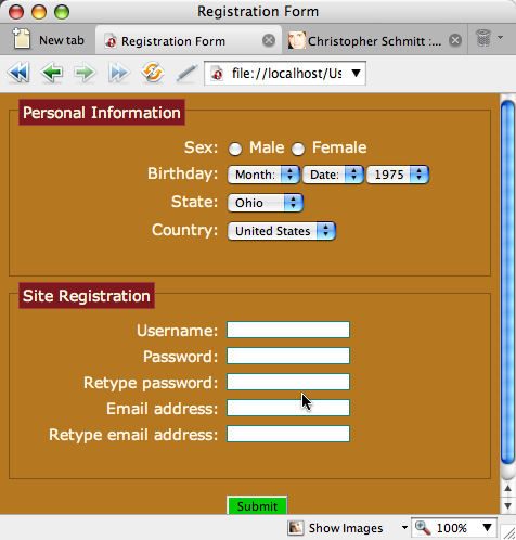
I want to build a form in Bootstrap 3 like this:
My site (not the above link) just updates from Bootstrap 2.3.2 and the format is not correct anymore.
I cannot find any doc about this type of form on getbootstrap.com.
Could anyone tell me how to do this? Only 'Username' would be OK.
Thanks.
PS There is a similar question but it's using Bootstrap 2.3.2.
Html Solutions
Solution 1 - Html
I have created a demo for you.
Here is how your nested structure should be in Bootstrap 3:
<div class="form-group">
	<label for="birthday" class="col-xs-2 control-label">Birthday</label>
	<div class="col-xs-10">
		<div class="form-inline">
			<div class="form-group">
				<input type="text" class="form-control" placeholder="year"/>
			</div>
			<div class="form-group">
				<input type="text" class="form-control" placeholder="month"/>
			</div>
			<div class="form-group">
				<input type="text" class="form-control" placeholder="day"/>
			</div>
		</div>
	</div>
</div>
Notice how the whole form-inline is nested within the col-xs-10 div containing the control of the horizontal form. In other terms, the whole form-inline is the "control" of the birthday label in the main horizontal form.
Note that you will encounter a left and right margin problem by nesting the inline form within the horizontal form. To fix this, add this to your css:
.form-inline .form-group{
    margin-left: 0;
    margin-right: 0;
}
Solution 2 - Html
Another option is to put all of the fields that you want on a single line within a single form-group.
http://jsfiddle.net/a3vAP/296/"><strong>See demo here
<form class="form-horizontal">
    <div class="form-group">
        <label for="name" class="col-xs-2 control-label">Name</label>
        <div class="col-xs-10">
            <input type="text" class="form-control col-sm-10" name="name" placeholder="name"/>
        </div>
    </div>

    <div class="form-group">
        <label for="birthday" class="col-xs-3 col-sm-2 control-label">Birthday</label>
        <div class="col-xs-3">
            <input type="text" class="form-control" placeholder="year"/>
        </div>
        <div class="col-xs-3">
            <input type="text" class="form-control" placeholder="month"/>
        </div>
        <div class="col-xs-3">
            <input type="text" class="form-control" placeholder="day"/>
        </div>
    </div>
</form>
Solution 3 - Html
This Bootply example seems like a much better option. Only thing is that the labels are a little too high so I added padding-top:5px to center them with my inputs.
<div class="container">
<h2>Bootstrap Mixed Form <p class="lead">with horizontal and inline fields</p></h2>
<form role="form" class="form-horizontal">
    <div class="form-group">
        <label class="col-sm-1" for="inputEmail1">Email</label>
        <div class="col-sm-5"><input type="email" class="form-control" id="inputEmail1" placeholder="Email"></div>
    </div>
    <div class="form-group">
        <label class="col-sm-1" for="inputPassword1">Password</label>
        <div class="col-sm-5"><input type="password" class="form-control" id="inputPassword1" placeholder="Password"></div>
    </div>
    <div class="form-group">
        <label class="col-sm-12" for="TextArea">Textarea</label>
        <div class="col-sm-6"><textarea class="form-control" id="TextArea"></textarea></div>
    </div>
    <div class="form-group">
        <div class="col-sm-3"><label>First name</label><input type="text" class="form-control" placeholder="First"></div>
        <div class="col-sm-3"><label>Last name</label><input type="text" class="form-control" placeholder="Last"></div>
    </div>
    <div class="form-group">
        <label class="col-sm-12">Phone number</label>
        <div class="col-sm-1"><input type="text" class="form-control" placeholder="000"><div class="help">area</div></div>
        <div class="col-sm-1"><input type="text" class="form-control" placeholder="000"><div class="help">local</div></div>
        <div class="col-sm-2"><input type="text" class="form-control" placeholder="1111"><div class="help">number</div></div>
        <div class="col-sm-2"><input type="text" class="form-control" placeholder="123"><div class="help">ext</div></div>
    </div>
    <div class="form-group">
        <label class="col-sm-1">Options</label>
        <div class="col-sm-2"><input type="text" class="form-control" placeholder="Option 1"></div>
        <div class="col-sm-3"><input type="text" class="form-control" placeholder="Option 2"></div>
    </div>
    <div class="form-group">
        <div class="col-sm-6">
            <button type="submit" class="btn btn-info pull-right">Submit</button>
        </div>
    </div>
</form>
<hr>
</div>
Solution 4 - Html
To make it work in Chrome (and bootply) i had to change code in this way:
<form class="form-horizontal">
  <div class="form-group">
    <label for="name" class="col-xs-2 control-label">Name</label>
    <div class="col-xs-10">
      <input type="text" class="form-control col-sm-10" name="name" placeholder="name" />
    </div>
  </div>

  <div class="form-group">
    <label for="birthday" class="col-xs-2 control-label">Birthday</label>
    <div class="col-xs-10">
      <div class="form-inline">
        <input type="text" class="form-control" placeholder="year" />
        <input type="text" class="form-control" placeholder="month" />
        <input type="text" class="form-control" placeholder="day" />
      </div>
    </div>
  </div>
</form>
Solution 5 - Html
A much simpler solution, without all the inside form-group elements
<div class="form-group">
       <label for="birthday" class="col-xs-2 control-label">Birthday</label>
       <div class="col-xs-10">
           <div class="form-inline">
               <input type="text" class="form-control" placeholder="year" style="width:70px;"/>
               <input type="text" class="form-control" placeholder="month" style="width:80px;"/>
               <input type="text" class="form-control" placeholder="day" style="width:100px;"/>
           </div>
     </div>
</div>
... and it will look like this,

Cheers!
Solution 6 - Html
I had problems aligning the label to the input(s) elements so I transferred the label element inside the form-inline and form-group too...and it works..
<div class="form-group">
    <div class="col-xs-10">
        <div class="form-inline">
            <div class="form-group">
                <label for="birthday" class="col-xs-2 control-label">Birthday:</label>
            </div>
            <div class="form-group">
                <input type="text" class="form-control" placeholder="year"/>
            </div>
            <div class="form-group">
                <input type="text" class="form-control" placeholder="month"/>
            </div>
            <div class="form-group">
                <input type="text" class="form-control" placeholder="day"/>
            </div>
        </div>
    </div>
</div>