ImageView in circular through XML
AndroidXmlImageviewAndroid Problem Overview
I'd Like to make any image from my ImageView to be circular with a border.
I searched but couldn't find any useful information (anything that I tried didn't work).
How can I achieve this through XML:
Create an ImageView with certain src and make it circular with a border?
Android Solutions
Solution 1 - Android
This is the simplest way that I designed. Try this.
dependencies
-
implementation 'androidx.appcompat:appcompat:1.3.0-beta01'
-
implementation 'androidx.cardview:cardview:1.0.0'
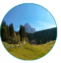
 <android.support.v7.widget.CardView
     android:layout_width="80dp"
     android:layout_height="80dp"
     android:elevation="12dp"
     android:id="@+id/view2"
    app:cardCornerRadius="40dp"
     android:layout_centerHorizontal="true"
     android:innerRadius="0dp"
     android:shape="ring"
     android:thicknessRatio="1.9">
     <ImageView
         android:layout_height="80dp"
         android:layout_width="match_parent"
         android:id="@+id/imageView1"
         android:src="@drawable/YOUR_IMAGE"
         android:layout_alignParentTop="true"
         android:layout_centerHorizontal="true">
     </ImageView>
  </android.support.v7.widget.CardView>
If you are working on android versions above lollipop
 <android.support.v7.widget.CardView
 android:layout_width="80dp"
 android:layout_height="80dp"
 android:elevation="12dp"
 android:id="@+id/view2"
 app:cardCornerRadius="40dp"
 android:layout_centerHorizontal="true">
 <ImageView
     android:layout_height="80dp"
     android:layout_width="match_parent"
     android:id="@+id/imageView1"
     android:src="@drawable/YOUR_IMAGE"
     android:scaleType="centerCrop"/>
   </android.support.v7.widget.CardView>
Adding Border to round ImageView - LATEST VERSION
Wrap it with another CardView slightly bigger than the inner one and set its background color to add a border to your round image. You can increase the size of the outer CardView to increase the thickness of the border.
<androidx.cardview.widget.CardView
  android:layout_width="155dp"
  android:layout_height="155dp"
  app:cardCornerRadius="250dp"
  app:cardBackgroundColor="@color/white">

    <androidx.cardview.widget.CardView
      android:layout_width="150dp"
      android:layout_height="150dp"
      app:cardCornerRadius="250dp"
      android:layout_gravity="center">

        <ImageView
          android:layout_width="150dp"
          android:layout_height="150dp"
          android:src="@drawable/default_user"
          android:scaleType="centerCrop"/>

   </androidx.cardview.widget.CardView>

 </androidx.cardview.widget.CardView>
Solution 2 - Android
You can make a simple circle with white border and transparent content with shape.
// res/drawable/circle.xml

<shape xmlns:android="http://schemas.android.com/apk/res/android"
    android:innerRadius="0dp"
    android:shape="ring"
    android:thicknessRatio="1.9"
    android:useLevel="false" >
    <solid android:color="@android:color/transparent" />

    <stroke
        android:width="10dp"
        android:color="@android:color/white" />
</shape>
Then make a layerlist drawable and put it as background to your imageview.
// res/drawable/img.xml

<?xml version="1.0" encoding="utf-8"?>
<layer-list xmlns:android="http://schemas.android.com/apk/res/android" >

    <item android:drawable="@drawable/circle"/>
    <item android:drawable="@drawable/ic_launcher"/>

</layer-list>
and put it as background to your imageview.
   <ImageView
        android:layout_width="wrap_content"
        android:layout_height="wrap_content"
        android:background="@drawable/img"/>
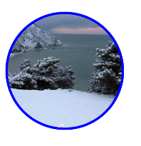
You'll have something like that.

Solution 3 - Android
I hope this will help you.
1) CircleImageView

 <de.hdodenhof.circleimageview.CircleImageView
    xmlns:app="http://schemas.android.com/apk/res-auto"
    android:id="@+id/profile_image"
    android:layout_width="96dp"
    android:layout_height="96dp"
    android:src="@drawable/profile"
    app:civ_border_width="2dp"
    app:civ_border_color="#FF000000"/>
Don't forget implementation: Gradle Scripts > build.gradle (Module: app) > dependencies
implementation 'de.hdodenhof:circleimageview:3.1.0'
For complete description please check here : The Source here.
2) CircularImageView

<com.mikhaellopez.circularimageview.CircularImageView
    android:layout_width="250dp"
    android:layout_height="250dp"
    android:src="@drawable/image"
    app:civ_border_color="#3f51b5"
    app:civ_border_width="4dp"
    app:civ_shadow="true"
    app:civ_shadow_radius="10"
    app:civ_shadow_color="#3f51b5"/>
Don't forget implementation: Gradle Scripts > build.gradle (Module: app) > dependencies
implementation 'com.mikhaellopez:circularimageview:4.3.0'
For complete description please check here : The Source here.
Solution 4 - Android
With the Material Components Library Just use the ShapeableImageView.
Somethig like:
<com.google.android.material.imageview.ShapeableImageView
    app:shapeAppearanceOverlay="@style/roundedImageViewRounded"
    app:strokeColor="@color/....."
    app:strokeWidth="1dp"
    ...
    />
with:
  <style name="roundedImageViewRounded">
    <item name="cornerFamily">rounded</item>
    <item name="cornerSize">50%</item>
  </style>
Note: it requires at least the version 1.2.0.
With jetpack compose you can apply the clip Modifier using a CircleShape:
Image(
    painter = painterResource(R.drawable.xxxx),
    contentDescription = "xxxx",
    contentScale = ContentScale.Crop,
    modifier = Modifier
        .size(100.dp)
        .clip(CircleShape)
        .border(2.dp, Color.Blue, CircleShape)
)
Solution 5 - Android
With the help of glide library and RoundedBitmapDrawableFactory class it's easy to achieve. You may need to create circular placeholder image.
Glide V4:
Glide.with(context).load(url).apply(RequestOptions.circleCropTransform()).into(imageView);
Glide V3:
    Glide.with(context)
        .load(imgUrl)
        .asBitmap()
        .placeholder(R.drawable.placeholder)
        .error(R.drawable.placeholder)
        .into(new BitmapImageViewTarget(imgProfilePicture) {
            @Override
            protected void setResource(Bitmap resource) {
                RoundedBitmapDrawable drawable = RoundedBitmapDrawableFactory.create(context.getResources(),
                        Bitmap.createScaledBitmap(resource, 50, 50, false));
                drawable.setCircular(true);
                imgProfilePicture.setImageDrawable(drawable);
            }
        });
For Picasso RoundedTransformation, this is a really great solution that gives an additional option of rounding image at either top or bottom edge.
Solution 6 - Android
The above methods don't seem to work if you're using the src attribute. What I did is to put two image views inside a frame layout one above another like this:
<FrameLayout android:id="@+id/frame"
             android:layout_width="40dp"
             android:layout_height="40dp">

    <ImageView android:id="@+id/pic"
               android:layout_width="40dp"
               android:layout_height="40dp"
               android:src="@drawable/my_picture" />

    <ImageView android:id="@+id/circle_crop"
               android:layout_width="40dp"
               android:layout_height="40dp"
               android:src="@drawable/circle_crop" />

</FrameLayout>
Simply put a circular_crop.png in your drawable folder which is in the shape of your image dimensions (a square in my case) with a white background and a transparent circle in the center. You can use this image if you have want a square imageview.
> 
Just download the picture above.
Solution 7 - Android
The following is one of the simplest ways to do it, use the following code:
Dependencies
dependencies {
    ...
    compile 'de.hdodenhof:circleimageview:2.1.0'      // use this or use the latest compile version. In case u get bug.
}
XML Code
<de.hdodenhof.circleimageview.CircleImageView
    xmlns:app="http://schemas.android.com/apk/res-auto"
    android:id="@+id/profile_image"
    android:layout_width="96dp"             //  here u can adjust the width
    android:layout_height="96dp"            //  here u can adjust the height
    android:src="@drawable/profile"         //  here u can change the image
    app:civ_border_width="2dp"              //  here u can adjust the border of the circle.
    app:civ_border_color="#FF000000"/>      //  here u can adjust the border color
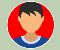
Screenshot:
Source: Circular ImageView GitHub Repository
Solution 8 - Android
you don't need any third-party library.
you can use the ShapeableImageView in the material.
implementation 'com.google.android.material:material:1.2.0'
style.xml
<style name="ShapeAppearanceOverlay.App.CornerSize">
     <item name="cornerSize">50%</item>
</style>
in layout
<com.google.android.material.imageview.ShapeableImageView
     android:layout_width="100dp"
     android:layout_height="100dp"
     app:srcCompat="@drawable/ic_profile"
     app:shapeAppearanceOverlay="@style/ShapeAppearanceOverlay.App.CornerSize"
/>
you can see this
https://developer.android.com/reference/com/google/android/material/imageview/ShapeableImageView
or this
https://medium.com/android-beginners/shapeableimageview-material-components-for-android-cac6edac2c0d
Solution 9 - Android
You can simply use CardView without any external Library
  <androidx.cardview.widget.CardView
                    android:id="@+id/roundCardView"
                    android:layout_width="40dp"
                    android:layout_height="40dp"
                    android:layout_centerHorizontal="true"
                    android:elevation="0dp"
                    app:cardCornerRadius="20dp">

                    <ImageView
                        android:layout_width="40dp"
                        android:layout_height="40dp"
                        android:src="@drawable/profile" />
</androidx.cardview.widget.CardView>
Solution 10 - Android
This will do the trick:
rectangle.xml
<?xml version="1.0" encoding="UTF-8"?>
<shape xmlns:android="http://schemas.android.com/apk/res/android"
    android:shape="rectangle">
    <solid android:color="@android:color/transparent" />
    <padding android:bottom="-14dp" android:left="-14dp" android:right="-14dp" android:top="-14dp" />

</shape>
circle.xml
<shape xmlns:android="http://schemas.android.com/apk/res/android"
    android:innerRadius="0dp"
    android:shape="oval"

    android:useLevel="false" >
    <solid android:color="@android:color/transparent" />

    <stroke
        android:width="15dp"
        android:color="@color/verification_contact_background" />

</shape>
profile_image.xml ( The layerlist )
<?xml version="1.0" encoding="utf-8"?>
<layer-list xmlns:android="http://schemas.android.com/apk/res/android" >

    <item android:drawable="@drawable/rectangle" />
    <item android:drawable="@drawable/circle"/>

</layer-list>
Your layout
 <ImageView
        android:id="@+id/profile_image"
        android:layout_width="match_parent"
        android:layout_height="match_parent"
        android:background="@drawable/default_org"
        android:src="@drawable/profile_image"/>
Solution 11 - Android
Best Solution courtesy https://www.youtube.com/watch?v=0MHoNU7ytaw the width and height of the card view determine the size of the images it contains set up is as follows:
- Add Dependency to Gradle(Module)
- Add the xml code to activity.xml or fragment.xml file
    implementation 'androidx.cardview:cardview:1.0.0'

   <androidx.cardview.widget.CardView
      android:layout_width="300dp"
      android:layout_height="270dp"
      android:layout_gravity="center"
      app:cardCornerRadius="150dp"
      app:cardBackgroundColor="@color/trans"
      >
    <ImageView
        android:id="@+id/resultImage"
        android:layout_width="match_parent"
        android:layout_height="match_parent"
        android:src="@drawable/congrats"
        android:layout_gravity="center">

    </ImageView>


  </androidx.cardview.widget.CardView>```
Solution 12 - Android
You can simply use AndroidX ImageFilterView.
 <androidx.constraintlayout.utils.widget.ImageFilterView
        android:layout_width="48dp"
        android:layout_height="48dp"
        android:layout_marginStart="@dimen/margin_medium"
        android:layout_marginBottom="@dimen/margin_medium"
        android:background="@color/white"
        android:padding="@dimen/margin_small"
        app:layout_constraintBottom_toBottomOf="parent"
        app:layout_constraintStart_toStartOf="parent"
        app:roundPercent="1"
        app:srcCompat="@drawable/ic_gallery" />

Solution 13 - Android
I use shape = "oval" instead of the "ring" below. It has worked for me. To keep the image within bounds, I use <padding> and set <adjustViewBounds> to true in my <ImageView>. I have tried with images of size between 50 x 50 px upto 200x200 px .
Solution 14 - Android
Update 2021: Using Glide v4 CircleCrop see https://bumptech.github.io/glide/doc/generatedapi.html
    implementation 'com.github.bumptech.glide:glide:4.11.0'
    annotationProcessor 'com.github.bumptech.glide:compiler:4.11.0'
XML
<ImageView
    android:id="@+id/vinyl"
    android:layout_width="match_parent"
    android:layout_height="match_parent"
    tools:ignore="ContentDescription" />
In Code
    Glide.with(this)
            .load("https://images.pexels.com/photos/3828241/pexels-photo-3828241.jpeg")
            .transform(CircleCrop())
            .into(rootView.findViewById<ImageView>(R.id.vinyl))
Solution 15 - Android
Posting this answer for future reference. You can use ShapeableImageView available in com.google.android.material:material.
<com.google.android.material.imageview.ShapeableImageView
    android:id="@+id/img_launcher_icon"
    android:layout_width="wrap_content"
    android:layout_height="wrap_content"
    android:layout_centerHorizontal="true"
    android:layout_margin="5dp"
    android:adjustViewBounds="true"
    android:background="@android:color/transparent"
    android:elevation="5dp"
    android:maxWidth="50dp"
    android:maxHeight="50dp"
    android:scaleType="fitXY"
    android:src="@mipmap/ic_launcher"
    app:shapeAppearance="?attr/actionButtonStyle"
    app:shapeAppearanceOverlay="@style/imageViewRounded"
    app:strokeColor="@android:color/white" />
Add imageViewRounded style in your styles.xml
<style name="imageViewRounded">
    <item name="cornerFamily">rounded</item>
    <item name="cornerSize">51%</item>
</style>
You can add material design dependency if not added.
implementation 'com.google.android.material:material:1.4.0'
Design looks like

Solution 16 - Android
@Jyotman Singh, answer is very good (for solid backgrounds), so I would like to enhance it by sharing vector drawable that can be re-colored for your needs, also it is convenient since vector one-piece shape is well scalable.
This is the rectangle-circle shape (@drawable/shape_round_profile_pic):
<?xml version="1.0" encoding="utf-8"?>
<vector xmlns:android="http://schemas.android.com/apk/res/android"
    android:viewportWidth="284"
    android:viewportHeight="284"
    android:width="284dp"
    android:height="284dp">
    <path
        android:pathData="M0 142L0 0l142 0 142 0 0 142 0 142 -142 0 -142 0zm165 137.34231c26.06742 -4.1212 52.67405 -17.543 72.66855 -36.65787 11.82805 -11.30768 20.55487 -22.85153 27.7633 -36.72531C290.23789 158.21592 285.62874 101.14121 253.48951 58.078079 217.58149 9.9651706 154.68849 -10.125717 98.348685 8.5190299 48.695824 24.95084 12.527764 67.047123 3.437787 118.98655 1.4806194 130.16966 1.511302 152.96723 3.4990422 164.5 12.168375 214.79902 47.646316 256.70775 96 273.76783c21.72002 7.66322 44.26673 9.48476 69 5.57448z"
        android:fillColor="#ffffff" /> // you can change frame color
</vector>
Usage is the same:
<FrameLayout
        android:layout_width="70dp"
        android:layout_height="70dp">

        <ImageView
            android:layout_width="match_parent"
            android:layout_height="match_parent"
            android:background="@drawable/YOUR_PICTURE" />

        <ImageView
            android:layout_width="match_parent"
            android:layout_height="match_parent"
            android:background="@drawable/shape_round_profile_pic"/>

    </FrameLayout>
Solution 17 - Android
Just use these lines of code and you are done :
<de.hdodenhof.circleimageview.CircleImageView
            xmlns:app="http://schemas.android.com/apk/res-auto"
            android:clickable="true"
            app:civ_border_width="3dp"
            app:civ_border_color="#FFFFFFFF"
            android:id="@+id/profile"
            android:layout_width="200dp"
            android:layout_height="200dp"
            android:layout_below="@+id/header_cover_image"
            android:layout_centerHorizontal="true"
            android:layout_marginTop="-130dp"
            android:elevation="5dp"
            android:padding="20dp"
            android:scaleType="centerCrop"
            android:src="@drawable/profilemain" />
Don't forget to import :
import de.hdodenhof.circleimageview.CircleImageView;
Add this library in build.gradle :
compile 'de.hdodenhof:circleimageview:2.1.0'
Solution 18 - Android
If you use Material Design in your app then use this
<com.google.android.material.card.MaterialCardView
            android:layout_width="75dp"
            android:layout_height="75dp"
            app:cardCornerRadius="50dp"
            app:strokeWidth="1dp"
            app:strokeColor="@color/black">
            <ImageView
                android:layout_width="fill_parent"
                android:layout_height="fill_parent"
                android:id="@+id/circular_image"
                android:scaleType="fitCenter"
                android:src="@drawable/your_img" />
        </com.google.android.material.card.MaterialCardView>
Solution 19 - Android
I did it like that, I used my background color in my vector image
ic_bg_picture.xml
 <vector xmlns:android="http://schemas.android.com/apk/res/android"
	android:width="100dp"
	android:height="100dp"
	android:viewportWidth="100"
	android:viewportHeight="100">
  <path
	  android:pathData="M100.6,95.5c0,-0.4 -0.1,-0.7 0,-1.1c-0.2,-0.7 -0.2,-1.4 -0.1,-2.1c0,-0.1 0,-0.2 0,-0.3c-0.1,-0.6 -0.1,-1.2 0,-1.8c-1,-1.3 -0.3,-2.9 -0.3,-4.3c-0.1,-28.7 -0.1,-57.3 -0.1,-86C68,-0.1 35.9,-0.1 3.8,-0.2C0.7,-0.2 0,0.5 0,3.6c0.1,32.1 0.1,64.2 0.1,96.2c31,0 62,-0.1 92.9,0.1c3.6,0 6.3,-0.2 7.5,-3.2C100.5,96.4 100.5,95.9 100.6,95.5zM46.3,95.2C26.4,94 2,74.4 3.8,46.8C5.1,27.2 24.4,2.7 52.6,4.6c20.2,1.4 43,21.3 41.5,45.1C96.1,72.4 73,96.8 46.3,95.2z"
	  android:fillColor="#6200EE"/>
</vector>
in my case I created a vector and changed the android:fillColor="#6200EE"
by the color of my background
  <ImageView
	android:id="@+id/iv_profile_image"
	android:layout_width="100dp"
	android:layout_height="100dp"
	android:contentDescription="@string/app_name"
	app:srcCompat="@color/colorPrimaryDark" />

<ImageView
	android:id="@+id/container_profile_image"
	android:layout_width="100dp"
	android:layout_height="100dp"
	android:contentDescription="@string/app_name"
	app:srcCompat="@drawable/ic_bg_picture"/>
Solution 20 - Android
Try this.
public class RoundedImageView extends android.support.v7.widget.AppCompatImageView {

    private int borderWidth = 4;
    private int viewWidth;
    private int viewHeight;
    private Bitmap image;
    private Paint paint;
    private Paint paintBorder;
    private BitmapShader shader;

    public RoundedImageView(Context context)
    {
        super(context);
        setup();
    }

    public RoundedImageView(Context context, AttributeSet attrs)
    {
        super(context, attrs);
        setup();
    }

    public RoundedImageView(Context context, AttributeSet attrs, int defStyle)
    {
        super(context, attrs, defStyle);
        setup();
    }

    private void setup()
    {
        paint = new Paint();
        paint.setAntiAlias(true);

        paintBorder = new Paint();
        setBorderColor(Color.WHITE);
        paintBorder.setAntiAlias(true);
        this.setLayerType(LAYER_TYPE_SOFTWARE, paintBorder);

        paintBorder.setShadowLayer(4.0f, 0.0f, 2.0f, Color.WHITE);
    }

    public void setBorderWidth(int borderWidth)
    {
        this.borderWidth = borderWidth;
        this.invalidate();
    }

    public void setBorderColor(int borderColor)
    {
        if (paintBorder != null)
            paintBorder.setColor(borderColor);

        this.invalidate();
    }

    private void loadBitmap()
    {
        BitmapDrawable bitmapDrawable = (BitmapDrawable) this.getDrawable();

        if (bitmapDrawable != null)
            image = bitmapDrawable.getBitmap();
    }

    @SuppressLint("DrawAllocation")
    @Override
    public void onDraw(Canvas canvas)
    {
        loadBitmap();

        if (image != null)
        {
            shader = new BitmapShader(Bitmap.createScaledBitmap(image, canvas.getWidth(), canvas.getHeight(), false), Shader.TileMode.CLAMP, Shader.TileMode.CLAMP);
            paint.setShader(shader);
            int circleCenter = viewWidth / 2;
            canvas.drawCircle(circleCenter + borderWidth, circleCenter + borderWidth, circleCenter + borderWidth - 4.0f, paintBorder);
            canvas.drawCircle(circleCenter + borderWidth, circleCenter + borderWidth, circleCenter - 4.0f, paint);
        }
    }

    @Override
    protected void onMeasure(int widthMeasureSpec, int heightMeasureSpec)
    {
        int width = measureWidth(widthMeasureSpec);
        int height = measureHeight(heightMeasureSpec, widthMeasureSpec);

        viewWidth = width - (borderWidth * 2);
        viewHeight = height - (borderWidth * 2);

        setMeasuredDimension(width, height);
    }

    private int measureWidth(int measureSpec)
    {
        int result = 0;
        int specMode = MeasureSpec.getMode(measureSpec);
        int specSize = MeasureSpec.getSize(measureSpec);

        if (specMode == MeasureSpec.EXACTLY)
        {
            result = specSize;
        }
        else
        {
            // Measure the text
            result = viewWidth;
        }

        return result;
    }

    private int measureHeight(int measureSpecHeight, int measureSpecWidth)
    {
        int result = 0;
        int specMode = MeasureSpec.getMode(measureSpecHeight);
        int specSize = MeasureSpec.getSize(measureSpecHeight);

        if (specMode == MeasureSpec.EXACTLY)
        {
            result = specSize;
        }
        else
        {
            result = viewHeight;
        }

        return (result + 2);
     }
 }
and use this ImageView in layout like:
<com.app.Demo.RoundedImageView
     android:id="@+id/iv_profileImage"
     android:layout_width="70dp"
     android:layout_height="70dp"
     android:layout_centerHorizontal="true"
    />
Solution 21 - Android
This Class is Custom Circular Imageview with shadow, Stroke,saturation and using this Custom Circular ImageView you can make your image in Circular Shape with Radius. Guys for Circular Shadow ImageView No need Github this class is enough.
Adding CircularImageView to your layout
CircularImageView c=new CircularImageView(this,screen width,screen height,Bitmap myimage);
yourLayout.addView(c);**


public class CircularImageView extends android.support.v7.widget.AppCompatImageView
{
    private final Context context;
    private final int width, height;
    private final Paint paint;
    private final Paint paintBorder,imagePaint;
    private final Bitmap bitmap2;
    private final Paint paint3;
    private Bitmap bitmap;
    private BitmapShader shader;
    private float radius = 4.0f;
    float x = 0.0f;
    float y = 8.0f;
    private float stroke;
    private float strokeWidth = 0.0f;
    private Bitmap bitmap3;
    private int corner_radius=50;


    public CircularImageView(Context context, int width, int height, Bitmap bitmap)     {
        super(context);
        this.context = context;
        this.width = width;
        this.height = height;

   //here "bitmap" is the square shape(width* width) scaled bitmap ..

        this.bitmap = bitmap;


        paint = new Paint(Paint.ANTI_ALIAS_FLAG);
        paint.setAntiAlias(true);
        paint.setFilterBitmap(true);
        paint.setDither(true);


        paint3=new Paint();
        paint3.setStyle(Paint.Style.STROKE);
        paint3.setColor(Color.WHITE);
        paint3.setAntiAlias(true);

        paintBorder = new Paint();
        imagePaint= new Paint();

        paintBorder.setColor(Color.WHITE);
        paintBorder.setAntiAlias(true);
        this.setLayerType(LAYER_TYPE_SOFTWARE, paintBorder);


        this.bitmap2 = Bitmap.createScaledBitmap(bitmap, (bitmap.getWidth() - 40), (bitmap.getHeight() - 40), true);


        imagePaint.setAntiAlias(true);


        invalidate();
    }

    @Override
    protected void onDraw(Canvas canvas)
    {
        super.onDraw(canvas);
        Shader b;
         if (bitmap3 != null)
            b = new BitmapShader(bitmap3, Shader.TileMode.CLAMP, Shader.TileMode.CLAMP);
         else
            b = new BitmapShader(bitmap2, Shader.TileMode.CLAMP, Shader.TileMode.CLAMP);
        imagePaint.setShader(b);
        canvas.drawBitmap(maskedBitmap(), 20, 20, null);
    }

    private Bitmap maskedBitmap()
    {
        Bitmap l1 = Bitmap.createBitmap(width,width, Bitmap.Config.ARGB_8888);
        Canvas canvas = new Canvas(l1);
        paintBorder.setShadowLayer(radius, x, y, Color.parseColor("#454645"));
        paint.setXfermode(new PorterDuffXfermode(PorterDuff.Mode.SRC_IN));
        final RectF rect = new RectF();
        rect.set(20, 20, bitmap2.getWidth(), bitmap2.getHeight());

        canvas.drawRoundRect(rect, corner_radius, corner_radius, paintBorder);

        canvas.drawRoundRect(rect, corner_radius, corner_radius, imagePaint);

        if (strokeWidth!=0.0f)
        {
            paint3.setStrokeWidth(strokeWidth);
            canvas.drawRoundRect(rect, corner_radius, corner_radius, paint3);
        }

         paint.setXfermode(null);
        return l1;
    }


     // use seekbar here, here you have to pass  "0 -- 250"  here corner radius will change

    public void setCornerRadius(int corner_radius)
    {
        this.corner_radius = corner_radius;
        invalidate();
    }


    -------->use seekbar here, here you have to pass  "0 -- 10.0f"  here shadow radius will change

    public void setShadow(float radius)
    {
        this.radius = radius;
        invalidate();
    }

   // use seekbar here, here you have to pass  "0 -- 10.0f"  here stroke size  will change

    public void setStroke(float stroke)
    {
        this.strokeWidth = stroke;
        invalidate();
    }

    private Bitmap updateSat(Bitmap src, float settingSat)
    {

        int w = src.getWidth();
        int h = src.getHeight();

        Bitmap bitmapResult =
                Bitmap.createBitmap(w, h, Bitmap.Config.ARGB_8888);
        Canvas canvasResult = new Canvas(bitmapResult);
        Paint paint = new Paint();
        ColorMatrix colorMatrix = new ColorMatrix();
        colorMatrix.setSaturation(settingSat);
        ColorMatrixColorFilter filter = new ColorMatrixColorFilter(colorMatrix);
        paint.setColorFilter(filter);
        canvasResult.drawBitmap(src, 0, 0, paint);

        return bitmapResult;
    }


  // use seekbar here, here you have to pass  "0 -- 2.0f"  here saturation  will change

    public void setSaturation(float sat)
    {
        System.out.println("qqqqqqqqqq            "+sat);
        bitmap3=updateSat(bitmap2, sat);

        invalidate();
    }


}


        // Seekbar to change radius

                  radius_seekbar.setOnSeekBarChangeListener(new SeekBar.OnSeekBarChangeListener() {
                        @Override
                        public void onProgressChanged(SeekBar seekBar, int progress, boolean fromUser)
                        {
                            text_radius.setText(""+progress);
                            circularImageView.setCornerRadius(progress);
                        }

                        @Override
                        public void onStartTrackingTouch(SeekBar seekBar) {

                        }

                        @Override
                        public void onStopTrackingTouch(SeekBar seekBar) {

                        }
                    });


     // Seekbar to change shadow

                    shadow_seekbar.setOnSeekBarChangeListener(new SeekBar.OnSeekBarChangeListener() {
                        @Override
                        public void onProgressChanged(SeekBar seekBar, int progress, boolean fromUser)
                        {
                            float f= 4+progress/10.0f;
                            text_shadow.setText(""+progress);
                            circularImageView.setShadow(f);
                        }

                        @Override
                        public void onStartTrackingTouch(SeekBar seekBar) {

                        }

                        @Override
                        public void onStopTrackingTouch(SeekBar seekBar) {

                        }
                    });


           // Seekbar to change saturation

                    saturation_seekbar.setOnSeekBarChangeListener(new SeekBar.OnSeekBarChangeListener() {
                        @Override
                        public void onProgressChanged(SeekBar seekBar, int progress, boolean fromUser)
                        {
                            int progressSat = saturation_seekbar.getProgress();
                            float sat = (float) ((progressSat*4 / 100.0f)-1.0f);
                            circularImageView.setSaturation(sat);

                            text_saturation.setText(""+progressSat);
                        }

                        @Override
                        public void onStartTrackingTouch(SeekBar seekBar) {

                        }

                        @Override
                        public void onStopTrackingTouch(SeekBar seekBar) {

                        }
                    });


    // Seekbar to change stroke

                    stroke_seekbar.setOnSeekBarChangeListener(new SeekBar.OnSeekBarChangeListener() {
                        @Override
                        public void onProgressChanged(SeekBar seekBar, int progress, boolean fromUser)
                        {
                            if (progress==0)
                            {
                                float f=(progress*10.0f/100.0f);
                                circularImageView.setStroke(f);
                            }
                            else
                            {
                                float f=(progress*10.0f/100.0f);
                                circularImageView.setStroke(f);
                            }

                            text_stroke.setText(""+progress);
                        }

                        @Override
                        public void onStartTrackingTouch(SeekBar seekBar) {

                        }

                        @Override
                        public void onStopTrackingTouch(SeekBar seekBar) {

                        }
                    });


             //radius seekbar in xml file

             <SeekBar
                android:layout_width="match_parent"
                android:layout_gravity="center"
                android:progress="50"
                android:max="250"
                android:id="@+id/radius_seekbar"
                android:layout_height="wrap_content" />


          //saturation seekbar in xml file

             <SeekBar
                android:layout_width="match_parent"
                android:layout_gravity="center"
                android:progress="50"
                android:max="100"
                android:id="@+id/saturation_seekbar"
                android:layout_height="wrap_content" />


    //shadow seekbar in xml file

             <SeekBar
                android:layout_width="match_parent"
                android:layout_gravity="center"
                android:progress="0"
                android:max="100"
                android:id="@+id/shadow_seekbar"
                android:layout_height="wrap_content" />


         //stroke seekbar in xml file

             <SeekBar
                android:layout_width="match_parent"
                android:layout_gravity="center"
                android:progress="0"
                android:max="100"
                android:id="@+id/stroke _seekbar"
                android:layout_height="wrap_content" />
Solution 22 - Android
Actually, you can use what Google provides via the support library RoundedBitmapDrawableFactory class (here and here), instead of using a third party library :
Gradle:
implementation 'androidx.appcompat:appcompat:1.0.0-beta01'
MainActivity.kt
class MainActivity : AppCompatActivity() {

    override fun onCreate(savedInstanceState: Bundle?) {
        super.onCreate(savedInstanceState)
        setContentView(R.layout.activity_main)
        val originalDrawable = ContextCompat.getDrawable(this, R.drawable.avatar_1)!!
        val bitmap = convertDrawableToBitmap(originalDrawable)
        val drawable = RoundedBitmapDrawableFactory.create(resources, bitmap)
        drawable.setAntiAlias(true)
        drawable.cornerRadius = Math.max(bitmap.width, bitmap.height) / 2.0f
        avatarImageView.setImageDrawable(drawable)
    }

    companion object {
        @JvmStatic
        fun convertDrawableToBitmap(drawable: Drawable): Bitmap {
            if (drawable is BitmapDrawable)
                return drawable.bitmap
            // We ask for the bounds if they have been set as they would be most
            // correct, then we check we are  > 0
            val bounds = drawable.bounds
            val width = if (!bounds.isEmpty) bounds.width() else drawable.intrinsicWidth
            val height = if (!bounds.isEmpty) bounds.height() else drawable.intrinsicHeight
            // Now we check we are > 0
            val bitmap = Bitmap.createBitmap(if (width <= 0) 1 else width, if (height <= 0) 1 else height,
                    Bitmap.Config.ARGB_8888)
            val canvas = Canvas(bitmap)
            drawable.setBounds(0, 0, canvas.width, canvas.height)
            drawable.draw(canvas)
            return bitmap
        }
    }
}
res/layout/activity_main.xml
<FrameLayout
    xmlns:android="http://schemas.android.com/apk/res/android" xmlns:app="http://schemas.android.com/apk/res-auto"
    xmlns:tools="http://schemas.android.com/tools" android:layout_width="match_parent"
    android:layout_height="match_parent" tools:context=".MainActivity">

    <androidx.appcompat.widget.AppCompatImageView
        android:id="@+id/avatarImageView" android:layout_width="100dp" android:layout_height="100dp"
        android:layout_gravity="center"/>

</FrameLayout>
res/drawable/avatar_1.xml
<vector xmlns:android="http://schemas.android.com/apk/res/android" android:width="128dp" android:height="128dp"
        android:viewportHeight="128.0" android:viewportWidth="128.0">
    <path
        android:fillColor="#FF8A80" android:pathData="M0 0h128v128h-128z"/>
    <path
        android:fillColor="#FFE0B2"
        android:pathData="M36.3 94.8c6.4 7.3 16.2 12.1 27.3 12.4 10.7,-.3 20.3,-4.7 26.7,-11.6l.2.1c-17,-13.3,-12.9,-23.4,-8.5,-28.6 1.3,-1.2 2.8,-2.5 4.4,-3.9l13.1,-11c1.5,-1.2 2.6,-3 2.9,-5.1.6,-4.4,-2.5,-8.4,-6.9,-9.1,-1.5,-.2,-3 0,-4.3.6,-.3,-1.3,-.4,-2.7,-1.6,-3.5,-1.4,-.9,-2.8,-1.7,-4.2,-2.5,-7.1,-3.9,-14.9,-6.6,-23,-7.9,-5.4,-.9,-11,-1.2,-16.1.7,-3.3 1.2,-6.1 3.2,-8.7 5.6,-1.3 1.2,-2.5 2.4,-3.7 3.7l-1.8 1.9c-.3.3,-.5.6,-.8.8,-.1.1,-.2 0,-.4.2.1.2.1.5.1.6,-1,-.3,-2.1,-.4,-3.2,-.2,-4.4.6,-7.5 4.7,-6.9 9.1.3 2.1 1.3 3.8 2.8 5.1l11 9.3c1.8 1.5 3.3 3.8 4.6 5.7 1.5 2.3 2.8 4.9 3.5 7.6 1.7 6.8,-.8 13.4,-5.4 18.4,-.5.6,-1.1 1,-1.4 1.7,-.2.6,-.4 1.3,-.6 2,-.4 1.5,-.5 3.1,-.3 4.6.4 3.1 1.8 6.1 4.1 8.2 3.3 3 8 4 12.4 4.5 5.2.6 10.5.7 15.7.2 4.5,-.4 9.1,-1.2 13,-3.4 5.6,-3.1 9.6,-8.9 10.5,-15.2m-14.4,-49.8c.9 0 1.6.7 1.6 1.6 0 .9,-.7 1.6,-1.6 1.6,-.9 0,-1.6,-.7,-1.6,-1.6,-.1,-.9.7,-1.6 1.6,-1.6zm-25.7 0c.9 0 1.6.7 1.6 1.6 0 .9,-.7 1.6,-1.6 1.6,-.9 0,-1.6,-.7,-1.6,-1.6,-.1,-.9.7,-1.6 1.6,-1.6z"/>
    <path
        android:fillColor="#E0F7FA"
        android:pathData="M105.3 106.1c-.9,-1.3,-1.3,-1.9,-1.3,-1.9l-.2,-.3c-.6,-.9,-1.2,-1.7,-1.9,-2.4,-3.2,-3.5,-7.3,-5.4,-11.4,-5.7 0 0 .1 0 .1.1l-.2,-.1c-6.4 6.9,-16 11.3,-26.7 11.6,-11.2,-.3,-21.1,-5.1,-27.5,-12.6,-.1.2,-.2.4,-.2.5,-3.1.9,-6 2.7,-8.4 5.4l-.2.2s-.5.6,-1.5 1.7c-.9 1.1,-2.2 2.6,-3.7 4.5,-3.1 3.9,-7.2 9.5,-11.7 16.6,-.9 1.4,-1.7 2.8,-2.6 4.3h109.6c-3.4,-7.1,-6.5,-12.8,-8.9,-16.9,-1.5,-2.2,-2.6,-3.8,-3.3,-5z"/>
    <path
        android:fillColor="#444" android:pathData="M76.3,47.5 m-2.0, 0 a 2.0,2.0 0 1,1 4.0,0 a2.0,2.0 0 1,1 -4.0,0"/>
    <path
        android:fillColor="#444" android:pathData="M50.7,47.6 m-2.0, 0 a 2.0,2.0 0 1,1 4.0,0 a2.0,2.0 0 1,1 -4.0,0"/>
    <path
        android:fillColor="#444"
        android:pathData="M48.1 27.4c4.5 5.9 15.5 12.1 42.4 8.4,-2.2,-6.9,-6.8,-12.6,-12.6,-16.4 17.2 1.5 14.1,-9.4 14.1,-9.4,-1.4 5.5,-11.1 4.4,-11.1 4.4h-18.8c-1.7,-.1,-3.4 0,-5.2.3,-12.8 1.8,-22.6 11.1,-25.7 22.9 10.6,-1.9 15.3,-7.6 16.9,-10.2z"/>
</vector>
The result:

And, suppose you want to add a border on top of it, you can use this for example:
stroke_drawable.xml
<shape xmlns:android="http://schemas.android.com/apk/res/android" android:shape="oval">
    <stroke
        android:width="4dp" android:color="@android:color/black"/>
</shape>
And add android:foreground="@drawable/stroke_drawable" to the ImageView in the layout XML file, and you get this :
I'm not sure how to add shadow (that will work on older Android versions), though. Using FloatingActionButton (from the "com.google.android.material:material" dependency), I failed to make the bitmap fill the FAB itself. Using it instead could be even better if it worked.
EDIT: if you wish to add shadow of elevation (available from API 21), you can change a bit what I wrote:
Inside the layout XML file:
<androidx.appcompat.widget.AppCompatImageView android:padding="4dp"
    android:id="@+id/avatarImageView" android:layout_width="100dp" android:layout_height="100dp" android:elevation="8dp"
    android:layout_gravity="center" android:background="@drawable/stroke_drawable" tools:srcCompat="@drawable/avatar_1"/>
CircularShadowViewOutlineProvider.kt
@TargetApi(Build.VERSION_CODES.LOLLIPOP)
class CircularShadowViewOutlineProvider : ViewOutlineProvider() {
    override fun getOutline(view: View, outline: Outline) {
        val size = Math.max(view.width, view.height)
        outline.setRoundRect(0, 0, size, size, size / 2f)
    }
}
In code:
    if (Build.VERSION.SDK_INT >= Build.VERSION_CODES.LOLLIPOP)
        avatarImageView.outlineProvider = CircularShadowViewOutlineProvider()
Result:
Solution 23 - Android
Create a CustomImageview then simply override its onDraw() method follows:
@Override
protected void onDraw(Canvas canvas) {

	float radius = this.getHeight()/2;
	Path path = new Path();
	RectF rect = new RectF(0, 0, this.getWidth(), this.getHeight());
	path.addRoundRect(rect, radius, radius, Path.Direction.CW);
	canvas.clipPath(path);
	super.onDraw(canvas);

}
In case you want the code for the custom widget as well:-
> CircularImageView.java
import android.content.Context;
import android.content.res.TypedArray;
import android.graphics.Canvas;
import android.graphics.Path;
import android.graphics.RectF;
import android.graphics.drawable.Drawable;
import android.util.AttributeSet;
import android.widget.ImageView;

import androidx.annotation.Nullable;

public class CircularImageView extends ImageView {

    private Drawable image;

    public CircularImageView(Context context) {
        super(context);

        init(null, 0);
    }

    public CircularImageView(Context context, @Nullable AttributeSet attrs) {
        super(context, attrs);

        init(attrs, 0);
    }

    public CircularImageView(Context context, @Nullable AttributeSet attrs, int defStyleAttr) {
        super(context, attrs, defStyleAttr);

        init(attrs, defStyleAttr);
    }

    @Override
    protected void onDraw(Canvas canvas) {

        float radius = this.getHeight()/2;
        Path path = new Path();
        RectF rect = new RectF(0, 0, this.getWidth(), this.getHeight());
        path.addRoundRect(rect, radius, radius, Path.Direction.CW);
        canvas.clipPath(path);
        super.onDraw(canvas);

    }

    private void init(AttributeSet attrs, int defStyle) {
        TypedArray a = Utils.CONTEXT.getTheme().obtainStyledAttributes(attrs, R.styleable.CircularImageView, 0, 0);
        try {
            image = a.getDrawable(R.styleable.CircularImageView_src);
        } finally {
            a.recycle();
        }

        this.setImageDrawable(image);
    }
}
Also, add the following code to your res/attrs.xml to create the required attribute:-
<declare-styleable name="CircularImageView">
        <attr name="src" format="reference" />
</declare-styleable>
Solution 24 - Android
I have a simple solution. Create a new Image asset by right clicking your package name and selecting New->Image asset. Enter name (any name) and path (location of image in your system). Then click Next and Finish. If you enter name of image as 'img', a round image with the name 'img_round' is created automatically in mipmap folder.
Then, do this :
<ImageView
        android:layout_width="100dp"
        android:layout_height="100dp"
        android:src="@mipmap/img_round"/>
Your preview may still show a rectangular image. But if you run the app on your device, it will be round.
Solution 25 - Android
if you want to set edit icon on to circle imageview than put this below code.

 <FrameLayout
                android:layout_width="@dimen/_100sdp"
                android:layout_height="@dimen/_100sdp"
                android:layout_gravity="center"
                android:layout_marginTop="10dp">

                <de.hdodenhof.circleimageview.CircleImageView
                    android:id="@+id/profilePic"
                    android:layout_width="@dimen/_100sdp"
                    android:layout_height="@dimen/_100sdp"
                    android:layout_gravity="bottom|center_horizontal"
                    android:src="@drawable/ic_upload" />

                <de.hdodenhof.circleimageview.CircleImageView
                    android:id="@+id/iv_camera"
                    android:layout_width="@dimen/_30sdp"
                    android:layout_height="@dimen/_30sdp"
                    android:layout_gravity="top|right"
                    android:src="@drawable/edit"/>
            </FrameLayout>
Solution 26 - Android
if you'd rather cut the image to display in circular, here you go
public static Bitmap getCircularBitmap(Bitmap bitmap) {
        Bitmap output;

        if (bitmap.getWidth() > bitmap.getHeight()) {
            output = Bitmap.createBitmap(bitmap.getHeight(), bitmap.getHeight(), Bitmap.Config.ARGB_8888);
        } else {
            output = Bitmap.createBitmap(bitmap.getWidth(), bitmap.getWidth(), Bitmap.Config.ARGB_8888);
        }

        Canvas canvas = new Canvas(output);

        final int color = 0xff424242;
        final Paint paint = new Paint();
        final Rect rect = new Rect(0, 0, bitmap.getWidth(), bitmap.getHeight());

        float r = 0;

        if (bitmap.getWidth() > bitmap.getHeight()) {
            r = bitmap.getHeight() / 2;
        } else {
            r = bitmap.getWidth() / 2;
        }

        paint.setAntiAlias(true);
        canvas.drawARGB(0, 0, 0, 0);
        paint.setColor(color);
        canvas.drawCircle(r, r, r, paint);
        paint.setXfermode(new PorterDuffXfermode(PorterDuff.Mode.SRC_IN));
        canvas.drawBitmap(bitmap, rect, rect, paint);
        return output;
    }
Solution 27 - Android
Another idea is to use clipToOutline property of an ImageView.
Here is an example layout:
<androidx.constraintlayout.widget.ConstraintLayout
    android:layout_width="match_parent"
    android:layout_height="match_parent">

    <!-- Simple view to draw borders for an image,
         borders will be rounded because of the oval-shaped background. -->
    <View
        android:id="@+id/v_border"
        android:layout_width="50dp"
        android:layout_height="50dp"
        android:background="@drawable/shape_border"
        app:layout_constraintStart_toStartOf="parent"
        app:layout_constraintTop_toTopOf="parent" />

    <!-- Image itself: fits the border view,
         a margin serves as a border width;
         the key point here - is a background shape which will clip the view to its forms. -->
    <ImageView
        android:id="@+id/iv_image"
        android:layout_width="0dp"
        android:layout_height="0dp"
        android:layout_margin="4dp"
        android:background="@drawable/shape_oval"
        android:src="@mipmap/ic_launcher"
        app:layout_constraintBottom_toBottomOf="@+id/v_border"
        app:layout_constraintEnd_toEndOf="@+id/v_border"
        app:layout_constraintStart_toStartOf="@+id/v_border"
        app:layout_constraintTop_toTopOf="@+id/v_border" />

</androidx.constraintlayout.widget.ConstraintLayout>
And here are our shape_border drawable:
<?xml version="1.0" encoding="utf-8"?>
<shape xmlns:android="http://schemas.android.com/apk/res/android" android:shape="oval">
    <solid android:color="#FF00FF" />
</shape>
And shape_oval drawable:
<?xml version="1.0" encoding="utf-8"?>
<shape xmlns:android="http://schemas.android.com/apk/res/android" android:shape="oval" />
The only thing you should do in the code - is to enable clipToOutline property:
binding.ivImage.clipToOutline = true
And of course you can avoid even this line of the code with some BindingAdapter.
Solution 28 - Android
This is a relatively old question, but you can just make a circle border in the drawable folder (let's assume the xml file will be called circle_border)
<?xml version="1.0" encoding="utf-8"?>
<shape xmlns="http://schemas.android.com/apk/res/android"
    android:shape="oval">

    <solid android:color="@android:color/transparent" />

    <!-- If you want a padding -->
    <padding android:top="4dp" android:left="4dp" android:right="4dp" android:bottom="4dp" />

    <!-- If you want the circle border to have a color -->
    <strong android:width="1dp" android:color="#FFFFFF" />

</shape>
Then you can use it as the background of the ImageView
<ImageView
    android:background="@drawable/circle_border"
    <!-- other attributes here -->
/>
Solution 29 - Android
just use this simple code: First add dependency :
implementation 'de.hdodenhof:circleimageview:2.2.0'
then add in xml layout the following code:-
<de.hdodenhof.circleimageview.CircleImageView xmlns:app="http://schemas.android.com/apk/res-auto"
                                        android:id="@+id/Imgshaligram"
                                        android:layout_width="96dp"
                                        android:layout_height="96dp"
                                        android:src="@drawable/shaligram"
                                        app:civ_border_color="#d1b1b1"

                                        android:foregroundGravity="center"/>
Solution 30 - Android
also, these two libraries can help you.
https://github.com/vinc3m1/RoundedImageView
implement below code:
implementation 'com.makeramen:roundedimageview:2.3.0'
Simple Usage:
<com.makeramen.roundedimageview.RoundedImageView
        xmlns:app="http://schemas.android.com/apk/res-auto"
        android:id="@+id/imageView1"
        android:src="@drawable/photo1"
        android:scaleType="fitCenter"
        app:riv_corner_radius="30dip"
        app:riv_border_width="2dip"
        app:riv_border_color="#333333"
        app:riv_mutate_background="true"
        app:riv_tile_mode="repeat"
        app:riv_oval="true" />
https://github.com/chirag-kachhadiya/RoundedImageView
Simple Usage:
implement below code:
implementation 'com.github.chirag-kachhadiya:RoundedImageView:1.0'


 <com.infinityandroid.roundedimageview.RoundedImageView
                android:layout_width="150dp"
                android:layout_height="wrap_content"
                android:layout_margin="10dp"
                android:adjustViewBounds="true"
                android:src="@drawable/the_hundred"
                app:corner_radius="10" />