HTML colspan in CSS
CssCss Problem Overview
I'm trying to construct a layout similar to the following:
+---+---+---+
|   |   |   |
+---+---+---+
|           |
+-----------+
where the bottom is filling the space of the upper row.
If this were an actual table, I could easily accomplish this with <td colspan="3">, but as I'm simply creating a table-like layout, I cannot use <table> tags. Is this possible using CSS?
Css Solutions
Solution 1 - Css
There's no simple, elegant CSS analog for colspan.
Searches on this very issue will return a variety of solutions that include a bevy of alternatives, including absolute positioning, sizing, along with a similar variety of browser- and circumstance-specific caveats. Read, and make the best informed decision you can based on what you find.
Solution 2 - Css
There is no colspan in css as far as I know, but there will be column-span for multi column layout in the near future, but since it is only a draft in CSS3, you can check it in here. Anyway you can do a workaround using div and span with table-like display like this.
This would be the HTML:
<div class="table">
  <div class="row">
    <span class="cell red first"></span>
    <span class="cell blue fill"></span>
    <span class="cell green last"></span>
  </div>
</div>
<div class="table">
  <div class="row">
    <span class="cell black"></span>
  </div>
</div>
And this would be the css:
  /* this is to reproduce table-like structure
     for the sake of table-less layout. */
  .table { display:table; table-layout:fixed; width:100px; }
  .row { display:table-row; height:10px; }
  .cell { display:table-cell; }

  /* this is where the colspan tricks works. */
  span { width:100%; }

  /* below is for visual recognition test purposes only. */
  .red { background:red; }
  .blue { background:blue; }
  .green { background:green; }
  .black { background:black; }

  /* this is the benefit of using table display, it is able
     to set the width of it's child object to fill the rest of
     the parent width as in table */
  .first { width: 20px; }
  .last { width: 30px; }
  .fill { width: 100%; }
The only reason to use this trick is to gain the benefit of table-layout behaviour, I use it alot if only setting div and span width to certain percentage didn't fullfil our design requirement.
But if you don't need to benefit from the table-layout behaviour, then durilai's answer would suit you enough.
Solution 3 - Css
Another suggestion is using flexbox instead of tables altogether. This is a "modern browser" thing of course, but come on, it's 2016 ;)
At least this might be an alternative solution for those looking for an answer to this nowadays, since the original post was from 2010.
Here's a great guide: https://css-tricks.com/snippets/css/a-guide-to-flexbox/
.table {
  border: 1px solid red;
  padding: 2px;
  max-width: 300px;
  display: flex;
  flex-flow: row wrap;
}
.table-cell {
  border: 1px solid blue;
  flex: 1 30%;
}
.colspan-3 {
  border: 1px solid green;
  flex: 1 100%;
}
<div class="table">
  <div class="table-cell">
    row 1 - cell 1
  </div>
  <div class="table-cell">
    row 1 - cell 2
  </div>
  <div class="table-cell">
    row 1 - cell 3
  </div>
  <div class="table-cell colspan-3">
    row 2 - cell 1 (spans 3 columns)
  </div>
</div>
Solution 4 - Css
<div style="width: 100%;">
    <div style="float: left; width: 33%;">Row 1 - Cell 1</div>
    <div style="float: left; width: 34%;">Row 1 - Cell 2</div>
    <div style="float: left; width: 33%;">Row 1 - Cell 3</div>
</div>
<div style="clear: left; width: 100%;">
Row 2 - Cell 1
</div>
Solution 5 - Css
To provide an up-to-date answer: The best way to do this today is to use css grid layout like this:
.container {
  display: grid;
  grid-template-columns: 1fr 1fr 1fr;
  grid-template-rows: auto;
  grid-template-areas:
    "top-left top-middle top-right"
    "bottom bottom bottom"
}

.item-a {
  grid-area: top-left;
}
.item-b {
  grid-area: top-middle;
}
.item-c {
  grid-area: top-right;
}
.item-d {
  grid-area: bottom;
}
and the HTML
<div class="container">
  <div class="item-a">1</div>
  <div class="item-b">2</div>
  <div class="item-c">3</div>
  <div class="item-d">123</div>
</div>
Solution 6 - Css
That isn't part of the purview of CSS. colspan describes the structure of the page's content, or gives some meaning to the data in the table, which is HTML's job.
Solution 7 - Css
You could trying using a grid system like http://960.gs/
Your code would be something like this, assuming you're using a "12 column" layout:
<div class="container_12">
<div class="grid_4">1</div><div class="grid_4">2</div><div class="grid_4">3</div>
<div class="clear"></div>
<div class="grid_12">123</div>
</div>
Solution 8 - Css
I've had some success, although it relies on a few properties to work:
table-layout: fixed
border-collapse: separate
and cell 'widths' that divide/span easily, i.e. 4 x cells of 25% width:
.div-table-cell,
* {
  box-sizing: border-box;
}

.div-table {
  display: table;
  border: solid 1px #ccc;
  border-left: none;
  border-bottom: none;
  table-layout: fixed;
  margin: 10px auto;
  width: 50%;
  border-collapse: separate;
  background: #eee;
}

.div-table-row {
  display: table-row;
}

.div-table-cell {
  display: table-cell;
  padding: 15px;
  border-left: solid 1px #ccc;
  border-bottom: solid 1px #ccc;
  text-align: center;
  background: #ddd;
}

.colspan-3 {
  width: 300%;
  display: table;
  background: #eee;
}

.row-1 .div-table-cell:before {
  content: "row 1: ";
}

.row-2 .div-table-cell:before {
  content: "row 2: ";
}

.row-3 .div-table-cell:before {
  content: "row 3: ";
  font-weight: bold;
}

.div-table-row-at-the-top {
  display: table-header-group;
}
<div class="div-table">

  <div class="div-table-row row-1">

    <div class="div-table-cell">Cell 1</div>
    <div class="div-table-cell">Cell 2</div>
    <div class="div-table-cell">Cell 3</div>

  </div>

  <div class="div-table-row row-2">

    <div class="div-table-cell colspan-3">
      Cor blimey he's only gone and done it.
    </div>

  </div>

  <div class="div-table-row row-3">

    <div class="div-table-cell">Cell 1</div>
    <div class="div-table-cell">Cell 2</div>
    <div class="div-table-cell">Cell 3</div>

  </div>

</div>
https://jsfiddle.net/sfjw26rb/2/
Also, applying display:table-header-group or table-footer-group is a handy way of jumping 'row' elements to the top/bottom of the 'table'.
Solution 9 - Css
Try adding display: table-cell; width: 1%; to your table cell element.
.table-cell {
  display: table-cell;
  width: 1%;
  padding: 4px;
  border: 1px solid #efefef;
}
<div class="table">
  <div class="table-cell">one</div>
  <div class="table-cell">two</div>
  <div class="table-cell">three</div>
  <div class="table-cell">four</div>
</div>
<div class="table">
  <div class="table-cell">one</div>
  <div class="table-cell">two</div>
  <div class="table-cell">three</div>
  <div class="table-cell">four</div>
</div>
<div class="table">
  <div class="table-cell">one</div>
</div>
Solution 10 - Css
The CSS properties "column-count", "column-gap", and "column-span" can do this in a way that keeps all the columns of the pseudo-table inside the same wrapper (HTML stays nice and neat).
The only caveats are that you can only define 1 column or all columns, and column-span doesn't yet work in Firefox, so some additional CSS is necessary to ensure it will displays correctly. https://www.w3schools.com/css/css3_multiple_columns.asp
.split-me {
  -webkit-column-count: 3;
  -webkit-column-gap: 0;
  -moz-column-count: 3;
  -moz-column-gap: 0;
  column-count: 3;
  column-gap: 0;
}

.cols {
  /* column-span is 1 by default */
  column-span: 1;
}

div.three-span {
  column-span: all !important;
}

/* alternate style for column-span in Firefox */
@-moz-document url-prefix(){
  .three-span {
    position: absolute;
    left: 8px;
    right: 8px;
    top: auto;
    width: auto;
  }
}
<p>The column width stays fully dynamic, just like flex-box, evenly scaling on resize.</p>

<div class='split-me'>
  <div class='col-1 cols'>Text inside Column 1 div.</div>
  <div class='col-2 cols'>Text inside Column 2 div.</div>
  <div class='col-3 cols'>Text inside Column 3 div.</div>
  <div class='three-span'>Text div spanning 3 columns.</div>
</div>
Solution 11 - Css
if you use div and span it will occupy more code size when the datagrid-table row are more in volume. This below code is checked in all browsers
HTML:
<div id="gridheading">
<h4>Sl.No</h4><h4 class="big">Name</h4><h4>Location</h4><h4>column</h4><h4>column</h4><h4>column</h4><h4>Amount(Rs)</h4><h4>View</h4><h4>Edit</h4><h4>Delete</h4>
</div>
<div class="data">
<h4>01</h4><h4 class="big">test</h4><h4>TVM</h4><h4>A</h4><h4>I</h4><h4>4575</h4><h4>4575</h4></div>
<div class="data">
<h4>01</h4><h4 class="big">test</h4><h4>TVM</h4><h4>A</h4><h4>I</h4><h4>4575</h4><h4>4575</h4></div>
CSS:
#gridheading {
    background: #ccc;
    border-bottom: 1px dotted #BBBBBB;
    font-size: 12px;
    line-height: 30px;
    text-transform: capitalize;
}
.data {
    border-bottom: 1px dotted #BBBBBB;
    display: block;
    font-weight: normal;
    line-height: 20px;
    text-align: left;
    word-wrap: break-word;
}
 h4 {
    border-right: thin dotted #000000;
    display: table-cell;
    margin-right: 100px;
    text-align: center;
    width: 100px;
    word-wrap: break-word;
}
.data .big {
    margin-right: 150px;
    width: 200px;
}
Solution 12 - Css
If you come here because you have to turn on or off the colspan attribute (say for a mobile layout):
Duplicate the <td>s and only show the ones with the desired colspan:
table.colspan--on td.single {
  display: none;
}

table.colspan--off td.both {
  display: none;
}
<!-- simple table -->
<table class="colspan--on">
  <thead>
    <th>col 1</th>
    <th>col 2</th>
  </thead>
  <tbody>
    <tr>
      <!-- normal row -->
      <td>a</td>
      <td>b</td>
    </tr>
    <tr>
      <!-- the <td> spanning both columns -->
      <td class="both" colspan="2">both</td>

      <!-- the two single-column <td>s -->
      <td class="single">A</td>
      <td class="single">B</td>
    </tr>
    <tr>
      <!-- normal row -->
      <td>a</td>
      <td>b</td>
    </tr>
  </tbody>
</table>
<!--
that's all
-->


<!--
stuff only needed for making this interactive example looking good:
-->
<br><br>
<button onclick="toggle()">Toggle colspan</button>
<script>/*toggle classes*/var tableClasses = document.querySelector('table').classList;
function toggle() {
  tableClasses.toggle('colspan--on');
  tableClasses.toggle('colspan--off');
}
</script>
<style>/* some not-needed styles to make this example more appealing */
td {text-align: center;}
table, td, th {border-collapse: collapse; border: 1px solid black;}</style>
Solution 13 - Css
I came here because currently the WordPress table block doesn't support the colspan parameter and i thought i will replace it using CSS. This was my solution, assuming that the columns are the same width:
table {
  width: 100%;
}

table td {
  width: 50%;
  background: #dbdbdb;
  text-align: center;
}

table tr:nth-child(2n+1) {
  position:relative;
  display:block;
  height:20px;
  background:green;
}

table tr:nth-child(2n+1) td {
  position:absolute;
  left:0;
  right:-100%;
  width: auto;
  top:0;
  bottom:0;
  background:red;
  text-align:center;
}
<table>
    <tr>
        <td>row</td>
    </tr>
    <tr>
        <td>cell</td>
        <td>cell</td>
    </tr>
    <tr>
        <td>row</td>
    </tr>
    <tr>
        <td>cell</td>
        <td>cell</td>
    </tr>
</table>
Solution 14 - Css
You could always position:absolute; things and specify widths. It's not a very fluid way of doing it, but it would work.
Solution 15 - Css
Media Query classes can be used to achieve something passable with duplicate markup. Here's my approach with bootstrap:
  <tr class="total">
    <td colspan="1" class="visible-xs"></td>
    <td colspan="5" class="hidden-xs"></td>
    <td class="focus">Total</td>
    <td class="focus" colspan="2"><%= number_to_currency @cart.total %></td>
  </tr>
colspan 1 for mobile, colspan 5 for others with CSS doing the work.
Solution 16 - Css
I've created this fiddle:
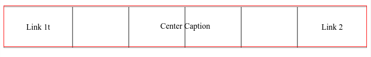
http://jsfiddle.net/wo40ev18/3/
HTML
<div id="table">
<div class="caption">
    Center Caption
</div>
<div class="group">
      <div class="row">
            <div class="cell">Link 1t</div>
            <div class="cell"></div>
          <div class="cell"></div>
          <div class="cell"></div>
            <div class="cell"></div>
            <div class="cell ">Link 2</div>
      </div>
</div>
CSS
   #table {
    display:table;
}

.group {display: table-row-group; }

.row {
    display:table-row;
    height: 80px;
    line-height: 80px;
}

.cell {
    display:table-cell;
    width:1%;
    text-align: center;
    border:1px solid grey;
    height: 80px
        line-height: 80px;
}

.caption {
    border:1px solid red; caption-side: top; display: table-caption; text-align: center;
    position: relative;
    top: 80px;
    height: 80px;
      height: 80px;
    line-height: 80px;

}