How to use CSS to surround a number with a circle?
HtmlCssCss ShapesHtml Problem Overview
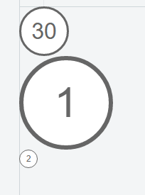
I would like to surround a number in a circle like in this image:

Is this possible and how is it achieved?
Html Solutions
Solution 1 - Html
Here's a demo on JSFiddle and a snippet:
.numberCircle {
    border-radius: 50%;
    width: 36px;
    height: 36px;
    padding: 8px;

    background: #fff;
    border: 2px solid #666;
    color: #666;
    text-align: center;

    font: 32px Arial, sans-serif;
}
<div class="numberCircle">30</div>
My answer is a good starting point, some of the other answers provide flexibility for different situations. If you care about IE8, look at the old version of my answer.
Solution 2 - Html
The problem with most of the other answers here is you need to tweak the size of the outer container so that it is the perfect size based on the font size and number of characters to be displayed. If you are mixing 1 digit numbers and 4 digit numbers, it won't work. If the ratio between the font size and the circle size isn't perfect, you'll either end up with an oval or a small number vertically aligned at the top of a large circle. This should work fine for any amount of text and any size circle. Just set the width and line-height to the same value:
.numberCircle {
    width: 120px;
    line-height: 120px;
    border-radius: 50%;
    text-align: center;
    font-size: 32px;
    border: 2px solid #666;
}
<div class="numberCircle">1</div>
<div class="numberCircle">100</div>
<div class="numberCircle">10000</div>
<div class="numberCircle">1000000</div>
If you need to make the content longer or shorter, all you need to do is adjust the width of the container for a better fit.
Solution 3 - Html
If it's 20 and lower, you can just use the unicode characters ① ② ... ⑳
Solution 4 - Html
For circle sizes varying based on the content this should work:
.numberCircle {
  display: inline-block;
  line-height: 0px;
  border-radius: 50%;
  border: 2px solid;
  font-size: 32px;
}

.numberCircle span {
  display: inline-block;
  padding-top: 50%;
  padding-bottom: 50%;
  margin-left: 8px;
  margin-right: 8px;
}
<span class="numberCircle"><span>30</span></span>
<span class="numberCircle"><span>1</span></span>
<span class="numberCircle"><span>5435</span></span>
<span class="numberCircle"><span>2</span></span>
<span class="numberCircle"><span>100</span></span>
It relies on the width of the content plus the margin-'s to determine the radius, then extends the height to match using the padding-'s. The margin-'s would need to be adjusted based on the font-size.
Update to remove inner element:
.numberCircle {
  display: inline-block;
  border-radius: 50%;
  border: 2px solid;
  font-size: 32px;
}

.numberCircle:before,
.numberCircle:after {
  content: '\200B';
  display: inline-block;
  line-height: 0px;
  padding-top: 50%;
  padding-bottom: 50%;
}

.numberCircle:before {
  padding-left: 8px;
}

.numberCircle:after {
  padding-right: 8px;
}
<span class="numberCircle">30</span>
<span class="numberCircle">1</span>
<span class="numberCircle">5435</span>
<span class="numberCircle">2</span>
<span class="numberCircle">100</span>
Uses pseudo-elements to force the height. Need the zero width space for vertical alignment. Moved the line-height:0px from the outer to the pseudo so that it is at least visible when degrading for IE8.
Solution 5 - Html
the easiest way is using bootstrap and badge class
<span class="badge">1</span>
Solution 6 - Html
This version does not rely on hard-coded, fixed values but sizes relative to the font-size of the div.
CSS:
.numberCircle {
    font: 32px Arial, sans-serif;

    width: 2em;
    height: 2em;
    box-sizing: initial;

    background: #fff;
    border: 0.1em solid #666;
    color: #666;
    text-align: center;
    border-radius: 50%;

    line-height: 2em;
    box-sizing: content-box;
}
HTML:
<div class="numberCircle">30</div>
<div class="numberCircle" style="font-size: 60px">1</div>
<div class="numberCircle" style="font-size: 12px">2</div>
Solution 7 - Html
You can use the border-radius for this:
<html>
  <head>
    <style type="text/css">

    .round
    {
        -moz-border-radius: 15px;
        border-radius: 15px;
        padding: 5px;
        border: 1px solid #000;
    }

  </style>
  </head>
  <body>
    <span class="round">30</span>
  </body>
</html>
Play with the border radius and the padding values until you are satisfied with the result.
But this won't work in all browsers. I guess IE still does not support rounded corners.
Solution 8 - Html
Late to the party, but here is a bootstrap-only solution that has worked for me. I'm using Bootstrap 4:
<link href="https://maxcdn.bootstrapcdn.com/bootstrap/4.0.0/css/bootstrap.min.css" rel="stylesheet"/>

<body>
<div class="row mt-4">
<div class="col-md-12">
<span class="bg-dark text-white rounded-circle px-3 py-1 mx-2 h3">1</span>
<span class="bg-dark text-white rounded-circle px-3 py-1 mx-2 h3">2</span>
<span class="bg-dark text-white rounded-circle px-3 py-1 mx-2 h3">3</span>
</div>
</div>
</body>
You basically add bg-dark text-white rounded-circle px-3 py-1 mx-2 h3 classes to your <span> (or whatever) element and you're done.
Note that you might need to adjust margin and padding classes if your content has more than one digits.
Solution 9 - Html
I am surprised nobody used flex which is easier to understand, so I put my version of answer here:
- To create a circle, make sure
widthequalsheight - To adapt to
font-sizeof number in the circle, useemrather thanpx - To center the number in the circle, use flex with
justify-content: center; align-items: center; - if the number grows (>1000 for example), increase the
widthandheightat same time
Here is an example:
.circled-number {
  color: #666;
  border: 2px solid #666;
  border-radius: 50%;
  font-size: 1rem;
  display: flex;
  justify-content: center;
  align-items: center;
  width: 2em;
  height: 2em;
}

.circled-number--big {
  color: #666;
  border: 2px solid #666;
  border-radius: 50%;
  font-size: 1rem;
  display: flex;
  justify-content: center;
  align-items: center;
  width: 4em;
  height: 4em;
}
<div class="circled-number">
  30
</div>

<div class="circled-number--big">
  3000000
</div>
Solution 10 - Html
My solution here - this easily allows for different sizes and colors and ties into a CMS for editorial control. For IE degrading to squares.
HTML:
<div class="circular-label label-outer label-size-large label-color-pink">
    <div class="label-inner">
        <span>Fashion & Beauty</span>
    </div>
</div>
CSS:
.circular-label {
    overflow: hidden;
    z-index: 100;
    vertical-align: middle;
    font-size: 11px;
    -webkit-box-shadow:0 3px 3px rgba(0, 0, 0, 0.2);
    -moz-box-shadow:0 3px 3px rgba(0, 0, 0, 0.2);
    box-shadow: 3px 3px 3px rgba(0, 0, 0, 0.2);
}
.label-inner {
    width: 85%;
    height: 85%;
    -moz-border-radius: 50%;
    -webkit-border-radius: 50%;
    border-radius: 50%;
    border: 2px dotted white;
    vertical-align: middle;
    margin: auto;
    top: 5%;
    position: relative;
    overflow: hidden;
}
.label-inner > span {
    display: table;
    text-align: center;
    vertical-align: middle;
    font-weight: bold;
    text-transform: uppercase;
    width: 100%;
    position: absolute;
    margin: auto;
    margin-top: 38%;
    font-family:'ProximaNovaLtSemibold';
    font-size: 13px;
    line-height: 1.0em;
}
.circular-label.label-size-large {
    width: 110px;
    height: 110px;
    -moz-border-radius: 55px;
    -webkit-border-radius: 55px;
    border-radius: 55px;
    margin-top:-55px;
}
.circular-label.label-size-med {
    width: 76px;
    height: 76px;
    -moz-border-radius: 38px;
    -webkit-border-radius: 38px;
    border-radius: 38px;
    margin-top:-38px;
}
.circular-label.label-size-med .label-inner > span {
    margin-top: 33%;
}
.circular-label.label-size-small {
    width: 66px;
    height: 66px;
    -moz-border-radius: 33px;
    -webkit-border-radius: 33px;
    border-radius: 33px;
    margin-top:-33px;
}
It's not too difficult to see how to do this. The bigger question is whether it is possible to make the dimensions of the circle scale to content.
Currently I don't think it is possible. Anyone?
Solution 11 - Html
.numberCircle {
  border-radius: 50%;
  width: 40px;
  height: 40px;
  display: block;
  float: left;
  border: 2px solid #000000;
  color: #000000;
  text-align: center;
  margin-right: 5px;
}
<h3><span class="numberCircle">1</span> Regiones del Interior</h3>
Solution 12 - Html
Late to the party but here's the solution I went with https://codepen.io/jnbruno/pen/vNpPpW
Required no extra work. Thanks John Noel Bruno
.btn-circle.btn-xl {
  width: 70px;
  height: 70px;
  padding: 10px 16px;
  border-radius: 35px;
  font-size: 24px;
  line-height: 1.33;
}

.btn-circle {
  width: 30px;
  height: 30px;
  padding: 6px 0px;
  border-radius: 15px;
  text-align: center;
  font-size: 12px;
  line-height: 1.42857;
}
<div class="panel-body">
  <h4>Normal Circle Buttons</h4>
  <button type="button" class="btn btn-default btn-circle">
        <i class="fa fa-check"></i>
      </button>
  <button type="button" class="btn btn-primary btn-circle">
        <i class="fa fa-list"></i>
      </button>
</div>
Solution 13 - Html
Do something like this in your css
div {
width: 10em; height: 10em;
-webkit-border-radius: 5em; -moz-border-radius: 5em;
}
p {
text-align: center; margin-top: 4.5em;
}
Use the paragraph tag to write the text. Hope that helps
Solution 14 - Html
Something like this could work (for numbers 0 to 99):
.circle {
  border: 0.1em solid grey;
  border-radius: 100%;
  height: 2em;
  width: 2em;
  text-align: center;
}

.circle p {
  margin-top: 0.10em;
  font-size: 1.5em;
  font-weight: bold;
  font-family: sans-serif;
  color: grey;
}
<body>
  <div class="circle">
    <p>30</p>
  </div>
</body>
Solution 15 - Html
Improving the first answer just get rid of the padding and add line-height and vertical-align:
.numberCircle {
   border-radius: 50%;

   width: 36px;
   height: 36px;
   line-height: 36px;
   vertical-align:middle;

   background: #fff;
   border: 2px solid #666;
   color: #666;

   text-align: center;
   font: 32px Arial, sans-serif;
}
Solution 16 - Html
Heres my way of doing it, using square method. upside is it works with different values, but you need 2 spans.
.circle {
  display: inline-block;
  border: 1px solid black;
  border-radius: 50%;
  position: relative;
  padding: 5px;
}
.circle::after {
  content: '';
  display: block;
  padding-bottom: 100%;
  height: 0;
  opacity: 0;
}
.num {
  position: absolute;
  top: 50%;
  transform: translateY(-50%);
}
.width_holder {
  display: block;
  height: 0;
  overflow: hidden;
}
<div class="circle">
  <span class="width_holder">1</span>
  <span class="num">1</span>
</div>
<div class="circle">
  <span class="width_holder">11</span>
  <span class="num">11</span>
</div>
<div class="circle">
  <span class="width_holder">11111</span>
  <span class="num">11111</span>
</div>
<div class="circle">
  <span class="width_holder">11111111</span>
  <span class="num">11111111</span>
</div>
Solution 17 - Html
Here's a demo on JSFiddle and a snippet:
/* Creating a number within a circle using CSS */
.numberCircle {
    font-family: "OpenSans-Semibold", Arial, "Helvetica Neue", Helvetica, sans-serif;
    display: inline-block;
    color: #fff;
    text-align: center;
    line-height: 0px;
    border-radius: 50%;
    font-size: 12px;
    min-width: 38px;
    min-height: 38px;
}

.numberCircle span {
    display: inline-block;
    padding-top: 50%;
    padding-bottom: 50%;
    margin-left: 1px;
    margin-right: 1px;
}

/* Some Back Ground Colors */
.clrGreen {
    background: #51a529;
}
.clrRose {
    background: #e6568b;
}
.clrOrange {
    background: #ec8234;
}
.clrBlueciel {
    background: #21adfc;
}
.clrMauve {
    background: #7b5d99;
}
<span class="numberCircle clrGreen"><span>8</span></span>
<span class="numberCircle clrRose"><span>80</span></span>
<span class="numberCircle clrOrange"><span>800</span></span>
<span class="numberCircle clrMauve"><span>8000</span></span>
Solution 18 - Html
You work like with a standard block, that is a square
This is feature of CSS 3 and it is not very well suporrted, you can count on firefox and safari for sure.
.circle {
  width: 10em;
  height: 10em;
  -webkit-border-radius: 5em;
  -moz-border-radius: 5em;
  border: 1px solid black;
}
<div class="circle"><span>1234</span></div>
Solution 19 - Html
The answer of thirtydot is right but is missing a little point. You need to add position: relative , if you want to have centered value in the circle and include also different range of number. For example 123;
HTML:
> <div class="numberCircle">30</div>
CSS:
.numberCircle {

border-radius: 50%;
behavior: url(PIE.htc); /* remove if you don't care about IE8 */
width: 36px;
height: 36px;
padding: 8px;
position: relative;
background: #fff;
border: 2px solid #666;
color: #666;
text-align: center;

font: 32px Arial, sans-serif;
}
but an easiest solution is to use Bootstrap
<span class="badge" style ="float:right">123</span>
Solution 20 - Html
You can use
span.red {
    background: red;
    border-radius: 0.8em;
    -moz-border-radius: 0.8em;
    -webkit-border-radius: 0.8em;
    color: #ffffff;
    display: inline-block;
    font-weight: bold;
    line-height: 1.6em;
    margin-right: 15px;
    text-align: center;
    width: 1.6em;
}

span.grey {
    background: #cccccc;
    border-radius: 0.8em;
    -moz-border-radius: 0.8em;
    -webkit-border-radius: 0.8em;
    color: #fff;
    display: inline-block;
    font-weight: bold;
    line-height: 1.6em;
    margin-right: 15px;
    text-align: center;
    width: 1.6em;
}

span.green {
    background: #5EA226;
    border-radius: 0.8em;
    -moz-border-radius: 0.8em;
    -webkit-border-radius: 0.8em;
    color: #ffffff;
    display: inline-block;
    font-weight: bold;
    line-height: 1.6em;
    margin-right: 15px;
    text-align: center;
    width: 1.6em;
}

span.blue {
    background: #5178D0;
    border-radius: 0.8em;
    -moz-border-radius: 0.8em;
    -webkit-border-radius: 0.8em;
    color: #ffffff;
    display: inline-block;
    font-weight: bold;
    line-height: 1.6em;
    margin-right: 15px;
    text-align: center;
    width: 1.6em;
}

span.pink {
    background: #EF0BD8;
    border-radius: 0.8em;
    -moz-border-radius: 0.8em;
    -webkit-border-radius: 0.8em;
    color: #ffffff;
    display: inline-block;
    font-weight: bold;
    line-height: 1.6em;
    margin-right: 15px;
    text-align: center;
    width: 1.6em;
}
    <h1><span class="grey">1</span>A grey circle with number inside</h1>
    <h1><span class="red">2</span>A red circle with number inside</h1>
    <h1><span class="blue">3</span>A blue circle with number inside</h1>
    <h1><span class="green">4</span>A green circle with number inside</h1>
    <h1><span class="pink">5</span>A pink circle with number inside</h1>
Thank to https://wpsites.net/web-design/colored-numbered-circles-using-pure-css-html/