How to use CSS (and JavaScript?) to create a blurred, "frosted" background?
JavascriptHtmlCssWebkitJavascript Problem Overview
I'm trying to create an iOS 7 style frosted look with HTML5, CSS3 and JavaScript which can work on webkit browsers.
Technically, given the following HTML:
<style>
#partial-overlay {
width: 100%;
height: 20px;
background: rgba(255, 255, 255, .2); /* TODO frost */
position: fixed;
top: 0;
left: 0;
}
</style>
<div id="main-view">
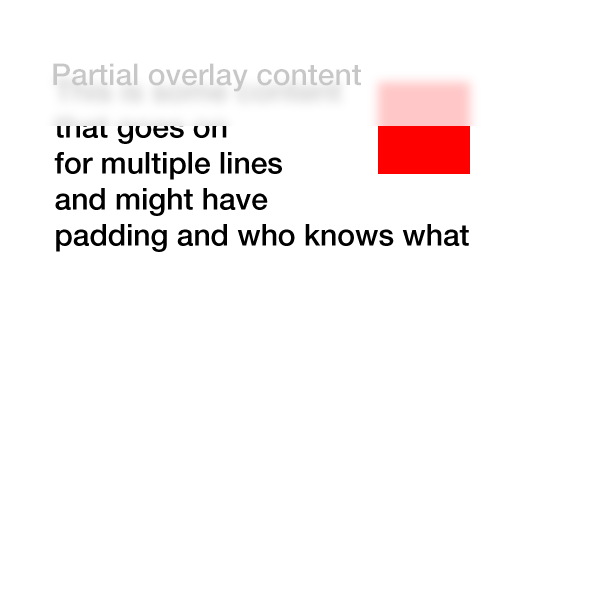
<div style="width: 50px; height: 50px; background: #f00"></div>
To my left is a red box<br>
Now there is just text<br>
Text that goes on for a few pixels <br>
or even more
</div>
<div id="partial-overlay">
Here is some content
</div>
I'd like to apply something like a -webkit-filter: blur(5px) to the first 20px horizontally of #main-view.
If the CSS was modified to be #partial-overlay { width: 20px; height: 100%; ...} then I'd need to apply the -webkit-filter: blur(5px) to the first 20px vertically.
The obvious solution is to use javascript to make a clone of the #main-view, set overflow: hidden and then change the width/height as appropriate but that seems to me hard to generalize to more complex pages/CSS structures.
Is there a better way to achieve this with minimal performance hit and maximal generalizability?
EDIT: Here is an example of what I'm trying to achieve:
Javascript Solutions
Solution 1 - Javascript
Thanks for the inspiration... It led me to this canvas plugin which does the trick
New and Improved: -webkit- and Firefox Working Example, now re-sizable/fluid.
JS
$(document).ready(function () {
    frost = function () {
        var w = $('#main-view').width();
        html2canvas(document.body, {
            onrendered: function (canvas) {
                document.body.appendChild(canvas);
                $('canvas').wrap('<div id="contain" />');
            },
            width: w,
            height: 30
        });
        $('canvas, #partial-overlay, #cover').hide();
        $('#cover').fadeIn('slow', function () {
            $('#partial-overlay').fadeIn('slow');
        });
    };

    $('body').append('<div id="cover"></div><svg id="svg-image-blur"><filter id="blur-effect-1"><feGaussianBlur stdDeviation="2"/></filter></svg>');

    $('#main-view').click(function () {
        frost();
        $('#partial-overlay').addClass('vis');
        $(window).resize(function () {
            $('canvas, #partial-overlay, #cover').hide();
        });

        function onResize() {
            if ($('#partial-overlay').hasClass('vis')) {
                frost();
            }
        }
        var timer;
        $(window).bind('resize', function () {
            timer && clearTimeout(timer);
            timer = setTimeout(onResize, 50);
        });

    });

    $('#partial-overlay').click(function () {
        $('#partial-overlay').removeClass('vis');
        $('canvas, #partial-overlay, #cover').hide();
    });
});
CSS
#main-view {
    width:75%;
    height:50%;
    box-sizing: border-box;
    margin:8px;
}
#partial-overlay {
    display:none;
    width: 100%;
    height: 20px;
    position: absolute;
    top: 0;
    left: 0;
    z-index:99;
    background: rgba(255, 255, 255, 0.2);
    cursor:pointer;
}
canvas {
    position: absolute;
    top: 0;
    left: 0;
    -webkit-filter:blur(5px);
    filter: url(#blur-effect-1);
}
#cover {
    display:none;
    height:19px;
    width:100%;
    background:#fff;
    top:0;
    left:0;
    position:absolute;
}
#contain {
    height:20px;
    width:100%;
    overflow:hidden;
    position:absolute;
    top:0;
    left:0;
}
svg {
    height:0;
    width:0;
}
HTML
<div id="main-view">
    <div style="width: 10%; height: 20%; background: #f00; float: left"></div>To my left is a red box
    <br>Now there is just text
    <br>Text that goes on for a few pixels
    <br>or even more</div>
<div id="partial-overlay">Here is some content</div>
I put it in a click function, because I figured it would be the most likely use case. It will work just as well on document ready.
Although the canvas representation wont be pixel perfect, I don't think it will really matter in most cases because its being blurred.
Update: As requested this is now re-sizable. I also moved the cover div into the JS and added an svg fall back for Firefox. The resizing requires the canvas to be redrawn on each re-size, so I set it up to hide the canvas, overlay, etc while you're resizing and then replace it when the re-size stops.
Solution 2 - Javascript
Basically you could have a overlay placeholder where you duplicate the main content and sync the scrolling of both divs, than apply css blur filter on the overlay only.
A simple javascript will do:
$(document).ready(function(){
  $('.overlay').append( $('.content').html() );
  $('.content').on('scroll', function(){
    $('.overlay').scrollTop($(this).scrollTop());
  });
});
And for the CSS:
.overlay {
    overflow:hidden;
    -webkit-filter: blur(.25em);
    background:#fff;
}
I put together a working example for you (webkit only):
Have fun! :)
Solution 3 - Javascript
> Is there a better way to achieve this with minimal performance hit and > maximal generalizability?
The answer to this is no.
The reason is that in order to do what you want you would need direct access to the bitmap used for the browser window to extract or manipulate the pixels in the area you want to blur (I wish, "aero" in a browser could look pretty neat..) or a filter that works on the elements behind the one you apply it to (or can have a limiting region set to it).
As there is no native support to do this (besides canvas and extension API, or a library that generate canvas image from the html -> relatively slow) this will need to be done with trickery (images, splitting divs etc.) in either case.
If you made everything in your page on a canvas you could do a lot of interesting things, but you would also need to perform layout, update, filtering etc. yourselves and therefor you would be back no non-optimized as Javascript is slower than native (not to mention it would be error prone).
Until browsers allow you to grab a section of the window as a canvas (never? as that would require everything on that page to be same-origin or have content with special accept headers set) there is no way around but to do tricks.
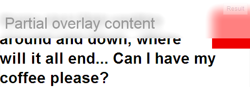
Update
As an demonstration that you can do it by using html2canvas etc, but having to use compromises (-> slow performance) - the demo is rough, experimental and needs tweaks to work well - but for the sake of demo only:
http://jsfiddle.net/AbdiasSoftware/RCaLR/
Result:
Generalized function to grab part of background:
getBlurredBG(x, y, width, height, id);
Get part of window using html2canvas:
function getBlurredBG(x, y, w, h, id) {

    html2canvas(document.body, {
        onrendered: function (canvas) {
            process(canvas, x, y, w, h, id);
        },
        width: (x + w),
        height: (y + h)
    });
}
Process the content:
function process(canvas, x, y, w, h, id) {

    //create new canvas to enable clipping
    //As html2canvas returns a canvas from 0,0 to width and height
    //we need to clip it.
    var ocanvas = document.createElement('canvas');
    ocanvas.width = w;
    ocanvas.height = h;
    ocanvas.style.left = x + 'px';
    ocanvas.style.top = y + 'px';
    ocanvas.style.position = 'absolute';
    ocanvas.id = id;

    var ctx = ocanvas.getContext('2d');
    ctx.drawImage(canvas, x, y, w, h,
                          0, 0, w, h);

    stackBlurCanvasRGB(ocanvas, x, y, w, h, 28)
    lighten(ocanvas);

    ctx.fillStyle = 'rgba(255,255,255,0.5)';
    ctx.fillRect(x, y, w, h);

    ctx.fillStyle = '#999';
    ctx.font = '32px arial';
    ctx.fillText("Partial overlay content", 10, 60);

    document.body.appendChild(ocanvas);
}
Solution 4 - Javascript
Recently, a new -webkit-backdrop-filter. This is currently supported in Safari 9.0, and Chrome behind a flag.
Demo:
#blurred {
  -webkit-backdrop-filter: blur(10px);
  width: 200px;
  height: 100px;
  position: fixed;
  top: 50px;
  left: 50px;
  border: 3px solid white;
}
<img src="https://upload.wikimedia.org/wikipedia/commons/e/eb/Ash_Tree_-_geograph.org.uk_-_590710.jpg">

<div id="blurred"> Blurred </div>
Support right now is only Safari. Chrome and Opera have this under a flag.
Note: Today -webkit-backdrop-filter still doesn't have great support so for now if you want to get this effect, the best way is using SVG's feGaussianBlur
Solution 5 - Javascript
CSS only solution:
backdrop-filter: blur(4px);
Solution 6 - Javascript
I've made some css-trick without backdrop-filter because chrome doesn't support it by default
My original code with sass: https://codepen.io/mixal_bl4/pen/EwPMWo
$(()=>{
  let sdm = $('.some-draggable-modal');
  sdm.center().draggable();
});

jQuery.fn.center = function () {
    this.css("position","absolute");
    this.css("top", Math.max(0, (($(window).height() - $(this).outerHeight()) / 2) +
                                                $(window).scrollTop()) + "px");
    this.css("left", Math.max(0, (($(window).width() - $(this).outerWidth()) / 2) +
                                                $(window).scrollLeft()) + "px");
    return this;
};
body {
  background: -webkit-repeating-linear-gradient(135deg, #fff, #fff 25px, #e2edc1 25px, #e2edc1 50px) fixed;
  background: repeating-linear-gradient(-45deg, #fff, #fff 25px, #e2edc1 25px, #e2edc1 50px) fixed;
  background-attachment: fixed;
  background-size: cover;
}
html:before,
body:before {
  content: "";
  display: block;
  position: absolute;
  top: 0;
  left: 0;
  right: 0;
  bottom: 0;
  background: rgba(0, 0, 0, 0.3);
}
html .some-draggable-modal,
body .some-draggable-modal {
  width: 150px;
  height: 150px;
  border: 1px solid lime;
  display: -webkit-box;
  display: -ms-flexbox;
  display: flex;
  place-content: center;
  -webkit-box-orient: vertical;
  -webkit-box-direction: normal;
      -ms-flex-direction: column;
          flex-direction: column;
  text-align: center;
  border-radius: 6px;
  cursor: move;
  position: relative;
  overflow: hidden;
}
html .some-draggable-modal .title,
body .some-draggable-modal .title {
  position: relative;
  z-index: 1;
  color: black;
}
html .some-draggable-modal:before,
body .some-draggable-modal:before {
  content: "";
  position: absolute;
  top: 0;
  left: 0;
  right: 0;
  bottom: 0;
  background: -webkit-repeating-linear-gradient(135deg, #fff, #fff 25px, #e2edc1 25px, #e2edc1 50px) fixed;
  background: repeating-linear-gradient(-45deg, #fff, #fff 25px, #e2edc1 25px, #e2edc1 50px) fixed;
  background-attachment: fixed;
  background-size: cover;
}
html .some-draggable-modal:hover:before,
body .some-draggable-modal:hover:before {
  -webkit-filter: blur(2px);
          filter: blur(2px);
}
html .some-draggable-modal:hover:after,
body .some-draggable-modal:hover:after {
  content: "filter: blur(2px)";
  position: absolute;
  left: 0;
  right: 0;
  bottom: 10px;
  color: green;
}
<script src="//cdnjs.cloudflare.com/ajax/libs/jquery/3.2.1/jquery.min.js"></script>
<script src="//cdnjs.cloudflare.com/ajax/libs/jqueryui/1.12.1/jquery-ui.min.js"></script>

<div class="some-draggable-modal">
  <span class="title">You can drag me :)</span>
</div>
Solution 7 - Javascript
Live sample of what I did ( and updated to look just like the image above )
Code:
<style>
  #partial-overlay {
    width: 100%;
    height: 45px;
    background: #ffffff; /* TODO frost */
    -webkit-opacity:0.70;
    -webkit-filter: blur(5px);
    position: absolute;
    top: 20px;
    left: 0px;
    z-index:5;
  }
  #main-view
  {
   position: fixed;
   top: 20px;
   left: 80px;
   z-index:-1;
  }
</style>
<div id="main-view">
  <div style="width: 50px; height: 50px; background: #f00; position:fixed; left:10px; top: 40px; -webkit-filter: blur(2px); "></div>
    <div style="width: 80px; height: 60px; background: #fff; position:fixed; left:0px; top: 66px; -webkit-filter: blur(5px);"></div>
    <div style="width: 50px; height: 30px; background: #f00; position:fixed; left:10px; top: 60px;"></div>
  <p style="font-family:Sans, Arial, Verdana;">
  To my left is a red box<br>
  Now there is just text<br>
  Text that goes on for a few pixels <br>
  or even more
  </p>
</div>
<div id="partial-overlay">

</div>
I made it look a bit prettier than it needs to be, but It works!
Solution 8 - Javascript
Unfortunately there is no nice way of doing this, as you figured out you will need a copy of the main div:
<div class="wrapper">
   <div class="overlay"></div>
   <div id="main-copy"></div>
</div>
Overlay will push the wrapper width around while, main-copy will be in the background with blur. Obviously there will be performance issues if the content in main-copy is complex.
Solution 9 - Javascript
It has still very limited suport (only Firefox) but one way to get it could be this:
Firefox only demo
The CSS is quite simple:
#partial-overlay {
    width:400px;
    height:100px;
    background: -moz-element(#main-view);
    top: 0px;
    left: 200px;
    position: absolute;
    opacity: 0.3;
}
and the key is to use as background for partial overlay the main-view element.
This demo uses only opacity because filters are not availables for Firefox.
The element property for the background has been approved by w3c, so it could show sometime in the future in webkit
In the demo partial-overlay has been shift to the right to make more clear what is what
Solution 10 - Javascript
You can now use the backdrop-filter CSS property.
Latest versions of Chrome, Opera and Edge support it by default, while Safari and Legacy Edge support it with the -webkit- prefix, and Firefox supports the unprefixed version if the layout.css.backdrop-filter.enabled preference is set to true.
So your CSS becomes:
#partial-overlay {
    width: 100%;
    height: 20px;
    background: rgba(255, 255, 255, .2); /* TODO frost */
    position: fixed;
    top: 0;
    left: 0;

    backdrop-filter: blur(10px);
    -webkit-backdrop-filter: blur(10px);
}