How to style the standard react-native android picker?
AndroidReact NativeAndroid Problem Overview
I am unable to style it. There is hardly any documentation on this. I want to know how to set the fontFamily. How to set the background color on the Picker.items?
https://facebook.github.io/react-native/docs/picker.html
Setting fontFamily or background color doesn't work. wrapping it up in a View and giving style attributes to View also doesn't work.
<Picker
   style={styles.picker} // cannot set fontFamily here
   selectedValue={this.state.selected2}
   onValueChange={this.onValueChange.bind(this, 'selected2')}
   mode="dropdown">
   <Item label="hello" value="key0" /> // cannot set backgroundColor here
   <Item label="world" value="key1" />
</Picker>
Android Solutions
Solution 1 - Android
It can be styled via native android. See this and this.
Add the following code to /res/values/styles.xml
<style name="AppTheme" parent="Theme.AppCompat.Light.NoActionBar">
  <item name="android:spinnerItemStyle">@style/SpinnerItem</item>
  <item name="android:spinnerDropDownItemStyle">@style/SpinnerDropDownItem</item>
</style>

<style name="SpinnerItem" parent="Theme.AppCompat.Light.NoActionBar">
  <item name="android:fontFamily">sans-serif-light</item>
  <item name="android:textSize">18dp</item>
</style>

<style name="SpinnerDropDownItem" parent="Theme.AppCompat.Light.NoActionBar">
    <item name="android:textColor">#ffffff</item>
    <item name="android:textSize">18dp</item>
    <item name="android:fontFamily">sans-serif-light</item>
    <item name="android:gravity">center</item>
    <item name="android:background">@drawable/mydivider</item>
</style>
Create a file at res/drawable/mydivider.xml and add the following code
<shape xmlns:android="http://schemas.android.com/apk/res/android"
    android:shape="rectangle">
    <solid android:color="#29A1C9" />
    <corners android:radius="0.5dp" />
    <stroke
        android:color="#FFFFFF"
        android:width="0.1dp" />
</shape>
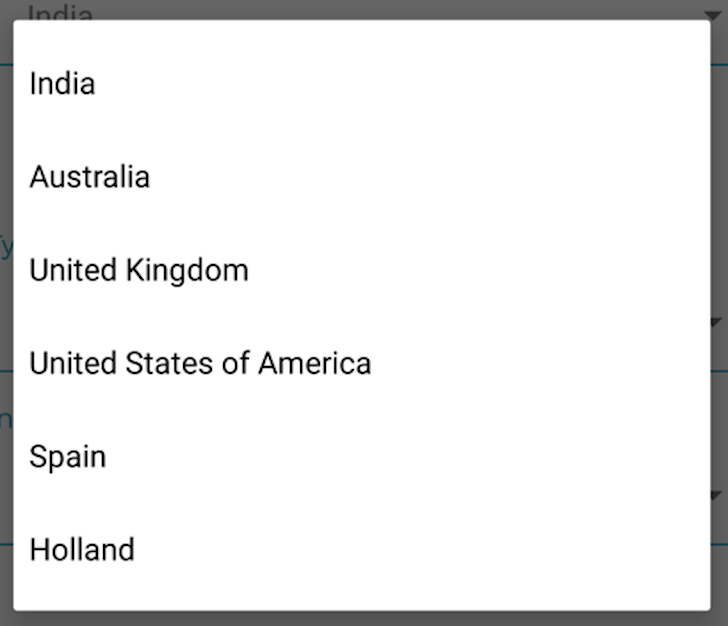
Before styling:
After styling: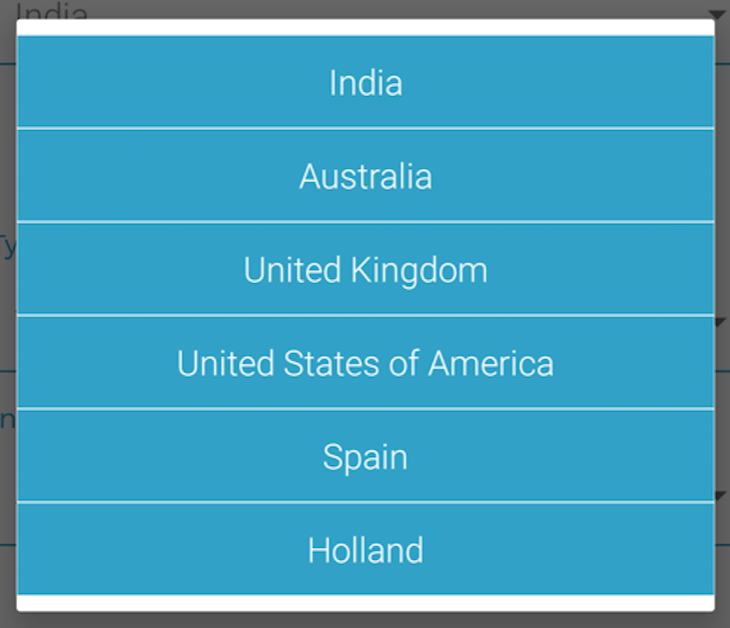
Solution 2 - Android
The question might be old but in case, you can use this to style the color:
<Item label="blue" color="blue" value="blue" />
Solution 3 - Android
If you take a look at the style prop, it's the style for the Picker, not the Picker items.
You can also see from the docs that the Picker has itemStyle prop but it's iOS only. Styling the Android Picker items can be done via native Android only.
Solution 4 - Android
For those who couldnt center texts in picker modal in @Abhishek Nalin answer use android:textAlignment="center"
Solution 5 - Android
Thank you for sharing the solution. I had similar issue with aligning text in picker item(spinnerDropDown) on RTL layout. I didn't want to hardcode left/right direction in my style. This was the workaround I used.
In your res/values/styles.xml file add
<!-- Base application theme. -->
<style name="AppTheme" parent="Theme.AppCompat.Light.NoActionBar">
		<!--
		... existing styles
		--->
        <item name="android:spinnerItemStyle">@style/SpinnerItem</item>
        <item name="android:spinnerDropDownItemStyle">@style/SpinnerDropDownItem</item>
 </style>

 <style name="SpinnerItem" parent="Theme.AppCompat.Light.NoActionBar">
    <item name="android:textAlignment">gravity</item>
    <item name="android:gravity">start</item>
</style>
<style name="SpinnerDropDownItem" parent="Theme.AppCompat.Light.NoActionBar">
    <item name="android:textAlignment">gravity</item>
    <item name="android:gravity">start</item>
    <item name="android:padding">10dp</item>
</style>
Solution 6 - Android
All of them work except the background, but I couldn't get the background color to work. All I want is #000 for the background, but no matter what I tried, colorBackround popupBackround etc. I tried all of them but it didn't work
 <style name="AppTheme" parent="Theme.AppCompat.DayNight.NoActionBar">
    <item name="android:forceDarkAllowed">false</item>
    <item name="android:navigationBarColor">#151617</item>
    <item name="android:windowBackground">#151617</item>
    <item name="android:editTextBackground">@drawable/rn_edit_text_material</item>
    <item name="android:spinnerItemStyle">@style/SpinnerItem</item>
    <item name="android:spinnerDropDownItemStyle">@style/SpinnerDropDownItem</item>
</style>


<style name="SpinnerItem" parent="Theme.AppCompat.DayNight.NoActionBar">
    <item name="android:fontFamily">sans-serif-light</item>
    <item name="android:textSize">18dp</item>
</style>

<style name="SpinnerDropDownItem" parent="Theme.AppCompat.DayNight.NoActionBar">
    <item name="android:textColor">#ffffff</item>
    <item name="android:textSize">18dp</item>
    <item name="android:fontFamily">sans-serif-light</item>
    <item name="android:gravity">center</item>
    <item name="android:background">#000</item>
</style>

<item name="android:background">@drawable/mydivider</item> // I tried that too, it didn't work