How to style the option of an html "select" element?
HtmlCssDrop Down-MenuHtml Problem Overview
Here's my HTML:
<select id="ddlProducts" name="ddProducts">
    <option>Product1 : Electronics </option>
    <option>Product2 : Sports </option>
</select>
I want to make the name of the product (i.e. 'Product1', 'Product2' , etc) bold, and its categories(viz. Electronics, Sports, etc) italicized, using CSS only. I found an old question that mentioned it's not possible using HTML and CSS, but hopefully, there's a solution now.
Html Solutions
Solution 1 - Html
There are only a few style attributes that can be applied to an <option> element.
This is because this type of element is an example of a "replaced element". They are OS-dependent and are not part of the HTML/browser. It cannot be styled via CSS.
There are replacement plug-ins/libraries that look like a <select> but are actually composed of regular HTML elements that CAN be styled.
Solution 2 - Html
No, it's not possible, as the styling for these elements is handled by the user's OS. MSDN will answer your question here:
> Except for background-color and color, style settings applied through the style object for the option element are ignored.
Solution 3 - Html
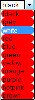
You can style the option elements to some extent.
Using the * CSS selector you can style the options inside the box that is drawn by the system.
Example:
#ddlProducts *
{
 border-radius: 15px;
 background-color: red;
}
That will look like this:
Solution 4 - Html
I found and using this good example of styling the selects and options.You can do with this select all you want.Here is the Fiddle
// Iterate over each select element
$('select').each(function() {

  // Cache the number of options
  var $this = $(this),
    numberOfOptions = $(this).children('option').length;

  // Hides the select element
  $this.addClass('s-hidden');

  // Wrap the select element in a div
  $this.wrap('<div class="select"></div>');

  // Insert a styled div to sit over the top of the hidden select element
  $this.after('<div class="styledSelect"></div>');

  // Cache the styled div
  var $styledSelect = $this.next('div.styledSelect');

  // Show the first select option in the styled div
  $styledSelect.text($this.children('option').eq(0).text());

  // Insert an unordered list after the styled div and also cache the list
  var $list = $('<ul />', {
    'class': 'options'
  }).insertAfter($styledSelect);

  // Insert a list item into the unordered list for each select option
  for (var i = 0; i < numberOfOptions; i++) {
    $('<li />', {
      text: $this.children('option').eq(i).text(),
      rel: $this.children('option').eq(i).val()
    }).appendTo($list);
  }

  // Cache the list items
  var $listItems = $list.children('li');

  // Show the unordered list when the styled div is clicked (also hides it if the div is clicked again)
  $styledSelect.click(function(e) {
    e.stopPropagation();
    $('div.styledSelect.active').each(function() {
      $(this).removeClass('active').next('ul.options').hide();
    });
    $(this).toggleClass('active').next('ul.options').toggle();
  });

  // Hides the unordered list when a list item is clicked and updates the styled div to show the selected list item
  // Updates the select element to have the value of the equivalent option
  $listItems.click(function(e) {
    e.stopPropagation();
    $styledSelect.text($(this).text()).removeClass('active');
    $this.val($(this).attr('rel'));
    $list.hide();
    /* alert($this.val()); Uncomment this for demonstration! */
  });

  // Hides the unordered list when clicking outside of it
  $(document).click(function() {
    $styledSelect.removeClass('active');
    $list.hide();
  });

});
body {
  padding: 50px;
  background-color: white;
}

.s-hidden {
  visibility: hidden;
  padding-right: 10px;
}

.select {
  cursor: pointer;
  display: inline-block;
  position: relative;
  font: normal 11px/22px Arial, Sans-Serif;
  color: black;
  border: 1px solid #ccc;
}

.styledSelect {
  position: absolute;
  top: 0;
  right: 0;
  bottom: 0;
  left: 0;
  background-color: white;
  padding: 0 10px;
  font-weight: bold;
}

.styledSelect:after {
  content: "";
  width: 0;
  height: 0;
  border: 5px solid transparent;
  border-color: black transparent transparent transparent;
  position: absolute;
  top: 9px;
  right: 6px;
}

.styledSelect:active,
.styledSelect.active {
  background-color: #eee;
}

.options {
  display: none;
  position: absolute;
  top: 100%;
  right: 0;
  left: 0;
  z-index: 999;
  margin: 0 0;
  padding: 0 0;
  list-style: none;
  border: 1px solid #ccc;
  background-color: white;
  -webkit-box-shadow: 0 1px 2px rgba(0, 0, 0, 0.2);
  -moz-box-shadow: 0 1px 2px rgba(0, 0, 0, 0.2);
  box-shadow: 0 1px 2px rgba(0, 0, 0, 0.2);
}

.options li {
  padding: 0 6px;
  margin: 0 0;
  padding: 0 10px;
}

.options li:hover {
  background-color: #39f;
  color: white;
}
<script src="https://cdnjs.cloudflare.com/ajax/libs/jquery/3.6.0/jquery.min.js"></script>
<select id="selectbox1">
<option value="">Select an option…</option>
<option value="aye">Aye</option>
<option value="eh">Eh</option>
<option value="ooh">Ooh</option>
<option value="whoop">Whoop</option>
</select>
<select id="selectbox2">
<option value="">Month…</option>
<option value="january">January</option>
<option value="february">February</option>
<option value="march">March</option>
<option value="april">April</option>
<option value="may">May</option>
<option value="june">June</option>
<option value="july">July</option>
<option value="august">August</option>
<option value="september">September</option>
<option value="october">October</option>
<option value="november">November</option>
<option value="december">December</option>
</select>
Solution 5 - Html
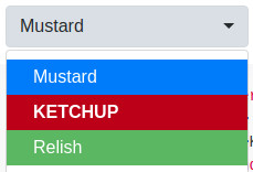
Here's some ways to style <option> along with the <select> if you're using Bootstrap and/or jquery. I understand this isn't what the original poster is asking but I thought I could help others that stumble onto this question.
You can still achieve the goal of styling each <option> separately, but may need to apply some style to the <select> as well. My favorite is the "Bootstrap Select" library mentioned below.
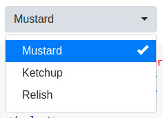
Bootstrap Select Library (jquery)
If you're already using bootstrap, you can try the Bootstrap Select library or the library below (since it has a bootstrap theme).
Note that you are able to style the entire select element, or the option elements separately.
Examples:
Dependencies: requires jQuery v1.9.1+, Bootstrap, Bootstrap’s dropdown.js component, and Bootstrap's CSS
Compatibility: Unsure, but bootstrap says it "supports the latest, stable releases of all major browsers and platforms"
Demo: https://developer.snapappointments.com/bootstrap-select/examples/
.special {
  font-weight: bold !important;
  color: #fff !important;
  background: #bc0000 !important;
  text-transform: uppercase;
}
<script src="https://cdnjs.cloudflare.com/ajax/libs/jquery/1.9.1/jquery.min.js"></script>
<script src="https://stackpath.bootstrapcdn.com/bootstrap/3.3.7/js/bootstrap.min.js"></script>
<link href="https://stackpath.bootstrapcdn.com/bootstrap/3.3.7/css/bootstrap.min.css" rel="stylesheet" />
<link href="https://cdn.jsdelivr.net/npm/[email protected]/dist/css/bootstrap-select.min.css" rel="stylesheet" />
<script src="https://cdn.jsdelivr.net/npm/[email protected]/dist/js/bootstrap-select.min.js"></script>
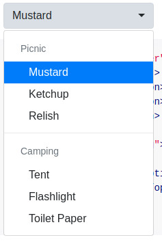
<select class="selectpicker">
<option>Mustard</option>
<option class="special">Ketchup</option>
<option style="background: #5cb85c; color: #fff;">Relish</option>
</select>
Select2 (JS lib)
There's a library you can use called Select2.
Dependencies: Library is JS + CSS + HTML only (does not require JQuery).
Compatibility: IE 8+, Chrome 8+, Firefox 10+, Safari 3+, Opera 10.6+
Demo: https://select2.org/getting-started/basic-usage
There's also a bootstrap theme available.
No Bootstrap example:
$(function() {
  var $select = $('.select2');

  $select.select2({
    theme: 'paper'
  });
});
<script src="https://cdnjs.cloudflare.com/ajax/libs/select2/4.0.7/js/select2.min.js"></script>
<link href="https://cdnjs.cloudflare.com/ajax/libs/select2/4.0.7/css/select2.min.css" rel="stylesheet"/>
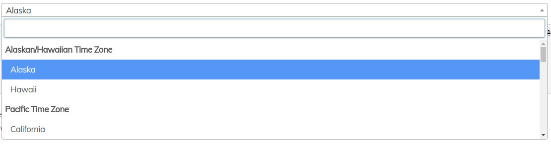
<select class="select2 form-control" placeholder="Country">
<optgroup label="Alaskan/Hawaiian Time Zone">
<option value="AK">Alaska</option>
<option value="HI">Hawaii</option>
</optgroup>
<optgroup label="Pacific Time Zone">
<option value="CA">California</option>
<option value="NV">Nevada</option>
<option value="OR">Oregon</option>
<option value="WA">Washington</option>
</optgroup>
</select>
Bootstrap example:
$(function() {
  var $select = $('.select2');

  $select.select2({
    theme: 'paper'
  });
});
<link href="https://cdnjs.cloudflare.com/ajax/libs/bootswatch/3.3.2/paper/bootstrap.css" rel="stylesheet"/>
<script src="https://cdnjs.cloudflare.com/ajax/libs/select2/4.0.7/js/select2.min.js"></script>
<link href="https://cdnjs.cloudflare.com/ajax/libs/select2/4.0.7/css/select2.min.css" rel="stylesheet"/>

<select class="select2 form-control" placeholder="Country">
  <optgroup label="Alaskan/Hawaiian Time Zone">
    <option value="AK">Alaska</option>
    <option value="HI">Hawaii</option>
  </optgroup>
  <optgroup label="Pacific Time Zone">
    <option value="CA">California</option>
    <option value="NV">Nevada</option>
    <option value="OR">Oregon</option>
    <option value="WA">Washington</option>
  </optgroup>
</select>
MDBootstrap ($ & Bootstrap & JQuery)
If you have extra money, you can use a premium library MDBootstrap. (This is an entire UI Kit, so it's not light)
This allows you to style your select and option elements using the Material design.
There is a free version, but it won't allow you to use the pretty Material design!
Dependencies: Bootstrap 4, JQuery,
Compatibility: "supports the latest, stable releases of all major browsers and platforms."
Demo: https://mdbootstrap.com/docs/jquery/forms/select/#color
Solution 6 - Html
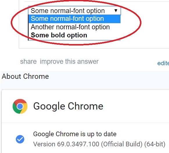
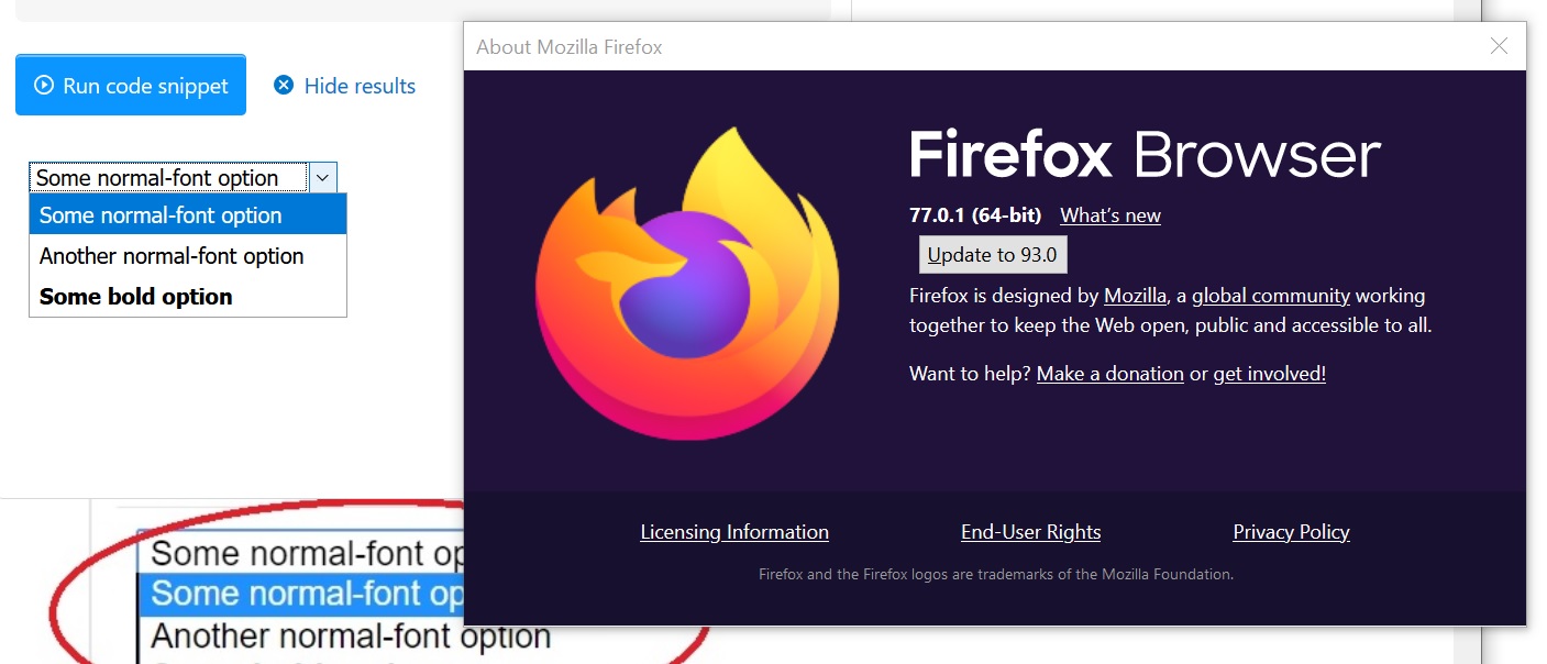
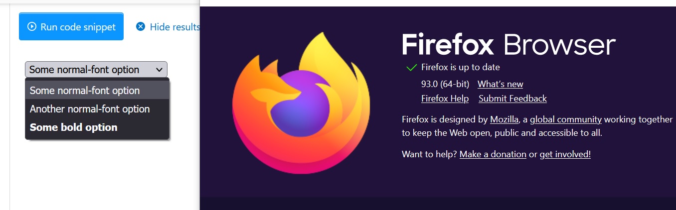
Seems like I can just set the CSS for the select in Chrome or Firefox directly. CSS and HTML code provided below :
.boldoption {
	font-weight: bold;
}
<select>
	<option>Some normal-font option</option>
	<option>Another normal-font option</option>
	<option class="boldoption">Some bold option</option>
</select>
Solution 7 - Html
As already mentioned, the only way is to use a plugin that replaces <select> functionality.
A list of jQuery plugins: http://plugins.jquery.com/tag/select/
Take a look at the example using Select2 plugin: http://jsfiddle.net/swsLokfj/23/
Solution 8 - Html
Some properties can be styled for<option> tag:
font-familycolorfont-*background-color
Also you can use custom font for individual <option> tag, for example any google font, Material Icons or other icon fonts from icomoon or alike. (That may come handy for font selectors etc.)
Considering that, you can create font-family stack and insert icons in <option> tags, eg.
    <select>
        <option style="font-family: 'Icons', 'Roboto', sans-serif;">a    ★★★</option>
        <option style="font-family: 'Icons', 'Roboto', sans-serif;">b    ★★★★</option>
    </select>
where ★ is taken from Icons and the rest is from Roboto.
Note though that custom fonts do not work for mobile select.
Solution 9 - Html
Bootstrap allows you to use styling via data-content:
<select class="selectpicker">
  <option data-content="<span class='label label-success'>Relish</span>">Relish</option>
</select>
Example: https://silviomoreto.github.io/bootstrap-select/examples/
Solution 10 - Html
Actually you can add :before and :after and style those. At least it's something
option {
  font-size: 18px;
  background-color: #ffffff;
}

option:before {
  content: ">";
  font-size: 20px;
  display: none;
  padding-right: 10px;
  padding-left: 5px;
  color: #fff;
}

option:hover:before {
  display: inline;
}
<select id="ddlProducts" name="ddProducts">
  <option>Product1 : Electronics </option>
  <option>Product2 : Sports </option>
</select>
Solution 11 - Html
It's 2017 and it IS possible to target specific select options. In my project I have a table with a class="variations", and the select options are in the table cell td="value", and the select has an ID select#pa_color. The option element also has a class option="attached" (among other class tags). If a user is logged in as a wholesale customer, they can see all of the color options. But retail customers are not allowed to purchase 2 color options, so I've disabled them
<option class="attached" disabled>color 1</option>
<option class="attached" disabled>color 2</option>
It took a little logic, but here is how I targeted the disabled select options.
CSS
table.variations td.value select#pa_color option.attached:disabled {
display: none !important;
}
With that, my color options are only visible to wholesale customers.
Solution 12 - Html
Leaving here a quick alternative, using class toggle on a table. The behavior is very similar than a select, but can be styled with transition, filters and colors, each children individually.
function toggleSelect(){
 if (store.classList[0] === "hidden"){
    store.classList = "viewfull"
  }
  else {
    store.classList = "hidden"
  }
}
#store {
  overflow-y: scroll;
  max-height: 110px;
  max-width: 50%
 }

.hidden {
  display: none
 }

.viewfull {
  display: block
}

#store :nth-child(4) {
  background-color: lime;
}

span {font-size:2rem;cursor:pointer}
<span onclick="toggleSelect()">⮋</span>
 <div id="store" class="hidden">

<ul><li><a href="#keylogger">keylogger</a></li><li><a href="#1526269343113">1526269343113</a></li><li><a href="#slow">slow</a></li><li><a href="#slow2">slow2</a></li><li><a href="#Benchmark">Benchmark</a></li><li><a href="#modal">modal</a></li><li><a href="#buma">buma</a></li><li><a href="#1526099371108">1526099371108</a></li><a href="#1526099371108o">1526099371108o</a></li><li><a href="#pwnClrB">pwnClrB</a></li><li><a href="#stars%20u">stars%20u</a></li><li><a href="#pwnClrC">pwnClrC</a></li><li><a href="#stars ">stars </a></li><li><a href="#wello">wello</a></li><li><a href="#equalizer">equalizer</a></li><li><a href="#pwnClrA">pwnClrA</a></li></ul>

 </div>
Solution 13 - Html
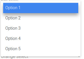
You can use inline styles to add custome styling to <option> tags.
For eg : <option style="font-weight:bold;color:#09C;">Option 1</option>
This will apply the styles to this particular <option> element only.
Then you can use a bit of javascript magic to apply the inline styles to all of the <option> elements within a <select> tag like so :
var select = $(document).getElementById('#select-element-id')
var option = select.children('#option-element-id')
option.css('font-weight', 'bold')
option.css('font-size', '24px')
You can also use <option value="" disabled> <br> </option> to add a line-break between the options.
Solution 14 - Html
Even if there aren't much properties to change, but you can achieve following style only with css:
.options {
  border: 1px solid #e5e5e5;
  padding: 10px;
}

select {
  font-size: 14px;
  border: none;
  width: 100%;
  background: white;
}
<div class="options">
  <select>
    <option value="">Apple</option>
    <option value="">Banana</option>
    <option value="">Orange</option>
    <option value="">Mango</option>
  </select>
</div>
Solution 15 - Html
Is this what youre looking for? I did it with jQuery!
Run Code Snippet
$(".custom-select").each(function() {
    var classes = $(this).attr("class"),
        id      = $(this).attr("id"),
        name    = $(this).attr("name");
    var template =  '<div class="' + classes + '">';
    template += '<span class="custom-select-trigger">' + $(this).attr("placeholder") + '</span>';
    template += '<div class="custom-options">';
    $(this).find("option").each(function() {
        template += '<span class="custom-option ' + $(this).attr("class") + '" data-value="' + $(this).attr("value") + '">' + $(this).html() + '</span>';
    });
    template += '</div></div>';

    $(this).wrap('<div class="custom-select-wrapper"></div>');
    $(this).hide();
    $(this).after(template);
});
$(".custom-option:first-of-type").hover(function() {
    $(this).parents(".custom-options").addClass("option-hover");
}, function() {
    $(this).parents(".custom-options").removeClass("option-hover");
});
$(".custom-select-trigger").on("click", function() {
    $('html').one('click',function() {
        $(".custom-select").removeClass("opened");
    });
    $(this).parents(".custom-select").toggleClass("opened");
    event.stopPropagation();
});
$(".custom-option").on("click", function() {
    $(this).parents(".custom-select-wrapper").find("select").val($(this).data("value"));
    $(this).parents(".custom-options").find(".custom-option").removeClass("selection");
    $(this).addClass("selection");
    $(this).parents(".custom-select").removeClass("opened");
    $(this).parents(".custom-select").find(".custom-select-trigger").text($(this).text());
});
body {
font-family: 'Roboto', sans-serif;
}

 .custom-select-wrapper {
        position: relative;
        display: inline-block;
        user-select: none;
    }
    .custom-select-wrapper select {
        display: none;
    }
    .custom-select {
        position: relative;
        display: inline-block;
    }
    .custom-select-trigger {
        position: relative;
        display: block;
        width: 170px;
        padding: 0 84px 0 22px;
        font-size: 19px;
        font-weight: 300;
        color: #5f5f5f;
        line-height: 50px;
        background: #EAEAEA;
        border-radius: 4px;
        cursor: pointer;
        margin-left:20px;
        border: 1px solid #5f5f5f;
        transition: all 0.3s;
    }

    .custom-select-trigger:hover {
        background-color: #d9d9d9;
        transition: all 0.3s;
    }

    .custom-select-trigger:after {
        position: absolute;
        display: block;
        content: '';
        width: 10px; height: 10px;
        top: 50%; right: 25px;
        margin-top: -3px;
        border-bottom: 1px solid #5f5f5f;
        border-right: 1px solid #5f5f5f;
        transform: rotate(45deg) translateY(-50%);
        transition: all 0.4s ease-in-out;
        transform-origin: 50% 0;
    }
    .custom-select.opened .custom-select-trigger:after {
        margin-top: 3px;
        transform: rotate(-135deg) translateY(-50%);
    }
    .custom-options {
        position: absolute;
        display: block;
        top: 100%; left: 0; right: 0;
        margin: 15px 0;
        border: 1px solid #b5b5b5;
        border-radius: 4px;
        box-sizing: border-box;
        box-shadow: 0 2px 1px rgba(0,0,0,.07);
        background: #fff;
        transition: all 0.4s ease-in-out;
        margin-left: 20px;
        opacity: 0;
        visibility: hidden;
        pointer-events: none;
        transform: translateY(-15px);
    }
    .custom-select.opened .custom-options {
        opacity: 1;
        visibility: visible;
        pointer-events: all;
        transform: translateY(0);
    }
    .custom-options:before {
        position: absolute;
        display: block;
        content: '';
        bottom: 100%; right: 25px;
        width: 7px; height: 7px;
        margin-bottom: -4px;
        border-top: 1px solid #b5b5b5;
        border-left: 1px solid #b5b5b5;
        background: #fff;
        transform: rotate(45deg);
        transition: all 0.4s ease-in-out;
    }
    .option-hover:before {
        background: #f9f9f9;
    }
    .custom-option {
        position: relative;
        display: block;
        padding: 0 22px;
        border-bottom: 1px solid #b5b5b5;
        font-size: 18px;
        font-weight: 600;
        color: #b5b5b5;
        line-height: 47px;
        cursor: pointer;
        transition: all 0.15s ease-in-out;
    }
    .custom-option:first-of-type {
        border-radius: 4px 4px 0 0;
    }
    .custom-option:last-of-type {
        border-bottom: 0;
        border-radius: 0 0 4px 4px;
    }
    .custom-option:hover,
    .custom-option.selection {
        background: #f2f0f0;
    }
<script src="https://cdnjs.cloudflare.com/ajax/libs/jquery/3.3.1/jquery.min.js"></script>
<select name="sources" id="sources" class="custom-select sources" placeholder="My Categories">
    <option value="categoryOne">Category 1</option>
    <option value="categoryTwo">Category 2</option>
    <option value="categoryThree">Category 3</option>
    <option value="categoryFour">Category 4</option>

</select>
Solution 16 - Html
This element is rendered by the OS, not HTML. It cannot be styled via CSS.
	$(function() {
    var clicky;
    var t=0;
    $(document).mousedown(function(e) {
        clicky = $(e.target);
    });
    $(document).mouseup(function(e) {
        clicky = null;
    });

    $("select").focusout(function(e) {
        if (typeof clicky.attr('id') !== typeof undefined && clicky.attr('id') !== false) {
        	$(this).parents().children("span.selected").html(clicky.html());
        	$(this).children('option[value="'+clicky.attr('id')+'"]').prop('selected', true);
		}

        $(this).parents().children("span.lists").html('');


    });
    $('select > option').text(function(i, text) {
				var attr = $(this).attr('selected');
				if (typeof attr !== typeof undefined && attr !== false) {
        				$(this).parents().parents().children("span.selected").html(text);
				}
	});

		$("select").focusin(function(){
			$(this).children('option').text(function(i, text) {
    			$(this).parents().children("span.lists").append("<span class='item' id='"+$(this).attr('value')+"'>"+text+"</span>");
				});
		});

	});
select {
  width: 0px;
  height: 0px;
  overflow:hidden;
  outline: none;
  border: none;
  appearance:none;
  -moz-appearance: none;

}
label{
	display: inline-block;
	padding: 5px 10px;
	position: relative;
	width: 100px;
	height: 20px;
	background-color:#ccc;

}
label .selected{
	display: inline-block;
	overflow: hidden;
	width: 100%;
	height: 100%;
}
label span.lists{
	width: 100%;
	display: inline-block;
	position: absolute;
	top: 100%;
	left: 0px;
	box-shadow: 0px 0px 2px 0px #ccc;
	background-color:#fff;
	z-index: 9;
}
label span.item{
	display: inline-block;
	width: 100%;
	border-bottom: 1px solid #ccc;
}
<!DOCTYPE html>
<html lang="en">
<head>
	<meta charset="UTF-8">
	<title>Document</title>
<script src="https://ajax.googleapis.com/ajax/libs/jquery/3.3.1/jquery.min.js"></script>
</head>
<body>
	<form action="?" method="GET">
	<label><span class="selected">select..</span> <span class="lists"></span>
	<select name="test">
		<option value="1">Lorem ipsum dolor sit amet, consectetur adipisicing elit.</option>
		<option value="2" selected>item 2</option>
		<option value="3">item 3</option>
		<option value="4">item 4</option>
	</select>
	</label><br>
	<label><span class="selected">select..</span> <span class="lists"></span>
	<select name="test2">
		<option value="1">Lorem ipsum dolor sit amet, consectetur adipisicing elit.</option>
		<option value="2">item 2</option>
		<option value="3" selected>item 3</option>
		<option value="4">item 4</option>
	</select>
	</label><br>
	<button>Submit</button>
</form>

</body>
</html>
try this it may help you
[ https://codepen.io/venu9l/pen/jeNXzY][1]
Solution 17 - Html
It's will definitely work.
The select option is rendered by OS not by html. That's whythe CSS style doesn't effect,.. generally
option{font-size : value ; background-color:colorCode; border-radius:value; }
this will work, but we can't customize the padding, margin etc..
Below code 100% work to customize select tag taken from this example
var x, i, j, selElmnt, a, b, c;
/*look for any elements with the class "custom-select":*/
x = document.getElementsByClassName("custom-select");
for (i = 0; i < x.length; i++) {
  selElmnt = x[i].getElementsByTagName("select")[0];
  /*for each element, create a new DIV that will act as the selected item:*/
  a = document.createElement("DIV");
  a.setAttribute("class", "select-selected");
  a.innerHTML = selElmnt.options[selElmnt.selectedIndex].innerHTML;
  x[i].appendChild(a);
  /*for each element, create a new DIV that will contain the option list:*/
  b = document.createElement("DIV");
  b.setAttribute("class", "select-items select-hide");
  for (j = 1; j < selElmnt.length; j++) {
    /*for each option in the original select element,
    create a new DIV that will act as an option item:*/
    c = document.createElement("DIV");
    c.innerHTML = selElmnt.options[j].innerHTML;
    c.addEventListener("click", function(e) {
        /*when an item is clicked, update the original select box,
        and the selected item:*/
        var y, i, k, s, h;
        s = this.parentNode.parentNode.getElementsByTagName("select")[0];
        h = this.parentNode.previousSibling;
        for (i = 0; i < s.length; i++) {
          if (s.options[i].innerHTML == this.innerHTML) {
            s.selectedIndex = i;
            h.innerHTML = this.innerHTML;
            y = this.parentNode.getElementsByClassName("same-as-selected");
            for (k = 0; k < y.length; k++) {
              y[k].removeAttribute("class");
            }
            this.setAttribute("class", "same-as-selected");
            break;
          }
        }
        h.click();
    });
    b.appendChild(c);
  }
  x[i].appendChild(b);
  a.addEventListener("click", function(e) {
      /*when the select box is clicked, close any other select boxes,
      and open/close the current select box:*/
      e.stopPropagation();
      closeAllSelect(this);
      this.nextSibling.classList.toggle("select-hide");
      this.classList.toggle("select-arrow-active");
  });
}
function closeAllSelect(elmnt) {
  /*a function that will close all select boxes in the document,
  except the current select box:*/
  var x, y, i, arrNo = [];
  x = document.getElementsByClassName("select-items");
  y = document.getElementsByClassName("select-selected");
  for (i = 0; i < y.length; i++) {
    if (elmnt == y[i]) {
      arrNo.push(i)
    } else {
      y[i].classList.remove("select-arrow-active");
    }
  }
  for (i = 0; i < x.length; i++) {
    if (arrNo.indexOf(i)) {
      x[i].classList.add("select-hide");
    }
  }
}
/*if the user clicks anywhere outside the select box,
then close all select boxes:*/
document.addEventListener("click", closeAllSelect);
/*the container must be positioned relative:*/
.custom-select {
  position: relative;
  font-family: Arial;
}
.custom-select select {
  display: none; /*hide original SELECT element:*/
}
.select-selected {
  background-color: DodgerBlue;
}
/*style the arrow inside the select element:*/
.select-selected:after {
  position: absolute;
  content: "";
  top: 14px;
  right: 10px;
  width: 0;
  height: 0;
  border: 6px solid transparent;
  border-color: #fff transparent transparent transparent;
}
/*point the arrow upwards when the select box is open (active):*/
.select-selected.select-arrow-active:after {
  border-color: transparent transparent #fff transparent;
  top: 7px;
}
/*style the items (options), including the selected item:*/
.select-items div,.select-selected {
  color: #ffffff;
  padding: 8px 16px;
  border: 1px solid transparent;
  border-color: transparent transparent rgba(0, 0, 0, 0.1) transparent;
  cursor: pointer;
}
/*style items (options):*/
.select-items {
  position: absolute;
  background-color: DodgerBlue;
  top: 100%;
  left: 0;
  right: 0;
  z-index: 99;
}
/*hide the items when the select box is closed:*/
.select-hide {
  display: none;
}
.select-items div:hover, .same-as-selected {
  background-color: rgba(0, 0, 0, 0.1);
}
<div class="custom-select" style="width:200px;">
  <select>
    <option value="0">Select car:</option>
    <option value="1">Audi</option>
    <option value="2">BMW</option>
    <option value="3">Citroen</option>
    <option value="4">Ford</option>
    <option value="5">Honda</option>
    <option value="6">Jaguar</option>
    <option value="7">Land Rover</option>
    <option value="8">Mercedes</option>
    <option value="9">Mini</option>
    <option value="10">Nissan</option>
    <option value="11">Toyota</option>
    <option value="12">Volvo</option>
  </select>
</div>
Solution 18 - Html
You can add a class and gives font-weight:700; in option. But by using this all the text will become bold.
Solution 19 - Html
This is a html css code used to style option and select tag. Selected option : background and bold After closing , it looks in itlaics.
    <style>
        .mydropdown{
         border:none;
         border-bottom:2px dotted black;
         display:inline;max-width:20%;
         font-style: italic;
         font-weight: 600;
         cursor: pointer;
    }
    .mydropdown:hover , .myoption:active , .myoption:checked{
         border:2px dotted green;
    }
    .myoption{
         font-style: normal;
    }
    .mydropdown .myoption:checked,
    .mydropdown .myoption:hover ,
    .mydropdown .myoption:active {
        font-style: italic;
        font-weight: 600;
     }
    </style>
Solution 20 - Html
(() => {
        const optionValues = document.querySelectorAll(".search-form__value");
        const searchOptions = document.querySelector(".search-form__selector");
        const dropdown = document.querySelector(".search-form__dropdown");
        const input = document.getElementById("search-form-loc");
        const selectorText = document.querySelector(".search-form__label--loc");

        searchOptions.addEventListener("click", function () {
          dropdownHandler();
        });

        optionValues.forEach((option) => {
          option.addEventListener("click", function () {
            updateUI(input, selectorText, this);
          });
        });

        window.addEventListener("mouseup", function (event) {
          if (event.target != dropdown) {
            dropdown.classList.remove("search-form__dropdown--show");
          }
        });

        function dropdownHandler() {
          dropdown.classList.toggle("search-form__dropdown--show");
        }

        function updateUI(input, selectorText, referedThis) {
          input.value = referedThis.textContent.trim();
          selectorText.textContent = referedThis.textContent.trim();
          dropdown.classList.remove("search-form__dropdown--show");
        }
      })();
/* CSS Reset Starts */

  *,
  *::before,
  *::after {
    margin: 0;
    padding: 0;
    box-sizing: border-box;
  }

  body {
    font-family:  sans-serif;
    color: #777;
    background-color: slateblue !important;
  }
  /* CSS Reset Ends */

  .search-form {
    display: flex;
    align-items: center;
    width: max-content;
    max-width: 700px;
    margin: 100px auto;

    background: #fff;
  }

  .search-form__label {
    margin-right: 40px;
  }

  .search-form__selector {
    display: flex;
    align-items: center;
    gap: 12px;
    cursor: pointer;
    font-size: 14px;
    padding: 12px 18px;
    background: #fff;

    position: relative;
    z-index: 1000;
  }

  .search-form__line {
    height: 100%;
    width: 1px;
    background: #777;
    margin-left: auto;
  }

  .search-form__icon {
    font-size: 24px;
  }

  /* Dropdown */
  .search-form__dropdown {
    list-style: none;
    position: absolute;
    left: 0;
    top: 100%;
    box-shadow: 0 7px 30px -10px #96aa6480;
    width: 100%;
    min-width: max-content;
    transition: 0.4s;
    background-color: #fff;
    opacity: 0;
    visibility: hidden;
    z-index: 10;
    pointer-events: none;
    transform: translateY(20px);
    cursor: pointer;
  }

  .search-form__value {
    padding: 7px;
  }

  .search-form__value:hover {
    background: #0667d5;
    color: #fff;
  }

  .pos-rel {
    position: relative;
  }

  .search-form__dropdown--show {
    opacity: 1;
    visibility: visible;
    pointer-events: visible;
    -webkit-transform: translate(0);
    -ms-transform: translate(0);
    transform: translate(0);
  }
<!DOCTYPE html>
<html lang="en">
<head>
<meta charset="UTF-8" />
<meta http-equiv="X-UA-Compatible" content="IE=edge" />
<meta name="viewport" content="width=device-width, initial-scale=1.0" />
<title>Document</title>
<link
rel="stylesheet"
href="https://cdnjs.cloudflare.com/ajax/libs/font-awesome/4.7.0/css/font-awesome.min.css"
/>
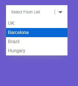
</head>
<body>
<form class="search-form">
<input type="hidden" name="search-form-loc" id="search-form-loc" />
<div class="pos-rel">
<div class="search-form__selector">
<p class="search-form__label search-form__label--loc">Select From List</p>
<div class="search-form__line"> </div>
<i class="fa fa-caret-down search-form__icon"></i>
</div>
<ul class="search-form__dropdown">
<li class="search-form__value" data-loc="search-form-loc">UK</li>
<li class="search-form__value" data-loc="search-form-loc">Barcelona</li>
<li class="search-form__value" data-loc="search-form-loc">Brazil</li>
<li class="search-form__value" data-loc="search-form-loc">Hungary</li>
</ul>
</div>
</form>
</body>
</html>