How to stop chrome responsive inspector from changing the zoom?
Google ChromeGoogle Chrome-DevtoolsGoogle Chrome Problem Overview
When using the option "toggle device scrollbar" in the Chrome inspector, whenever you type a new width/height, the window zoom adjusts for that width/height automatically. This is an incredibly frustrating UI, as I don't want the zoom to adjust... ever. The only way to avoid this is by resizing the responsive window by dragging the side borders.
Is there a way to turn the auto zoom off?
My current version of chrome: Version 54.0.2840.98 (64-bit)
Google Chrome Solutions
Solution 1 - Google Chrome
I have had this issue a few times now. I'm unsure what causes it, but i've found that you can fix it by selecting "Restore to defaults" in the Toggle device toolbar menu.
Solution 2 - Google Chrome
Here's how I finally managed to resolve this issue in 5 steps, I hope it helps:
-
Click
"Toggle device toolbar"to bring the toolbar up
-
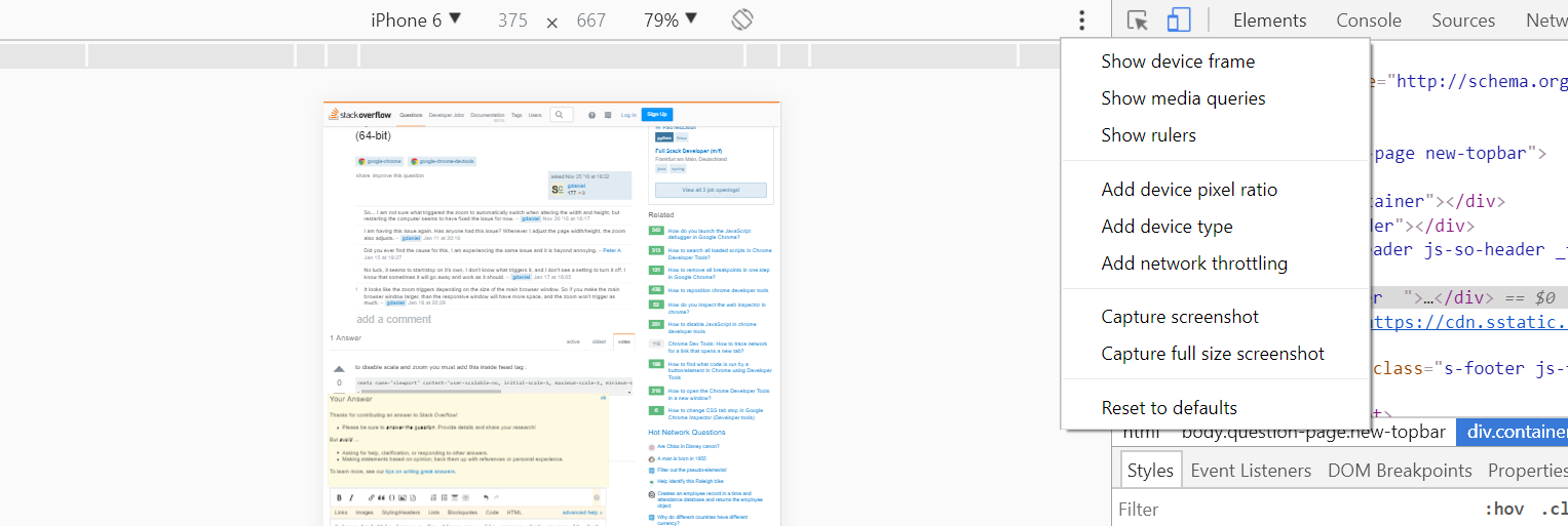
Click the 3 dots on the right hand side of the device toolbar

-
Click the option
"Add device type". -
This will add a new dropdown to the device toolbar. From there you can select
"Desktop (touch)"
-
Problem solved.
Solution 3 - Google Chrome
To disable scaling and zooming you must add this inside the <head> tag:
<meta name="viewport" content="user-scalable=no, initial-scale=1, maximum-scale=1, minimum-scale=1, width=device-width, height=device-height, target-densitydpi=device-dpi" />
The minimal <meta> tag (which doesn’t disable user-controlled scaling) is:
<meta name="viewport" content="initial-scale=1" />
It’s not a Chrome problem.
Solution 4 - Google Chrome
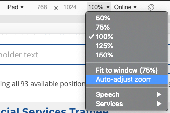
I asked this question a long time ago, and today I noticed a change in Chrome. I am not sure when this was introduced, since I haven't used the responsive options as much, but on Version 73.0.3683.86 (Official Build) (64-bit) there's now an option called "Auto-adjust zoom", and it was checked (enabled) by default. I unchecked it, and now the zoom will no longer change when the screen is resized.
You can access this option by clicking on "100%" next to the screen size, in the responsive screen. See image below:
Solution 5 - Google Chrome
I've reported this bug to Chromium.
Here's the link: https://bugs.chromium.org/p/chromium/issues/detail?id=1129880#c2
I've found the reason why this happens as well as a "mitigation": set the height to empty string: ""
Solution 6 - Google Chrome
As of now you can go to device toolbar then click Responsive here:

Then in the Responsive dropdown go to Edit ... and add the resolution you want.

Then you can select your custom one from the options and zoom and it will stay the same resolution!
Solution 7 - Google Chrome
Chrome is definitely doing something 'heuristically' and I'm pretty sure there are some bugs.
When using the 'responsive mode' (so I can drag the width back and forth) below around 320px the whole page starts scaling down. This makes sense as a default since there are basically no devices below that width and most content looks awful if it's allowed to fend for itself at such small sizes.
My original viewport settings were:
<meta name="viewport" content="width=device-width, initial-scale=1, maximum-scale=1.0">
The problem with that was there's nothing in the Chrome UI to constrain the minimum width to 320px (nobody needs to be designing for below that) and if you're dragging back and forth quickly then you'll inevitably end up with a width of say 169px. See the screenshot below to see how much of a mess I got in.
The height of my menu bar is 50px so it's clear that it is being scaled down. Unfortunately the rendering engine just seems to get confused and my buttons end up overflowing and making a huge mess. Even if I resize to greater than 320px it still stays confused and I have to refresh the page.

The important part of the accepted answer is the minimum-scale=1.0 which prevents this scaling at low screen widths.
That's the key part to add to fix the issue and I can't see any reason to not have that.
Solution 8 - Google Chrome
- Click F12
- In the right, top corner, near to chrome cross sign click on "Customize and control DevTools" kebab menu.
- Click settings
- Click Preferences
- At the bottom, Click Restore defaults and reload
- Make sure that you extensions will be removed.
Solution 9 - Google Chrome
Here is what worked for me:
- F12 (open developer tools)
- Ctrl + Shift + M (toggle device toolbar)
- Click the top right three dot menu
- Click Add Device Type
- On the top bar, A "Mobile" or "Desktop" dropdown list should appear
- Chances are "Mobile" is selected, switch it to "Desktop"
The auto-zoom should now go away, when you are in responsive mode and shrink the width of the viewport/device...
Solution 10 - Google Chrome
under zoom menu in responsive window > auto adjust zoom must get disabled
Solution 11 - Google Chrome
Change Dock side to Undock into separate window as shown in the picture below:
