How to specify size for iPhone 6/7 customised edge-to-edge image?
IosObjective CIphoneCocoa TouchIphone 6Ios Problem Overview
Say I want a bundled image to take up all available screen width in an iPhone app - for example a banner. I'd create my_banner.png with width 320px, [email protected] with width 640px and [email protected] for iPhone 6 plus with width 1242px. But the resolution of iPhone 6 is 750×1334 pixels. Still it shares the @2x suffix with iPhone 4 and 5 that have 640px width.
What's the recommended way or a good way to specify an image file that has been optimised for the 750px width of iPhone 6? Seems like it cannot be done in an asset catalog? Should it be done programatically? Is there some other suffix that can be used for iPhone 6?
 (Image extracted from http://www.iphoneresolution.com)
Ios Solutions
Solution 1 - Ios
It seems to me that a lot of these answers want to address how to constrain the imageView, where I think you are concerned with loading the correct media file? I would come up with my own future extensible solution, something like this:
"UIImage+DeviceSpecificMedia.h" - (a category on UIImage)
Interface:
#import <UIKit/UIKit.h>

typedef NS_ENUM(NSInteger, thisDeviceClass) {

	thisDeviceClass_iPhone,
	thisDeviceClass_iPhoneRetina,
	thisDeviceClass_iPhone5,
	thisDeviceClass_iPhone6,
	thisDeviceClass_iPhone6plus,

    // we can add new devices when we become aware of them

	thisDeviceClass_iPad,
	thisDeviceClass_iPadRetina,


	thisDeviceClass_unknown
};

thisDeviceClass currentDeviceClass();

@interface UIImage (DeviceSpecificMedia)

+ (instancetype )imageForDeviceWithName:(NSString *)fileName;

@end
Implementation:
#import "UIImage+DeviceSpecificMedia.h"

thisDeviceClass currentDeviceClass() {

	CGFloat greaterPixelDimension = (CGFloat) fmaxf(((float)[[UIScreen mainScreen]bounds].size.height),
													((float)[[UIScreen mainScreen]bounds].size.width));

	switch ((NSInteger)greaterPixelDimension) {
		case 480:
			return (( [[UIScreen mainScreen]scale] > 1.0) ? thisDeviceClass_iPhoneRetina : thisDeviceClass_iPhone );
			break;
		case 568:
			return thisDeviceClass_iPhone5;
			break;
		case 667:
			return thisDeviceClass_iPhone6;
			break;
		case 736:
			return thisDeviceClass_iPhone6plus;
			break;
		case 1024:
			return (( [[UIScreen mainScreen]scale] > 1.0) ? thisDeviceClass_iPadRetina : thisDeviceClass_iPad );
			break;
		default:
			return thisDeviceClass_unknown;
			break;
	}
}

@implementation UIImage (deviceSpecificMedia)

+ (NSString *)magicSuffixForDevice
{
	switch (currentDeviceClass()) {
		case thisDeviceClass_iPhone:
			return @"";
			break;
		case thisDeviceClass_iPhoneRetina:
			return @"@2x";
			break;
		case thisDeviceClass_iPhone5:
			return @"-568h@2x";
			break;
		case thisDeviceClass_iPhone6:
			return @"-667h@2x"; //or some other arbitrary string..
			break;
		case thisDeviceClass_iPhone6plus:
			return @"-736h@3x";
			break;

		case thisDeviceClass_iPad:
			return @"~ipad";
			break;
		case thisDeviceClass_iPadRetina:
			return @"~ipad@2x";
			break;

		case thisDeviceClass_unknown:
		default:
			return @"";
			break;
	}
}

+ (instancetype )imageForDeviceWithName:(NSString *)fileName
{
	UIImage *result = nil;
	NSString *nameWithSuffix = [fileName stringByAppendingString:[UIImage magicSuffixForDevice]];

	result = [UIImage imageNamed:nameWithSuffix];
	if (!result) {
		result = [UIImage imageNamed:fileName];
	}
	return result;
}

@end
Solution 2 - Ios
I am using the following trick as some stuff actually works:
- Asset Catalog for specific devices
- Specify images for
1x,2xon the base of 320x640 - Specify images for
4 2xand3xon the base of 320x568 (iPhone 5) - Create a new Images set for the iPhone 6 specifically (as this is the only device that makes trouble with edge to edge bindings)
- Only provide
2ximage for iPhone 6 in full resolution (750x1334)
Declare a constant
#define IS_IPHONE_6 [[UIScreen mainScreen]nativeBounds].size.width == 750.0 ? true : false
and use it like this:
UIImage *image = [UIImage imageNamed:@"Default_Image_Name"];
if(IS_IPHONE_^) {
    image = [UIImage imageNamed:@"Iphone6_Image_Name"];
}
this might be not the most beautiful solution, but it works, at least as long as apple does not provide a better API for edge to edge bindings.
Solution 3 - Ios
Auto Layout is supposed to help with this situation..
Now tell me @Nicklas Berglund what would you do if the device rotates? Lets say you are in landscape mode now.. How would you fill the Horizontal space which is not in the image assets any more?
Just food for thoughts.. Auto Layout supposed to take care of your screen no matter which orientation, or which device you are running your app on..
Maybe Apple should start targeting device orientations in image assets in future?
Lets go back to your question.. The solution is to replace your @2x images with 750px wide images and then have Auto Layout do its job. Oh yea, this is the tricky part..
If you just add constraints to fit it, it will squeeze it horizontally when displayed in 4" screen, but you can use multipliers to scale the image appropriately. Here's how you can do it:
[self.view addConstraints:[NSLayoutConstraint constraintsWithVisualFormat:@"H:|[imageFooterView]|" options:0 metrics:nil views:NSDictionaryOfVariableBindings(imageFooterView)]];

[self.view addConstraints:[NSLayoutConstraint constraintsWithVisualFormat:@"V:[imageFooterView]|" options:0 metrics:nil views:NSDictionaryOfVariableBindings(imageFooterView)]];


float aspectRatio = imageFooterView.frame.size.height/imageFooterView.frame.size.width;

[imageFooterView addConstraint:[NSLayoutConstraint constraintWithItem:imageFooterView attribute:NSLayoutAttributeHeight relatedBy:NSLayoutRelationEqual toItem:imageFooterView attribute:NSLayoutAttributeWidth multiplier:aspectRatio constant:0.0f]];
Solution 4 - Ios
I couldn't find a way to do it either, as I had a background Image that was perfectly sized with the Asset Catalog on every device except the iPhone 6. My fix (I did this in SpriteKit)?
if (bgNode.size.width != self.frame.size.width) {
        bgNode.texture = [SKTexture textureWithImageNamed:@"i6bg.png"];
        [bgNode runAction:[SKAction scaleXTo:self.frame.size.width/bgNode.size.width y:self.frame.size.width/bgNode.size.height duration:.1]];
    }
bgNode is the background image that is pulled up by the device. If it's an iPhone 6, it won't fit the screen and so the background image width wont be the same as the screen width. When the device is recognized as an iPhone 6, I change the texture to the R4 texture (the @2x for retina) and scale it to the correct dimensions.
I tried doing the same with the regular @2x image, but the scaled image looked very bad (it was too stretched out and noticable). With the R4 texture scaled, the proportions of width/height are a bit better and so the change isn't even noticeable. I hope this gives you some idea as to what you can do before Apple adds an iPhone 6 Asset.
Solution 5 - Ios
Hope this will solve all your issues related to customised edge to edge image.
https://stackoverflow.com/questions/26020979/xcode-6-xcassets-for-universal-image-support/26191308#26191308
Make sure if you are using auto layout then check pin is set to zero for all edges and constraints to margin is un checked.
You can also visit this links for launch screen images:
http://www.paintcodeapp.com/news/iphone-6-screens-demystified<br>
http://www.paintcodeapp.com/news/ultimate-guide-to-iphone-resolutions
Solution 6 - Ios
I raised the same question to apple technical support and they confirm that for fullscreen image it can't be done in asset catalog: "Currently, there is no way for the Asset Catalog to load device specific images. If your app needs to support device specific images you will need to implement your own code to detect the screen size and choose the appropriate image. You can file an enhancement request by using the following link. Be sure to explain your use case for this feature. "
Solution 7 - Ios
I checked the naming convention of a launch image generated from an asset catalog via Xcode 6 and the landscape version for iPhone 6+, for example, had: LaunchImage-Landscape-736h@3x.png
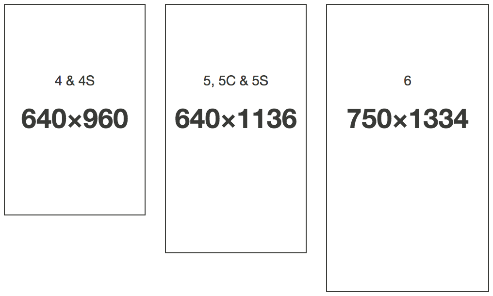
Based on that, I'd presume it would be as follows, for retina devices, assuming a base file desert.png:
- desert@2x : iPhone 4s (320 x 420)
- desert-568h@2x : iPhones 5, 5C and 5S (320 x 568)
- desert-667h@2x : iPhone 6 (375 x 667)
- desert-736h@3x : iPhone 6+ (414 x 736)
- desert@2x~ipad : iPad (1024 x 768)
Solution 8 - Ios
There is no native Assets support for this case, so I think it would be better to do it manually as working with undocumented file names may break easily in the future.
Solution 9 - Ios
Just measure the device dimensions and call the image that you want. ie Do it programatically
So in your appdelegate have globals
deviceHeight = self.window.frame.size.height;
deviceWidth = self.window.frame.size.width;
that you can call repeatedly. Then check them and call the appropriate image
if (deviceWidth == 640){
image = IPHONE4IMAGE;
deviceString = @"iPhone4";
}
else...
Solution 10 - Ios
In my case, I was interested in making my base view controller subclass have the same background image as my launch image.
>NOTE: This approach will not work unless this is your specific requirement.
Also, even when I tried creating a background image that was the correct size for the iPhone 6 (750x1334), loading that image as a pattern image into a background color for a view ended up scaling the image up in an undesirable way.
This answer gave me the code that I needed to figure out a good solution for me.
Here's the code I got working to have my launch image match my UIViewController's background image (or vice versa):
- (void)viewDidLoad {
    [super viewDidLoad];
    UIImage *background         = [UIImage imageNamed:[self splashImageName]];
    UIColor *backgroundColor    = [UIColor colorWithPatternImage:background];
    self.view.backgroundColor   = backgroundColor;
}
- (NSString *)splashImageName {
    UIInterfaceOrientation orientation  = [[UIApplication sharedApplication] statusBarOrientation];
    CGSize viewSize                     = self.view.bounds.size;
    NSString *viewOrientation           = @"Portrait";
    if (UIDeviceOrientationIsLandscape(orientation)) {
        viewSize                        = CGSizeMake(viewSize.height, viewSize.width);
        viewOrientation                 = @"Landscape";
    }
    NSArray *imagesDict                 = [[[NSBundle mainBundle] infoDictionary] valueForKey:@"UILaunchImages"];
    for (NSDictionary *dict in imagesDict) {
        CGSize imageSize                = CGSizeFromString(dict[@"UILaunchImageSize"]);
        if (CGSizeEqualToSize(imageSize, viewSize) && [viewOrientation isEqualToString:dict[@"UILaunchImageOrientation"]])
            return dict[@"UILaunchImageName"];
    }
    return nil;
}
Solution 11 - Ios
Please try this class to change the image name programmatically.
import UIKit

class AGTools: NSObject {
    class func fullWidthImage(imageName: String!) -> String!{
        let screenWidth = UIScreen.mainScreen().bounds.size.width
        switch (screenWidth){
        case 320:
            // scale 2x or 1x
            return (UIScreen.mainScreen().scale > 1.0) ? "\(imageName)@2x" : imageName
        case 375:
            return "\(imageName)-375w@2x"
        case 414:
            return "\(imageName)-414w@3x"
        default:
            return imageName
        }
    }
}
use this method like this.
_imgTest.image = UIImage(named: AGTools.fullWidthImage("imageName"))
Solution 12 - Ios
FIRST of all, you need to configure your imageView to cover all the screen, Autolayout will help a lot for this job, take a look on the link below and find how to Pin the constraints (Leading Space, Trailing Space, Top Space and Bottom Space) using Storyboards:
http://www.thinkandbuild.it/learn-to-love-auto-layout/
SECOND step is create device specific image sets on your image assets (image below), to display different images according to device.
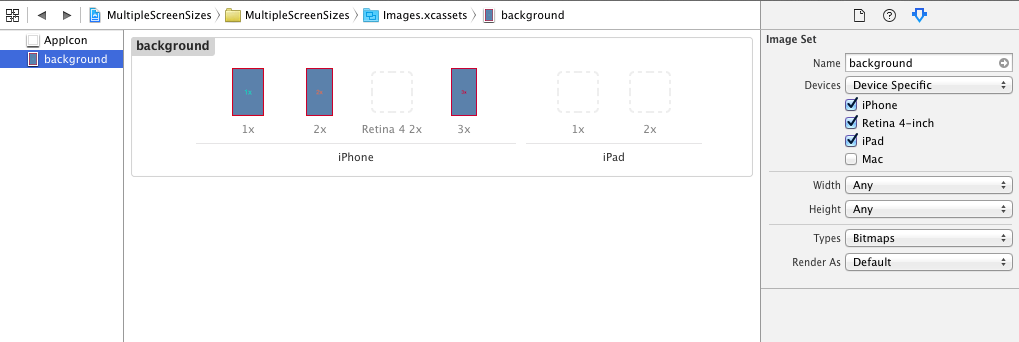
Check out this infographic: http://www.paintcodeapp.com/news/ultimate-guide-to-iphone-resolutions
It explains the differences between old iPhones, iPhone 6 and iPhone 6 Plus. You can see comparison of screen sizes in points, rendered pixels and physical pixels
That's all
Please, give a feedback if you have any trouble.