How to overlay one div over another div
HtmlCssPositionOverlayHtml Problem Overview
I need assistance with overlaying one individual div over another individual div.
My code looks like this:
<div class="navi"></div>
<div id="infoi">
    <img src="info_icon2.png" height="20" width="32"/>
</div>
Unfortunately I cannot nest the div#infoi or the img, inside the first div.navi.
It has to be two separate divs as shown, but I need to know how I could place the div#infoi over the div.navi and to the right most side and centered on top of the div.navi.
Html Solutions
Solution 1 - Html
#container {
  width: 100px;
  height: 100px;
  position: relative;
}
#navi,
#infoi {
  width: 100%;
  height: 100%;
  position: absolute;
  top: 0;
  left: 0;
}
#infoi {
  z-index: 10;
}
<div id="container">
  <div id="navi">a</div>
  <div id="infoi">
    <img src="https://appharbor.com/assets/images/stackoverflow-logo.png" height="20" width="32" />b
  </div>
</div>
I would suggest learning about position: relative and child elements with position: absolute.
Solution 2 - Html
The accepted solution works great, but IMO lacks an explanation as to why it works. The example below is boiled down to the basics and separates the important CSS from the non-relevant styling CSS. As a bonus, I've also included a detailed explanation of how CSS positioning works.
TLDR; if you only want the code, scroll down to The Result.
The Problem
There are two separate, sibling, elements and the goal is to position the second element (with an id of infoi), so it appears within the previous element (the one with a class of navi). The HTML structure cannot be changed.
Proposed Solution
To achieve the desired result we're going to move, or position, the second element, which we'll call #infoi so it appears within the first element, which we'll call .navi. Specifically, we want #infoi to be positioned in the top-right corner of .navi.
CSS Position Required Knowledge
CSS has several properties for positioning elements. By default, all elements are position: static. This means the element will be positioned according to its order in the HTML structure, with few exceptions.
The other position values are relative, absolute, sticky, and fixed. By setting an element's position to one of these other values it's now possible to use a combination of the following four properties to position the element:
toprightbottomleft
In other words, by setting position: absolute, we can add top: 100px to position the element 100 pixels from the top of the page. Conversely, if we set bottom: 100px the element would be positioned 100 pixels from the bottom of the page.
Here's where many CSS newcomers get lost - position: absolute has a frame of reference. In the example above, the frame of reference is the body element. position: absolute with top: 100px means the element is positioned 100 pixels from the top of the body element.
The position frame of reference, or position context, can be altered by setting the position of a parent element to any value other than position: static. That is, we can create a new position context by giving a parent element:
position: relative;position: absolute;position: sticky;position: fixed;
For example, if a <div class="parent"> element is given position: relative, any child elements use the <div class="parent"> as their position context. If a child element were given position: absolute and top: 100px, the element would be positioned 100 pixels from the top of the <div class="parent"> element, because the <div class="parent"> is now the position context.
The other factor to be aware of is stack order - or how elements are stacked in the z-direction. The must-know here is the stack order of elements are, by default, defined by the reverse of their order in the HTML structure. Consider the following example:
<body>
  <div>Bottom</div>
  <div>Top</div>
</body>
In this example, if the two <div> elements were positioned in the same place on the page, the <div>Top</div> element would cover the <div>Bottom</div> element. Since <div>Top</div> comes after <div>Bottom</div> in the HTML structure it has a higher stacking order.
div {
  position: absolute;
  width: 50%;
  height: 50%;
}

#bottom {
  top: 0;
  left: 0;
  background-color: blue;
}

#top {
  top: 25%;
  left: 25%;
  background-color: red;
}
<div id="bottom">Bottom</div>
<div id="top">Top</div>
The stacking order can be changed with CSS using the z-index or order properties.
We can ignore the stacking order in this issue as the natural HTML structure of the elements means the element we want to appear on top comes after the other element.
So, back to the problem at hand - we'll use position context to solve this issue.
The Solution
As stated above, our goal is to position the #infoi element so it appears within the .navi element. To do this, we'll wrap the .navi and #infoi elements in a new element <div class="wrapper"> so we can create a new position context.
<div class="wrapper">
  <div class="navi"></div>
  <div id="infoi"></div>
</div>
Then create a new position context by giving .wrapper a position: relative.
.wrapper {
  position: relative;
}
With this new position context, we can position #infoi within .wrapper. First, give #infoi a position: absolute, allowing us to position #infoi absolutely in .wrapper.
Then add top: 0 and right: 0 to position the #infoi element in the top-right corner. Remember, because the #infoi element is using .wrapper as its position context, it will be in the top-right of the .wrapper element.
#infoi {
  position: absolute;
  top: 0;
  right: 0;
}
Because .wrapper is merely a container for .navi, positioning #infoi in the top-right corner of .wrapper gives the effect of being positioned in the top-right corner of .navi.
And there we have it, #infoi now appears to be in the top-right corner of .navi.
The Result
The example below is boiled down to the basics, and contains some minimal styling.
/*
*  position: relative gives a new position context
*/
.wrapper {
  position: relative;
}

/*
*  The .navi properties are for styling only
*  These properties can be changed or removed
*/
.navi {
  background-color: #eaeaea;
  height: 40px;
}


/*
*  Position the #infoi element in the top-right
*  of the .wrapper element
*/
#infoi {
  position: absolute;
  top: 0;
  right: 0;

  /*
  *  Styling only, the below can be changed or removed
  *  depending on your use case
  */
  height: 20px;
  padding: 10px 10px;
}
<div class="wrapper">
  <div class="navi"></div>
  <div id="infoi">
    <img src="http://via.placeholder.com/32x20/000000/ffffff?text=?" height="20" width="32"/>
  </div>
</div>
An Alternate (Grid) Solution
Here's an alternate solution using CSS Grid to position the .navi element with the #infoi element in the far right. I've used the verbose grid properties to make it as clear as possible.
:root {
  --columns: 12;
}

/*
*  Setup the wrapper as a Grid element, with 12 columns, 1 row
*/
.wrapper {
  display: grid;
  grid-template-columns: repeat(var(--columns), 1fr);
  grid-template-rows: 40px;
}

/*
*  Position the .navi element to span all columns
*/
.navi {
  grid-column-start: 1;
  grid-column-end: span var(--columns);
  grid-row-start: 1;
  grid-row-end: 2;

  /*
  *  Styling only, the below can be changed or removed
  *  depending on your use case
  */
  background-color: #eaeaea;
}


/*
*  Position the #infoi element in the last column, and center it
*/
#infoi {
  grid-column-start: var(--columns);
  grid-column-end: span 1;
  grid-row-start: 1;
  place-self: center;
}
<div class="wrapper">
  <div class="navi"></div>
  <div id="infoi">
    <img src="http://via.placeholder.com/32x20/000000/ffffff?text=?" height="20" width="32"/>
  </div>
</div>
An Alternate (No Wrapper) Solution
In the case we can't edit any HTML, meaning we can't add a wrapper element, we can still achieve the desired effect.
Instead of using position: absolute on the #infoi element, we'll use position: relative. This allows us to reposition the #infoi element from its default position below the .navi element. With position: relative we can use a negative top value to move it up from its default position, and a left value of 100% minus a few pixels, using left: calc(100% - 52px), to position it near the right-side.
/*
*  The .navi properties are for styling only
*  These properties can be changed or removed
*/
.navi {
  background-color: #eaeaea;
  height: 40px;
  width: 100%;
}


/*
*  Position the #infoi element in the top-right
*  of the .wrapper element
*/
#infoi {
  position: relative;
  display: inline-block;
  top: -40px;
  left: calc(100% - 52px);

  /*
  *  Styling only, the below can be changed or removed
  *  depending on your use case
  */
  height: 20px;
  padding: 10px 10px;
}
<div class="navi"></div>
<div id="infoi">
  <img src="http://via.placeholder.com/32x20/000000/ffffff?text=?" height="20" width="32"/>
</div>
Solution 3 - Html
By using a div with style z-index:1; and position: absolute; you can overlay your div on any other div.
z-index determines the order in which divs 'stack'. A div with a higher z-index will appear in front of a div with a lower z-index. Note that this property only works with positioned elements.
Solution 4 - Html
The new Grid CSS specification provides a far more elegant solution. Using position: absolute may lead to overlaps or scaling issues while Grid will save you from dirty CSS hacks.
Most minimal Grid Overlay example:
HTML
<div class="container">
  <div class="content">This is the content</div>
  <div class="overlay">Overlay - must be placed under content in the HTML</div>
</div>
CSS
.container {
  display: grid;
}

.content, .overlay {
  grid-area: 1 / 1;
}
That's it. If you don't build for Internet Explorer, your code will most probably work.
Solution 5 - Html
You need to add a parent with a relative position, inside this parent you can set the absolute position of your divs
<div> <------Relative
  <div/> <------Absolute
  <div/> <------Absolute
  <div/> <------Absolute
<div/>
Final result:
https://codepen.io/hiteshsahu/pen/XWKYEYb?editors=0100
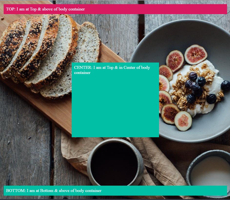
<div class="container">
  <div class="header">TOP: I am at Top & above of body container</div>

    <div class="center">CENTER: I am at Top & in Center of body container</div>

  <div class="footer">BOTTOM: I am at Bottom & above of body container</div>
</div>
Set HTML Body full width
 html, body {
  overflow: hidden;
  width: 100%;
  height: 100%;
  margin: 0;
  padding: 0;
}
After that, you can set a div with the relative position to take full width and height
.container {
  position: relative;
  background-color: blue;
  height: 100%;
  width: 100%;
  border:1px solid;
  color: white;
  background-image: url("https://images.pexels.com/photos/5591663/pexels-photo-5591663.jpeg?auto=compress&cs=tinysrgb&dpr=2&h=750&w=1260");
  background-color: #cccccc;
}
Inside this div with the relative position you can put your div with absolute positions
On TOP above the container
.header {
  position: absolute;
  margin-top: -10px;
  background-color: #d81b60 ;
  left:0;
  right:0;
  margin:15px;
  padding:10px;
  font-size: large;
}
On BOTTOM above the container
.footer {
  position: absolute;
  background-color: #00bfa5;
  left:0;
  right:0;
  bottom:0;
  margin:15px;
  padding:10px;
  color: white;
  font-size: large;

}
In CENTER above the container
.center {
  position: absolute;
  background-color: #00bfa5;
  left:  30%;
  right: 30%;
  bottom:30%;
  top: 30%;
  margin:10px;
  padding:10px;
  color: white;
  font-size: large;
}
Solution 6 - Html
Here follows a simple solution 100% based on CSS. The "secret" is to use the display: inline-block in the wrapper element. The vertical-align: bottom in the image is a hack to overcome the 4px padding that some browsers add after the element.
Advice: if the element before the wrapper is inline they can end up nested. In this case you can "wrap the wrapper" inside a container with display: block - usually a good and old div.
.wrapper {
    display: inline-block;
    position: relative;
}

.hover {
    position: absolute;
    top: 0;
    left: 0;
    right: 0;
    bottom: 0;
    background-color: rgba(0, 188, 212, 0);
    transition: background-color 0.5s;
}

.hover:hover {
    background-color: rgba(0, 188, 212, 0.8);
    // You can tweak with other background properties too (ie: background-image)...
}

img {
    vertical-align: bottom;
}
<div class="wrapper">
    <div class="hover"></div>
    <img src="http://placehold.it/450x250" />
</div>
Solution 7 - Html
This is what you need:
function showFrontLayer() {
  document.getElementById('bg_mask').style.visibility='visible';
  document.getElementById('frontlayer').style.visibility='visible';
}
function hideFrontLayer() {
  document.getElementById('bg_mask').style.visibility='hidden';
  document.getElementById('frontlayer').style.visibility='hidden';
}
#bg_mask {
  position: absolute;
  top: 0;
  right: 0;  bottom: 0;
  left: 0;
  margin: auto;
  margin-top: 0px;
  width: 981px;
  height: 610px;
  background : url("img_dot_white.jpg") center;
  z-index: 0;
  visibility: hidden;
}

#frontlayer {
  position: absolute;
  top: 0;
  right: 0;
  bottom: 0;
  left: 0;
  margin: 70px 140px 175px 140px;
  padding : 30px;
  width: 700px;
  height: 400px;
  background-color: orange;
  visibility: hidden;
  border: 1px solid black;
  z-index: 1;
}


</style>
<html>
  <head>
    <META HTTP-EQUIV="EXPIRES" CONTENT="-1" />

  </head>
  <body>
    <form action="test.html">
      <div id="baselayer">

        <input type="text" value="testing text"/>
        <input type="button" value="Show front layer" onclick="showFrontLayer();"/> Click 'Show front layer' button<br/><br/><br/>

        Testing text Testing text Testing text Testing text Testing text Testing text Testing text Testing text Testing text Testing text Testing text Testing text Testing text Testing text Testing text Testing text Testing text Testing text Testing text Testing text
        Testing text Testing text Testing text Testing text Testing text Testing text Testing text Testing text Testing text Testing text Testing text Testing text Testing text Testing text Testing text Testing text Testing text Testing text Testing text Testing text
        Testing text Testing text Testing text Testing text Testing text Testing text Testing text Testing text Testing text Testing text Testing text Testing text Testing text Testing text Testing text Testing text Testing text Testing text Testing text Testing textsting text Testing text Testing text Testing text Testing text Testing text Testing text Testing text Testing text Testing text Testing text Testing text Testing text Testing text Testing text Testing text Testing text Testing text
        <div id="bg_mask">
          <div id="frontlayer"><br/><br/>
            Now try to click on "Show front layer" button or the text box. It is not active.<br/><br/><br/>
            Use position: absolute to get the one div on top of another div.<br/><br/><br/>
            The bg_mask div is between baselayer and front layer.<br/><br/><br/>
            In bg_mask, img_dot_white.jpg(1 pixel in width and height) is used as background image to avoid IE browser transparency issue;<br/><br/><br/>
            <input type="button" value="Hide front layer" onclick="hideFrontLayer();"/>
          </div>
        </div>
      </div>
    </form>
  </body>
</html>
Solution 8 - Html
I am not much of a coder nor an expert in CSS, but I am still using your idea in my web designs. I have tried different resolutions too:
#wrapper {
  margin: 0 auto;
  width: 901px;
  height: 100%;
  background-color: #f7f7f7;
  background-image: url(images/wrapperback.gif);
  color: #000;
}
#header {
  float: left;
  width: 100.00%;
  height: 122px;
  background-color: #00314e;
  background-image: url(images/header.jpg);
  color: #fff;
}
#menu {
  float: left;
  padding-top: 20px;
  margin-left: 495px;
  width: 390px;
  color: #f1f1f1;
}
<div id="wrapper">
  <div id="header">
    <div id="menu">
      menu will go here
    </div>
  </div>
</div>
Of course there will be a wrapper around both of them. You can control the location of the menu div which will be displayed within the header div with left margins and top positions. You can also set the div menu to float right if you like.
Solution 9 - Html
Here is a simple example to bring an overlay effect with a loading icon over another div.
<style>
    #overlay {
        position: absolute;
        width: 100%;
        height: 100%;
        background: black url('icons/loading.gif') center center no-repeat; /* Make sure the path and a fine named 'loading.gif' is there */
        background-size: 50px;
        z-index: 1;
        opacity: .6;
    }
    .wraper{
        position: relative;
        width:400px;  /* Just for testing, remove width and height if you have content inside this div */
        height:500px; /* Remove this if you have content inside */
    }
</style>

<h2>The overlay tester</h2>
<div class="wraper">
    <div id="overlay"></div>
    <h3>Apply the overlay over this div</h3>
</div>
Try it here: http://jsbin.com/fotozolucu/edit?html,css,output